- Published on
How To Make A Sidebar Navigation With Tailwind CSS In 6 Easy Steps?
- What is Tailwind CSS?
- The description of Sidebar Navigation UI component
- Why use Tailwind CSS to create a Sidebar Navigation UI component?
- The preview of Sidebar Navigation UI component
- The source code of Sidebar Navigation UI component
- How to create a Sidebar Navigation with Tailwind CSS?
- Conclusion
As a FrontEnd technology blogger, I always try to find the best and easiest ways to create UI components. In this article, I will show you how to create a Sidebar Navigation with Tailwind CSS in 6 easy steps.
What is Tailwind CSS?
Tailwind CSS is a utility-first CSS framework that helps you to create custom designs without writing any CSS. It provides a set of pre-defined classes that you can use to style your HTML elements. Tailwind CSS is easy to use and highly customizable.
The description of Sidebar Navigation UI component
A Sidebar Navigation is a UI component that helps users to navigate through different sections of a website or application. It is usually placed on the left or right side of the screen and contains links to different pages or sections of the website.
Why use Tailwind CSS to create a Sidebar Navigation UI component?
Tailwind CSS provides a set of pre-defined classes that you can use to create a Sidebar Navigation UI component without writing any CSS. It saves a lot of time and effort and helps you to create a responsive and highly customizable Sidebar Navigation.
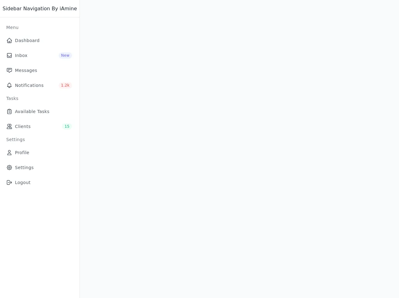
The preview of Sidebar Navigation UI component
To create a Sidebar Navigation UI component with Tailwind CSS, we will use the following classes:
bg-gray-800: sets the background color of the Sidebar Navigation to gray.text-white: sets the text color of the Sidebar Navigation to white.p-4: adds padding to the Sidebar Navigation.flex flex-col: sets the display property of the Sidebar Navigation to flex and the flex-direction to column.justify-start: aligns the content of the Sidebar Navigation to the top.items-center: aligns the items of the Sidebar Navigation to the center.w-64: sets the width of the Sidebar Navigation to 64 pixels.
Free download of the Sidebar Navigation's source code
The source code of Sidebar Navigation UI component
To create a Sidebar Navigation UI component with Tailwind CSS, you can use the following HTML code:
<div class="min-h-screen flex flex-col flex-auto flex-shrink-0 antialiased bg-gray-50 text-gray-800">
  <div class="fixed flex flex-col top-0 left-0 w-64 bg-white h-full border-r">
    <div class="flex items-center justify-center h-14 border-b">
      <div>Sidebar Navigation By iAmine</div>
    </div>
    <div class="overflow-y-auto overflow-x-hidden flex-grow">
      <ul class="flex flex-col py-4 space-y-1">
        <li class="px-5">
          <div class="flex flex-row items-center h-8">
            <div class="text-sm font-light tracking-wide text-gray-500">Menu</div>
          </div>
        </li>
        <li>
          <a href="#" class="relative flex flex-row items-center h-11 focus:outline-none hover:bg-gray-50 text-gray-600 hover:text-gray-800 border-l-4 border-transparent hover:border-indigo-500 pr-6">
            <span class="inline-flex justify-center items-center ml-4">
              <svg class="w-5 h-5" fill="none" stroke="currentColor" viewBox="0 0 24 24" xmlns="http://www.w3.org/2000/svg"><path stroke-linecap="round" stroke-linejoin="round" stroke-width="2" d="M3 12l2-2m0 0l7-7 7 7M5 10v10a1 1 0 001 1h3m10-11l2 2m-2-2v10a1 1 0 01-1 1h-3m-6 0a1 1 0 001-1v-4a1 1 0 011-1h2a1 1 0 011 1v4a1 1 0 001 1m-6 0h6"></path></svg>
            </span>
            <span class="ml-2 text-sm tracking-wide truncate">Dashboard</span>
          </a>
        </li>
        <li>
          <a href="#" class="relative flex flex-row items-center h-11 focus:outline-none hover:bg-gray-50 text-gray-600 hover:text-gray-800 border-l-4 border-transparent hover:border-indigo-500 pr-6">
            <span class="inline-flex justify-center items-center ml-4">
              <svg class="w-5 h-5" fill="none" stroke="currentColor" viewBox="0 0 24 24" xmlns="http://www.w3.org/2000/svg"><path stroke-linecap="round" stroke-linejoin="round" stroke-width="2" d="M20 13V6a2 2 0 00-2-2H6a2 2 0 00-2 2v7m16 0v5a2 2 0 01-2 2H6a2 2 0 01-2-2v-5m16 0h-2.586a1 1 0 00-.707.293l-2.414 2.414a1 1 0 01-.707.293h-3.172a1 1 0 01-.707-.293l-2.414-2.414A1 1 0 006.586 13H4"></path></svg>
            </span>
            <span class="ml-2 text-sm tracking-wide truncate">Inbox</span>
            <span class="px-2 py-0.5 ml-auto text-xs font-medium tracking-wide text-indigo-500 bg-indigo-50 rounded-full">New</span>
          </a>
        </li>
        <li>
          <a href="#" class="relative flex flex-row items-center h-11 focus:outline-none hover:bg-gray-50 text-gray-600 hover:text-gray-800 border-l-4 border-transparent hover:border-indigo-500 pr-6">
            <span class="inline-flex justify-center items-center ml-4">
              <svg class="w-5 h-5" fill="none" stroke="currentColor" viewBox="0 0 24 24" xmlns="http://www.w3.org/2000/svg"><path stroke-linecap="round" stroke-linejoin="round" stroke-width="2" d="M7 8h10M7 12h4m1 8l-4-4H5a2 2 0 01-2-2V6a2 2 0 012-2h14a2 2 0 012 2v8a2 2 0 01-2 2h-3l-4 4z"></path></svg>
            </span>
            <span class="ml-2 text-sm tracking-wide truncate">Messages</span>
          </a>
        </li>
        <li>
          <a href="#" class="relative flex flex-row items-center h-11 focus:outline-none hover:bg-gray-50 text-gray-600 hover:text-gray-800 border-l-4 border-transparent hover:border-indigo-500 pr-6">
            <span class="inline-flex justify-center items-center ml-4">
              <svg class="w-5 h-5" fill="none" stroke="currentColor" viewBox="0 0 24 24" xmlns="http://www.w3.org/2000/svg"><path stroke-linecap="round" stroke-linejoin="round" stroke-width="2" d="M15 17h5l-1.405-1.405A2.032 2.032 0 0118 14.158V11a6.002 6.002 0 00-4-5.659V5a2 2 0 10-4 0v.341C7.67 6.165 6 8.388 6 11v3.159c0 .538-.214 1.055-.595 1.436L4 17h5m6 0v1a3 3 0 11-6 0v-1m6 0H9"></path></svg>
            </span>
            <span class="ml-2 text-sm tracking-wide truncate">Notifications</span>
            <span class="px-2 py-0.5 ml-auto text-xs font-medium tracking-wide text-red-500 bg-red-50 rounded-full">1.2k</span>
          </a>
        </li>
        <li class="px-5">
          <div class="flex flex-row items-center h-8">
            <div class="text-sm font-light tracking-wide text-gray-500">Tasks</div>
          </div>
        </li>
        <li>
          <a href="#" class="relative flex flex-row items-center h-11 focus:outline-none hover:bg-gray-50 text-gray-600 hover:text-gray-800 border-l-4 border-transparent hover:border-indigo-500 pr-6">
            <span class="inline-flex justify-center items-center ml-4">
              <svg class="w-5 h-5" fill="none" stroke="currentColor" viewBox="0 0 24 24" xmlns="http://www.w3.org/2000/svg"><path stroke-linecap="round" stroke-linejoin="round" stroke-width="2" d="M9 5H7a2 2 0 00-2 2v12a2 2 0 002 2h10a2 2 0 002-2V7a2 2 0 00-2-2h-2M9 5a2 2 0 002 2h2a2 2 0 002-2M9 5a2 2 0 012-2h2a2 2 0 012 2m-3 7h3m-3 4h3m-6-4h.01M9 16h.01"></path></svg>
            </span>
            <span class="ml-2 text-sm tracking-wide truncate">Available Tasks</span>
          </a>
        </li>
        <li>
          <a href="#" class="relative flex flex-row items-center h-11 focus:outline-none hover:bg-gray-50 text-gray-600 hover:text-gray-800 border-l-4 border-transparent hover:border-indigo-500 pr-6">
            <span class="inline-flex justify-center items-center ml-4">
              <svg class="w-5 h-5" fill="none" stroke="currentColor" viewBox="0 0 24 24" xmlns="http://www.w3.org/2000/svg"><path stroke-linecap="round" stroke-linejoin="round" stroke-width="2" d="M12 4.354a4 4 0 110 5.292M15 21H3v-1a6 6 0 0112 0v1zm0 0h6v-1a6 6 0 00-9-5.197M13 7a4 4 0 11-8 0 4 4 0 018 0z"></path></svg>
            </span>
            <span class="ml-2 text-sm tracking-wide truncate">Clients</span>
            <span class="px-2 py-0.5 ml-auto text-xs font-medium tracking-wide text-green-500 bg-green-50 rounded-full">15</span>
          </a>
        </li>
        <li class="px-5">
          <div class="flex flex-row items-center h-8">
            <div class="text-sm font-light tracking-wide text-gray-500">Settings</div>
          </div>
        </li>
        <li>
          <a href="#" class="relative flex flex-row items-center h-11 focus:outline-none hover:bg-gray-50 text-gray-600 hover:text-gray-800 border-l-4 border-transparent hover:border-indigo-500 pr-6">
            <span class="inline-flex justify-center items-center ml-4">
              <svg class="w-5 h-5" fill="none" stroke="currentColor" viewBox="0 0 24 24" xmlns="http://www.w3.org/2000/svg"><path stroke-linecap="round" stroke-linejoin="round" stroke-width="2" d="M16 7a4 4 0 11-8 0 4 4 0 018 0zM12 14a7 7 0 00-7 7h14a7 7 0 00-7-7z"></path></svg>
            </span>
            <span class="ml-2 text-sm tracking-wide truncate">Profile</span>
          </a>
        </li>
        <li>
          <a href="#" class="relative flex flex-row items-center h-11 focus:outline-none hover:bg-gray-50 text-gray-600 hover:text-gray-800 border-l-4 border-transparent hover:border-indigo-500 pr-6">
            <span class="inline-flex justify-center items-center ml-4">
              <svg class="w-5 h-5" fill="none" stroke="currentColor" viewBox="0 0 24 24" xmlns="http://www.w3.org/2000/svg">
                <path stroke-linecap="round" stroke-linejoin="round" stroke-width="2" d="M10.325 4.317c.426-1.756 2.924-1.756 3.35 0a1.724 1.724 0 002.573 1.066c1.543-.94 3.31.826 2.37 2.37a1.724 1.724 0 001.065 2.572c1.756.426 1.756 2.924 0 3.35a1.724 1.724 0 00-1.066 2.573c.94 1.543-.826 3.31-2.37 2.37a1.724 1.724 0 00-2.572 1.065c-.426 1.756-2.924 1.756-3.35 0a1.724 1.724 0 00-2.573-1.066c-1.543.94-3.31-.826-2.37-2.37a1.724 1.724 0 00-1.065-2.572c-1.756-.426-1.756-2.924 0-3.35a1.724 1.724 0 001.066-2.573c-.94-1.543.826-3.31 2.37-2.37.996.608 2.296.07 2.572-1.065z"></path>
                <path stroke-linecap="round" stroke-linejoin="round" stroke-width="2" d="M15 12a3 3 0 11-6 0 3 3 0 016 0z"></path>
              </svg>
            </span>
            <span class="ml-2 text-sm tracking-wide truncate">Settings</span>
          </a>
        </li>
        <li>
          <a href="#" class="relative flex flex-row items-center h-11 focus:outline-none hover:bg-gray-50 text-gray-600 hover:text-gray-800 border-l-4 border-transparent hover:border-indigo-500 pr-6">
            <span class="inline-flex justify-center items-center ml-4">
              <svg class="w-5 h-5" fill="none" stroke="currentColor" viewBox="0 0 24 24" xmlns="http://www.w3.org/2000/svg"><path stroke-linecap="round" stroke-linejoin="round" stroke-width="2" d="M17 16l4-4m0 0l-4-4m4 4H7m6 4v1a3 3 0 01-3 3H6a3 3 0 01-3-3V7a3 3 0 013-3h4a3 3 0 013 3v1"></path></svg>
            </span>
            <span class="ml-2 text-sm tracking-wide truncate">Logout</span>
          </a>
        </li>
      </ul>
    </div>
  </div>
</div>
How to create a Sidebar Navigation with Tailwind CSS?
Now that we have seen the preview and source code of the Sidebar Navigation UI component, let's see how to create it in 6 easy steps.
Step 1: Create a new HTML file and add the following code:
<!DOCTYPE html>
<html lang="en">
<head>
    <meta charset="UTF-8">
    <title>Sidebar Navigation with Tailwind CSS</title>
    <link rel="stylesheet" href="https://cdn.jsdelivr.net/npm/[email protected]/dist/tailwind.min.css">
</head>
<body>
    <div class="flex">
        <!-- Sidebar Navigation -->
    </div>
</body>
</html>
Step 2: Add the following code inside the div tag to create the Sidebar Navigation:
<div class="bg-gray-800 text-white p-4 flex flex-col justify-start items-center w-64">
    <!-- Sidebar Navigation Links -->
</div>
Step 3: Add the following code inside the Sidebar Navigation div tag to create the Sidebar Navigation Links:
<a href="#" class="my-2 hover:text-gray-300">Home</a>
<a href="#" class="my-2 hover:text-gray-300">About</a>
<a href="#" class="my-2 hover:text-gray-300">Services</a>
<a href="#" class="my-2 hover:text-gray-300">Contact</a>
Step 4: Save the HTML file and open it in your browser. You should see the Sidebar Navigation with links.
Step 5: Customize the Sidebar Navigation by changing the classes and adding your own styles.
Step 6: Congratulations! You have successfully created a Sidebar Navigation with Tailwind CSS.
Conclusion
In this article, we have learned how to create a Sidebar Navigation with Tailwind CSS in 6 easy steps. Tailwind CSS is a powerful CSS framework that helps you to create custom designs without writing any CSS. It provides a set of pre-defined classes that you can use to style your HTML elements. I hope this article helps you to create your own Sidebar Navigation UI component with Tailwind CSS.