- Published on
Learn How To Make A Sidebar menu With Tailwind CSS Like an Expert
- What is Tailwind CSS?
- The description of Sidebar menu ui component
- Why use Tailwind CSS to create a Sidebar menu ui component?
- The preview of Sidebar menu ui component
- The source code of Sidebar menu ui component
- How to create a Sidebar menu with Tailwind CSS?
- Conclusion
As a FrontEnd technology blogger, it is important to stay up to date with the latest trends and tools in the industry. One such tool that has gained immense popularity in recent years is Tailwind CSS. Tailwind CSS is a utility-first CSS framework that helps developers create responsive and customizable user interfaces quickly. In this article, we will learn how to create a Sidebar menu with Tailwind CSS.
What is Tailwind CSS?
Tailwind CSS is a utility-first CSS framework that provides a set of pre-defined CSS classes that can be used to style HTML elements. It is designed to help developers create responsive and customizable user interfaces quickly. Tailwind CSS is different from other CSS frameworks like Bootstrap or Foundation because it does not come with pre-designed UI components. Instead, it provides a set of utility classes that can be used to create custom UI components.
The description of Sidebar menu ui component
A Sidebar menu is a UI component that is commonly used in web applications to provide navigation options to users. It is a vertical menu that is typically located on the left or right side of the screen. The Sidebar menu can be expanded or collapsed based on user interaction.
Why use Tailwind CSS to create a Sidebar menu ui component?
Tailwind CSS provides a set of utility classes that can be used to create a Sidebar menu quickly and easily. The utility classes provide a high level of flexibility and customization options, allowing developers to create unique and responsive Sidebar menus that meet their specific needs.
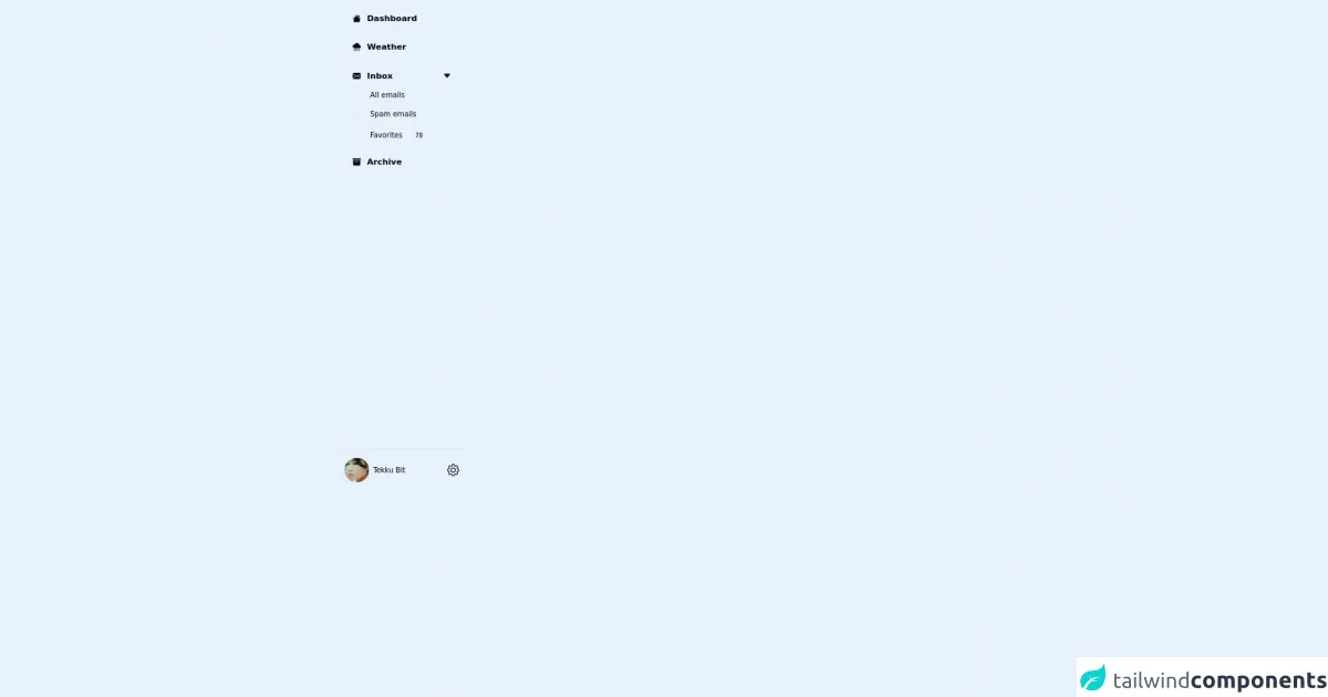
The preview of Sidebar menu ui component
To create a Sidebar menu with Tailwind CSS, we will use a combination of HTML and CSS. The Sidebar menu will have a fixed width and will be positioned on the left side of the screen. It will have a header section that contains a logo and a close button, and a body section that contains navigation links.
Free download of the Sidebar menu's source code
The source code of Sidebar menu ui component
To create the Sidebar menu, we will use a combination of HTML and CSS. The HTML code will define the structure of the Sidebar menu, and the CSS code will define its style and behavior.
<div class="flex h-screen w-64 flex-col justify-between bg-zinc-900 text-zinc-300">
  <div class="p-4">
    <!-- items -->
    <div class="mb-4">
      <div class="flex w-full items-center justify-between">
        <a class="flex w-full cursor-pointer items-center rounded-lg px-4 py-2 transition duration-300 ease-in-out hover:bg-zinc-800 hover:text-white">
          <svg xmlns="http://www.w3.org/2000/svg" width="16" height="16" fill="currentColor" class="bi bi-house-fill" viewBox="0 0 16 16">
            <path fill-rule="evenodd" d="m8 3.293 6 6V13.5a1.5 1.5 0 0 1-1.5 1.5h-9A1.5 1.5 0 0 1 2 13.5V9.293l6-6zm5-.793V6l-2-2V2.5a.5.5 0 0 1 .5-.5h1a.5.5 0 0 1 .5.5z" />
            <path fill-rule="evenodd" d="M7.293 1.5a1 1 0 0 1 1.414 0l6.647 6.646a.5.5 0 0 1-.708.708L8 2.207 1.354 8.854a.5.5 0 1 1-.708-.708L7.293 1.5z" />
          </svg>
          <span class="ml-3 font-bold">Dashboard</span>
        </a>
      </div>
    </div>
    <!-- item -->
    <div class="mb-4">
      <div class="flex w-full items-center justify-between">
        <a class="flex w-full cursor-pointer items-center rounded-lg px-4 py-2 transition duration-300 ease-in-out hover:bg-zinc-800 hover:text-white">
          <svg xmlns="http://www.w3.org/2000/svg" width="16" height="16" fill="currentColor" class="bi bi-cloud-rain-heavy-fill" viewBox="0 0 16 16">
            <path d="M4.176 11.032a.5.5 0 0 1 .292.643l-1.5 4a.5.5 0 0 1-.936-.35l1.5-4a.5.5 0 0 1 .644-.293zm3 0a.5.5 0 0 1 .292.643l-1.5 4a.5.5 0 0 1-.936-.35l1.5-4a.5.5 0 0 1 .644-.293zm3 0a.5.5 0 0 1 .292.643l-1.5 4a.5.5 0 0 1-.936-.35l1.5-4a.5.5 0 0 1 .644-.293zm3 0a.5.5 0 0 1 .292.643l-1.5 4a.5.5 0 0 1-.936-.35l1.5-4a.5.5 0 0 1 .644-.293zm.229-7.005a5.001 5.001 0 0 0-9.499-1.004A3.5 3.5 0 1 0 3.5 10H13a3 3 0 0 0 .405-5.973z" />
          </svg>
          <span class="ml-3 font-bold">Weather</span>
        </a>
      </div>
    </div>
    <!-- item -->
    <div class="mb-4 flex flex-col">
      <!-- Main sidebar items -->
      <div class="flex w-full items-center justify-between">
        <a class="flex w-full cursor-pointer items-center rounded-lg px-4 py-2 transition duration-300 ease-in-out hover:bg-zinc-800 hover:text-white">
          <svg xmlns="http://www.w3.org/2000/svg" width="16" height="16" fill="currentColor" class="bi bi-envelope-fill" viewBox="0 0 16 16">
            <path d="M.05 3.555A2 2 0 0 1 2 2h12a2 2 0 0 1 1.95 1.555L8 8.414.05 3.555ZM0 4.697v7.104l5.803-3.558L0 4.697ZM6.761 8.83l-6.57 4.027A2 2 0 0 0 2 14h12a2 2 0 0 0 1.808-1.144l-6.57-4.027L8 9.586l-1.239-.757Zm3.436-.586L16 11.801V4.697l-5.803 3.546Z" />
          </svg>
          <span class="ml-3 font-bold">Inbox</span>
        </a>
        <button class="ml-4 h-full cursor-pointer px-4 py-2 transition duration-300 ease-in-out hover:text-white">
          <svg xmlns="http://www.w3.org/2000/svg" width="16" height="16" fill="currentColor" class="bi bi-caret-down-fill" viewBox="0 0 16 16">
            <path d="M7.247 11.14 2.451 5.658C1.885 5.013 2.345 4 3.204 4h9.592a1 1 0 0 1 .753 1.659l-4.796 5.48a1 1 0 0 1-1.506 0z" />
          </svg>
        </button>
      </div>
      <!-- Main sidebar item sub menu -->
      <ul class="ml-6 mt-2 w-full border-l-2 border-zinc-800 pl-6 text-sm">
        <li class="mb-4 transition duration-300 ease-in-out hover:text-white">
          <a href="#">All emails</a>
        </li>
        <li class="mb-4 transition duration-300 ease-in-out hover:text-white">
          <a href="#">Spam emails</a>
        </li>
        <li class="transition duration-300 ease-in-out hover:text-white">
          <a href="#" class="flex items-center">
            Favorites
            <span class="ml-4 flex h-8 w-8 items-center justify-center rounded-full bg-zinc-800 text-xs">78</span>
          </a>
        </li>
      </ul>
    </div>
    <!-- item -->
    <div class="mb-4">
      <div class="flex w-full items-center justify-between">
        <a class="flex w-full cursor-pointer items-center rounded-lg px-4 py-2 transition duration-300 ease-in-out hover:bg-zinc-800 hover:text-white">
          <svg xmlns="http://www.w3.org/2000/svg" width="16" height="16" fill="currentColor" class="bi bi-archive-fill" viewBox="0 0 16 16">
            <path d="M12.643 15C13.979 15 15 13.845 15 12.5V5H1v7.5C1 13.845 2.021 15 3.357 15h9.286zM5.5 7h5a.5.5 0 0 1 0 1h-5a.5.5 0 0 1 0-1zM.8 1a.8.8 0 0 0-.8.8V3a.8.8 0 0 0 .8.8h14.4A.8.8 0 0 0 16 3V1.8a.8.8 0 0 0-.8-.8H.8z" />
          </svg>
          <span class="ml-3 font-bold">Archive</span>
        </a>
      </div>
    </div>
  </div>
  <!-- Bottom -->
  <div class="flex items-center border-t-2 border-zinc-700 p-4">
    <img src="https://images.unsplash.com/photo-1649180493506-1074b5f7c9b2?ixlib=rb-1.2.1&ixid=MnwxMjA3fDB8MHxwaG90by1wYWdlfHx8fGVufDB8fHx8&auto=format&fit=face&w=1936&q=80" alt="" class="h-12 w-12 rounded-full object-cover" />
    <a href="https://www.youtube.com/channel/UCZXcplsSliFfK3vGUjCKY2A" class="ml-2 text-sm" target="_blank">Tekku Bit</a>
    <button class="ml-auto cursor-pointer">
      <svg xmlns="http://www.w3.org/2000/svg" width="24" height="24" fill="currentColor" class="bi bi-gear" viewBox="0 0 16 16">
        <path d="M8 4.754a3.246 3.246 0 1 0 0 6.492 3.246 3.246 0 0 0 0-6.492zM5.754 8a2.246 2.246 0 1 1 4.492 0 2.246 2.246 0 0 1-4.492 0z" />
        <path d="M9.796 1.343c-.527-1.79-3.065-1.79-3.592 0l-.094.319a.873.873 0 0 1-1.255.52l-.292-.16c-1.64-.892-3.433.902-2.54 2.541l.159.292a.873.873 0 0 1-.52 1.255l-.319.094c-1.79.527-1.79 3.065 0 3.592l.319.094a.873.873 0 0 1 .52 1.255l-.16.292c-.892 1.64.901 3.434 2.541 2.54l.292-.159a.873.873 0 0 1 1.255.52l.094.319c.527 1.79 3.065 1.79 3.592 0l.094-.319a.873.873 0 0 1 1.255-.52l.292.16c1.64.893 3.434-.902 2.54-2.541l-.159-.292a.873.873 0 0 1 .52-1.255l.319-.094c1.79-.527 1.79-3.065 0-3.592l-.319-.094a.873.873 0 0 1-.52-1.255l.16-.292c.893-1.64-.902-3.433-2.541-2.54l-.292.159a.873.873 0 0 1-1.255-.52l-.094-.319zm-2.633.283c.246-.835 1.428-.835 1.674 0l.094.319a1.873 1.873 0 0 0 2.693 1.115l.291-.16c.764-.415 1.6.42 1.184 1.185l-.159.292a1.873 1.873 0 0 0 1.116 2.692l.318.094c.835.246.835 1.428 0 1.674l-.319.094a1.873 1.873 0 0 0-1.115 2.693l.16.291c.415.764-.42 1.6-1.185 1.184l-.291-.159a1.873 1.873 0 0 0-2.693 1.116l-.094.318c-.246.835-1.428.835-1.674 0l-.094-.319a1.873 1.873 0 0 0-2.692-1.115l-.292.16c-.764.415-1.6-.42-1.184-1.185l.159-.291A1.873 1.873 0 0 0 1.945 8.93l-.319-.094c-.835-.246-.835-1.428 0-1.674l.319-.094A1.873 1.873 0 0 0 3.06 4.377l-.16-.292c-.415-.764.42-1.6 1.185-1.184l.292.159a1.873 1.873 0 0 0 2.692-1.115l.094-.319z" />
      </svg>
    </button>
  </div>
</div>
How to create a Sidebar menu with Tailwind CSS?
To create a Sidebar menu with Tailwind CSS, follow the steps below:
- Create a new HTML file and add the following code:
<div class="sidebar">
<div class="sidebar-header">
<img src="logo.png" alt="Logo">
<button class="close-btn">×</button>
</div>
<div class="sidebar-body">
<ul class="sidebar-nav">
<li><a href="#">Home</a></li>
<li><a href="#">About</a></li>
<li><a href="#">Services</a></li>
<li><a href="#">Contact</a></li>
</ul>
</div>
</div>
- Add the following CSS code to your stylesheet:
.sidebar {
  position: fixed;
  top: 0;
  left: 0;
  bottom: 0;
  width: 250px;
  background-color: #fff;
  border-right: 1px solid #ddd;
  z-index: 9999;
  transition: all 0.3s ease-in-out;
}

.sidebar-header {
  display: flex;
  align-items: center;
  justify-content: space-between;
  padding: 10px;
  border-bottom: 1px solid #ddd;
}

.sidebar-header img {
  max-width: 100%;
  height: auto;
}

.close-btn {
  font-size: 1.5rem;
  background-color: transparent;
  border: none;
  cursor: pointer;
}

.sidebar-body {
  padding: 20px;
}

.sidebar-nav {
  list-style: none;
  padding: 0;
  margin: 0;
}

.sidebar-nav li {
  margin-bottom: 10px;
}

.sidebar-nav li a {
  display: block;
  padding: 10px;
  border-radius: 5px;
  color: #333;
  font-weight: bold;
  transition: all 0.3s ease-in-out;
}

.sidebar-nav li a:hover {
  background-color: #eee;
}
Open the HTML file in your web browser, and you should see the Sidebar menu on the left side of the screen.
To toggle the Sidebar menu, add the following JavaScript code:
const sidebar = document.querySelector('.sidebar');
const closeBtn = document.querySelector('.close-btn');

closeBtn.addEventListener('click', () => {
  sidebar.classList.toggle('hidden');
});
- Save your changes and test the Sidebar menu by clicking on the close button.
Conclusion
In this article, we learned how to create a Sidebar menu with Tailwind CSS. We saw how Tailwind CSS provides a set of utility classes that can be used to create responsive and customizable UI components quickly. We also saw how to use HTML, CSS, and JavaScript to create a Sidebar menu that can be expanded or collapsed based on user interaction. With Tailwind CSS, developers can create unique and responsive UI components that meet their specific needs.