- Published on
How To Make A Section Avatars With Tailwind CSS In 5 Easy Steps
- What is Tailwind CSS?
- The description of Section Avatars ui component
- Why use Tailwind CSS to create a Section Avatars ui component?
- The preview of Section Avatars ui component
- The source code of Section Avatars ui component
- How to create a Section Avatars with Tailwind CSS?
- Step 1: Set up your HTML structure
- Step 2: Add the avatar images
- Step 3: Add the avatar names or titles
- Step 4: Style the grid layout
- Step 5: Style the avatar images and names
- Conclusion
What is Tailwind CSS?
Tailwind CSS is a utility-first CSS framework that provides a set of pre-defined classes to help developers quickly build custom user interfaces. It's a popular choice for front-end developers who want to streamline their workflow and create responsive designs with ease.
The description of Section Avatars ui component
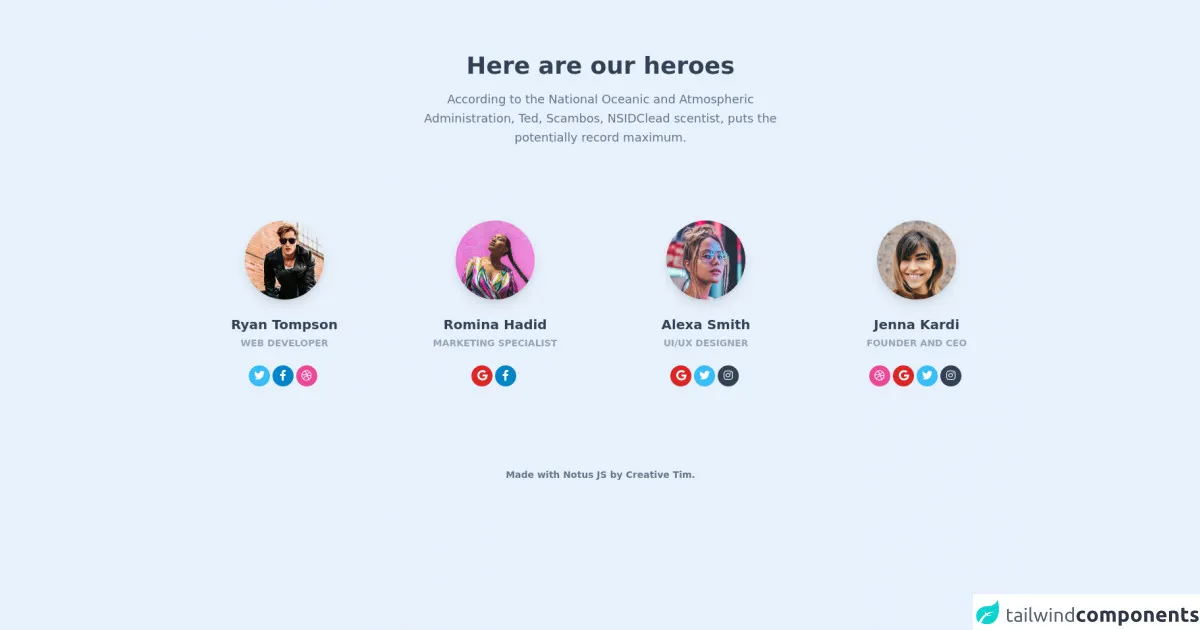
A Section Avatars UI component is a design element that displays a group of avatars in a section of a web page. It's commonly used in team or community pages to showcase the members of a group. Each avatar typically includes an image and a name or title.
Why use Tailwind CSS to create a Section Avatars ui component?
Tailwind CSS provides a set of pre-defined classes that make it easy to create custom UI components like Section Avatars. With Tailwind, you can quickly style and position each avatar without having to write custom CSS from scratch. This saves time and makes it easier to maintain the codebase.
The preview of Section Avatars ui component
To create a Section Avatars UI component with Tailwind CSS, we'll use a combination of flexbox and grid layout classes. The result will be a responsive design that adapts to different screen sizes.
Free download of the Section Avatars's source code
The source code of Section Avatars ui component
Here's the HTML and CSS code for the Section Avatars UI component:
<link rel="stylesheet" href="https://demos.creative-tim.com/notus-js/assets/styles/tailwind.css">
<link rel="stylesheet" href="https://demos.creative-tim.com/notus-js/assets/vendor/@fortawesome/fontawesome-free/css/all.min.css">

<section class="pt-20 pb-20">
<div class="flex flex-wrap justify-center text-center mb-24">
            <div class="w-full lg:w-6/12 px-4">
              <h2 class="text-4xl font-semibold  text-blueGray-700">Here are our heroes</h2>
              <p class="text-lg leading-relaxed m-4 text-blueGray-500">
                According to the National Oceanic and Atmospheric
                Administration, Ted, Scambos, NSIDClead scentist, puts the
                potentially record maximum.
              </p>
            </div>
          </div>
  <div class="flex flex-wrap">
    <div class="w-full md:w-6/12 lg:w-3/12 lg:mb-0 mb-12 px-8">
      <div class="px-6">
        <img alt="..." src="https://demos.creative-tim.com/notus-js/assets/img/team-1-800x800.jpg" class="shadow-lg rounded-full mx-auto max-w-120-px">
        <div class="pt-6 text-center">
          <h5 class="text-xl font-bold text-blueGray-700">Ryan Tompson</h5>
          <p class="mt-1 text-sm text-blueGray-400 uppercase font-semibold"> Web Developer</p>
          <div class="mt-6">
            <button class="bg-lightBlue-400 text-white w-8 h-8 rounded-full outline-none focus:outline-none mr-1 mb-1" type="button">
              <i class="fab fa-twitter"></i></button><button class="bg-lightBlue-600 text-white w-8 h-8 rounded-full outline-none focus:outline-none mr-1 mb-1" type="button">
              <i class="fab fa-facebook-f"></i></button><button class="bg-pink-500 text-white w-8 h-8 rounded-full outline-none focus:outline-none mr-1 mb-1" type="button">
              <i class="fab fa-dribbble"></i>
            </button>
          </div>
        </div>
      </div>
    </div>

    <div class="w-full md:w-6/12 lg:w-3/12 lg:mb-0 mb-12 px-8">
      <div class="px-6">
        <img alt="..." src="https://demos.creative-tim.com/notus-js/assets/img/team-2-800x800.jpg" class="shadow-lg rounded-full mx-auto max-w-120-px">
        <div class="pt-6 text-center">
          <h5 class="text-xl font-bold text-blueGray-700">Romina Hadid</h5>
          <p class="mt-1 text-sm text-blueGray-400 uppercase font-semibold">
            Marketing Specialist
          </p>
          <div class="mt-6">
            <button class="bg-red-600 text-white w-8 h-8 rounded-full outline-none focus:outline-none mr-1 mb-1" type="button">
              <i class="fab fa-google"></i></button><button class="bg-lightBlue-600 text-white w-8 h-8 rounded-full outline-none focus:outline-none mr-1 mb-1" type="button">
              <i class="fab fa-facebook-f"></i>
            </button>
          </div>
        </div>
      </div>
    </div>

    <div class="w-full md:w-6/12 lg:w-3/12 lg:mb-0 mb-12 px-8">
      <div class="px-6">
        <img alt="..." src="https://demos.creative-tim.com/notus-js/assets/img/team-3-800x800.jpg" class="shadow-lg rounded-full mx-auto max-w-120-px">
        <div class="pt-6 text-center">
          <h5 class="text-xl font-bold text-blueGray-700">Alexa Smith</h5>
          <p class="mt-1 text-sm text-blueGray-400 uppercase font-semibold">UI/UX Designer </p>
          <div class="mt-6">
            <button class="bg-red-600 text-white w-8 h-8 rounded-full outline-none focus:outline-none mr-1 mb-1" type="button">
              <i class="fab fa-google"></i></button><button class="bg-lightBlue-400 text-white w-8 h-8 rounded-full outline-none focus:outline-none mr-1 mb-1" type="button">
              <i class="fab fa-twitter"></i></button><button class="bg-blueGray-700 text-white w-8 h-8 rounded-full outline-none focus:outline-none mr-1 mb-1" type="button">
              <i class="fab fa-instagram"></i>
            </button>
          </div>
        </div>
      </div>
    </div>


    <div class="w-full md:w-6/12 lg:w-3/12 lg:mb-0 mb-12 px-8">
      <div class="px-6">
        <img alt="..." src="https://demos.creative-tim.com/notus-js/assets/img/team-4-470x470.png" class="shadow-lg rounded-full mx-auto max-w-120-px">
        <div class="pt-6 text-center">
          <h5 class="text-xl font-bold text-blueGray-700">Jenna Kardi</h5>
          <p class="mt-1 text-sm text-blueGray-400 uppercase font-semibold">Founder and CEO</p>
          <div class="mt-6">
            <button class="bg-pink-500 text-white w-8 h-8 rounded-full outline-none focus:outline-none mr-1 mb-1" type="button">
              <i class="fab fa-dribbble"></i></button><button class="bg-red-600 text-white w-8 h-8 rounded-full outline-none focus:outline-none mr-1 mb-1" type="button">
              <i class="fab fa-google"></i></button><button class="bg-lightBlue-400 text-white w-8 h-8 rounded-full outline-none focus:outline-none mr-1 mb-1" type="button">
              <i class="fab fa-twitter"></i></button><button class="bg-blueGray-700 text-white w-8 h-8 rounded-full outline-none focus:outline-none mr-1 mb-1" type="button">
              <i class="fab fa-instagram"></i>
            </button>
          </div>
        </div>
      </div>
    </div>
  </div>
</section>
  <footer class="relative pt-8 pb-6 mt-1">
  <div class="container mx-auto px-4">
    <div class="flex flex-wrap items-center md:justify-between justify-center">
      <div class="w-full md:w-6/12 px-4 mx-auto text-center">
        <div class="text-sm text-blueGray-500 font-semibold py-1">
          Made with <a href="https://www.creative-tim.com/product/notus-js" class="text-blueGray-500 hover:text-gray-800" target="_blank">Notus JS</a> by <a href="https://www.creative-tim.com" class="text-blueGray-500 hover:text-blueGray-800" target="_blank"> Creative Tim</a>.
        </div>
      </div>
    </div>
  </div>
</footer>
How to create a Section Avatars with Tailwind CSS?
Now, let's dive into the steps to create a Section Avatars UI component with Tailwind CSS.
Step 1: Set up your HTML structure
First, we'll create the HTML structure for the Section Avatars component. We'll use a div element with a class of grid to create a grid layout for the avatars. Each avatar will be wrapped in a div element with a class of flex flex-col items-center.
<div class="grid grid-cols-3 gap-4">
  <div class="flex flex-col items-center">
    <!-- Avatar content here -->
  </div>
  <div class="flex flex-col items-center">
    <!-- Avatar content here -->
  </div>
  <div class="flex flex-col items-center">
    <!-- Avatar content here -->
  </div>
  <!-- Add more avatars as needed -->
</div>
Step 2: Add the avatar images
Next, we'll add the avatar images to each div element. We'll use the img element with a class of w-20 h-20 rounded-full object-cover to style the images. The object-cover class ensures that the image is scaled and cropped to fit the container.
<div class="grid grid-cols-3 gap-4">
  <div class="flex flex-col items-center">
    <img src="avatar1.jpg" alt="Avatar 1" class="w-20 h-20 rounded-full object-cover">
    <!-- Add name or title here -->
  </div>
  <div class="flex flex-col items-center">
    <img src="avatar2.jpg" alt="Avatar 2" class="w-20 h-20 rounded-full object-cover">
    <!-- Add name or title here -->
  </div>
  <div class="flex flex-col items-center">
    <img src="avatar3.jpg" alt="Avatar 3" class="w-20 h-20 rounded-full object-cover">
    <!-- Add name or title here -->
  </div>
  <!-- Add more avatars as needed -->
</div>
Step 3: Add the avatar names or titles
We'll add the names or titles of each avatar below the image. We'll use a p element with a class of mt-2 text-center font-medium text-gray-800 to style the text.
<div class="grid grid-cols-3 gap-4">
  <div class="flex flex-col items-center">
    <img src="avatar1.jpg" alt="Avatar 1" class="w-20 h-20 rounded-full object-cover">
    <p class="mt-2 text-center font-medium text-gray-800">John Doe</p>
  </div>
  <div class="flex flex-col items-center">
    <img src="avatar2.jpg" alt="Avatar 2" class="w-20 h-20 rounded-full object-cover">
    <p class="mt-2 text-center font-medium text-gray-800">Jane Smith</p>
  </div>
  <div class="flex flex-col items-center">
    <img src="avatar3.jpg" alt="Avatar 3" class="w-20 h-20 rounded-full object-cover">
    <p class="mt-2 text-center font-medium text-gray-800">Bob Johnson</p>
  </div>
  <!-- Add more avatars as needed -->
</div>
Step 4: Style the grid layout
We'll use Tailwind CSS grid layout classes to style the grid layout of the avatars. We'll set the number of columns to 3 using the grid-cols-3 class and add a gap between each avatar using the gap-4 class.
<div class="grid grid-cols-3 gap-4">
  <!-- Avatar content here -->
</div>
Step 5: Style the avatar images and names
Finally, we'll use Tailwind CSS utility classes to style the avatar images and names. We'll set the width and height of the images to w-20 and h-20, respectively, using the w-{size} and h-{size} classes. We'll also add a rounded border to the images using the rounded-full class.
For the names, we'll set the margin top to mt-2, the text alignment to text-center, the font weight to font-medium, and the text color to text-gray-800.
<div class="grid grid-cols-3 gap-4">
  <div class="flex flex-col items-center">
    <img src="avatar1.jpg" alt="Avatar 1" class="w-20 h-20 rounded-full object-cover">
    <p class="mt-2 text-center font-medium text-gray-800">John Doe</p>
  </div>
  <div class="flex flex-col items-center">
    <img src="avatar2.jpg" alt="Avatar 2" class="w-20 h-20 rounded-full object-cover">
    <p class="mt-2 text-center font-medium text-gray-800">Jane Smith</p>
  </div>
  <div class="flex flex-col items-center">
    <img src="avatar3.jpg" alt="Avatar 3" class="w-20 h-20 rounded-full object-cover">
    <p class="mt-2 text-center font-medium text-gray-800">Bob Johnson</p>
  </div>
  <!-- Add more avatars as needed -->
</div>
Conclusion
In this article, we've learned how to create a Section Avatars UI component with Tailwind CSS in 5 easy steps. With Tailwind CSS, we can quickly style and position each avatar without having to write custom CSS from scratch. This saves time and makes it easier to maintain the codebase. Try it out for yourself and see how easy it is to create custom UI components with Tailwind CSS!