- Published on
Surprisingly Effective Ways To Build A blog page With Tailwind CSS
- What is Tailwind CSS?
- The Description of Blog Page UI Component
- Why Use Tailwind CSS to Create a Blog Page UI Component?
- The Preview of Blog Page UI Component
- The Source Code of Blog Page UI Component
- How to Create a Blog Page with Tailwind CSS?
- Conclusion
As a FrontEnd technology blogger, you must have heard about Tailwind CSS, a utility-first CSS framework that helps you to create responsive and customizable user interfaces. In this article, we are going to explore how to create a blog page UI component with Tailwind CSS.
What is Tailwind CSS?
Tailwind CSS is a utility-first CSS framework that provides a set of pre-defined CSS classes that you can use to style your HTML elements. It is different from traditional CSS frameworks like Bootstrap or Foundation, which come with pre-designed UI components. With Tailwind CSS, you have the freedom to create your own custom UI components by combining the pre-defined CSS classes.
The Description of Blog Page UI Component
A blog page is a common UI component that you can find on almost every website that publishes articles. It usually consists of a header, a navigation menu, a list of articles, and a footer.
The header contains the website logo, a search bar, and some navigation links. The navigation menu contains links to different categories of articles. The list of articles displays the article title, author, date, and a brief description. The footer contains some links to social media profiles and copyright information.
Why Use Tailwind CSS to Create a Blog Page UI Component?
Tailwind CSS provides a set of pre-defined CSS classes that you can use to create a blog page UI component quickly. It also allows you to customize the design of the UI component by modifying the pre-defined CSS classes or creating your own custom classes.
Another advantage of using Tailwind CSS is that it is highly responsive. You can create a blog page that looks great on all devices, including desktops, tablets, and smartphones, without writing any media queries.
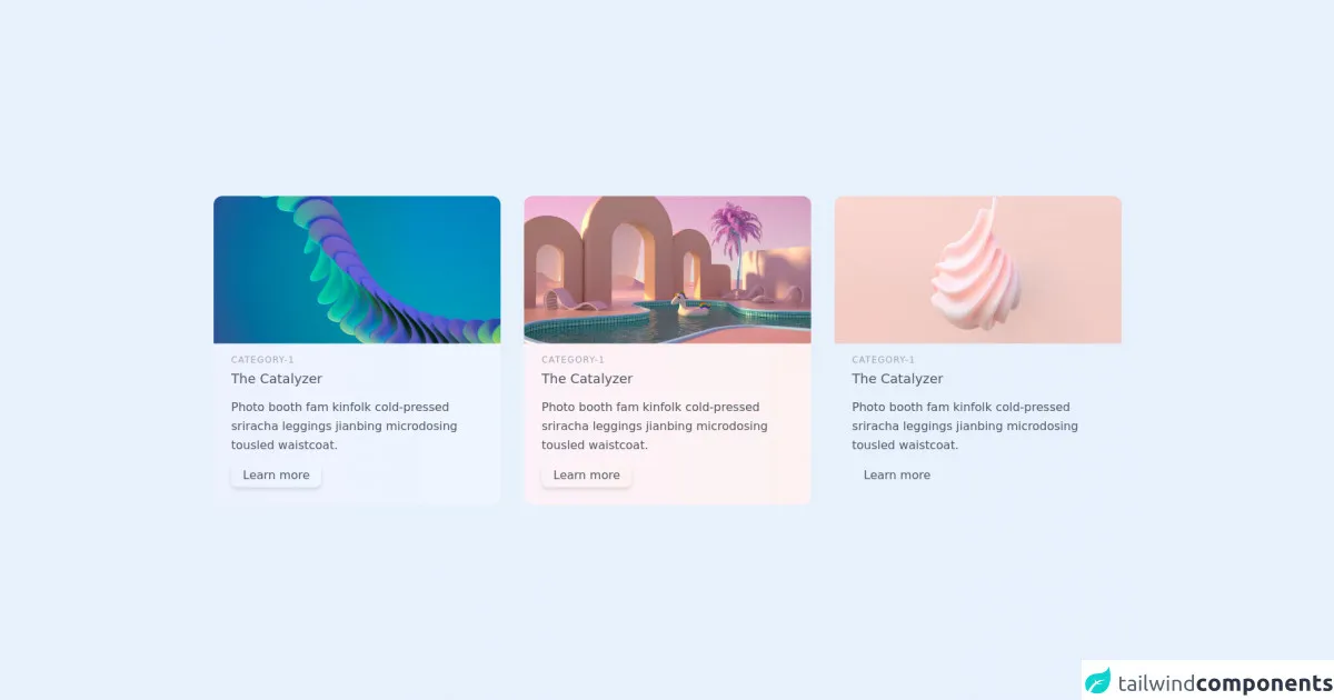
The Preview of Blog Page UI Component
To give you an idea of what a blog page UI component created with Tailwind CSS looks like, here is a preview:
Free download of the blog page's source code
The Source Code of Blog Page UI Component
If you want to create a blog page UI component with Tailwind CSS, you can start by copying the following HTML code:
<section class="text-gray-600 body-font">
        <div class="container px-5 py-24 mx-auto">
          <div class="flex flex-wrap -m-4">
            <div class="p-4 md:w-1/3">
              <div class="h-full rounded-xl shadow-cla-blue bg-gradient-to-r from-indigo-50 to-blue-50 overflow-hidden">
                <img class="lg:h-48 md:h-36 w-full object-cover object-center scale-110 transition-all duration-400 hover:scale-100" src="https://images.unsplash.com/photo-1618172193622-ae2d025f4032?ixlib=rb-1.2.1&ixid=MnwxMjA3fDB8MHxwaG90by1wYWdlfHx8fGVufDB8fHx8&auto=format&fit=crop&w=1064&q=80" alt="blog">
                <div class="p-6">
                  <h2 class="tracking-widest text-xs title-font font-medium text-gray-400 mb-1">CATEGORY-1</h2>
                  <h1 class="title-font text-lg font-medium text-gray-600 mb-3">The Catalyzer</h1>
                  <p class="leading-relaxed mb-3">Photo booth fam kinfolk cold-pressed sriracha leggings jianbing microdosing tousled waistcoat.</p>
                  <div class="flex items-center flex-wrap ">
                    <button class="bg-gradient-to-r from-cyan-400 to-blue-400 hover:scale-105 drop-shadow-md  shadow-cla-blue px-4 py-1 rounded-lg">Learn more</button>

                  </div>
                </div>
              </div>
            </div>
            <div class="p-4 md:w-1/3">
                <div class="h-full rounded-xl shadow-cla-violate bg-gradient-to-r from-pink-50 to-red-50 overflow-hidden">
                  <img class="lg:h-48 md:h-36 w-full object-cover object-center scale-110 transition-all duration-400 hover:scale-100" src="https://images.unsplash.com/photo-1624628639856-100bf817fd35?ixlib=rb-1.2.1&ixid=MnwxMjA3fDB8MHxzZWFyY2h8MXx8M2QlMjBpbWFnZXxlbnwwfHwwfHw%3D&auto=format&fit=crop&w=600&q=60" alt="blog">
                  <div class="p-6">
                    <h2 class="tracking-widest text-xs title-font font-medium text-gray-400 mb-1">CATEGORY-1</h2>
                    <h1 class="title-font text-lg font-medium text-gray-600 mb-3">The Catalyzer</h1>
                    <p class="leading-relaxed mb-3">Photo booth fam kinfolk cold-pressed sriracha leggings jianbing microdosing tousled waistcoat.</p>
                    <div class="flex items-center flex-wrap ">
                      <button class="bg-gradient-to-r from-orange-300 to-amber-400 hover:scale-105 drop-shadow-md shadow-cla-violate px-4 py-1 rounded-lg">Learn more</button>

                    </div>
                  </div>
                </div>
              </div>
              <div class="p-4 md:w-1/3">
                <div class="h-full rounded-xl shadow-cla-pink bg-gradient-to-r from-fuchsia-50 to-pink-50 overflow-hidden">
                  <img class="lg:h-48 md:h-36 w-full object-cover object-center scale-110 transition-all duration-400 hover:scale-100" src="https://images.unsplash.com/photo-1631700611307-37dbcb89ef7e?ixlib=rb-1.2.1&ixid=MnwxMjA3fDB8MHxwaG90by1yZWxhdGVkfDIwfHx8ZW58MHx8fHw%3D&auto=format&fit=crop&w=600&q=60" alt="blog">
                  <div class="p-6">
                    <h2 class="tracking-widest text-xs title-font font-medium text-gray-400 mb-1">CATEGORY-1</h2>
                    <h1 class="title-font text-lg font-medium text-gray-600 mb-3">The Catalyzer</h1>
                    <p class="leading-relaxed mb-3">Photo booth fam kinfolk cold-pressed sriracha leggings jianbing microdosing tousled waistcoat.</p>
                    <div class="flex items-center flex-wrap ">
                      <button class="bg-gradient-to-r from-fuchsia-300 to-pink-400 hover:scale-105  shadow-cla-blue px-4 py-1 rounded-lg">Learn more</button>

                    </div>
                  </div>
                </div>
              </div>
          </div>
        </div>
      </section>
How to Create a Blog Page with Tailwind CSS?
To create a blog page with Tailwind CSS, you need to follow these steps:
Set up your development environment: You can use any code editor you like, but we recommend using Visual Studio Code with the Tailwind CSS IntelliSense extension.
Create a new HTML file: Open your code editor and create a new HTML file. You can name it anything you like, but we recommend using "index.html".
Add the necessary HTML elements: Copy the HTML code from the previous section and paste it into your HTML file.
Add Tailwind CSS to your project: You can include Tailwind CSS in your project by downloading the CSS file from the official website or by installing it using npm.
Add the necessary CSS classes: To style your HTML elements, you need to add the necessary CSS classes. You can find a list of pre-defined CSS classes in the official documentation.
Customize the design: If you want to customize the design of your blog page, you can modify the pre-defined CSS classes or create your own custom classes.
Test your blog page: Once you have created your blog page, you should test it on different devices to make sure it looks great on all of them.
Conclusion
Creating a blog page UI component with Tailwind CSS is surprisingly easy and effective. With the pre-defined CSS classes and the ability to customize the design, you can create a blog page that looks great on all devices without writing any media queries. If you haven't tried Tailwind CSS yet, we highly recommend giving it a try.