- Published on
Beginners Guide: Build A Responsive Testimonials Cards #1 With Tailwind CSS
- What is Tailwind CSS?
- The description of Responsive Testimonials Cards #1 ui component
- Why use Tailwind CSS to create a Responsive Testimonials Cards #1 ui component?
- The preview of Responsive Testimonials Cards #1 ui component.
- The source code of Responsive Testimonials Cards #1 ui component.
- How to create a Responsive Testimonials Cards #1 with Tailwind CSS?
- Step 1: Set up your project
- Step 2: Create the testimonials card
- Step 3: Make the testimonials card responsive
- Conclusion
Are you a beginner in FrontEnd development and want to learn how to create a responsive testimonials card with Tailwind CSS? You're in the right place! In this article, we will guide you through the process of building a responsive testimonials card using Tailwind CSS.
What is Tailwind CSS?
Tailwind CSS is a utility-first CSS framework that provides a set of pre-defined classes to help you quickly build a responsive and customizable user interface. It allows you to design your website without writing custom CSS code, which can save you a lot of time and effort.
The description of Responsive Testimonials Cards #1 ui component
A testimonials card is a user interface component that displays customer reviews or feedback. It is a great way to showcase your products or services and build trust with your potential customers. In this tutorial, we will create a responsive testimonials card with a quote, image, and name of the customer.
Why use Tailwind CSS to create a Responsive Testimonials Cards #1 ui component?
Tailwind CSS provides a set of pre-defined classes that can help you quickly build a responsive and customizable user interface. It allows you to design your website without writing custom CSS code, which can save you a lot of time and effort. Additionally, Tailwind CSS is easy to learn and use, even for beginners.
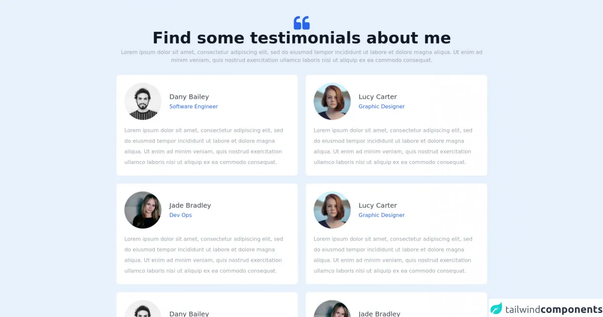
The preview of Responsive Testimonials Cards #1 ui component.
In this section, we will show you a preview of the responsive testimonials card that we will create in this tutorial.
Free download of the Responsive Testimonials Cards #1's source code
The source code of Responsive Testimonials Cards #1 ui component.
In this section, we will show you the source code of the responsive testimonials card that we will create in this tutorial.
<section class="max-w-6xl mx-auto px-4 sm:px-6 lg:px-4 py-12">
    <div class="w-full text-center pb-8">
        <svg class="mx-auto" width="48" height="42" viewBox="0 0 48 42" fill="none" xmlns="http://www.w3.org/2000/svg">
            <path d="M16.6153 19.154H10.1537C9.38437 19.154 8.73037 18.8849 8.19185 18.3463C7.65363 17.8078 7.38417 17.154 7.38417 16.3845V15.4619C7.38417 13.4233 8.10546 11.6831 9.54795 10.2406C10.9903 8.79859 12.7309 8.0773 14.7693 8.0773H16.6153C17.1152 8.0773 17.5477 7.89453 17.9133 7.52929C18.2786 7.16384 18.4613 6.73131 18.4613 6.23128V2.53864C18.4613 2.03872 18.2785 1.60578 17.9133 1.24034C17.5478 0.875398 17.1153 0.692322 16.6153 0.692322H14.7693C12.7691 0.692322 10.8608 1.08212 9.04327 1.86059C7.22595 2.63958 5.65404 3.69257 4.32694 5.01967C2.99994 6.34616 1.94726 7.91817 1.16837 9.7357C0.389491 11.553 0 13.4618 0 15.4618V35.769C0 37.3083 0.538216 38.6152 1.61515 39.6926C2.69219 40.7693 4.00019 41.3076 5.53856 41.3076H16.616C18.1542 41.3076 19.4618 40.7693 20.539 39.6926C21.6157 38.6152 22.1542 37.3083 22.1542 35.769V24.6926C22.1542 23.1536 21.6157 21.8466 20.5383 20.7692C19.4616 19.6925 18.1535 19.154 16.6153 19.154Z" fill="#2865E9"/>
            <path d="M46.3856 20.7692C45.309 19.6925 44.0013 19.154 42.4626 19.154H36.0011C35.2322 19.154 34.5776 18.8849 34.04 18.3463C33.5012 17.8078 33.2323 17.154 33.2323 16.3845V15.4619C33.2323 13.4233 33.9536 11.6831 35.3954 10.2406C36.8372 8.79859 38.5777 8.0773 40.6171 8.0773H42.4627C42.9627 8.0773 43.3955 7.89453 43.7608 7.52929C44.1258 7.16384 44.3092 6.73131 44.3092 6.23128V2.53864C44.3092 2.03872 44.1259 1.60578 43.7608 1.24034C43.3956 0.875398 42.9628 0.692322 42.4627 0.692322H40.6171C38.6158 0.692322 36.7079 1.08212 34.8899 1.86059C33.0729 2.63958 31.5015 3.69257 30.1744 5.01967C28.8473 6.34616 27.7941 7.91817 27.0155 9.7357C26.2368 11.553 25.8468 13.4618 25.8468 15.4618V35.769C25.8468 37.3083 26.3855 38.6152 27.4622 39.6926C28.5389 40.7693 29.8466 41.3076 31.3852 41.3076H42.462C44.0006 41.3076 45.3082 40.7693 46.3849 39.6926C47.4623 38.6152 47.9999 37.3083 47.9999 35.769V24.6926C48 23.1535 47.4623 21.8466 46.3856 20.7692Z" fill="#2865E9"/>
        </svg>

        <h1 class="font-bold text-3xl md:text-4xl lg:text-5xl font-heading text-gray-900 pb-2">
            Find some testimonials about me
        </h1>
        <p class="text-gray-400 font-normal text-base">Lorem ipsum dolor sit amet, consectetur adipiscing elit, sed do eiusmod tempor incididunt ut labore et dolore magna aliqua. Ut enim ad minim veniam, quis nostrud exercitation ullamco laboris nisi ut aliquip ex ea commodo consequat.</p>
    </div>
    <div class="w-full grid grid-cols-1 md:grid-cols-2 gap-6">
        <div class="bg-white rounded-lg p-6">
            <div class="flex items-center space-x-6 mb-4">
                <img class="h-28 w-28 object-cover object-center rounded-full"
                src="https://images.unsplash.com/flagged/photo-1570612861542-284f4c12e75f?ixid=MnwxMjA3fDB8MHxwaG90by1wYWdlfHx8fGVufDB8fHx8&ixlib=rb-1.2.1&auto=format&fit=crop&w=1170&q=80" alt="photo">
                <div>
                    <p class="text-xl text-gray-700 font-normal mb-1">Dany Bailey</p>
                    <p class="text-base text-blue-600 font-normal">Software Engineer</p>
                </div>
            </div>
            <div>
                <p class="text-gray-400 leading-loose font-normal text-base">Lorem ipsum dolor sit amet, consectetur adipiscing elit, sed do eiusmod tempor incididunt ut labore et dolore magna aliqua. Ut enim ad minim veniam, quis nostrud exercitation ullamco laboris nisi ut aliquip ex ea commodo consequat.</p>
            </div>
        </div>
        <div class="bg-white rounded-lg p-6">
            <div class="flex items-center space-x-6 mb-4">
                <img class="h-28 w-28 object-cover object-center rounded-full"
                src="https://images.unsplash.com/photo-1438761681033-6461ffad8d80?ixid=MnwxMjA3fDB8MHxwaG90by1wYWdlfHx8fGVufDB8fHx8&ixlib=rb-1.2.1&auto=format&fit=crop&w=1170&q=80" alt="photo">
                <div>
                    <p class="text-xl text-gray-700 font-normal mb-1">Lucy Carter</p>
                    <p class="text-base text-blue-600 font-normal">Graphic Designer</p>
                </div>
            </div>
            <div>
                <p class="text-gray-400 leading-loose font-normal text-base">Lorem ipsum dolor sit amet, consectetur adipiscing elit, sed do eiusmod tempor incididunt ut labore et dolore magna aliqua. Ut enim ad minim veniam, quis nostrud exercitation ullamco laboris nisi ut aliquip ex ea commodo consequat.</p>
            </div>
        </div>
        <div class="bg-white rounded-lg p-6">
            <div class="flex items-center space-x-6 mb-4">
                <img class="h-28 w-28 object-cover object-center rounded-full"
                src="https://images.unsplash.com/photo-1499952127939-9bbf5af6c51c?ixid=MnwxMjA3fDB8MHxwaG90by1wYWdlfHx8fGVufDB8fHx8&ixlib=rb-1.2.1&auto=format&fit=crop&w=1176&q=80" alt="photo">
                <div>
                    <p class="text-xl text-gray-700 font-normal mb-1">Jade Bradley</p>
                    <p class="text-base text-blue-600 font-normal">Dev Ops</p>
                </div>
            </div>
            <div>
                <p class="text-gray-400 leading-loose font-normal text-base">Lorem ipsum dolor sit amet, consectetur adipiscing elit, sed do eiusmod tempor incididunt ut labore et dolore magna aliqua. Ut enim ad minim veniam, quis nostrud exercitation ullamco laboris nisi ut aliquip ex ea commodo consequat.</p>
            </div>
        </div>
        <div class="bg-white rounded-lg p-6">
            <div class="flex items-center space-x-6 mb-4">
                <img class="h-28 w-28 object-cover object-center rounded-full"
                src="https://images.unsplash.com/photo-1438761681033-6461ffad8d80?ixid=MnwxMjA3fDB8MHxwaG90by1wYWdlfHx8fGVufDB8fHx8&ixlib=rb-1.2.1&auto=format&fit=crop&w=1170&q=80" alt="photo">
                <div>
                    <p class="text-xl text-gray-700 font-normal mb-1">Lucy Carter</p>
                    <p class="text-base text-blue-600 font-normal">Graphic Designer</p>
                </div>
            </div>
            <div>
                <p class="text-gray-400 leading-loose font-normal text-base">Lorem ipsum dolor sit amet, consectetur adipiscing elit, sed do eiusmod tempor incididunt ut labore et dolore magna aliqua. Ut enim ad minim veniam, quis nostrud exercitation ullamco laboris nisi ut aliquip ex ea commodo consequat.</p>
            </div>
        </div>
        <div class="bg-white rounded-lg p-6">
            <div class="flex items-center space-x-6 mb-4">
                <img class="h-28 w-28 object-cover object-center rounded-full"
                src="https://images.unsplash.com/flagged/photo-1570612861542-284f4c12e75f?ixid=MnwxMjA3fDB8MHxwaG90by1wYWdlfHx8fGVufDB8fHx8&ixlib=rb-1.2.1&auto=format&fit=crop&w=1170&q=80" alt="photo">
                <div>
                    <p class="text-xl text-gray-700 font-normal mb-1">Dany Bailey</p>
                    <p class="text-base text-blue-600 font-normal">Software Engineer</p>
                </div>
            </div>
            <div>
                <p class="text-gray-400 leading-loose font-normal text-base">Lorem ipsum dolor sit amet, consectetur adipiscing elit, sed do eiusmod tempor incididunt ut labore et dolore magna aliqua. Ut enim ad minim veniam, quis nostrud exercitation ullamco laboris nisi ut aliquip ex ea commodo consequat.</p>
            </div>
        </div>
        <div class="bg-white rounded-lg p-6">
            <div class="flex items-center space-x-6 mb-4">
                <img class="h-28 w-28 object-cover object-center rounded-full"
                src="https://images.unsplash.com/photo-1499952127939-9bbf5af6c51c?ixid=MnwxMjA3fDB8MHxwaG90by1wYWdlfHx8fGVufDB8fHx8&ixlib=rb-1.2.1&auto=format&fit=crop&w=1176&q=80" alt="photo">
                <div>
                    <p class="text-xl text-gray-700 font-normal mb-1">Jade Bradley</p>
                    <p class="text-base text-blue-600 font-normal">Dev Ops</p>
                </div>
            </div>
            <div>
                <p class="text-gray-400 leading-loose font-normal text-base">Lorem ipsum dolor sit amet, consectetur adipiscing elit, sed do eiusmod tempor incididunt ut labore et dolore magna aliqua. Ut enim ad minim veniam, quis nostrud exercitation ullamco laboris nisi ut aliquip ex ea commodo consequat.</p>
            </div>
        </div>
    </div>
</section>
How to create a Responsive Testimonials Cards #1 with Tailwind CSS?
Now, let's dive into the step-by-step process of creating a responsive testimonials card with Tailwind CSS.
Step 1: Set up your project
First, create a new HTML file and add the following code to it:
<!DOCTYPE html>
<html lang="en">
<head>
  <meta charset="UTF-8">
  <meta name="viewport" content="width=device-width, initial-scale=1.0">
  <title>Responsive Testimonials Card #1</title>
  <link rel="stylesheet" href="https://cdn.jsdelivr.net/npm/[email protected]/dist/tailwind.min.css">
</head>
<body>

</body>
</html>
This code sets up the basic structure of our HTML file and includes the Tailwind CSS framework.
Step 2: Create the testimonials card
Next, let's create the testimonials card. Add the following code to your HTML file:
<div class="max-w-sm mx-auto bg-white rounded-xl shadow-md overflow-hidden">
  <div class="md:flex">
    <div class="md:flex-shrink-0">
      <img class="h-48 w-full object-cover md:w-48" src="https://via.placeholder.com/150" alt="Customer image">
    </div>
    <div class="p-8">
      <div class="uppercase tracking-wide text-sm text-indigo-500 font-semibold">Customer Name</div>
      <p class="mt-2 text-gray-500">"Lorem ipsum dolor sit amet, consectetur adipiscing elit, sed do eiusmod tempor incididunt ut labore et dolore magna aliqua."</p>
    </div>
  </div>
</div>
This code creates a testimonials card with a customer image, name, and quote. The max-w-sm class sets the maximum width of the card to 640 pixels on larger screens and 100% on smaller screens. The mx-auto class centers the card horizontally. The bg-white class sets the background color to white. The rounded-xl class rounds the corners of the card. The shadow-md class adds a shadow effect to the card. The overflow-hidden class hides any content that overflows the card.
The md:flex class sets the flexbox layout for larger screens. The md:flex-shrink-0 class prevents the customer image from shrinking on smaller screens. The h-48 class sets the height of the customer image to 192 pixels on larger screens and 100% on smaller screens. The w-full class sets the width of the customer image to 100% of its container. The object-cover class scales the customer image to cover the entire container.
The p-8 class sets the padding of the card to 32 pixels. The uppercase class sets the text to uppercase. The tracking-wide class adds some letter spacing. The text-sm class sets the font size to 14 pixels. The text-indigo-500 class sets the text color to indigo. The font-semibold class sets the font weight to semibold. The mt-2 class adds some margin to the top of the quote. The text-gray-500 class sets the text color to gray.
Step 3: Make the testimonials card responsive
Finally, let's make the testimonials card responsive. Add the following classes to your HTML code:
<div class="max-w-sm mx-auto bg-white rounded-xl shadow-md overflow-hidden sm:max-w-xl lg:max-w-4xl">
  <div class="md:flex">
    <div class="md:flex-shrink-0">
      <img class="h-48 w-full object-cover md:w-48" src="https://via.placeholder.com/150" alt="Customer image">
    </div>
    <div class="p-8">
      <div class="uppercase tracking-wide text-sm text-indigo-500 font-semibold">Customer Name</div>
      <p class="mt-2 text-gray-500">"Lorem ipsum dolor sit amet, consectetur adipiscing elit, sed do eiusmod tempor incididunt ut labore et dolore magna aliqua."</p>
    </div>
  </div>
</div>
The sm:max-w-xl class sets the maximum width of the card to 640 pixels on larger screens and 100% on smaller screens. The lg:max-w-4xl class sets the maximum width of the card to 1280 pixels on larger screens.
Conclusion
In this tutorial, we have shown you how to create a responsive testimonials card using Tailwind CSS. We hope that this tutorial has helped you understand the basics of Tailwind CSS and how to use it to create user interface components. If you have any questions or feedback, please leave a comment below. Happy coding!