- Published on
Best Ways To Make A Responsive Team Cards #4 - Light Mode With Tailwind CSS
- What is Tailwind CSS?
- The description of Responsive Team Cards #4 - Light Mode ui component
- Why use Tailwind CSS to create a Responsive Team Cards #4 - Light Mode ui component?
- The preview of Responsive Team Cards #4 - Light Mode ui component
- The source code of Responsive Team Cards #4 - Light Mode ui component
- How to create a Responsive Team Cards #4 - Light Mode with Tailwind CSS?
- Step 1: Set up your HTML structure
- Step 2: Style your HTML elements using Tailwind CSS classes
- Step 3: Customize your responsive team cards UI component using Tailwind CSS
- Step 4: Add responsive design to your responsive team cards UI component
- Conclusion
If you're looking to create a responsive team cards UI component, Tailwind CSS is an excellent choice. In this article, we'll explore what Tailwind CSS is, why it's a great option for creating a responsive team cards UI component, and how to create a responsive team cards UI component using Tailwind CSS.
What is Tailwind CSS?
Tailwind CSS is a utility-first CSS framework that provides a set of pre-defined CSS classes that you can use to quickly and easily style your HTML elements. With Tailwind CSS, you don't need to write custom CSS styles for every element on your page. Instead, you can use pre-defined classes to apply styles to your elements.
The description of Responsive Team Cards #4 - Light Mode ui component
The responsive team cards UI component is a common design pattern used on many websites. It allows you to display a team member's photo, name, title, and social media links in a visually appealing way. The responsive team cards UI component is designed to be responsive, meaning it looks great on all devices, from desktops to mobile phones.
In this article, we'll be focusing on creating a light mode version of the responsive team cards UI component using Tailwind CSS.
Why use Tailwind CSS to create a Responsive Team Cards #4 - Light Mode ui component?
Tailwind CSS is an excellent choice for creating a responsive team cards UI component for several reasons:
- Tailwind CSS provides a set of pre-defined CSS classes that you can use to quickly and easily style your HTML elements. This makes it easy to create a responsive team cards UI component without having to write custom CSS styles for every element.
- Tailwind CSS is designed to be highly customizable. You can easily customize the colors, fonts, and other design elements of your responsive team cards UI component using Tailwind CSS.
- Tailwind CSS is lightweight and fast. It's designed to be highly optimized for performance, which means your responsive team cards UI component will load quickly and perform well.
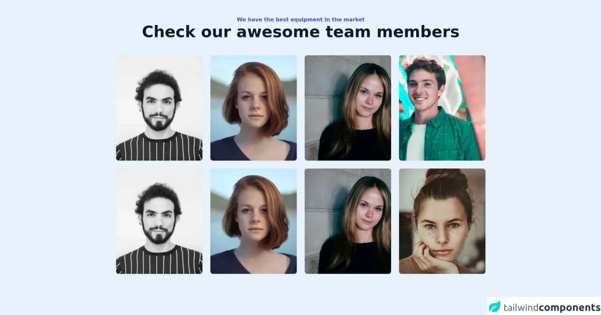
The preview of Responsive Team Cards #4 - Light Mode ui component
Free download of the Responsive Team Cards #4 - Light Mode's source code
The source code of Responsive Team Cards #4 - Light Mode ui component
<section class="max-w-6xl mx-auto px-4 sm:px-6 lg:px-4 py-12">
    <div class="text-center pb-12">
        <h2 class="text-base font-bold text-indigo-600">
            We have the best equipment in the market
        </h2>
        <h1 class="font-bold text-3xl md:text-4xl lg:text-5xl font-heading text-gray-900">
            Check our awesome team members
        </h1>
    </div>
    <div class="grid grid-cols-1 sm:grid-cols-2 lg:grid-cols-3 xl:grid-cols-4 gap-6">
        <div class="w-full bg-white rounded-lg sahdow-lg overflow-hidden flex flex-col md:flex-row">
            <div class="w-full h-80">
                <img class="object-center object-cover w-full h-full" src="https://images.unsplash.com/flagged/photo-1570612861542-284f4c12e75f?ixid=MnwxMjA3fDB8MHxwaG90by1wYWdlfHx8fGVufDB8fHx8&ixlib=rb-1.2.1&auto=format&fit=crop&w=1170&q=80" alt="photo">
            </div>
        </div>
        <div class="w-full bg-white rounded-lg sahdow-lg overflow-hidden flex flex-col md:flex-row">
            <div class="w-full h-80">
                <img class="object-center object-cover w-full h-full" src="https://images.unsplash.com/photo-1438761681033-6461ffad8d80?ixid=MnwxMjA3fDB8MHxwaG90by1wYWdlfHx8fGVufDB8fHx8&ixlib=rb-1.2.1&auto=format&fit=crop&w=1170&q=80" alt="photo">
            </div>
        </div>
        <div class="w-full bg-white rounded-lg sahdow-lg overflow-hidden flex flex-col md:flex-row">
            <div class="w-full h-80">
                <img class="object-center object-cover w-full h-full" src="https://images.unsplash.com/photo-1499952127939-9bbf5af6c51c?ixid=MnwxMjA3fDB8MHxwaG90by1wYWdlfHx8fGVufDB8fHx8&ixlib=rb-1.2.1&auto=format&fit=crop&w=1176&q=80" alt="photo">
            </div>
        </div>
        <div class="w-full bg-white rounded-lg sahdow-lg overflow-hidden flex flex-col md:flex-row">
            <div class="w-full h-80">
                <img class="object-center object-cover w-full h-full" src="https://images.unsplash.com/photo-1500048993953-d23a436266cf?ixid=MnwxMjA3fDB8MHxwaG90by1wYWdlfHx8fGVufDB8fHx8&ixlib=rb-1.2.1&auto=format&fit=crop&w=1169&q=80" alt="photo">
            </div>
        </div>
        <div class="w-full bg-white rounded-lg sahdow-lg overflow-hidden flex flex-col md:flex-row">
            <div class="w-full h-80">
                <img class="object-center object-cover w-full h-full" src="https://images.unsplash.com/flagged/photo-1570612861542-284f4c12e75f?ixid=MnwxMjA3fDB8MHxwaG90by1wYWdlfHx8fGVufDB8fHx8&ixlib=rb-1.2.1&auto=format&fit=crop&w=1170&q=80" alt="photo">
            </div>
        </div>
        <div class="w-full bg-white rounded-lg sahdow-lg overflow-hidden flex flex-col md:flex-row">
            <div class="w-full h-80">
                <img class="object-center object-cover w-full h-full" src="https://images.unsplash.com/photo-1438761681033-6461ffad8d80?ixid=MnwxMjA3fDB8MHxwaG90by1wYWdlfHx8fGVufDB8fHx8&ixlib=rb-1.2.1&auto=format&fit=crop&w=1170&q=80" alt="photo">
            </div>
        </div>
        <div class="w-full bg-white rounded-lg sahdow-lg overflow-hidden flex flex-col md:flex-row">
            <div class="w-full h-80">
                <img class="object-center object-cover w-full h-full" src="https://images.unsplash.com/photo-1499952127939-9bbf5af6c51c?ixid=MnwxMjA3fDB8MHxwaG90by1wYWdlfHx8fGVufDB8fHx8&ixlib=rb-1.2.1&auto=format&fit=crop&w=1176&q=80" alt="photo">
            </div>
        </div>
        <div class="w-full bg-white rounded-lg sahdow-lg overflow-hidden flex flex-col md:flex-row">
            <div class="w-full h-80">
                <img class="object-center object-cover w-full h-full" src="https://images.unsplash.com/photo-1554151228-14d9def656e4?ixid=MnwxMjA3fDB8MHxwaG90by1wYWdlfHx8fGVufDB8fHx8&ixlib=rb-1.2.1&auto=format&fit=crop&w=686&q=80" alt="photo">
            </div>
        </div>
    </div>
</section>
How to create a Responsive Team Cards #4 - Light Mode with Tailwind CSS?
Now that we've covered the basics of Tailwind CSS and why it's a great choice for creating a responsive team cards UI component, let's dive into how to create a responsive team cards UI component using Tailwind CSS.
Step 1: Set up your HTML structure
The first step in creating a responsive team cards UI component is to set up your HTML structure. Here's an example HTML structure for a responsive team cards UI component:
<div class="team-card">
  <img src="team-member-photo.jpg" alt="Team member photo" class="team-card__photo">
  <h3 class="team-card__name">John Doe</h3>
  <p class="team-card__title">CEO</p>
  <ul class="team-card__social">
    <li><a href="#" class="team-card__social-link"><i class="fab fa-facebook-f"></i></a></li>
    <li><a href="#" class="team-card__social-link"><i class="fab fa-twitter"></i></a></li>
    <li><a href="#" class="team-card__social-link"><i class="fab fa-linkedin-in"></i></a></li>
  </ul>
</div>
Step 2: Style your HTML elements using Tailwind CSS classes
Once you've set up your HTML structure, you can start styling your HTML elements using Tailwind CSS classes. Here's an example of how to style the HTML elements in the example HTML structure using Tailwind CSS classes:
<div class="team-card bg-white rounded-lg overflow-hidden shadow-lg">
  <img src="team-member-photo.jpg" alt="Team member photo" class="team-card__photo w-full h-48 object-cover">
  <div class="p-4">
    <h3 class="team-card__name text-gray-900 font-semibold text-lg">John Doe</h3>
    <p class="team-card__title text-gray-600 font-medium">CEO</p>
    <ul class="team-card__social flex justify-center mt-4">
      <li><a href="#" class="team-card__social-link text-gray-500 hover:text-gray-600"><i class="fab fa-facebook-f"></i></a></li>
      <li><a href="#" class="team-card__social-link text-gray-500 hover:text-gray-600"><i class="fab fa-twitter"></i></a></li>
      <li><a href="#" class="team-card__social-link text-gray-500 hover:text-gray-600"><i class="fab fa-linkedin-in"></i></a></li>
    </ul>
  </div>
</div>
Step 3: Customize your responsive team cards UI component using Tailwind CSS
Once you've styled your HTML elements using Tailwind CSS classes, you can customize your responsive team cards UI component using Tailwind CSS. Here are some examples of how to customize your responsive team cards UI component using Tailwind CSS:
<div class="team-card bg-white rounded-lg overflow-hidden shadow-lg">
  <img src="team-member-photo.jpg" alt="Team member photo" class="team-card__photo w-full h-48 object-cover">
  <div class="p-4">
    <h3 class="team-card__name text-gray-900 font-semibold text-lg">John Doe</h3>
    <p class="team-card__title text-gray-600 font-medium">CEO</p>
    <ul class="team-card__social flex justify-center mt-4">
      <li><a href="#" class="team-card__social-link text-gray-500 hover:text-gray-600"><i class="fab fa-facebook-f"></i></a></li>
      <li><a href="#" class="team-card__social-link text-gray-500 hover:text-gray-600"><i class="fab fa-twitter"></i></a></li>
      <li><a href="#" class="team-card__social-link text-gray-500 hover:text-gray-600"><i class="fab fa-linkedin-in"></i></a></li>
    </ul>
  </div>
</div>
Step 4: Add responsive design to your responsive team cards UI component
Finally, you can add responsive design to your responsive team cards UI component using Tailwind CSS. Here's an example of how to make your responsive team cards UI component responsive using Tailwind CSS:
<div class="team-card bg-white rounded-lg overflow-hidden shadow-lg sm:flex">
  <img src="team-member-photo.jpg" alt="Team member photo" class="team-card__photo w-full h-48 sm:w-48 sm:h-auto sm:rounded-none sm:rounded-l-lg object-cover">
  <div class="p-4">
    <h3 class="team-card__name text-gray-900 font-semibold text-lg">John Doe</h3>
    <p class="team-card__title text-gray-600 font-medium">CEO</p>
    <ul class="team-card__social flex justify-center mt-4">
      <li><a href="#" class="team-card__social-link text-gray-500 hover:text-gray-600"><i class="fab fa-facebook-f"></i></a></li>
      <li><a href="#" class="team-card__social-link text-gray-500 hover:text-gray-600"><i class="fab fa-twitter"></i></a></li>
      <li><a href="#" class="team-card__social-link text-gray-500 hover:text-gray-600"><i class="fab fa-linkedin-in"></i></a></li>
    </ul>
  </div>
</div>
Conclusion
In this article, we've explored what Tailwind CSS is, why it's a great option for creating a responsive team cards UI component, and how to create a responsive team cards UI component using Tailwind CSS. With Tailwind CSS, you can quickly and easily create a visually appealing and responsive team cards UI component that looks great on all devices. So if you're looking to create a responsive team cards UI component, be sure to give Tailwind CSS a try!