- Published on
The Ninja Guide To How To Make A Responsive Two Columns Sidebar Layout With Tailwind CSS Better
- What is Tailwind CSS?
- The description of Responsive Two Columns Sidebar Layout ui component
- Why use Tailwind CSS to create a Responsive Two Columns Sidebar Layout ui component?
- The preview of Responsive Two Columns Sidebar Layout ui component.
- The source code of Responsive Two Columns Sidebar Layout ui component.
- How to create a Responsive Two Columns Sidebar Layout with Tailwind CSS?
- Step 1: Set up your HTML structure
- Step 2: Style your main content and sidebar
- Step 3: Add responsive classes
- Conclusion
As a FrontEnd technology blogger, you must have heard of Tailwind CSS. It is a utility-first CSS framework that provides a set of pre-defined classes to help you build custom designs quickly. In this article, we will explore how to create a responsive two-column sidebar layout with Tailwind CSS.
What is Tailwind CSS?
Tailwind CSS is a utility-first CSS framework that provides a set of pre-defined classes to help you build custom designs quickly. It is a low-level framework that provides you with the building blocks to create your own custom designs. With Tailwind CSS, you can create responsive designs, custom layouts, and more.
The description of Responsive Two Columns Sidebar Layout ui component
A responsive two-column sidebar layout is a common UI component that you can find on many websites. It consists of a main content area and a sidebar that is typically used for navigation or displaying additional information. The sidebar is usually fixed, and the main content area is scrollable.
Why use Tailwind CSS to create a Responsive Two Columns Sidebar Layout ui component?
Tailwind CSS provides a set of pre-defined classes that can help you create a responsive two-column sidebar layout quickly. With Tailwind CSS, you can easily create custom designs without writing any CSS code. It also provides a responsive design system that allows you to create designs that work on different screen sizes.
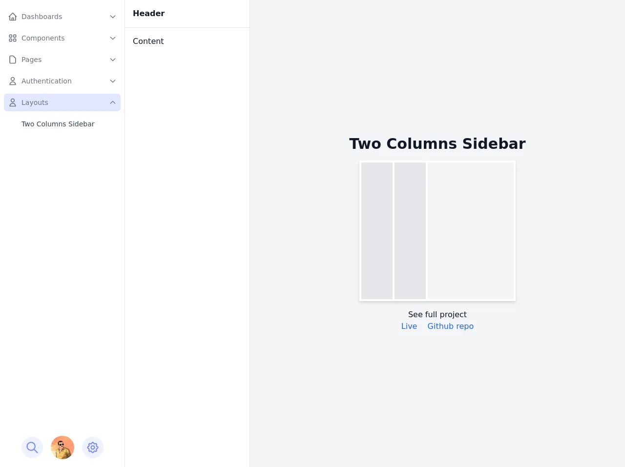
The preview of Responsive Two Columns Sidebar Layout ui component.
Free download of the Responsive Two Columns Sidebar Layout's source code
The source code of Responsive Two Columns Sidebar Layout ui component.
<style>
/* This example part of kwd-dashboard see https://kamona-wd.github.io/kwd-dashboard/ */
/* So here we will write some classes to simulate dark mode and some of tailwind css config in our project */
:root {
--light: #edf2f9;
--dark: #152e4d;
--darker: #12263f;
}
.dark .dark\:text-light {
color: var(--light);
}
.dark .dark\:bg-dark {
background-color: var(--dark);
}
.dark .dark\:bg-darker {
background-color: var(--darker);
}
.dark .dark\:text-gray-300 {
color: #d1d5db;
}
.dark .dark\:text-indigo-500 {
color: #6366f1;
}
.dark .dark\:text-indigo-100 {
color: #e0e7ff;
}
.dark .dark\:hover\:text-light:hover {
color: var(--light);
}
.dark .dark\:border-indigo-800 {
border-color: #3730a3;
}
.dark .dark\:border-indigo-700 {
border-color: #4338ca;
}
.dark .dark\:bg-indigo-600 {
background-color: #4f46e5;
}
.dark .dark\:hover\:bg-indigo-600:hover {
background-color: #4f46e5;
}
.dark .dark\:border-indigo-500 {
border-color: #6366f1;
}
.hover\:overflow-y-auto:hover {
overflow-y: auto;
}
</style>
<script src="https://cdn.jsdelivr.net/gh/alpine-collective/[email protected]/dist/component.min.js"></script>
<script src="https://cdn.jsdelivr.net/gh/alpinejs/[email protected]/dist/alpine.min.js" defer></script>
<div
x-data="setup()"
x-init="$refs.loading.classList.add('hidden');"
:class="{ 'dark': isDark }"
@resize.window="watchScreen()"
>
<div class="flex h-screen antialiased text-gray-900 bg-gray-100 dark:bg-dark dark:text-light">
<!-- Loading screen -->
<div
x-ref="loading"
class="fixed inset-0 z-50 flex items-center justify-center text-2xl font-semibold text-white bg-indigo-800"
>
Loading.....
</div>
<!-- Sidebar first column -->
<!-- Backdrop -->
<div
x-show="isSidebarOpen"
@click="isSidebarOpen = false"
class="fixed inset-0 z-10 bg-indigo-800 lg:hidden"
style="opacity: 0.5"
aria-hidden="true"
></div>
<aside
x-show="isSidebarOpen"
x-transition:enter="transition-all transform duration-300 ease-in-out"
x-transition:enter-start="-translate-x-full opacity-0"
x-transition:enter-end="translate-x-0 opacity-100"
x-transition:leave="transition-all transform duration-300 ease-in-out"
x-transition:leave-start="translate-x-0 opacity-100"
x-transition:leave-end="-translate-x-full opacity-0"
x-ref="sidebar"
@keydown.escape="window.innerWidth <= 1024 ? isSidebarOpen = false : ''"
tabindex="-1"
class="fixed inset-y-0 z-10 flex-shrink-0 w-64 bg-white border-r lg:static dark:border-indigo-800 dark:bg-darker focus:outline-none"
>
<div class="flex flex-col h-full">
<!-- Sidebar links -->
<nav aria-label="Main" class="flex-1 px-2 py-4 space-y-2 overflow-y-hidden hover:overflow-y-auto">
<!-- Dashboards links -->
<div x-data="{ isActive: false, open: false}">
<!-- active & hover classes 'bg-indigo-100 dark:bg-indigo-600' -->
<a
href="#"
@click="$event.preventDefault(); open = !open"
class="flex items-center p-2 text-gray-500 transition-colors rounded-md dark:text-light hover:bg-indigo-100 dark:hover:bg-indigo-600"
:class="{'bg-indigo-100 dark:bg-indigo-600': isActive || open}"
role="button"
aria-haspopup="true"
:aria-expanded="(open || isActive) ? 'true' : 'false'"
>
<span aria-hidden="true">
<svg
class="w-5 h-5"
xmlns="http://www.w3.org/2000/svg"
fill="none"
viewBox="0 0 24 24"
stroke="currentColor"
>
<path
stroke-linecap="round"
stroke-linejoin="round"
stroke-width="2"
d="M3 12l2-2m0 0l7-7 7 7M5 10v10a1 1 0 001 1h3m10-11l2 2m-2-2v10a1 1 0 01-1 1h-3m-6 0a1 1 0 001-1v-4a1 1 0 011-1h2a1 1 0 011 1v4a1 1 0 001 1m-6 0h6"
/>
</svg>
</span>
<span class="ml-2 text-sm"> Dashboards </span>
<span class="ml-auto" aria-hidden="true">
<!-- active class 'rotate-180' -->
<svg
class="w-4 h-4 transition-transform transform"
:class="{ 'rotate-180': open }"
xmlns="http://www.w3.org/2000/svg"
fill="none"
viewBox="0 0 24 24"
stroke="currentColor"
>
<path stroke-linecap="round" stroke-linejoin="round" stroke-width="2" d="M19 9l-7 7-7-7" />
</svg>
</span>
</a>
<div role="menu" x-show="open" class="mt-2 space-y-2 px-7" aria-label="Dashboards">
<!-- active & hover classes 'text-gray-700 dark:text-light' -->
<!-- inActive classes 'text-gray-400 dark:text-gray-400' -->
<a
href="#"
role="menuitem"
class="block p-2 text-sm text-gray-400 transition-colors duration-200 rounded-md dark:text-gray-400 dark:hover:text-light hover:text-gray-700"
>
Default
</a>
<a
href="#"
role="menuitem"
class="block p-2 text-sm text-gray-400 transition-colors duration-200 rounded-md dark:hover:text-light hover:text-gray-700"
>
Project Mangement
</a>
<a
href="#"
role="menuitem"
class="block p-2 text-sm text-gray-400 transition-colors duration-200 rounded-md dark:hover:text-light hover:text-gray-700"
>
E-Commerce
</a>
</div>
</div>
<!-- Components links -->
<div x-data="{ isActive: false, open: false }">
<!-- active classes 'bg-indigo-100 dark:bg-indigo-600' -->
<a
href="#"
@click="$event.preventDefault(); open = !open"
class="flex items-center p-2 text-gray-500 transition-colors rounded-md dark:text-light hover:bg-indigo-100 dark:hover:bg-indigo-600"
:class="{ 'bg-indigo-100 dark:bg-indigo-600': isActive || open }"
role="button"
aria-haspopup="true"
:aria-expanded="(open || isActive) ? 'true' : 'false'"
>
<span aria-hidden="true">
<svg
class="w-5 h-5"
xmlns="http://www.w3.org/2000/svg"
fill="none"
viewBox="0 0 24 24"
stroke="currentColor"
>
<path
stroke-linecap="round"
stroke-linejoin="round"
stroke-width="2"
d="M4 6a2 2 0 012-2h2a2 2 0 012 2v2a2 2 0 01-2 2H6a2 2 0 01-2-2V6zM14 6a2 2 0 012-2h2a2 2 0 012 2v2a2 2 0 01-2 2h-2a2 2 0 01-2-2V6zM4 16a2 2 0 012-2h2a2 2 0 012 2v2a2 2 0 01-2 2H6a2 2 0 01-2-2v-2zM14 16a2 2 0 012-2h2a2 2 0 012 2v2a2 2 0 01-2 2h-2a2 2 0 01-2-2v-2z"
/>
</svg>
</span>
<span class="ml-2 text-sm"> Components </span>
<span aria-hidden="true" class="ml-auto">
<!-- active class 'rotate-180' -->
<svg
class="w-4 h-4 transition-transform transform"
:class="{ 'rotate-180': open }"
xmlns="http://www.w3.org/2000/svg"
fill="none"
viewBox="0 0 24 24"
stroke="currentColor"
>
<path stroke-linecap="round" stroke-linejoin="round" stroke-width="2" d="M19 9l-7 7-7-7" />
</svg>
</span>
</a>
<div x-show="open" class="mt-2 space-y-2 px-7" role="menu" arial-label="Components">
<!-- active & hover classes 'text-gray-700 dark:text-light' -->
<!-- inActive classes 'text-gray-400 dark:text-gray-400' -->
<a
href="#"
role="menuitem"
class="block p-2 text-sm text-gray-400 transition-colors duration-200 rounded-md dark:text-gray-400 dark:hover:text-light hover:text-gray-700"
>
Alerts
</a>
<a
href="#"
role="menuitem"
class="block p-2 text-sm text-gray-400 transition-colors duration-200 rounded-md dark:text-gray-400 dark:hover:text-light hover:text-gray-700"
>
Buttons
</a>
<a
href="#"
role="menuitem"
class="block p-2 text-sm text-gray-400 transition-colors duration-200 rounded-md dark:hover:text-light hover:text-gray-700"
>
Cards
</a>
<a
href="#"
role="menuitem"
class="block p-2 text-sm text-gray-400 transition-colors duration-200 rounded-md dark:hover:text-light hover:text-gray-700"
>
Dropdowns
</a>
<a
href="#"
role="menuitem"
class="block p-2 text-sm text-gray-400 transition-colors duration-200 rounded-md dark:hover:text-light hover:text-gray-700"
>
Forms
</a>
<a
href="#"
role="menuitem"
class="block p-2 text-sm text-gray-400 transition-colors duration-200 rounded-md dark:hover:text-light hover:text-gray-700"
>
Lists
</a>
<a
href="#"
role="menuitem"
class="block p-2 text-sm text-gray-400 transition-colors duration-200 rounded-md dark:hover:text-light hover:text-gray-700"
>
Modals
</a>
</div>
</div>
<!-- Pages links -->
<div x-data="{ isActive: false, open: false }">
<!-- active classes 'bg-indigo-100 dark:bg-indigo-600' -->
<a
href="#"
@click="$event.preventDefault(); open = !open"
class="flex items-center p-2 text-gray-500 transition-colors rounded-md dark:text-light hover:bg-indigo-100 dark:hover:bg-indigo-600"
:class="{ 'bg-indigo-100 dark:bg-indigo-600': isActive || open }"
role="button"
aria-haspopup="true"
:aria-expanded="(open || isActive) ? 'true' : 'false'"
>
<span aria-hidden="true">
<svg
class="w-5 h-5"
xmlns="http://www.w3.org/2000/svg"
fill="none"
viewBox="0 0 24 24"
stroke="currentColor"
>
<path
stroke-linecap="round"
stroke-linejoin="round"
stroke-width="2"
d="M7 21h10a2 2 0 002-2V9.414a1 1 0 00-.293-.707l-5.414-5.414A1 1 0 0012.586 3H7a2 2 0 00-2 2v14a2 2 0 002 2z"
/>
</svg>
</span>
<span class="ml-2 text-sm"> Pages </span>
<span aria-hidden="true" class="ml-auto">
<!-- active class 'rotate-180' -->
<svg
class="w-4 h-4 transition-transform transform"
:class="{ 'rotate-180': open }"
xmlns="http://www.w3.org/2000/svg"
fill="none"
viewBox="0 0 24 24"
stroke="currentColor"
>
<path stroke-linecap="round" stroke-linejoin="round" stroke-width="2" d="M19 9l-7 7-7-7" />
</svg>
</span>
</a>
<div x-show="open" class="mt-2 space-y-2 px-7" role="menu" arial-label="Pages">
<!-- active & hover classes 'text-gray-700 dark:text-light' -->
<!-- inActive classes 'text-gray-400 dark:text-gray-400' -->
<a
href="#"
role="menuitem"
class="block p-2 text-sm text-gray-400 transition-colors duration-200 rounded-md dark:text-gray-400 dark:hover:text-light hover:text-gray-700"
>
Blank
</a>
<a
href="#"
role="menuitem"
class="block p-2 text-sm text-gray-400 transition-colors duration-200 rounded-md dark:text-gray-400 dark:hover:text-light hover:text-gray-700"
>
Profile
</a>
<a
href="#"
role="menuitem"
class="block p-2 text-sm text-gray-400 transition-colors duration-200 rounded-md dark:hover:text-light hover:text-gray-700"
>
Pricing
</a>
<a
href="#"
role="menuitem"
class="block p-2 text-sm text-gray-400 transition-colors duration-200 rounded-md dark:hover:text-light hover:text-gray-700"
>
Kanban
</a>
<a
href="#"
role="menuitem"
class="block p-2 text-sm text-gray-400 transition-colors duration-200 rounded-md dark:hover:text-light hover:text-gray-700"
>
Feed
</a>
</div>
</div>
<!-- Authentication links -->
<div x-data="{ isActive: false, open: false}">
<!-- active & hover classes 'bg-indigo-100 dark:bg-indigo-600' -->
<a
href="#"
@click="$event.preventDefault(); open = !open"
class="flex items-center p-2 text-gray-500 transition-colors rounded-md dark:text-light hover:bg-indigo-100 dark:hover:bg-indigo-600"
:class="{'bg-indigo-100 dark:bg-indigo-600': isActive || open}"
role="button"
aria-haspopup="true"
:aria-expanded="(open || isActive) ? 'true' : 'false'"
>
<span aria-hidden="true">
<svg
class="w-5 h-5"
xmlns="http://www.w3.org/2000/svg"
fill="none"
viewBox="0 0 24 24"
stroke="currentColor"
>
<path
stroke-linecap="round"
stroke-linejoin="round"
stroke-width="2"
d="M16 7a4 4 0 11-8 0 4 4 0 018 0zM12 14a7 7 0 00-7 7h14a7 7 0 00-7-7z"
/>
</svg>
</span>
<span class="ml-2 text-sm"> Authentication </span>
<span aria-hidden="true" class="ml-auto">
<!-- active class 'rotate-180' -->
<svg
class="w-4 h-4 transition-transform transform"
:class="{ 'rotate-180': open }"
xmlns="http://www.w3.org/2000/svg"
fill="none"
viewBox="0 0 24 24"
stroke="currentColor"
>
<path stroke-linecap="round" stroke-linejoin="round" stroke-width="2" d="M19 9l-7 7-7-7" />
</svg>
</span>
</a>
<div x-show="open" class="mt-2 space-y-2 px-7" role="menu" aria-label="Authentication">
<!-- active & hover classes 'text-gray-700 dark:text-light' -->
<!-- inActive classes 'text-gray-400 dark:text-gray-400' -->
<a
href="#"
role="menuitem"
class="block p-2 text-sm text-gray-400 transition-colors duration-200 rounded-md dark:hover:text-light hover:text-gray-700"
>
Register
</a>
<a
href="#"
role="menuitem"
class="block p-2 text-sm text-gray-400 transition-colors duration-200 rounded-md dark:hover:text-light hover:text-gray-700"
>
Login
</a>
<a
href="#"
role="menuitem"
class="block p-2 text-sm text-gray-400 transition-colors duration-200 rounded-md dark:hover:text-light hover:text-gray-700"
>
Password Reset
</a>
</div>
</div>
<!-- Layouts links -->
<div x-data="{ isActive: true, open: true}">
<!-- active & hover classes 'bg-indigo-100 dark:bg-indigo-600' -->
<a
href="#"
@click="$event.preventDefault(); open = !open"
class="flex items-center p-2 text-gray-500 transition-colors rounded-md dark:text-light hover:bg-indigo-100 dark:hover:bg-indigo-600"
:class="{'bg-indigo-100 dark:bg-indigo-600': isActive || open}"
role="button"
aria-haspopup="true"
:aria-expanded="(open || isActive) ? 'true' : 'false'"
>
<span aria-hidden="true">
<svg
class="w-5 h-5"
xmlns="http://www.w3.org/2000/svg"
fill="none"
viewBox="0 0 24 24"
stroke="currentColor"
>
<path
stroke-linecap="round"
stroke-linejoin="round"
stroke-width="2"
d="M16 7a4 4 0 11-8 0 4 4 0 018 0zM12 14a7 7 0 00-7 7h14a7 7 0 00-7-7z"
/>
</svg>
</span>
<span class="ml-2 text-sm"> Layouts </span>
<span aria-hidden="true" class="ml-auto">
<!-- active class 'rotate-180' -->
<svg
class="w-4 h-4 transition-transform transform"
:class="{ 'rotate-180': open }"
xmlns="http://www.w3.org/2000/svg"
fill="none"
viewBox="0 0 24 24"
stroke="currentColor"
>
<path stroke-linecap="round" stroke-linejoin="round" stroke-width="2" d="M19 9l-7 7-7-7" />
</svg>
</span>
</a>
<div x-show="open" class="mt-2 space-y-2 px-7" role="menu" aria-label="Authentication">
<!-- active & hover classes 'text-gray-700 dark:text-light' -->
<!-- inActive classes 'text-gray-400 dark:text-gray-400' -->
<a
href="#"
role="menuitem"
class="block p-2 text-sm text-gray-700 transition-colors duration-200 rounded-md dark:text-light dark:hover:text-light hover:text-gray-700"
>
Two Columns Sidebar
</a>
</div>
</div>
</nav>
<!-- Sidebar footer -->
<div class="relative flex items-center justify-center flex-shrink-0 px-2 py-4 space-x-4">
<!-- Search button -->
<button
@click="openSearchPanel"
class="p-2 text-indigo-400 transition-colors duration-200 rounded-full bg-indigo-50 hover:text-indigo-600 hover:bg-indigo-100 dark:hover:text-light dark:hover:bg-indigo-700 dark:bg-dark focus:outline-none focus:bg-indigo-100 dark:focus:bg-indigo-700 focus:ring-indigo-800"
>
<span class="sr-only">Open search panel</span>
<svg
class="w-7 h-7"
xmlns="http://www.w3.org/2000/svg"
fill="none"
viewBox="0 0 24 24"
stroke="currentColor"
aria-hidden="true"
>
<path
stroke-linecap="round"
stroke-linejoin="round"
stroke-width="2"
d="M21 21l-6-6m2-5a7 7 0 11-14 0 7 7 0 0114 0z"
/>
</svg>
</button>
<!-- User avatar button -->
<div class="" x-data="{ open: false }">
<button
@click="open = !open; $nextTick(() => { if(open){ $refs.userMenu.focus() } })"
type="button"
aria-haspopup="true"
:aria-expanded="open ? 'true' : 'false'"
class="block transition-opacity duration-200 rounded-full dark:opacity-75 dark:hover:opacity-100 focus:outline-none focus:ring dark:focus:opacity-100"
>
<span class="sr-only">User menu</span>
<img
class="w-12 h-12 rounded-full"
src="https://avatars.githubusercontent.com/u/57622665?s=460&u=8f581f4c4acd4c18c33a87b3e6476112325e8b38&v=4"
alt="Ahmed Kamel"
/>
</button>
<!-- User dropdown menu -->
<div
x-show="open"
x-ref="userMenu"
x-transition:enter="transition-all transform ease-out"
x-transition:enter-start="-translate-y-1/2 opacity-0"
x-transition:enter-end="translate-y-0 opacity-100"
x-transition:leave="transition-all transform ease-in"
x-transition:leave-start="translate-y-0 opacity-100"
x-transition:leave-end="-translate-y-1/2 opacity-0"
@click.away="open = false"
@keydown.escape="open = false"
class="absolute max-w-xs py-1 bg-white rounded-md shadow-lg min-w-max left-5 right-5 bottom-full ring-1 ring-black ring-opacity-5 dark:bg-dark focus:outline-none"
tabindex="-1"
role="menu"
aria-orientation="vertical"
aria-label="User menu"
>
<a
href="#"
role="menuitem"
class="block px-4 py-2 text-sm text-gray-700 transition-colors hover:bg-gray-100 dark:text-light dark:hover:bg-indigo-600"
>
Your Profile
</a>
<a
href="#"
role="menuitem"
class="block px-4 py-2 text-sm text-gray-700 transition-colors hover:bg-gray-100 dark:text-light dark:hover:bg-indigo-600"
>
Settings
</a>
<a
href="#"
role="menuitem"
class="block px-4 py-2 text-sm text-gray-700 transition-colors hover:bg-gray-100 dark:text-light dark:hover:bg-indigo-600"
>
Logout
</a>
</div>
</div>
<!-- Settings button -->
<button
@click="openSettingsPanel"
class="p-2 text-indigo-400 transition-colors duration-200 rounded-full bg-indigo-50 hover:text-indigo-600 hover:bg-indigo-100 dark:hover:text-light dark:hover:bg-indigo-700 dark:bg-dark focus:outline-none focus:bg-indigo-100 dark:focus:bg-indigo-700 focus:ring-indigo-800"
>
<span class="sr-only">Open settings panel</span>
<svg
class="w-7 h-7"
xmlns="http://www.w3.org/2000/svg"
fill="none"
viewBox="0 0 24 24"
stroke="currentColor"
aria-hidden="true"
>
<path
stroke-linecap="round"
stroke-linejoin="round"
stroke-width="2"
d="M10.325 4.317c.426-1.756 2.924-1.756 3.35 0a1.724 1.724 0 002.573 1.066c1.543-.94 3.31.826 2.37 2.37a1.724 1.724 0 001.065 2.572c1.756.426 1.756 2.924 0 3.35a1.724 1.724 0 00-1.066 2.573c.94 1.543-.826 3.31-2.37 2.37a1.724 1.724 0 00-2.572 1.065c-.426 1.756-2.924 1.756-3.35 0a1.724 1.724 0 00-2.573-1.066c-1.543.94-3.31-.826-2.37-2.37a1.724 1.724 0 00-1.065-2.572c-1.756-.426-1.756-2.924 0-3.35a1.724 1.724 0 001.066-2.573c-.94-1.543.826-3.31 2.37-2.37.996.608 2.296.07 2.572-1.065z"
/>
<path
stroke-linecap="round"
stroke-linejoin="round"
stroke-width="2"
d="M15 12a3 3 0 11-6 0 3 3 0 016 0z"
/>
</svg>
</button>
</div>
</div>
</aside>
<!-- Second column -->
<!-- Backdrop -->
<div
x-show="isSecondSidebarOpen"
@click="isSecondSidebarOpen = false"
class="fixed inset-0 z-10 bg-indigo-800 lg:hidden"
style="opacity: 0.5"
aria-hidden="true"
></div>
<section
x-show="isSecondSidebarOpen"
x-transition:enter="transition-all transform duration-300 ease-in-out"
x-transition:enter-start="-translate-x-full opacity-0"
x-transition:enter-end="translate-x-0 opacity-100"
x-transition:leave="transition-all transform duration-300 ease-in-out"
x-transition:leave-start="translate-x-0 opacity-100"
x-transition:leave-end="-translate-x-full opacity-0"
x-ref="secondSidebar"
@keydown.escape="window.innerWidth <= 1024 ? isSecondSidebarOpen = false : ''"
tabindex="-1"
class="fixed inset-y-0 z-10 flex-shrink-0 w-64 bg-white border-r dark:border-indigo-800 dark:bg-darker lg:static focus:outline-none"
>
<div class="flex flex-col h-screen">
<!-- Panel header -->
<div class="flex-shrink-0">
<div class="px-4 pt-4 border-b dark:border-indigo-800">
<h2 class="pb-4 font-semibold">Header</h2>
</div>
</div>
<!-- Panel content -->
<div class="flex-1 pt-4 overflow-y-hidden hover:overflow-y-auto">
<div class="space-y-4">
<!-- Content -->
<p class="px-4">Content</p>
</div>
</div>
</div>
</section>
<!-- Sidebars buttons -->
<div class="fixed flex items-center space-x-4 top-5 right-10 lg:hidden">
<button
@click="isSidebarOpen = true; $nextTick(() => { $refs.sidebar.focus() })"
class="p-1 text-indigo-400 transition-colors duration-200 rounded-md bg-indigo-50 hover:text-indigo-600 hover:bg-indigo-100 dark:hover:text-light dark:hover:bg-indigo-700 dark:bg-dark focus:outline-none focus:ring"
>
<span class="sr-only">Toggle main manu</span>
<span aria-hidden="true">
<svg
x-show="!isSidebarOpen"
class="w-8 h-8"
xmlns="http://www.w3.org/2000/svg"
fill="none"
viewBox="0 0 24 24"
stroke="currentColor"
>
<path stroke-linecap="round" stroke-linejoin="round" stroke-width="2" d="M4 6h16M4 12h16M4 18h16" />
</svg>
<svg
x-show="isSidebarOpen"
class="w-8 h-8"
xmlns="http://www.w3.org/2000/svg"
fill="none"
viewBox="0 0 24 24"
stroke="currentColor"
>
<path stroke-linecap="round" stroke-linejoin="round" stroke-width="2" d="M6 18L18 6M6 6l12 12" />
</svg>
</span>
</button>
<button
@click="isSecondSidebarOpen = true; $nextTick(() => { $refs.secondSidebar.focus() })"
class="p-1 text-indigo-400 transition-colors duration-200 rounded-md bg-indigo-50 hover:text-indigo-600 hover:bg-indigo-100 dark:hover:text-light dark:hover:bg-indigo-700 dark:bg-dark focus:outline-none focus:ring"
>
<span class="sr-only">Toggle panel</span>
<span aria-hidden="true">
<svg
class="w-8 h-8 transition-transform transform"
:class="{ 'rotate-180': isSecondSidebarOpen }"
xmlns="http://www.w3.org/2000/svg"
fill="none"
viewBox="0 0 24 24"
stroke="currentColor"
>
<path stroke-linecap="round" stroke-linejoin="round" stroke-width="2" d="M13 5l7 7-7 7M5 5l7 7-7 7" />
</svg>
</span>
</button>
</div>
<!-- Main content -->
<main class="flex-1">
<div
class="flex flex-col items-center justify-center flex-1 h-full min-h-screen p-4 overflow-x-hidden overflow-y-auto"
>
<h1 class="mb-4 text-2xl font-semibold text-center md:text-3xl">Two Columns Sidebar</h1>
<div class="mb-4">
<div class="relative flex p-1 space-x-1 bg-white shadow-md w-80 h-72 dark:bg-darker">
<div class="w-16 h-full bg-gray-200 dark:bg-dark"></div>
<div class="w-16 h-full bg-gray-200 dark:bg-dark"></div>
<div class="flex-1 h-full bg-gray-100 dark:bg-dark"></div>
</div>
</div>
<div>
<p class="text-center">See full project</p>
<a
href="https://kamona-wd.github.io/kwd-dashboard/"
target="_blank"
class="text-base text-blue-600 hover:underline"
>Live</a
>
<a
href="https://github.com/Kamona-WD/kwd-dashboard"
target="_blank"
class="ml-4 text-base text-blue-600 hover:underline"
>Github repo</a
>
</div>
</div>
</main>
<!-- Panels -->
<!-- Settings Panel -->
<!-- Backdrop -->
<div
x-transition:enter="transition duration-300 ease-in-out"
x-transition:enter-start="opacity-0"
x-transition:enter-end="opacity-100"
x-transition:leave="transition duration-300 ease-in-out"
x-transition:leave-start="opacity-100"
x-transition:leave-end="opacity-0"
x-show="isSettingsPanelOpen"
@click="isSettingsPanelOpen = false"
class="fixed inset-0 z-10 bg-indigo-800"
style="opacity: 0.5"
aria-hidden="true"
></div>
<!-- Panel -->
<section
x-transition:enter="transition duration-300 ease-in-out transform sm:duration-500"
x-transition:enter-start="translate-x-full"
x-transition:enter-end="translate-x-0"
x-transition:leave="transition duration-300 ease-in-out transform sm:duration-500"
x-transition:leave-start="translate-x-0"
x-transition:leave-end="translate-x-full"
x-ref="settingsPanel"
tabindex="-1"
x-show="isSettingsPanelOpen"
@keydown.escape="isSettingsPanelOpen = false"
class="fixed inset-y-0 right-0 z-20 w-full max-w-xs bg-white shadow-xl dark:bg-darker dark:text-light sm:max-w-md focus:outline-none"
aria-labelledby="settinsPanelLabel"
>
<div class="absolute left-0 p-2 transform -translate-x-full">
<!-- Close button -->
<button
@click="isSettingsPanelOpen = false"
class="p-2 text-white rounded-md focus:outline-none focus:ring"
>
<svg
class="w-5 h-5"
xmlns="http://www.w3.org/2000/svg"
fill="none"
viewBox="0 0 24 24"
stroke="currentColor"
>
<path stroke-linecap="round" stroke-linejoin="round" stroke-width="2" d="M6 18L18 6M6 6l12 12" />
</svg>
</button>
</div>
<!-- Panel content -->
<div class="flex flex-col h-screen">
<!-- Panel header -->
<div
class="flex flex-col items-center justify-center flex-shrink-0 px-4 py-8 space-y-4 border-b dark:border-indigo-700"
>
<span aria-hidden="true" class="text-gray-500 dark:text-indigo-600">
<svg
class="w-8 h-8"
xmlns="http://www.w3.org/2000/svg"
fill="none"
viewBox="0 0 24 24"
stroke="currentColor"
>
<path
stroke-linecap="round"
stroke-linejoin="round"
stroke-width="2"
d="M12 6V4m0 2a2 2 0 100 4m0-4a2 2 0 110 4m-6 8a2 2 0 100-4m0 4a2 2 0 110-4m0 4v2m0-6V4m6 6v10m6-2a2 2 0 100-4m0 4a2 2 0 110-4m0 4v2m0-6V4"
/>
</svg>
</span>
<h2 id="settinsPanelLabel" class="text-xl font-medium text-gray-500 dark:text-light">Settings</h2>
</div>
<!-- Content -->
<div class="flex-1 overflow-hidden hover:overflow-y-auto">
<!-- Theme -->
<div class="p-4 space-y-4 md:p-8">
<h6 class="text-lg font-medium text-gray-400 dark:text-light">Mode</h6>
<div class="flex items-center space-x-8">
<!-- Light button -->
<button
@click="setLightTheme"
class="flex items-center justify-center px-4 py-2 space-x-4 transition-colors border rounded-md hover:text-gray-900 hover:border-gray-900 dark:border-indigo-600 dark:hover:text-indigo-100 dark:hover:border-indigo-500 focus:outline-none focus:ring focus:ring-indigo-400 dark:focus:ring-indigo-700"
:class="{ 'border-gray-900 text-gray-900 dark:border-indigo-500 dark:text-indigo-100': !isDark, 'text-gray-500 dark:text-indigo-500': isDark }"
>
<span>
<svg
class="w-6 h-6"
xmlns="http://www.w3.org/2000/svg"
fill="none"
viewBox="0 0 24 24"
stroke="currentColor"
>
<path
stroke-linecap="round"
stroke-linejoin="round"
stroke-width="2"
d="M11.049 2.927c.3-.921 1.603-.921 1.902 0l1.519 4.674a1 1 0 00.95.69h4.915c.969 0 1.371 1.24.588 1.81l-3.976 2.888a1 1 0 00-.363 1.118l1.518 4.674c.3.922-.755 1.688-1.538 1.118l-3.976-2.888a1 1 0 00-1.176 0l-3.976 2.888c-.783.57-1.838-.197-1.538-1.118l1.518-4.674a1 1 0 00-.363-1.118l-3.976-2.888c-.784-.57-.38-1.81.588-1.81h4.914a1 1 0 00.951-.69l1.519-4.674z"
/>
</svg>
</span>
<span>Light</span>
</button>
<!-- Dark button -->
<button
@click="setDarkTheme"
class="flex items-center justify-center px-4 py-2 space-x-4 transition-colors border rounded-md hover:text-gray-900 hover:border-gray-900 dark:border-indigo-600 dark:hover:text-indigo-100 dark:hover:border-indigo-500 focus:outline-none focus:ring focus:ring-indigo-400 dark:focus:ring-indigo-700"
:class="{ 'border-gray-900 text-gray-900 dark:border-indigo-500 dark:text-indigo-100': isDark, 'text-gray-500 dark:text-indigo-500': !isDark }"
>
<span>
<svg
class="w-6 h-6"
xmlns="http://www.w3.org/2000/svg"
fill="none"
viewBox="0 0 24 24"
stroke="currentColor"
>
<path
stroke-linecap="round"
stroke-linejoin="round"
stroke-width="2"
d="M20.354 15.354A9 9 0 018.646 3.646 9.003 9.003 0 0012 21a9.003 9.003 0 008.354-5.646z"
/>
</svg>
</span>
<span>Dark</span>
</button>
</div>
</div>
</div>
</div>
</section>
<!-- Search panel -->
<!-- Backdrop -->
<div
x-transition:enter="transition duration-300 ease-in-out"
x-transition:enter-start="opacity-0"
x-transition:enter-end="opacity-100"
x-transition:leave="transition duration-300 ease-in-out"
x-transition:leave-start="opacity-100"
x-transition:leave-end="opacity-0"
x-show="isSearchPanelOpen"
@click="isSearchPanelOpen = false"
class="fixed inset-0 z-10 bg-indigo-800"
style="opacity: 0.5"
aria-hidden="ture"
></div>
<!-- Panel -->
<section
x-transition:enter="transition duration-300 ease-in-out transform sm:duration-500"
x-transition:enter-start="-translate-x-full"
x-transition:enter-end="translate-x-0"
x-transition:leave="transition duration-300 ease-in-out transform sm:duration-500"
x-transition:leave-start="translate-x-0"
x-transition:leave-end="-translate-x-full"
x-show="isSearchPanelOpen"
@keydown.escape="isSearchPanelOpen = false"
class="fixed inset-y-0 z-20 w-full max-w-xs bg-white shadow-xl dark:bg-darker dark:text-light sm:max-w-md focus:outline-none"
>
<div class="absolute right-0 p-2 transform translate-x-full">
<!-- Close button -->
<button @click="isSearchPanelOpen = false" class="p-2 text-white rounded-md focus:outline-none focus:ring">
<svg
class="w-5 h-5"
xmlns="http://www.w3.org/2000/svg"
fill="none"
viewBox="0 0 24 24"
stroke="currentColor"
>
<path stroke-linecap="round" stroke-linejoin="round" stroke-width="2" d="M6 18L18 6M6 6l12 12" />
</svg>
</button>
</div>
<h2 class="sr-only">Search panel</h2>
<!-- Panel content -->
<div class="flex flex-col h-screen">
<!-- Panel header (Search input) -->
<div
class="relative flex-shrink-0 px-4 py-8 text-gray-400 border-b dark:border-indigo-800 dark:focus-within:text-light focus-within:text-gray-700"
>
<span class="absolute inset-y-0 inline-flex items-center px-4">
<svg
class="w-5 h-5"
xmlns="http://www.w3.org/2000/svg"
fill="none"
viewBox="0 0 24 24"
stroke="currentColor"
>
<path
stroke-linecap="round"
stroke-linejoin="round"
stroke-width="2"
d="M21 21l-6-6m2-5a7 7 0 11-14 0 7 7 0 0114 0z"
/>
</svg>
</span>
<input
x-ref="searchInput"
type="text"
class="w-full py-2 pl-10 pr-4 border rounded-full dark:bg-dark dark:border-transparent dark:text-light focus:outline-none focus:ring"
placeholder="Search..."
/>
</div>
<!-- Panel content (Search result) -->
<div class="flex-1 px-4 pb-4 space-y-4 overflow-y-hidden h hover:overflow-y-auto">
<h3 class="py-2 text-sm font-semibold text-gray-600 dark:text-light">History</h3>
<p class="px=4">Search resault</p>
<!-- -->
<!-- Search content -->
<!-- -->
</div>
</div>
</section>
</div>
</div>
<script>
const setup = () => {
const getTheme = () => {
if (window.localStorage.getItem('dark')) {
return JSON.parse(window.localStorage.getItem('dark'))
}
return !!window.matchMedia && window.matchMedia('(prefers-color-scheme: dark)').matches
}
const setTheme = (value) => {
window.localStorage.setItem('dark', value)
}
return {
loading: true,
isDark: getTheme(),
toggleTheme() {
this.isDark = !this.isDark
setTheme(this.isDark)
},
setLightTheme() {
this.isDark = false
setTheme(this.isDark)
},
setDarkTheme() {
this.isDark = true
setTheme(this.isDark)
},
watchScreen() {
if (window.innerWidth <= 1024) {
this.isSidebarOpen = false
this.isSecondSidebarOpen = false
} else if (window.innerWidth >= 1024) {
this.isSidebarOpen = true
this.isSecondSidebarOpen = true
}
},
isSidebarOpen: window.innerWidth >= 1024 ? true : false,
toggleSidbarMenu() {
this.isSidebarOpen = !this.isSidebarOpen
},
isSecondSidebarOpen: window.innerWidth >= 1024 ? true : false,
toggleSecondSidbarColumn() {
this.isSecondSidebarOpen = !this.isSecondSidebarOpen
},
isSettingsPanelOpen: false,
openSettingsPanel() {
this.isSettingsPanelOpen = true
this.$nextTick(() => {
this.$refs.settingsPanel.focus()
})
},
isSearchPanelOpen: false,
openSearchPanel() {
this.isSearchPanelOpen = true
this.$nextTick(() => {
this.$refs.searchInput.focus()
})
},
}
}
</script>
How to create a Responsive Two Columns Sidebar Layout with Tailwind CSS?
To create a responsive two-column sidebar layout with Tailwind CSS, you need to follow these steps:
Step 1: Set up your HTML structure
The first step is to set up your HTML structure. You need to create a container that will hold your main content and sidebar. Inside the container, you need to create two columns, one for the main content and one for the sidebar.
<div class="container mx-auto">
  <div class="flex flex-wrap">
    <div class="w-full md:w-3/4 px-4">
      <!-- Main content -->
    </div>
    <div class="w-full md:w-1/4 px-4">
      <!-- Sidebar -->
    </div>
  </div>
</div>
Step 2: Style your main content and sidebar
The next step is to style your main content and sidebar. You can use Tailwind CSS classes to style your elements. For example, you can use the bg-gray-100 class to set the background color of your main content and sidebar.
<div class="container mx-auto">
  <div class="flex flex-wrap">
    <div class="w-full md:w-3/4 px-4 bg-gray-100">
      <!-- Main content -->
    </div>
    <div class="w-full md:w-1/4 px-4 bg-gray-100">
      <!-- Sidebar -->
    </div>
  </div>
</div>
Step 3: Add responsive classes
The final step is to add responsive classes to your elements. You can use Tailwind CSS responsive classes to create designs that work on different screen sizes. For example, you can use the md:w-3/4 class to set the width of your main content column to 75% on medium-sized screens.
<div class="container mx-auto">
  <div class="flex flex-wrap">
    <div class="w-full md:w-3/4 px-4 bg-gray-100">
      <!-- Main content -->
    </div>
    <div class="w-full md:w-1/4 px-4 bg-gray-100">
      <!-- Sidebar -->
    </div>
  </div>
</div>
Conclusion
In this article, we have explored how to create a responsive two-column sidebar layout with Tailwind CSS. We have seen how Tailwind CSS provides a set of pre-defined classes that can help you create custom designs quickly. With Tailwind CSS, you can create responsive designs that work on different screen sizes. We hope this article has been helpful in your journey to become a FrontEnd technology blogger.