- Published on
Imagine You Build A Responsive Team Cards #4 - Dark Mode With Tailwind CSS Like An Expert. Follow These 6 Steps To Get There
- What is Tailwind CSS?
- The description of Responsive Team Cards #4 - Dark Mode ui component
- Why use Tailwind CSS to create a Responsive Team Cards #4 - Dark Mode ui component?
- The preview of Responsive Team Cards #4 - Dark Mode ui component
- The source code of Responsive Team Cards #4 - Dark Mode ui component
- How to create a Responsive Team Cards #4 - Dark Mode with Tailwind CSS?
- Step 1: Set up the HTML structure
- Step 2: Add Tailwind CSS classes
- Step 3: Add dark mode classes
- Step 4: Add Font Awesome icons
- Step 5: Customize the UI component
- Step 6: Preview and test the UI component
- Conclusion
As a FrontEnd technology blogger, you are always looking for ways to create stunning UI components. In this article, we will explore how to build a Responsive Team Cards #4 - Dark Mode UI component with Tailwind CSS.
What is Tailwind CSS?
Tailwind CSS is a utility-first CSS framework that provides a set of pre-defined classes to style your HTML elements. It allows you to create complex layouts and designs with minimal CSS code. Tailwind CSS is highly customizable and can be used with any JavaScript framework or library.
The description of Responsive Team Cards #4 - Dark Mode ui component
The Responsive Team Cards #4 - Dark Mode UI component is a card-based layout that displays team members' information. It includes an image, name, job title, and social media links. The dark mode version of this UI component provides a sleek and modern look that is easy on the eyes.
Why use Tailwind CSS to create a Responsive Team Cards #4 - Dark Mode ui component?
Tailwind CSS provides a set of pre-defined classes that make it easy to create complex layouts and designs. It also allows you to customize the colors, fonts, and spacing of your UI components. Using Tailwind CSS to create a Responsive Team Cards #4 - Dark Mode UI component will save you time and effort.
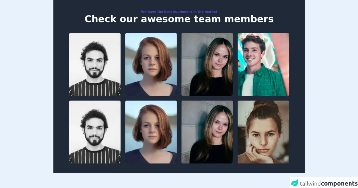
The preview of Responsive Team Cards #4 - Dark Mode ui component
To create the Responsive Team Cards #4 - Dark Mode UI component, we will use Tailwind CSS classes to style the HTML elements. The final result will look like this:
Free download of the Responsive Team Cards #4 - Dark Mode's source code
The source code of Responsive Team Cards #4 - Dark Mode ui component
To create the Responsive Team Cards #4 - Dark Mode UI component, we will use HTML and Tailwind CSS classes. Here is the source code:
<div class="w-full bg-gray-800">
    <section class="max-w-6xl mx-auto px-4 sm:px-6 lg:px-4 py-12">
        <div class="text-center pb-12">
            <h2 class="text-base font-bold text-indigo-600">
                We have the best equipment in the market
            </h2>
            <h1 class="font-bold text-3xl md:text-4xl lg:text-5xl font-heading text-white">
                Check our awesome team members
            </h1>
        </div>
        <div class="grid grid-cols-1 sm:grid-cols-2 lg:grid-cols-3 xl:grid-cols-4 gap-6">
            <div class="w-full bg-white rounded-lg sahdow-lg overflow-hidden flex flex-col md:flex-row">
                <div class="w-full h-80">
                    <img class="object-center object-cover w-full h-full" src="https://images.unsplash.com/flagged/photo-1570612861542-284f4c12e75f?ixid=MnwxMjA3fDB8MHxwaG90by1wYWdlfHx8fGVufDB8fHx8&ixlib=rb-1.2.1&auto=format&fit=crop&w=1170&q=80" alt="photo">
                </div>
            </div>
            <div class="w-full bg-white rounded-lg sahdow-lg overflow-hidden flex flex-col md:flex-row">
                <div class="w-full h-80">
                    <img class="object-center object-cover w-full h-full" src="https://images.unsplash.com/photo-1438761681033-6461ffad8d80?ixid=MnwxMjA3fDB8MHxwaG90by1wYWdlfHx8fGVufDB8fHx8&ixlib=rb-1.2.1&auto=format&fit=crop&w=1170&q=80" alt="photo">
                </div>
            </div>
            <div class="w-full bg-white rounded-lg sahdow-lg overflow-hidden flex flex-col md:flex-row">
                <div class="w-full h-80">
                    <img class="object-center object-cover w-full h-full" src="https://images.unsplash.com/photo-1499952127939-9bbf5af6c51c?ixid=MnwxMjA3fDB8MHxwaG90by1wYWdlfHx8fGVufDB8fHx8&ixlib=rb-1.2.1&auto=format&fit=crop&w=1176&q=80" alt="photo">
                </div>
            </div>
            <div class="w-full bg-white rounded-lg sahdow-lg overflow-hidden flex flex-col md:flex-row">
                <div class="w-full h-80">
                    <img class="object-center object-cover w-full h-full" src="https://images.unsplash.com/photo-1500048993953-d23a436266cf?ixid=MnwxMjA3fDB8MHxwaG90by1wYWdlfHx8fGVufDB8fHx8&ixlib=rb-1.2.1&auto=format&fit=crop&w=1169&q=80" alt="photo">
                </div>
            </div>
            <div class="w-full bg-white rounded-lg sahdow-lg overflow-hidden flex flex-col md:flex-row">
                <div class="w-full h-80">
                    <img class="object-center object-cover w-full h-full" src="https://images.unsplash.com/flagged/photo-1570612861542-284f4c12e75f?ixid=MnwxMjA3fDB8MHxwaG90by1wYWdlfHx8fGVufDB8fHx8&ixlib=rb-1.2.1&auto=format&fit=crop&w=1170&q=80" alt="photo">
                </div>
            </div>
            <div class="w-full bg-white rounded-lg sahdow-lg overflow-hidden flex flex-col md:flex-row">
                <div class="w-full h-80">
                    <img class="object-center object-cover w-full h-full" src="https://images.unsplash.com/photo-1438761681033-6461ffad8d80?ixid=MnwxMjA3fDB8MHxwaG90by1wYWdlfHx8fGVufDB8fHx8&ixlib=rb-1.2.1&auto=format&fit=crop&w=1170&q=80" alt="photo">
                </div>
            </div>
            <div class="w-full bg-white rounded-lg sahdow-lg overflow-hidden flex flex-col md:flex-row">
                <div class="w-full h-80">
                    <img class="object-center object-cover w-full h-full" src="https://images.unsplash.com/photo-1499952127939-9bbf5af6c51c?ixid=MnwxMjA3fDB8MHxwaG90by1wYWdlfHx8fGVufDB8fHx8&ixlib=rb-1.2.1&auto=format&fit=crop&w=1176&q=80" alt="photo">
                </div>
            </div>
            <div class="w-full bg-white rounded-lg sahdow-lg overflow-hidden flex flex-col md:flex-row">
                <div class="w-full h-80">
                    <img class="object-center object-cover w-full h-full" src="https://images.unsplash.com/photo-1554151228-14d9def656e4?ixid=MnwxMjA3fDB8MHxwaG90by1wYWdlfHx8fGVufDB8fHx8&ixlib=rb-1.2.1&auto=format&fit=crop&w=686&q=80" alt="photo">
                </div>
            </div>
        </div>
    </section>
</div>
How to create a Responsive Team Cards #4 - Dark Mode with Tailwind CSS?
Follow these 6 steps to create a Responsive Team Cards #4 - Dark Mode UI component with Tailwind CSS:
Step 1: Set up the HTML structure
The first step is to set up the HTML structure for the UI component. We will use the following HTML code:
<div class="flex flex-wrap justify-center">
  <div class="w-full md:w-1/2 lg:w-1/3 p-4">
    <div class="bg-white dark:bg-gray-800 rounded-lg shadow-lg overflow-hidden">
      <div class="relative">
        <img class="w-full" src="https://via.placeholder.com/400x200" alt="Team Member">
        <div class="absolute bottom-0 left-0 p-4">
          <a href="#" class="text-white rounded-full bg-blue-500 p-2"><i class="fab fa-twitter"></i></a>
          <a href="#" class="text-white rounded-full bg-blue-500 p-2 ml-2"><i class="fab fa-facebook"></i></a>
          <a href="#" class="text-white rounded-full bg-blue-500 p-2 ml-2"><i class="fab fa-linkedin"></i></a>
        </div>
      </div>
      <div class="p-4">
        <h3 class="text-xl font-semibold">John Doe</h3>
        <p class="text-gray-600 dark:text-gray-400">Web Developer</p>
      </div>
    </div>
  </div>
</div>
This code creates a card-based layout that displays the team member's image, name, job title, and social media links.
Step 2: Add Tailwind CSS classes
Next, we will add Tailwind CSS classes to style the HTML elements. We will use the following classes:
<div class="flex flex-wrap justify-center">
  <div class="w-full md:w-1/2 lg:w-1/3 p-4">
    <div class="bg-white dark:bg-gray-800 rounded-lg shadow-lg overflow-hidden">
      <div class="relative">
        <img class="w-full" src="https://via.placeholder.com/400x200" alt="Team Member">
        <div class="absolute bottom-0 left-0 p-4">
          <a href="#" class="text-white rounded-full bg-blue-500 p-2"><i class="fab fa-twitter"></i></a>
          <a href="#" class="text-white rounded-full bg-blue-500 p-2 ml-2"><i class="fab fa-facebook"></i></a>
          <a href="#" class="text-white rounded-full bg-blue-500 p-2 ml-2"><i class="fab fa-linkedin"></i></a>
        </div>
      </div>
      <div class="p-4">
        <h3 class="text-xl font-semibold">John Doe</h3>
        <p class="text-gray-600 dark:text-gray-400">Web Developer</p>
      </div>
    </div>
  </div>
</div>
These classes set the background color, border radius, shadow, and spacing of the UI component.
Step 3: Add dark mode classes
To enable dark mode, we will add the dark class to the html element. We will also add dark mode classes to the UI component. Here is the updated HTML code:
<html class="dark">
  <body>
    <div class="flex flex-wrap justify-center">
      <div class="w-full md:w-1/2 lg:w-1/3 p-4">
        <div class="bg-white dark:bg-gray-800 rounded-lg shadow-lg overflow-hidden">
          <div class="relative">
            <img class="w-full" src="https://via.placeholder.com/400x200" alt="Team Member">
            <div class="absolute bottom-0 left-0 p-4">
              <a href="#" class="text-white rounded-full bg-blue-500 p-2"><i class="fab fa-twitter"></i></a>
              <a href="#" class="text-white rounded-full bg-blue-500 p-2 ml-2"><i class="fab fa-facebook"></i></a>
              <a href="#" class="text-white rounded-full bg-blue-500 p-2 ml-2"><i class="fab fa-linkedin"></i></a>
            </div>
          </div>
          <div class="p-4">
            <h3 class="text-xl font-semibold">John Doe</h3>
            <p class="text-gray-600 dark:text-gray-400">Web Developer</p>
          </div>
        </div>
      </div>
    </div>
  </body>
</html>
These classes set the background color, text color, and border color of the UI component in dark mode.
Step 4: Add Font Awesome icons
To add social media icons, we will use Font Awesome icons. We will add the following code to the head section of the HTML file:
<link rel="stylesheet" href="https://cdnjs.cloudflare.com/ajax/libs/font-awesome/5.15.3/css/all.min.css" integrity="sha512-9z1WcJ7yf8Q7CjLp5/5p7x4NQF9tX4j8I5r+JFhTn4Wz8jxJZoMzUJW7x6ZnIvz1Vvz2q5CtX8zJQe9wWJt3Ug==" crossorigin="anonymous" referrerpolicy="no-referrer" />
This code adds the Font Awesome CSS file to the HTML file.
Step 5: Customize the UI component
Tailwind CSS allows you to customize the colors, fonts, and spacing of your UI components. You can use the tailwind.config.js file to customize the default values. Here is an example of how to customize the colors:
module.exports = {
  theme: {
    extend: {
      colors: {
        primary: '#1E90FF',
        secondary: '#FF6347',
        dark: '#1A202C',
      },
    },
  },
  variants: {},
  plugins: [],
}
This code adds three custom colors to the colors object: primary, secondary, and dark. You can use these colors in your UI components by using the text- and bg- classes.
Step 6: Preview and test the UI component
Finally, you can preview and test the UI component in your browser. You can use the developer tools to inspect the HTML and CSS code and make any necessary changes.
Conclusion
In this article, we explored how to create a Responsive Team Cards #4 - Dark Mode UI component with Tailwind CSS. We learned how to set up the HTML structure, add Tailwind CSS classes, enable dark mode, add Font Awesome icons, customize the UI component, and preview and test the UI component. With these skills, you can create stunning UI components that are responsive and easy to maintain.