- Published on
6 Ideas To Help You Make A Responsive Tailwind CSS navbar With Tailwind CSS Like A Pro
- What is Tailwind CSS?
- The Description of Responsive Tailwind CSS Navbar UI Component
- Why Use Tailwind CSS to Create a Responsive Tailwind CSS Navbar UI Component?
- The Preview of Responsive Tailwind CSS Navbar UI Component
- The Source Code of Responsive Tailwind CSS Navbar UI Component
- How to Create a Responsive Tailwind CSS Navbar with Tailwind CSS?
- Step 1: Create a Navbar Container
- Step 2: Add Logo and Website Name
- Step 3: Add Navbar Items
- Step 4: Style the Navbar
- Conclusion
What is Tailwind CSS?
Tailwind CSS is a utility-first CSS framework that enables you to create custom designs quickly. With Tailwind CSS, you can create responsive designs that are optimized for all devices, including mobile, tablet, and desktop.
The Description of Responsive Tailwind CSS Navbar UI Component
A navbar is a common UI component that is used to navigate between different sections of a website. A responsive Tailwind CSS navbar is a navbar that is optimized for all devices and screen sizes. It is a UI component that adjusts its layout and design to fit the screen size of the device it is being viewed on.
Why Use Tailwind CSS to Create a Responsive Tailwind CSS Navbar UI Component?
Tailwind CSS is an excellent choice for creating a responsive Tailwind CSS navbar UI component because it provides a set of pre-defined utility classes that you can use to create custom designs quickly. With Tailwind CSS, you can create a responsive Tailwind CSS navbar UI component that is optimized for all devices and screen sizes without having to write a lot of custom CSS.
The Preview of Responsive Tailwind CSS Navbar UI Component
To create a responsive Tailwind CSS navbar UI component, you can use the following utility classes:
bg-white: Sets the background color of the navbar to white.flex: Makes the navbar a flex container.justify-between: Aligns the navbar items to the left and right of the container.py-4: Adds padding to the top and bottom of the navbar.px-6: Adds padding to the left and right of the navbar.border-b: Adds a border to the bottom of the navbar.
Free download of the Responsive Tailwind CSS navbar's source code
The Source Code of Responsive Tailwind CSS Navbar UI Component
To create a responsive Tailwind CSS navbar UI component, you can use the following HTML code:
<nav class="bg-white flex justify-between py-4 px-6 border-b">
  <div class="flex items-center">
    <img src="logo.png" alt="Logo" class="h-8">
    <h1 class="text-lg font-bold ml-2">My Website</h1>
  </div>
  <div class="flex items-center">
    <a href="#" class="text-gray-600 hover:text-gray-800 px-3 py-2">Home</a>
    <a href="#" class="text-gray-600 hover:text-gray-800 px-3 py-2">About</a>
    <a href="#" class="text-gray-600 hover:text-gray-800 px-3 py-2">Contact</a>
  </div>
</nav>
<!-- This is an example component -->
<div class="max-w-2xl mx-auto">
<nav class="border-gray-200 px-2 mb-10">
<div class="container mx-auto flex flex-wrap items-center justify-between">
<a href="#" class="flex">
<svg class="h-10 mr-3" width="51" height="70" viewBox="0 0 51 70" fill="none" xmlns="http://www.w3.org/2000/svg"><g clip-path="url(#clip0)"><path d="M1 53H27.9022C40.6587 53 51 42.7025 51 30H24.0978C11.3412 30 1 40.2975 1 53Z" fill="#76A9FA"></path><path d="M-0.876544 32.1644L-0.876544 66.411C11.9849 66.411 22.4111 55.9847 22.4111 43.1233L22.4111 8.87674C10.1196 8.98051 0.518714 19.5571 -0.876544 32.1644Z" fill="#A4CAFE"></path><path d="M50 5H23.0978C10.3413 5 0 15.2975 0 28H26.9022C39.6588 28 50 17.7025 50 5Z" fill="#1C64F2"></path></g><defs><clipPath id="clip0"><rect width="51" height="70" fill="white"></rect></clipPath></defs></svg>
<span class="self-center text-lg font-semibold whitespace-nowrap">FlowBite</span>
</a>
<div class="flex md:order-2">
<div class="relative mr-3 md:mr-0 hidden md:block">
<div class="absolute inset-y-0 left-0 pl-3 flex items-center pointer-events-none">
<svg class="w-5 h-5 text-gray-500" fill="currentColor" viewBox="0 0 20 20" xmlns="http://www.w3.org/2000/svg"><path fill-rule="evenodd" d="M8 4a4 4 0 100 8 4 4 0 000-8zM2 8a6 6 0 1110.89 3.476l4.817 4.817a1 1 0 01-1.414 1.414l-4.816-4.816A6 6 0 012 8z" clip-rule="evenodd"></path></svg>
</div>
<input type="text" id="email-adress-icon" class="bg-gray-50 border border-gray-300 text-gray-900 sm:text-sm rounded-lg focus:ring-blue-500 focus:border-blue-500 block w-full pl-10 p-2" placeholder="Search...">
</div>
<button data-collapse-toggle="mobile-menu-3" type="button" class="md:hidden text-gray-400 hover:text-gray-900 focus:outline-none focus:ring-2 focus:ring-blue-300 rounded-lg inline-flex items-center justify-center" aria-controls="mobile-menu-3" aria-expanded="false">
<span class="sr-only">Open main menu</span>
<svg class="w-6 h-6" fill="currentColor" viewBox="0 0 20 20" xmlns="http://www.w3.org/2000/svg"><path fill-rule="evenodd" d="M3 5a1 1 0 011-1h12a1 1 0 110 2H4a1 1 0 01-1-1zM3 10a1 1 0 011-1h12a1 1 0 110 2H4a1 1 0 01-1-1zM3 15a1 1 0 011-1h12a1 1 0 110 2H4a1 1 0 01-1-1z" clip-rule="evenodd"></path></svg>
<svg class="hidden w-6 h-6" fill="currentColor" viewBox="0 0 20 20" xmlns="http://www.w3.org/2000/svg"><path fill-rule="evenodd" d="M4.293 4.293a1 1 0 011.414 0L10 8.586l4.293-4.293a1 1 0 111.414 1.414L11.414 10l4.293 4.293a1 1 0 01-1.414 1.414L10 11.414l-4.293 4.293a1 1 0 01-1.414-1.414L8.586 10 4.293 5.707a1 1 0 010-1.414z" clip-rule="evenodd"></path></svg>
</button>
</div>
<div class="hidden md:flex justify-between items-center w-full md:w-auto md:order-1" id="mobile-menu-3">
<ul class="flex-col md:flex-row flex md:space-x-8 mt-4 md:mt-0 md:text-sm md:font-medium">
<li>
<a href="#" class="bg-blue-700 md:bg-transparent text-white block pl-3 pr-4 py-2 md:text-blue-700 md:p-0 rounded" aria-current="page">Home</a>
</li>
<li>
<a href="#" class="text-gray-700 hover:bg-gray-50 border-b border-gray-100 md:hover:bg-transparent md:border-0 block pl-3 pr-4 py-2 md:hover:text-blue-700 md:p-0">About</a>
</li>
<li>
<a href="#" class="text-gray-700 hover:bg-gray-50 border-b border-gray-100 md:hover:bg-transparent md:border-0 block pl-3 pr-4 py-2 md:hover:text-blue-700 md:p-0">Services</a>
</li>
</ul>
</div>
</div>
</nav>
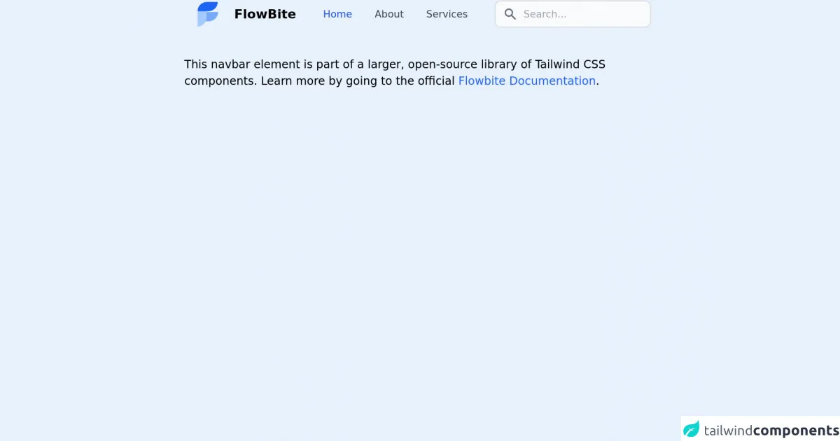
<p class="mt-5">This navbar element is part of a larger, open-source library of Tailwind CSS components. Learn more by going to the official <a class="text-blue-600 hover:underline" href="https://flowbite.com/docs/getting-started/introduction/" target="_blank">Flowbite Documentation</a>.</p>
</div>
<script src="https://unpkg.com/@themesberg/[email protected]/dist/flowbite.bundle.js"></script>
How to Create a Responsive Tailwind CSS Navbar with Tailwind CSS?
To create a responsive Tailwind CSS navbar with Tailwind CSS, follow these steps:
Step 1: Create a Navbar Container
The first step is to create a container for the navbar. You can use the nav element for this purpose.
<nav class="bg-white flex justify-between py-4 px-6 border-b">
</nav>
Step 2: Add Logo and Website Name
Next, you can add the logo and website name to the left side of the navbar. You can use the flex and items-center utility classes to align the logo and website name vertically.
<nav class="bg-white flex justify-between py-4 px-6 border-b">
  <div class="flex items-center">
    <img src="logo.png" alt="Logo" class="h-8">
    <h1 class="text-lg font-bold ml-2">My Website</h1>
  </div>
</nav>
Step 3: Add Navbar Items
Next, you can add the navbar items to the right side of the navbar. You can use the flex and items-center utility classes to align the navbar items vertically.
<nav class="bg-white flex justify-between py-4 px-6 border-b">
  <div class="flex items-center">
    <img src="logo.png" alt="Logo" class="h-8">
    <h1 class="text-lg font-bold ml-2">My Website</h1>
  </div>
  <div class="flex items-center">
    <a href="#" class="text-gray-600 hover:text-gray-800 px-3 py-2">Home</a>
    <a href="#" class="text-gray-600 hover:text-gray-800 px-3 py-2">About</a>
    <a href="#" class="text-gray-600 hover:text-gray-800 px-3 py-2">Contact</a>
  </div>
</nav>
Step 4: Style the Navbar
Finally, you can style the navbar using Tailwind CSS utility classes. You can use the bg-white, flex, justify-between, py-4, px-6, and border-b utility classes to style the navbar.
<nav class="bg-white flex justify-between py-4 px-6 border-b">
  <div class="flex items-center">
    <img src="logo.png" alt="Logo" class="h-8">
    <h1 class="text-lg font-bold ml-2">My Website</h1>
  </div>
  <div class="flex items-center">
    <a href="#" class="text-gray-600 hover:text-gray-800 px-3 py-2">Home</a>
    <a href="#" class="text-gray-600 hover:text-gray-800 px-3 py-2">About</a>
    <a href="#" class="text-gray-600 hover:text-gray-800 px-3 py-2">Contact</a>
  </div>
</nav>
Conclusion
In conclusion, creating a responsive Tailwind CSS navbar is easy with Tailwind CSS. By using the pre-defined utility classes, you can create a custom design that is optimized for all devices and screen sizes. With these 6 ideas, you can create a responsive Tailwind CSS navbar like a pro.