- Published on
Here Are 6 Ways To Create A Responsive Table With Tailwind CSS
- What is Tailwind CSS?
- The description of Responsive Table UI component
- Why use Tailwind CSS to create a Responsive Table UI component?
- The preview of Responsive Table UI component
- The source code of Responsive Table UI component
- How to create a Responsive Table with Tailwind CSS?
- 1. Using the table-auto class
- 2. Using the table-fixed class
- 3. Using the hidden class
- 4. Using the truncate class
- 5. Using the text-center class
- 6. Using custom CSS
- Conclusion
In today's digital world, responsive design has become a necessity. With the increasing use of mobile and tablet devices, it is important to create websites that can adapt to different screen sizes. One of the most common UI components on a website is a table. However, tables can be difficult to make responsive. In this article, we will explore six ways to create a responsive table with Tailwind CSS.
What is Tailwind CSS?
Tailwind CSS is a utility-first CSS framework that provides a set of pre-defined classes for common CSS properties. It allows developers to quickly create responsive and customizable UI components without writing custom CSS. Tailwind CSS is gaining popularity among developers due to its ease of use and flexibility.
The description of Responsive Table UI component
A responsive table is a table that can adapt to different screen sizes. When viewed on a small screen, the table should be displayed in a way that is easy to read and navigate. This can be achieved by hiding certain columns or rows, or by displaying them in a different format.
Why use Tailwind CSS to create a Responsive Table UI component?
Tailwind CSS provides a set of pre-defined classes that can be used to create a responsive table. This saves developers time and effort, as they do not have to write custom CSS. Tailwind CSS also provides a consistent and customizable design system, which ensures that the table looks good on all devices.
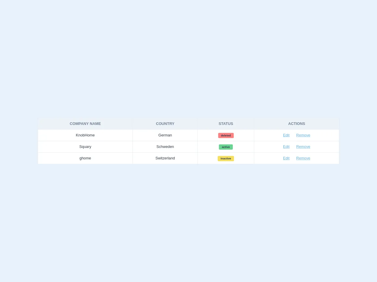
The preview of Responsive Table UI component
Creating a responsive table with Tailwind CSS is easy. Here is a preview of what the table will look like:
Free download of the Responsive Table's source code
The source code of Responsive Table UI component
To create a responsive table with Tailwind CSS, you can use a combination of pre-defined classes. Here is an example of the source code:
<table class="border-collapse w-full">
    <thead>
        <tr>
            <th class="p-3 font-bold uppercase bg-gray-200 text-gray-600 border border-gray-300 hidden lg:table-cell">Company name</th>
            <th class="p-3 font-bold uppercase bg-gray-200 text-gray-600 border border-gray-300 hidden lg:table-cell">Country</th>
            <th class="p-3 font-bold uppercase bg-gray-200 text-gray-600 border border-gray-300 hidden lg:table-cell">Status</th>
            <th class="p-3 font-bold uppercase bg-gray-200 text-gray-600 border border-gray-300 hidden lg:table-cell">Actions</th>
        </tr>
    </thead>
    <tbody>
        <tr class="bg-white lg:hover:bg-gray-100 flex lg:table-row flex-row lg:flex-row flex-wrap lg:flex-no-wrap mb-10 lg:mb-0">
            <td class="w-full lg:w-auto p-3 text-gray-800 text-center border border-b block lg:table-cell relative lg:static">
                <span class="lg:hidden absolute top-0 left-0 bg-blue-200 px-2 py-1 text-xs font-bold uppercase">Company name</span>
                KnobHome
            </td>
            <td class="w-full lg:w-auto p-3 text-gray-800 text-center border border-b text-center block lg:table-cell relative lg:static">
                <span class="lg:hidden absolute top-0 left-0 bg-blue-200 px-2 py-1 text-xs font-bold uppercase">Country</span>
                German
            </td>
          	<td class="w-full lg:w-auto p-3 text-gray-800 text-center border border-b text-center block lg:table-cell relative lg:static">
                <span class="lg:hidden absolute top-0 left-0 bg-blue-200 px-2 py-1 text-xs font-bold uppercase">Status</span>
                <span class="rounded bg-red-400 py-1 px-3 text-xs font-bold">deleted</span>
          	</td>
            <td class="w-full lg:w-auto p-3 text-gray-800 text-center border border-b text-center block lg:table-cell relative lg:static">
                <span class="lg:hidden absolute top-0 left-0 bg-blue-200 px-2 py-1 text-xs font-bold uppercase">Actions</span>
                <a href="#" class="text-blue-400 hover:text-blue-600 underline">Edit</a>
                <a href="#" class="text-blue-400 hover:text-blue-600 underline pl-6">Remove</a>
            </td>
        </tr>
        <tr class="bg-white lg:hover:bg-gray-100 flex lg:table-row flex-row lg:flex-row flex-wrap lg:flex-no-wrap mb-10 lg:mb-0">
            <td class="w-full lg:w-auto p-3 text-gray-800 text-center border border-b block lg:table-cell relative lg:static">
                <span class="lg:hidden absolute top-0 left-0 bg-blue-200 px-2 py-1 text-xs font-bold uppercase">Company name</span>
                Squary
            </td>
            <td class="w-full lg:w-auto p-3 text-gray-800 text-center border border-b text-center block lg:table-cell relative lg:static">
                <span class="lg:hidden absolute top-0 left-0 bg-blue-200 px-2 py-1 text-xs font-bold uppercase">Country</span>
                Schweden
            </td>
            <td class="w-full lg:w-auto p-3 text-gray-800 text-center border border-b text-center block lg:table-cell relative lg:static">
                <span class="lg:hidden absolute top-0 left-0 bg-blue-200 px-2 py-1 text-xs font-bold uppercase">Status</span>
                <span class="rounded bg-green-400 py-1 px-3 text-xs font-bold">active</span>
            </td>
            <td class="w-full lg:w-auto p-3 text-gray-800 text-center border border-b text-center block lg:table-cell relative lg:static">
                <span class="lg:hidden absolute top-0 left-0 bg-blue-200 px-2 py-1 text-xs font-bold uppercase">Actions</span>
                <a href="#" class="text-blue-400 hover:text-blue-600 underline">Edit</a>
                <a href="#" class="text-blue-400 hover:text-blue-600 underline pl-6">Remove</a>
            </td>
        </tr>
        <tr class="bg-white lg:hover:bg-gray-100 flex lg:table-row flex-row lg:flex-row flex-wrap lg:flex-no-wrap mb-10 lg:mb-0">
            <td class="w-full lg:w-auto p-3 text-gray-800 text-center border border-b block lg:table-cell relative lg:static">
                <span class="lg:hidden absolute top-0 left-0 bg-blue-200 px-2 py-1 text-xs font-bold uppercase">Company name</span>
				ghome
            </td>
            <td class="w-full lg:w-auto p-3 text-gray-800 text-center border border-b text-center block lg:table-cell relative lg:static">
                <span class="lg:hidden absolute top-0 left-0 bg-blue-200 px-2 py-1 text-xs font-bold uppercase">Country</span>
                Switzerland
            </td>
            <td class="w-full lg:w-auto p-3 text-gray-800 text-center border border-b text-center block lg:table-cell relative lg:static">
                <span class="lg:hidden absolute top-0 left-0 bg-blue-200 px-2 py-1 text-xs font-bold uppercase">Status</span>
                <span class="rounded bg-yellow-400 py-1 px-3 text-xs font-bold">inactive</span>
            </td>
            <td class="w-full lg:w-auto p-3 text-gray-800 text-center border border-b text-center block lg:table-cell relative lg:static">
                <span class="lg:hidden absolute top-0 left-0 bg-blue-200 px-2 py-1 text-xs font-bold uppercase">Actions</span>
                <a href="#" class="text-blue-400 hover:text-blue-600 underline">Edit</a>
                <a href="#" class="text-blue-400 hover:text-blue-600 underline pl-6">Remove</a>
            </td>
        </tr>
    </tbody>
</table>
How to create a Responsive Table with Tailwind CSS?
Now that we have an understanding of what a responsive table is and why we should use Tailwind CSS to create it, let's dive into the six ways to create a responsive table.
1. Using the table-auto class
The table-auto class is a pre-defined class in Tailwind CSS that sets the table's width to fit its content. This class is useful when you have a table with varying column widths. To make the table responsive, you can wrap it in a div element with the overflow-x-auto class. This will enable horizontal scrolling on small screens.
2. Using the table-fixed class
The table-fixed class is another pre-defined class in Tailwind CSS that sets the table's width to a fixed value. This class is useful when you have a table with a fixed number of columns. To make the table responsive, you can wrap it in a div element with the overflow-x-auto class.
3. Using the hidden class
The hidden class is a pre-defined class in Tailwind CSS that hides an element. You can use this class to hide certain columns on small screens. To do this, you can add the hidden class to the th and td elements of the column you want to hide.
4. Using the truncate class
The truncate class is a pre-defined class in Tailwind CSS that truncates text that overflows its container. You can use this class to truncate text in a table cell on small screens. To do this, you can add the truncate class to the td element.
5. Using the text-center class
The text-center class is a pre-defined class in Tailwind CSS that centers text horizontally. You can use this class to center text in a table cell on small screens. To do this, you can add the text-center class to the td element.
6. Using custom CSS
If none of the above methods work for your specific use case, you can write custom CSS to make the table responsive. However, it is recommended to use the pre-defined classes in Tailwind CSS as much as possible to maintain consistency and reduce code bloat.
Conclusion
In this article, we explored six ways to create a responsive table with Tailwind CSS. Tailwind CSS provides a set of pre-defined classes that can be used to create a responsive and customizable design system. By using these classes, developers can save time and effort and ensure that their tables look good on all devices.