- Published on
Best Ways To Create A Responsive Employee Card With Tailwind CSS
- What is Tailwind CSS?
- The description of Responsive Employee Card ui component
- Why use Tailwind CSS to create a Responsive Employee Card ui component?
- The preview of Responsive Employee Card ui component.
- The source code of Responsive Employee Card ui component.
- How to create a Responsive Employee Card with Tailwind CSS?
- Conclusion
In today's world, responsive design has become a necessity for web developers. With the increasing number of mobile users, it is important to make sure that your website is accessible and user-friendly on all devices. In this article, we will discuss the best ways to create a responsive employee card with Tailwind CSS.
What is Tailwind CSS?
Tailwind CSS is a utility-first CSS framework that makes it easy to create responsive designs. It provides a set of pre-defined classes that can be used to style HTML elements. With Tailwind CSS, you can create complex layouts and designs without writing custom CSS code.
The description of Responsive Employee Card ui component
A responsive employee card is a UI component that displays information about an employee. It typically includes a photo, name, job title, and contact information. The card should be responsive, meaning that it should adjust its layout and size based on the device screen size.
Why use Tailwind CSS to create a Responsive Employee Card ui component?
Tailwind CSS provides a set of pre-defined classes that can be used to create a responsive employee card quickly and easily. It eliminates the need to write custom CSS code, which saves time and reduces the chance of errors. Additionally, Tailwind CSS provides a consistent design language, making it easy to maintain and update the UI component.
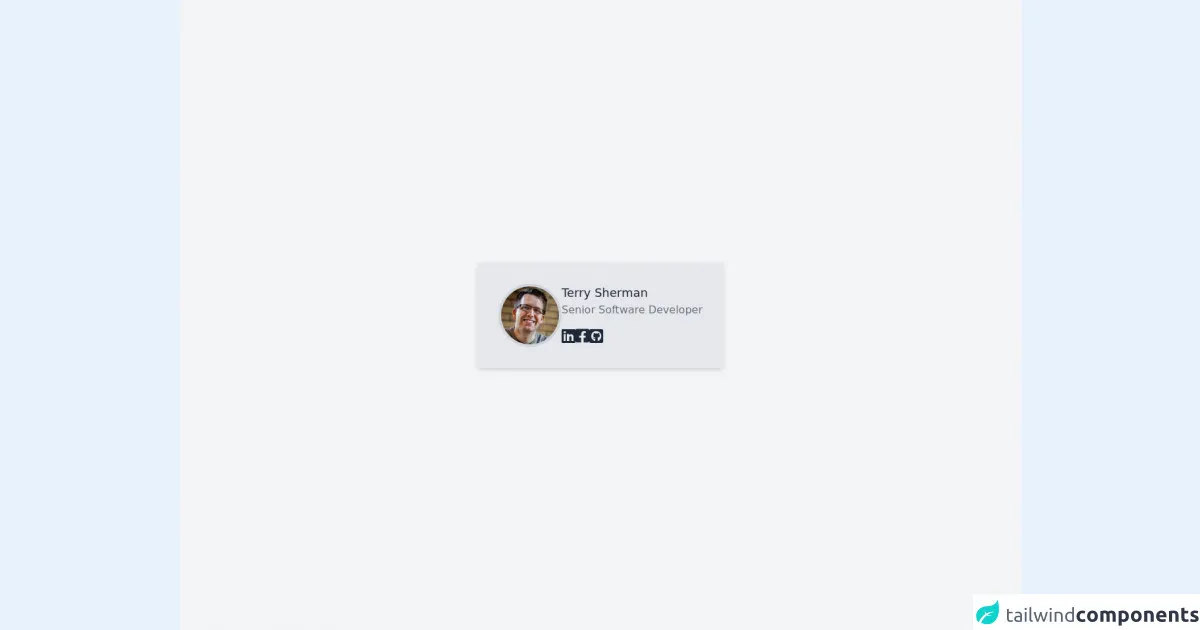
The preview of Responsive Employee Card ui component.
To create a responsive employee card with Tailwind CSS, we will use a combination of flexbox and grid layout. The card will adjust its layout and size based on the device screen size.
Free download of the Responsive Employee Card's source code
The source code of Responsive Employee Card ui component.
To create a responsive employee card with Tailwind CSS, we will use the following HTML and CSS code.
<link rel="stylesheet" href="https://pro.fontawesome.com/releases/v6.0.0-beta1/css/all.css" />

<div class="min-h-screen flex flex-col bg-gray-100">
  <div class="m-auto">
    <div class="flex flex-col bg-gray-200 max-w-sm shadow-md py-8 px-10 md:px-8 rounded-md">
      <div class="flex flex-col md:flex-row gap-6 md:gap-8">
        <img class="rounded-full border-4 border-gray-300 h-24 w-24 mx-auto" src="https://randomuser.me/api/portraits/men/78.jpg" alt="" />
        <div class="flex flex-col text-center md:text-left">
          <div class="font-medium text-lg text-gray-800">Terry Sherman</div>
          <div class="text-gray-500 mb-3 whitespace-nowrap">Senior Software Developer</div>
          <div class="flex flex-row gap-4 text-gray-800 my-auto text-2xl mx-auto md:mx-0">
            <a class="hover:cursor-pointer hover:text-blue-500"><i class="fab fa-linkedin"></i></a>
            <a class="hover:cursor-pointer hover:text-blue-500"><i class="fab fa-facebook-square"></i></a>
            <a class="hover:cursor-pointer hover:text-blue-500"><i class="fab fa-github-square"></i></a>
          </div>
        </div>
      </div>
    </div>
  </div>
</div>
How to create a Responsive Employee Card with Tailwind CSS?
To create a responsive employee card with Tailwind CSS, follow these steps:
Create a new HTML file and add the necessary HTML elements for the employee card, such as an image, name, job title, and contact information.
Add the necessary Tailwind CSS classes to the HTML elements to style the employee card. For example, you can use the
flexandgridclasses to create a responsive layout.Test the employee card on different devices to make sure that it is responsive and user-friendly.
Conclusion
Creating a responsive employee card with Tailwind CSS is easy and efficient. By using pre-defined classes, you can create complex layouts and designs without writing custom CSS code. Additionally, Tailwind CSS provides a consistent design language, making it easy to maintain and update the UI component. With these tips, you can create a responsive employee card that looks great on all devices.