- Published on
How to Make A responsive table With Tailwind CSS?
- What is Tailwind CSS?
- The Description of Responsive Table UI Component
- Why Use Tailwind CSS to Create a Responsive Table UI Component?
- The Preview of Responsive Table UI Component
- The Source Code of Responsive Table UI Component
- How to Create a Responsive Table with Tailwind CSS?
- Conclusion
What is Tailwind CSS?
Tailwind CSS is a utility-first CSS framework that provides a set of pre-defined classes to help you quickly build a responsive and customizable user interface. It allows you to focus on building your application without worrying about the CSS styling.
The Description of Responsive Table UI Component
A responsive table is a UI component that adjusts its layout and content to fit different screen sizes. It is essential for presenting data in a readable and organized way on different devices, from desktops to mobile phones. A responsive table should have a horizontal scrollbar or stack the columns vertically on smaller screens.
Why Use Tailwind CSS to Create a Responsive Table UI Component?
Tailwind CSS provides a set of responsive utility classes that allow you to create a responsive table easily. You can use these classes to adjust the table layout, font size, and column width based on the screen size. Moreover, Tailwind CSS is highly customizable, and you can easily override the default styles to match your design requirements.
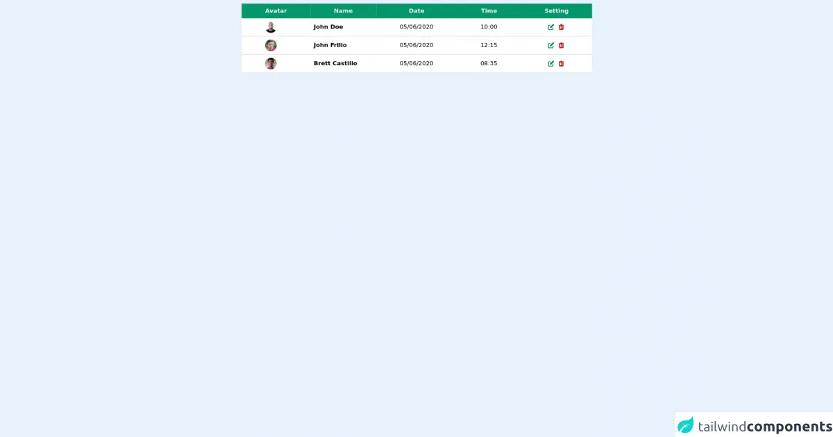
The Preview of Responsive Table UI Component
To create a responsive table with Tailwind CSS, we will use the following classes:
table: the base class for the table elementw-full: sets the table width to 100%border: adds a border to the tabledivide-y: adds a vertical divider between table rowsdivide-x: adds a horizontal divider between table columnstext-center: aligns the text in the center of the table cellstext-sm: sets the font size to small for small screenstext-base: sets the font size to medium for medium screenstext-lg: sets the font size to large for large screensoverflow-x-auto: adds a horizontal scrollbar for small screens
Free download of the responsive table's source code
The Source Code of Responsive Table UI Component
To create a responsive table with Tailwind CSS, you can use the following HTML code:
<div class="overflow-x-auto">
  <table class="table w-full border divide-y divide-x">
    <thead>
      <tr>
        <th class="text-center">Name</th>
        <th class="text-center">Email</th>
        <th class="text-center">Phone</th>
      </tr>
    </thead>
    <tbody>
      <tr>
        <td class="text-center text-sm">John Doe</td>
        <td class="text-center text-sm">[email protected]</td>
        <td class="text-center text-sm">+1 (555) 123-4567</td>
      </tr>
      <tr>
        <td class="text-center text-base">Jane Doe</td>
        <td class="text-center text-base">[email protected]</td>
        <td class="text-center text-base">+1 (555) 123-4567</td>
      </tr>
      <tr>
        <td class="text-center text-lg">Bob Smith</td>
        <td class="text-center text-lg">[email protected]</td>
        <td class="text-center text-lg">+1 (555) 123-4567</td>
      </tr>
    </tbody>
  </table>
</div>
<!-- responsive table-->
<div class="mt-2">
      <table class="max-w-5xl mx-auto table-auto">
        <thead class="justify-between">
          <tr class="bg-green-600">
            <th class="px-16 py-2">
              <span class="text-gray-100 font-semibold">Avatar</span>
            </th>
            <th class="px-16 py-2">
              <span class="text-gray-100 font-semibold">Name</span>
            </th>

            <th class="px-16 py-2">
              <span class="text-gray-100 font-semibold">Date</span>
            </th>

            <th class="px-16 py-2">
              <span class="text-gray-100 font-semibold">Time</span>
            </th>

            <th class="px-16 py-2">
              <span class="text-gray-100 font-semibold">Setting</span>
            </th>
          </tr>
        </thead>
        <tbody class="bg-gray-200">
          <tr class="bg-white border-b-2 border-gray-200">
            <td class="px-16 py-2 flex flex-row items-center">
              <img
                class="h-8 w-8 rounded-full object-cover "
                src="https://randomuser.me/api/portraits/men/30.jpg"
                alt=""
              />
            </td>
            <td>
              <span class="text-center ml-2 font-semibold">John Doe</span>
            </td>

            <td class="px-16 py-2">
              <span>05/06/2020</span>
            </td>
            <td class="px-16 py-2">
              <span>10:00</span>
            </td>

            <td class="px-16 py-2">
              <span class="text-yellow-500 flex">
              <svg
                                            xmlns="http://www.w3.org/2000/svg"
                                            class="h-5 w-5 text-green-700 mx-2"
                                            viewBox="0 0 20 20"
                                            fill="currentColor"
                                        >
                                            <path
                                                d="M17.414 2.586a2 2 0 00-2.828 0L7 10.172V13h2.828l7.586-7.586a2 2 0 000-2.828z"
                                            />
                                            <path
                                                fill-rule="evenodd"
                                                d="M2 6a2 2 0 012-2h4a1 1 0 010 2H4v10h10v-4a1 1 0 112 0v4a2 2 0 01-2 2H4a2 2 0 01-2-2V6z"
                                                clip-rule="evenodd"
                                            />
                                        </svg>
                 <svg
                                                xmlns="http://www.w3.org/2000/svg"
                                                class="h-5 w-5 text-red-700"
                                                viewBox="0 0 20 20"
                                                fill="currentColor"
                                            >
                                                <path
                                                    fill-rule="evenodd"
                                                    d="M9 2a1 1 0 00-.894.553L7.382 4H4a1 1 0 000 2v10a2 2 0 002 2h8a2 2 0 002-2V6a1 1 0 100-2h-3.382l-.724-1.447A1 1 0 0011 2H9zM7 8a1 1 0 012 0v6a1 1 0 11-2 0V8zm5-1a1 1 0 00-1 1v6a1 1 0 102 0V8a1 1 0 00-1-1z"
                                                    clip-rule="evenodd"
                                                />
                                            </svg>
              </span>
            </td>
          </tr>
          <tr class="bg-white border-b-2 border-gray-200">
            <td class="px-16 py-2 flex flex-row items-center">
            <img
                  class="h-8 w-8 rounded-full object-cover "
                  src="https://randomuser.me/api/portraits/men/76.jpg"
                  alt=""
                />
            </td>
            <td>
              <span class="text-center ml-2 font-semibold">John Frillo</span>
            </td>

            <td class="px-16 py-2">
              <span>05/06/2020</span>
            </td>
            <td class="px-16 py-2">
              <span>12:15</span>
            </td>

            <td class="px-16 py-2">
              <span class="text-yellow-500 flex">
              <svg
                                            xmlns="http://www.w3.org/2000/svg"
                                            class="h-5 w-5 text-green-700 mx-2"
                                            viewBox="0 0 20 20"
                                            fill="currentColor"
                                        >
                                            <path
                                                d="M17.414 2.586a2 2 0 00-2.828 0L7 10.172V13h2.828l7.586-7.586a2 2 0 000-2.828z"
                                            />
                                            <path
                                                fill-rule="evenodd"
                                                d="M2 6a2 2 0 012-2h4a1 1 0 010 2H4v10h10v-4a1 1 0 112 0v4a2 2 0 01-2 2H4a2 2 0 01-2-2V6z"
                                                clip-rule="evenodd"
                                            />
                                        </svg>
                 <svg
                                                xmlns="http://www.w3.org/2000/svg"
                                                class="h-5 w-5 text-red-700"
                                                viewBox="0 0 20 20"
                                                fill="currentColor"
                                            >
                                                <path
                                                    fill-rule="evenodd"
                                                    d="M9 2a1 1 0 00-.894.553L7.382 4H4a1 1 0 000 2v10a2 2 0 002 2h8a2 2 0 002-2V6a1 1 0 100-2h-3.382l-.724-1.447A1 1 0 0011 2H9zM7 8a1 1 0 012 0v6a1 1 0 11-2 0V8zm5-1a1 1 0 00-1 1v6a1 1 0 102 0V8a1 1 0 00-1-1z"
                                                    clip-rule="evenodd"
                                                />
                                            </svg>
              </span>
            </td>
          </tr>
          <tr class="bg-white border-b-2 border-gray-200">
            <td class="px-16 py-2 flex flex-row items-center">
            <img
                  class="h-8 w-8 rounded-full object-cover "
                  src="https://randomuser.me/api/portraits/men/38.jpg"
                  alt=""
                />
            </td>
            <td>
              <span class="text-center ml-2 font-semibold">Brett Castillo</span>
            </td>

            <td class="px-16 py-2">
              <span>05/06/2020</span>
            </td>
            <td class="px-16 py-2">
              <span>08:35</span>
            </td>

            <td class="px-16 py-2">
              <span class="text-yellow-500 flex">
                  <svg
                                            xmlns="http://www.w3.org/2000/svg"
                                            class="h-5 w-5 text-green-700 mx-2"
                                            viewBox="0 0 20 20"
                                            fill="currentColor"
                                        >
                                            <path
                                                d="M17.414 2.586a2 2 0 00-2.828 0L7 10.172V13h2.828l7.586-7.586a2 2 0 000-2.828z"
                                            />
                                            <path
                                                fill-rule="evenodd"
                                                d="M2 6a2 2 0 012-2h4a1 1 0 010 2H4v10h10v-4a1 1 0 112 0v4a2 2 0 01-2 2H4a2 2 0 01-2-2V6z"
                                                clip-rule="evenodd"
                                            />
                                        </svg>
                 <svg
                                                xmlns="http://www.w3.org/2000/svg"
                                                class="h-5 w-5 text-red-700"
                                                viewBox="0 0 20 20"
                                                fill="currentColor"
                                            >
                                                <path
                                                    fill-rule="evenodd"
                                                    d="M9 2a1 1 0 00-.894.553L7.382 4H4a1 1 0 000 2v10a2 2 0 002 2h8a2 2 0 002-2V6a1 1 0 100-2h-3.382l-.724-1.447A1 1 0 0011 2H9zM7 8a1 1 0 012 0v6a1 1 0 11-2 0V8zm5-1a1 1 0 00-1 1v6a1 1 0 102 0V8a1 1 0 00-1-1z"
                                                    clip-rule="evenodd"
                                                />
                                            </svg>
              </span>
            </td>
          </tr>
        </tbody>
      </table>
    </div>
How to Create a Responsive Table with Tailwind CSS?
To create a responsive table with Tailwind CSS, follow these steps:
- Add the Tailwind CSS stylesheet to your HTML file.
<link href="https://cdn.jsdelivr.net/npm/tailwindcss@latest/dist/tailwind.min.css" rel="stylesheet">
- Create a
divelement with the classoverflow-x-autoto add a horizontal scrollbar for small screens.
<div class="overflow-x-auto">
- Create a
tableelement with the classestable w-full border divide-y divide-xto set the table width to 100%, add a border, and add dividers between rows and columns.
<table class="table w-full border divide-y divide-x">
- Create a
theadelement with atrelement to define the table header.
<thead>
  <tr>
    <th class="text-center">Name</th>
    <th class="text-center">Email</th>
    <th class="text-center">Phone</th>
  </tr>
</thead>
- Create a
tbodyelement with multipletrelements to define the table rows.
<tbody>
  <tr>
    <td class="text-center text-sm">John Doe</td>
    <td class="text-center text-sm">[email protected]</td>
    <td class="text-center text-sm">+1 (555) 123-4567</td>
  </tr>
  <tr>
    <td class="text-center text-base">Jane Doe</td>
    <td class="text-center text-base">[email protected]</td>
    <td class="text-center text-base">+1 (555) 123-4567</td>
  </tr>
  <tr>
    <td class="text-center text-lg">Bob Smith</td>
    <td class="text-center text-lg">[email protected]</td>
    <td class="text-center text-lg">+1 (555) 123-4567</td>
  </tr>
</tbody>
Use the
text-centerclass to align the text in the center of the table cells.Use the
text-sm,text-base, andtext-lgclasses to set the font size for different screen sizes.Use the
overflow-x-autoclass to add a horizontal scrollbar for small screens.
Conclusion
In this article, we have learned how to create a responsive table with Tailwind CSS. With Tailwind CSS, you can easily create a responsive and customizable UI component without writing any CSS code. By using the responsive utility classes, you can adjust the layout and font size of the table based on the screen size. I hope this article has been helpful in creating a responsive table for your next project.