- Published on
A Complete Guide To Build A responsive table With Tailwind CSS
- What is Tailwind CSS?
- The Description of Responsive Table UI Component
- Why Use Tailwind CSS to Create a Responsive Table UI Component?
- The Preview of Responsive Table UI Component
- The Source Code of Responsive Table UI Component
- How to Create a Responsive Table with Tailwind CSS?
- Step 1: Set up the HTML structure
- Step 2: Add Tailwind CSS classes
- Step 3: Add media queries
- Conclusion
As a FrontEnd technology blogger, it is important to stay up-to-date with the latest tools and techniques for creating responsive and user-friendly interfaces. One such tool that has gained popularity in recent times is Tailwind CSS. In this article, we will explore how to build a responsive table using Tailwind CSS.
What is Tailwind CSS?
Tailwind CSS is a utility-first CSS framework that allows developers to quickly build custom user interfaces. It provides a set of pre-defined classes that can be used to style HTML elements. Tailwind CSS is designed to be highly customizable, allowing developers to create unique designs without writing custom CSS.
The Description of Responsive Table UI Component
A responsive table is a UI component that adjusts its layout based on the screen size of the device. It is an essential component for displaying data in a tabular format on websites and applications. A responsive table should be able to adjust its layout to fit the screen size of the device, without sacrificing the readability of the data.
Why Use Tailwind CSS to Create a Responsive Table UI Component?
Tailwind CSS provides a set of pre-defined classes that can be used to create a responsive table UI component quickly. These classes are designed to work together seamlessly, making it easy to create complex layouts without writing custom CSS. Tailwind CSS also provides a responsive design system that allows developers to create designs that adapt to different screen sizes.
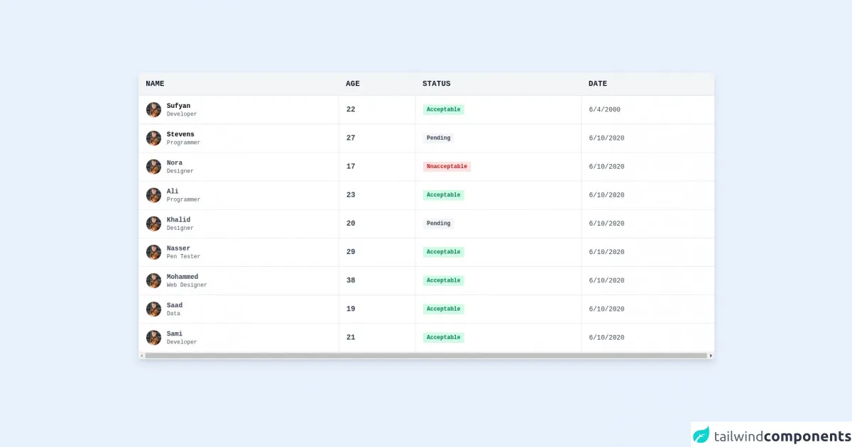
The Preview of Responsive Table UI Component
To create a responsive table UI component, we will be using Tailwind CSS. The table will adjust its layout based on the screen size of the device. Here is a preview of what the responsive table UI component will look like:
Free download of the responsive table's source code
The Source Code of Responsive Table UI Component
To create a responsive table UI component, we will be using HTML and Tailwind CSS. The HTML will define the structure of the table, and the Tailwind CSS classes will be used to style the table. Here is the source code of the responsive table UI component:
<section class="container mx-auto p-6 font-mono">
  <div class="w-full mb-8 overflow-hidden rounded-lg shadow-lg">
    <div class="w-full overflow-x-auto">
      <table class="w-full">
        <thead>
          <tr class="text-md font-semibold tracking-wide text-left text-gray-900 bg-gray-100 uppercase border-b border-gray-600">
            <th class="px-4 py-3">Name</th>
            <th class="px-4 py-3">Age</th>
            <th class="px-4 py-3">Status</th>
            <th class="px-4 py-3">Date</th>
          </tr>
        </thead>
        <tbody class="bg-white">
          <tr class="text-gray-700">
            <td class="px-4 py-3 border">
              <div class="flex items-center text-sm">
                <div class="relative w-8 h-8 mr-3 rounded-full md:block">
                  <img class="object-cover w-full h-full rounded-full" src="https://images.pexels.com/photos/5212324/pexels-photo-5212324.jpeg?auto=compress&cs=tinysrgb&dpr=3&h=750&w=1260" alt="" loading="lazy" />
                  <div class="absolute inset-0 rounded-full shadow-inner" aria-hidden="true"></div>
                </div>
                <div>
                  <p class="font-semibold text-black">Sufyan</p>
                  <p class="text-xs text-gray-600">Developer</p>
                </div>
              </div>
            </td>
            <td class="px-4 py-3 text-ms font-semibold border">22</td>
            <td class="px-4 py-3 text-xs border">
              <span class="px-2 py-1 font-semibold leading-tight text-green-700 bg-green-100 rounded-sm"> Acceptable </span>
            </td>
            <td class="px-4 py-3 text-sm border">6/4/2000</td>
          </tr>
          <tr class="text-gray-700">
            <td class="px-4 py-3 border">
              <div class="flex items-center text-sm">
                <div class="relative w-8 h-8 mr-3 rounded-full">
                  <img class="object-cover w-full h-full rounded-full" src="https://images.pexels.com/photos/5212324/pexels-photo-5212324.jpeg?auto=compress&cs=tinysrgb&dpr=3&h=750&w=1260" alt="" loading="lazy" />
                  <div class="absolute inset-0 rounded-full shadow-inner" aria-hidden="true"></div>
                </div>
                <div>
                  <p class="font-semibold text-black">Stevens</p>
                  <p class="text-xs text-gray-600">Programmer</p>
                </div>
              </div>
            </td>
            <td class="px-4 py-3 text-md font-semibold border">27</td>
            <td class="px-4 py-3 text-xs border">
              <span class="px-2 py-1 font-semibold leading-tight text-orange-700 bg-gray-100 rounded-sm"> Pending </span>
            </td>
            <td class="px-4 py-3 text-sm border">6/10/2020</td>
          </tr>
          <tr class="text-gray-700">
            <td class="px-4 py-3 border">
              <div class="flex items-center text-sm">
                <div class="relative w-8 h-8 mr-3 rounded-full">
                  <img class="object-cover w-full h-full rounded-full" src="https://images.pexels.com/photos/5212324/pexels-photo-5212324.jpeg?auto=compress&cs=tinysrgb&dpr=3&h=750&w=1260" alt="" loading="lazy" />
                  <div class="absolute inset-0 rounded-full shadow-inner" aria-hidden="true"></div>
                </div>
                <div>
                  <p class="font-semibold">Nora</p>
                  <p class="text-xs text-gray-600">Designer</p>
                </div>
              </div>
            </td>
            <td class="px-4 py-3 text-md font-semibold border">17</td>
            <td class="px-4 py-3 text-xs border">
              <span class="px-2 py-1 font-semibold leading-tight text-red-700 bg-red-100 rounded-sm"> Nnacceptable </span>
            </td>
            <td class="px-4 py-3 text-sm border">6/10/2020</td>
          </tr>
          <tr class="text-gray-700">
            <td class="px-4 py-3 border">
              <div class="flex items-center text-sm">
                <div class="relative w-8 h-8 mr-3 rounded-full">
                  <img class="object-cover w-full h-full rounded-full" src="https://images.pexels.com/photos/5212324/pexels-photo-5212324.jpeg?auto=compress&cs=tinysrgb&dpr=3&h=750&w=1260" alt="" loading="lazy" />
                  <div class="absolute inset-0 rounded-full shadow-inner" aria-hidden="true"></div>
                </div>
                <div>
                  <p class="font-semibold">Ali</p>
                  <p class="text-xs text-gray-600">Programmer</p>
                </div>
              </div>
            </td>
            <td class="px-4 py-3 border text-md font-semibold">23</td>
            <td class="px-4 py-3 border text-xs">
              <span class="px-2 py-1 font-semibold leading-tight text-green-700 bg-green-100 rounded-sm"> Acceptable </span>
            </td>
            <td class="px-4 py-3 border text-sm">6/10/2020</td>
          </tr>
          <tr class="text-gray-700">
            <td class="px-4 py-3 border">
              <div class="flex items-center text-sm">
                <div class="relative w-8 h-8 mr-3 rounded-full">
                  <img class="object-cover w-full h-full rounded-full" src="https://images.pexels.com/photos/5212324/pexels-photo-5212324.jpeg?auto=compress&cs=tinysrgb&dpr=3&h=750&w=1260" alt="" loading="lazy" />
                  <div class="absolute inset-0 rounded-full shadow-inner" aria-hidden="true"></div>
                </div>
                <div>
                  <p class="font-semibold">Khalid</p>
                  <p class="text-xs text-gray-600">Designer</p>
                </div>
              </div>
            </td>
            <td class="px-4 py-3 border text-md font-semibold">20</td>
            <td class="px-4 py-3 border text-xs">
              <span class="px-2 py-1 font-semibold leading-tight text-gray-700 bg-gray-100 rounded-sm"> Pending </span>
            </td>
            <td class="px-4 py-3 border text-sm">6/10/2020</td>
          </tr>
          <tr class="text-gray-700">
            <td class="px-4 py-3 border">
              <div class="flex items-center text-sm">
                <div class="relative w-8 h-8 mr-3 rounded-full">
                  <img class="object-cover w-full h-full rounded-full" src="https://images.pexels.com/photos/5212324/pexels-photo-5212324.jpeg?auto=compress&cs=tinysrgb&dpr=3&h=750&w=1260" alt="" loading="lazy" />
                  <div class="absolute inset-0 rounded-full shadow-inner" aria-hidden="true"></div>
                </div>
                <div>
                  <p class="font-semibold">Nasser</p>
                  <p class="text-xs text-gray-600">Pen Tester</p>
                </div>
              </div>
            </td>
            <td class="px-4 py-3 border text-md font-semibold">29</td>
            <td class="px-4 py-3 border text-xs">
              <span class="px-2 py-1 font-semibold leading-tight text-green-700 bg-green-100 rounded-sm"> Acceptable </span>
            </td>
            <td class="px-4 py-3 border text-sm">6/10/2020</td>
          </tr>
          <tr class="text-gray-700">
            <td class="px-4 py-3 border">
              <div class="flex items-center text-sm">
                <div class="relative w-8 h-8 mr-3 rounded-full">
                  <img class="object-cover w-full h-full rounded-full" src="https://images.pexels.com/photos/5212324/pexels-photo-5212324.jpeg?auto=compress&cs=tinysrgb&dpr=3&h=750&w=1260" alt="" loading="lazy" />
                  <div class="absolute inset-0 rounded-full shadow-inner" aria-hidden="true"></div>
                </div>
                <div>
                  <p class="font-semibold">Mohammed</p>
                  <p class="text-xs text-gray-600">Web Designer</p>
                </div>
              </div>
            </td>
            <td class="px-4 py-3 border text-md font-semibold">38</td>
            <td class="px-4 py-3 border text-xs">
              <span class="px-2 py-1 font-semibold leading-tight text-green-700 bg-green-100 rounded-sm"> Acceptable </span>
            </td>
            <td class="px-4 py-3 border text-sm">6/10/2020</td>
          </tr>
          <tr class="text-gray-700">
            <td class="px-4 py-3 border">
              <div class="flex items-center text-sm">
                <div class="relative w-8 h-8 mr-3 rounded-full">
                  <img class="object-cover w-full h-full rounded-full" src="https://images.pexels.com/photos/5212324/pexels-photo-5212324.jpeg?auto=compress&cs=tinysrgb&dpr=3&h=750&w=1260" alt="" loading="lazy" />
                  <div class="absolute inset-0 rounded-full shadow-inner" aria-hidden="true"></div>
                </div>
                <div>
                  <p class="font-semibold">Saad</p>
                  <p class="text-xs text-gray-600">Data</p>
                </div>
              </div>
            </td>
            <td class="px-4 py-3 border text-md font-semibold">19</td>
            <td class="px-4 py-3 border text-xs">
              <span class="px-2 py-1 font-semibold leading-tight text-green-700 bg-green-100 rounded-sm"> Acceptable </span>
            </td>
            <td class="px-4 py-3 border text-sm">6/10/2020</td>
          </tr>
          <tr class="text-gray-700">
            <td class="px-4 py-3 border">
              <div class="flex items-center text-sm">
                <div class="relative w-8 h-8 mr-3 rounded-full">
                  <img class="object-cover w-full h-full rounded-full" src="https://images.pexels.com/photos/5212324/pexels-photo-5212324.jpeg?auto=compress&cs=tinysrgb&dpr=3&h=750&w=1260" alt="" loading="lazy" />
                  <div class="absolute inset-0 rounded-full shadow-inner" aria-hidden="true"></div>
                </div>
                <div>
                  <p class="font-semibold">Sami</p>
                  <p class="text-xs text-gray-600">Developer</p>
                </div>
              </div>
            </td>
            <td class="px-4 py-3 border text-md font-semibold">21</td>
            <td class="px-4 py-3 border text-xs">
              <span class="px-2 py-1 font-semibold leading-tight text-green-700 bg-green-100 rounded-sm"> Acceptable </span>
            </td>
            <td class="px-4 py-3 border text-sm">6/10/2020</td>
          </tr>
        </tbody>
      </table>
    </div>
  </div>
</section>
How to Create a Responsive Table with Tailwind CSS?
To create a responsive table with Tailwind CSS, follow these steps:
Step 1: Set up the HTML structure
The first step is to set up the HTML structure of the table. Here is an example of the HTML structure:
<div class="overflow-x-auto">
  <table class="table-auto">
    <thead>
      <tr>
        <th class="px-4 py-2">Name</th>
        <th class="px-4 py-2">Age</th>
        <th class="px-4 py-2">Email</th>
        <th class="px-4 py-2">Phone</th>
      </tr>
    </thead>
    <tbody>
      <tr>
        <td class="border px-4 py-2">John Doe</td>
        <td class="border px-4 py-2">25</td>
        <td class="border px-4 py-2">[email protected]</td>
        <td class="border px-4 py-2">+1 (555) 555-5555</td>
      </tr>
      <tr>
        <td class="border px-4 py-2">Jane Doe</td>
        <td class="border px-4 py-2">30</td>
        <td class="border px-4 py-2">[email protected]</td>
        <td class="border px-4 py-2">+1 (555) 555-5555</td>
      </tr>
    </tbody>
  </table>
</div>
In this example, we have used the table-auto class to set the width of the table to auto. We have also used the px-4 and py-2 classes to add padding to the table cells.
Step 2: Add Tailwind CSS classes
The next step is to add Tailwind CSS classes to the HTML elements to style the table. Here is an example of the Tailwind CSS classes that can be used:
<div class="overflow-x-auto">
  <table class="table-auto">
    <thead>
      <tr>
        <th class="px-4 py-2 bg-gray-100 text-left text-xs leading-4 font-medium text-gray-500 uppercase tracking-wider">Name</th>
        <th class="px-4 py-2 bg-gray-100 text-left text-xs leading-4 font-medium text-gray-500 uppercase tracking-wider">Age</th>
        <th class="px-4 py-2 bg-gray-100 text-left text-xs leading-4 font-medium text-gray-500 uppercase tracking-wider">Email</th>
        <th class="px-4 py-2 bg-gray-100 text-left text-xs leading-4 font-medium text-gray-500 uppercase tracking-wider">Phone</th>
      </tr>
    </thead>
    <tbody>
      <tr>
        <td class="border px-4 py-2">{{__placeholder3__}}</td>
        <td class="border px-4 py-2">{{__placeholder4__}}</td>
        <td class="border px-4 py-2">{{__placeholder5__}}</td>
        <td class="border px-4 py-2">{{__placeholder6__}}</td>
      </tr>
      <tr>
        <td class="border px-4 py-2">{{__placeholder7__}}</td>
        <td class="border px-4 py-2">{{__placeholder8__}}</td>
        <td class="border px-4 py-2">{{__placeholder9__}}</td>
        <td class="border px-4 py-2">{{__placeholder10__}}</td>
      </tr>
    </tbody>
  </table>
</div>
In this example, we have used the bg-gray-100 class to set the background color of the table header. We have also used the text-left class to align the text to the left and the text-xs class to set the font size of the text to extra small.
Step 3: Add media queries
The final step is to add media queries to adjust the layout of the table based on the screen size of the device. Here is an example of the media queries that can be used:
@media (min-width: 640px) {
  .table-auto {
    width: 100%;
  }
}

@media (min-width: 768px) {
  .table-auto {
    width: 100%;
  }
}

@media (min-width: 1024px) {
  .table-auto {
    width: 100%;
  }
}
In this example, we have used media queries to set the width of the table to 100% for screen sizes larger than 640px, 768px, and 1024px.
Conclusion
In this article, we have explored how to create a responsive table UI component using Tailwind CSS. We have discussed the benefits of using Tailwind CSS and provided a step-by-step guide to creating a responsive table. With Tailwind CSS, developers can create custom user interfaces quickly and efficiently, without sacrificing the readability of the data.