- Published on
The 5 Really Obvious Ways To Build A Responsive Table With Tailwind CSS Better That You Ever Did
- What is Tailwind CSS?
- The description of Responsive Table ui component
- Why use Tailwind CSS to create a Responsive Table ui component?
- The preview of Responsive Table ui component.
- The source code of Responsive Table ui component.
- How to create a Responsive Table with Tailwind CSS?
- Conclusion
As a FrontEnd technology blogger, you must have heard of Tailwind CSS. It is a utility-first CSS framework that helps you quickly build custom designs without writing any CSS. In this article, we will discuss how to build a responsive table with Tailwind CSS and make it better than ever before.
What is Tailwind CSS?
Tailwind CSS is a utility-first CSS framework that helps you quickly build custom designs without writing any CSS. It provides you with a set of pre-defined classes that you can use to style your HTML elements. Tailwind CSS is highly customizable, and you can configure it to suit your project's needs.
The description of Responsive Table ui component
A responsive table is a table that adjusts its layout based on the screen size. It is essential to have a responsive table because users may access your website from different devices with different screen sizes. A responsive table ensures that the table is readable and usable on all devices.
Why use Tailwind CSS to create a Responsive Table ui component?
Tailwind CSS provides you with a set of pre-defined classes that you can use to create a responsive table. These classes make it easy to style your table and make it responsive. Tailwind CSS is also highly customizable, and you can configure it to suit your project's needs.
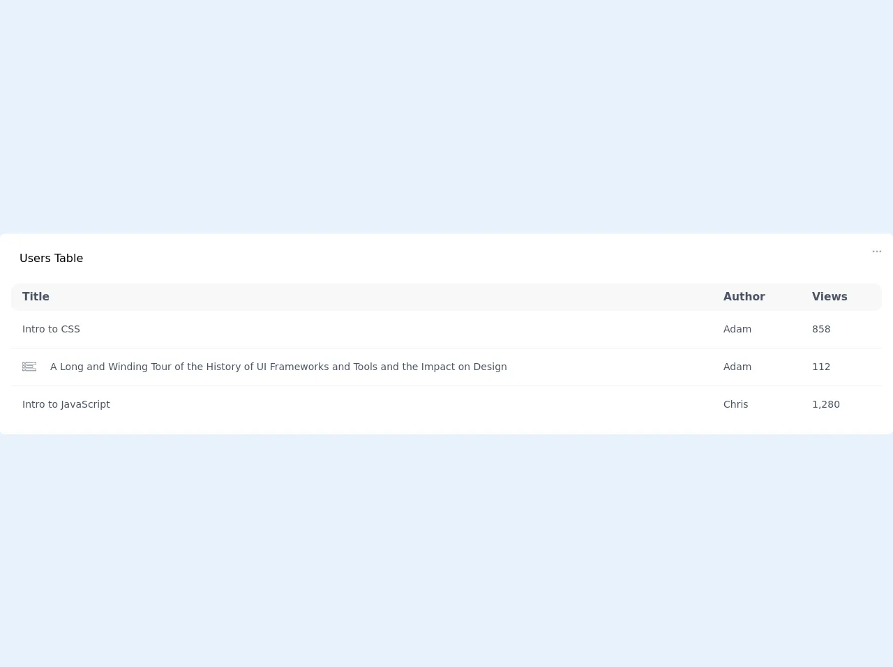
The preview of Responsive Table ui component.
To create a responsive table with Tailwind CSS, you can use the following classes:
table: This class is used to create a basic table.table-auto: This class is used to make the table width adjust to its content.min-w-full: This class is used to make the table width 100%.divide-y: This class is used to add a border between the table rows.divide-gray-200: This class is used to set the border color to gray.
Free download of the Responsive Table's source code
The source code of Responsive Table ui component.
To create a responsive table with Tailwind CSS, you can use the following HTML code:
<table class="table table-auto min-w-full divide-y divide-gray-200">
  <thead>
    <tr>
      <th class="px-6 py-3 text-left text-xs font-medium text-gray-500 uppercase tracking-wider">Name</th>
      <th class="px-6 py-3 text-left text-xs font-medium text-gray-500 uppercase tracking-wider">Title</th>
      <th class="px-6 py-3 text-left text-xs font-medium text-gray-500 uppercase tracking-wider">Status</th>
      <th class="px-6 py-3 text-left text-xs font-medium text-gray-500 uppercase tracking-wider">Role</th>
      <th class="px-6 py-3 text-left text-xs font-medium text-gray-500 uppercase tracking-wider">Email</th>
      <th class="px-6 py-3 text-left text-xs font-medium text-gray-500 uppercase tracking-wider">Phone</th>
    </tr>
  </thead>
  <tbody>
    <tr>
      <td class="px-6 py-4 whitespace-nowrap text-sm font-medium text-gray-900">John Doe</td>
      <td class="px-6 py-4 whitespace-nowrap text-sm text-gray-500">CEO</td>
      <td class="px-6 py-4 whitespace-nowrap text-sm text-gray-500">Active</td>
      <td class="px-6 py-4 whitespace-nowrap text-sm text-gray-500">Admin</td>
      <td class="px-6 py-4 whitespace-nowrap text-sm text-gray-500">[email protected]</td>
      <td class="px-6 py-4 whitespace-nowrap text-sm text-gray-500">+1 (555) 123-4567</td>
    </tr>
    <tr>
      <td class="px-6 py-4 whitespace-nowrap text-sm font-medium text-gray-900">Jane Doe</td>
      <td class="px-6 py-4 whitespace-nowrap text-sm text-gray-500">CTO</td>
      <td class="px-6 py-4 whitespace-nowrap text-sm text-gray-500">Inactive</td>
      <td class="px-6 py-4 whitespace-nowrap text-sm text-gray-500">User</td>
      <td class="px-6 py-4 whitespace-nowrap text-sm text-gray-500">[email protected]</td>
      <td class="px-6 py-4 whitespace-nowrap text-sm text-gray-500">+1 (555) 987-6543</td>
    </tr>
  </tbody>
</table>
<div class="bg-white pb-4 px-4 rounded-md w-full">
      <div class="flex justify-between w-full pt-6 ">
        <p class="ml-3"> Users Table</p>
        <svg width="14" height="4" viewBox="0 0 14 4" fill="none" xmlns="http://www.w3.org/2000/svg">
        <g opacity="0.4">
        <circle cx="2.19796" cy="1.80139" r="1.38611" fill="#222222"/>
        <circle cx="11.9013" cy="1.80115" r="1.38611" fill="#222222"/>
        <circle cx="7.04991" cy="1.80115" r="1.38611" fill="#222222"/>
        </g>
        </svg>

      </div>
  <div class="w-full flex justify-end px-2 mt-2">
        <div class="w-full sm:w-64 inline-block relative ">
          <input type="" name="" class="leading-snug border border-gray-300 block w-full appearance-none bg-gray-100 text-sm text-gray-600 py-1 px-4 pl-8 rounded-lg" placeholder="Search" />

          <div class="pointer-events-none absolute pl-3 inset-y-0 left-0 flex items-center px-2 text-gray-300">

            <svg class="fill-current h-3 w-3" xmlns="http://www.w3.org/2000/svg" viewBox="0 0 511.999 511.999">
              <path d="M508.874 478.708L360.142 329.976c28.21-34.827 45.191-79.103 45.191-127.309C405.333 90.917 314.416 0 202.666 0S0 90.917 0 202.667s90.917 202.667 202.667 202.667c48.206 0 92.482-16.982 127.309-45.191l148.732 148.732c4.167 4.165 10.919 4.165 15.086 0l15.081-15.082c4.165-4.166 4.165-10.92-.001-15.085zM202.667 362.667c-88.229 0-160-71.771-160-160s71.771-160 160-160 160 71.771 160 160-71.771 160-160 160z" />
            </svg>
          </div>
        </div>
      </div>
    <div class="overflow-x-auto mt-6">

      <table class="table-auto border-collapse w-full">
        <thead>
          <tr class="rounded-lg text-sm font-medium text-gray-700 text-left" style="font-size: 0.9674rem">
            <th class="px-4 py-2 bg-gray-200 " style="background-color:#f8f8f8">Title</th>
            <th class="px-4 py-2 " style="background-color:#f8f8f8">Author</th>
            <th class="px-4 py-2 " style="background-color:#f8f8f8">Views</th>
          </tr>
        </thead>
        <tbody class="text-sm font-normal text-gray-700">
          <tr class="hover:bg-gray-100 border-b border-gray-200 py-10">
            <td class="px-4 py-4">Intro to CSS</td>
            <td class="px-4 py-4">Adam</td>
            <td class="px-4 py-4">858</td>
          </tr>
          <tr class="hover:bg-gray-100 border-b border-gray-200 py-4">
            <td class="px-4 py-4 flex items-center">
            <svg xmlns="http://www.w3.org/2000/svg"   class="fill-current w-5 h-5 mr-5" viewBox="0 -98 512 512">
       <path d="M17.453 89.8h54.89c9.626 0 17.454-7.831 17.454-17.456v-54.89C89.797 7.831 81.969 0 72.344 0h-54.89C7.827 0 0 7.828 0 17.453v54.89c0 9.626 7.828 17.458 17.453 17.458zM15 17.454A2.457 2.457 0 0117.453 15h54.89a2.457 2.457 0 012.454 2.453v54.89a2.457 2.457 0 01-2.453 2.454h-54.89A2.457 2.457 0 0115 72.344zm0 0M494.547 0h-47.852c-4.14 0-7.5 3.36-7.5 7.5s3.36 7.5 7.5 7.5h47.852A2.457 2.457 0 01497 17.453v54.89a2.457 2.457 0 01-2.453 2.454H132.012a2.457 2.457 0 01-2.453-2.453v-54.89A2.457 2.457 0 01132.012 15h279.293c4.14 0 7.5-3.36 7.5-7.5s-3.36-7.5-7.5-7.5H132.012c-9.625 0-17.453 7.828-17.453 17.453v54.89c0 9.626 7.828 17.454 17.453 17.454h362.535c9.625 0 17.453-7.828 17.453-17.453v-54.89C512 7.827 504.172 0 494.547 0zm0 0M17.453 203.047h54.89c9.626 0 17.454-7.832 17.454-17.453v-54.89c0-9.626-7.828-17.458-17.453-17.458h-54.89C7.827 113.246 0 121.078 0 130.703v54.89c0 9.622 7.828 17.454 17.453 17.454zM15 130.703a2.458 2.458 0 012.453-2.457h54.89a2.458 2.458 0 012.454 2.457v54.89a2.457 2.457 0 01-2.453 2.454h-54.89A2.457 2.457 0 0115 185.594zm0 0M132.012 203.047h242.535c9.625 0 17.453-7.832 17.453-17.453v-54.89c0-9.626-7.828-17.458-17.453-17.458H184.699a7.5 7.5 0 00-7.5 7.5c0 4.145 3.356 7.5 7.5 7.5h189.848a2.458 2.458 0 012.453 2.457v54.89a2.457 2.457 0 01-2.453 2.454H132.012a2.457 2.457 0 01-2.453-2.453v-54.89a2.458 2.458 0 012.453-2.458h17.293a7.5 7.5 0 100-15h-17.293c-9.625 0-17.453 7.832-17.453 17.457v54.89c0 9.622 7.828 17.454 17.453 17.454zm0 0M72.344 226.496h-54.89C7.827 226.496 0 234.324 0 243.95v54.89c0 9.626 7.828 17.454 17.453 17.454h54.89c9.626 0 17.458-7.828 17.458-17.453v-10.996a7.5 7.5 0 00-7.5-7.5 7.497 7.497 0 00-7.5 7.5v10.996a2.458 2.458 0 01-2.457 2.453h-54.89A2.457 2.457 0 0115 298.84v-54.89a2.457 2.457 0 012.453-2.454h54.89a2.458 2.458 0 012.458 2.453v8.5a7.5 7.5 0 1015 0v-8.5c0-9.625-7.832-17.453-17.457-17.453zm0 0M494.547 226.496H132.012c-9.625 0-17.453 7.828-17.453 17.453v54.89c0 9.626 7.828 17.454 17.453 17.454h362.535c9.625 0 17.453-7.828 17.453-17.453v-54.89c0-9.626-7.828-17.454-17.453-17.454zM497 298.84a2.457 2.457 0 01-2.453 2.453H132.012a2.457 2.457 0 01-2.453-2.453v-54.89a2.457 2.457 0 012.453-2.454h362.535A2.457 2.457 0 01497 243.95zm0 0" data-original="#000000" data-old_color="#000000" />
       </svg>

             A Long and Winding Tour of the History of UI Frameworks and Tools and the Impact on Design</td>
            <td class="px-4 py-4">Adam</td>
            <td class="px-4 py-4">112</td>
          </tr>
          <tr class="hover:bg-gray-100  border-gray-200">
            <td class="px-4 py-4">Intro to JavaScript</td>
            <td class="px-4 py-4">Chris</td>
            <td class="px-4 py-4">1,280</td>
          </tr>
        </tbody>
      </table>
    </div>
  	 <div id="pagination" class="w-full flex justify-center border-t border-gray-100 pt-4 items-center">

        <svg class="h-6 w-6" width="24" height="24" viewBox="0 0 24 24" fill="none" xmlns="http://www.w3.org/2000/svg">
<g opacity="0.4">
<path fill-rule="evenodd" clip-rule="evenodd" d="M9 12C9 12.2652 9.10536 12.5196 9.29289 12.7071L13.2929 16.7072C13.6834 17.0977 14.3166 17.0977 14.7071 16.7072C15.0977 16.3167 15.0977 15.6835 14.7071 15.293L11.4142 12L14.7071 8.70712C15.0977 8.31659 15.0977 7.68343 14.7071 7.29289C14.3166 6.90237 13.6834 6.90237 13.2929 7.29289L9.29289 11.2929C9.10536 11.4804 9 11.7348 9 12Z" fill="#2C2C2C"/>
</g>
</svg>

        <p class="leading-relaxed cursor-pointer mx-2 text-blue-600 hover:text-blue-600 text-sm">1</p>
        <p class="leading-relaxed cursor-pointer mx-2 text-sm hover:text-blue-600" >2</p>
        <p class="leading-relaxed cursor-pointer mx-2 text-sm hover:text-blue-600"> 3 </p>
        <p class="leading-relaxed cursor-pointer mx-2 text-sm hover:text-blue-600"> 4 </p>
        <svg class="h-6 w-6" width="24" height="24" viewBox="0 0 24 24" fill="none" xmlns="http://www.w3.org/2000/svg">
<path fill-rule="evenodd" clip-rule="evenodd" d="M15 12C15 11.7348 14.8946 11.4804 14.7071 11.2929L10.7071 7.2929C10.3166 6.9024 9.6834 6.9024 9.2929 7.2929C8.9024 7.6834 8.9024 8.3166 9.2929 8.7071L12.5858 12L9.2929 15.2929C8.9024 15.6834 8.9024 16.3166 9.2929 16.7071C9.6834 17.0976 10.3166 17.0976 10.7071 16.7071L14.7071 12.7071C14.8946 12.5196 15 12.2652 15 12Z" fill="#18A0FB"/>
</svg>

      </div>
    </div>

<style>

thead tr th:first-child { border-top-left-radius: 10px; border-bottom-left-radius: 10px;}
thead tr th:last-child { border-top-right-radius: 10px; border-bottom-right-radius: 10px;}

tbody tr td:first-child { border-top-left-radius: 5px; border-bottom-left-radius: 0px;}
tbody tr td:last-child { border-top-right-radius: 5px; border-bottom-right-radius: 0px;}


</style>
How to create a Responsive Table with Tailwind CSS?
To create a responsive table with Tailwind CSS, you can follow these steps:
- Create a basic table using the
tableclass. - Use the
table-autoclass to make the table width adjust to its content. - Use the
min-w-fullclass to make the table width 100%. - Use the
divide-yclass to add a border between the table rows. - Use the
divide-gray-200class to set the border color to gray.
You can also use other Tailwind CSS classes to style your table further. For example, you can use the whitespace-nowrap class to prevent text wrapping in table cells.
Conclusion
In this article, we discussed how to build a responsive table with Tailwind CSS. We explained what Tailwind CSS is, why you should use it to create a responsive table, and provided a preview and source code of a responsive table. We also provided steps on how to create a responsive table with Tailwind CSS. With these tips, you can create a responsive table that looks great on all devices.