- Published on
6 Tips To Create A Responsive Pricing Cards With Tailwind CSS
- What is Tailwind CSS?
- The description of Responsive Pricing Cards ui component
- Why use Tailwind CSS to create a Responsive Pricing Cards ui component?
- The preview of Responsive Pricing Cards ui component
- The source code of Responsive Pricing Cards ui component
- How to create a Responsive Pricing Cards with Tailwind CSS?
- Step 1: Set up your HTML structure
- Step 2: Add Tailwind CSS classes
- Step 3: Test and adjust your pricing card
- Conclusion
As a FrontEnd technology blogger, you may have heard about Tailwind CSS, a utility-first CSS framework that helps developers to create responsive and modern web designs. In this article, we will explore how to create a responsive pricing card with Tailwind CSS and provide six tips to make it easier for you to create your own pricing cards.
What is Tailwind CSS?
Tailwind CSS is a utility-first CSS framework that provides a set of pre-defined classes that can be used to style HTML elements. It is designed to help developers create responsive and modern web designs quickly and easily. With Tailwind CSS, you don't need to write custom CSS code for every element on your web page. Instead, you can use pre-defined classes to style your elements and achieve a consistent look and feel across your website.
The description of Responsive Pricing Cards ui component
A pricing card is a user interface component that displays pricing information for a product or service. It typically includes a title, a description, a price, and a call-to-action button. A responsive pricing card is one that adjusts its layout and design to fit different screen sizes and devices.
Why use Tailwind CSS to create a Responsive Pricing Cards ui component?
Tailwind CSS provides a set of pre-defined classes that can be used to create responsive pricing cards quickly and easily. By using Tailwind CSS, you can avoid writing custom CSS code for every element on your pricing card, which can be time-consuming and error-prone. Additionally, Tailwind CSS provides a consistent and modular approach to styling your pricing card, making it easier to maintain and update your code in the future.
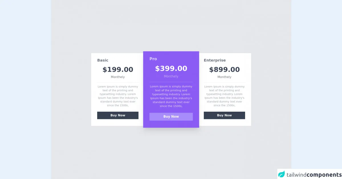
The preview of Responsive Pricing Cards ui component
In this section, we will provide a preview of what a responsive pricing card created with Tailwind CSS might look like.
Free download of the Responsive Pricing Cards's source code
The source code of Responsive Pricing Cards ui component
In this section, we will provide the source code for a responsive pricing card created with Tailwind CSS.
<div class="min-h-screen  bg-gray-200  flex flex-wrap items-center  justify-center  ">

            <div class="flex flex-col sm:flex-col lg:flex-row xl:flex-row md:flex-row justify-center items center  container   ">
            <div class="py-12 sm:py-12 md:py-6 lg:py-6 xl:py-6 px-8 w-full md:max-w-min sm:w-full bg-white z-30">
                <h1 class="text-gray-500 font-semibold text-xl ">Basic</h1>
                    <div class="text-center py-4 px-7">
                        <h1 class="text-gray-700 text-4xl font-black">$199.00</h1>
                        <p class="text-gray-500  mt-2">Monthely</p>

                    </div>
                    <div class="h-px bg-gray-200"></div>
                    <div class="text-center mt-3">
                        <p class="text-sm text-gray-400">
                        Lorem Ipsum is simply dummy text of the printing and typesetting industry. Lorem Ipsum has been the industry's standard dummy text ever since the 1500s,
                        </p>
                    </div>
                    <button class="w-full mt-6 mb-3 py-2 text-white font-semibold bg-gray-700 hover:shadow-xl duration-200 hover:bg-gray-800">Buy Now</button>
                </div>
                <div class="py-12 sm:py-12 md:py-6 lg:py-6 xl:py-6 px-8 w-full md:max-w-min sm:w-full bg-purple-500 transform scale-1 sm:scale-1 md:scale-105 lg:scale-105 xl:scale-105 z-40  shadow-none sm:shadow-none md:shadow-xl lg:shadow-xl xl:shadow-xl">
                    <h1 class="text-purple-200 font-semibold text-xl ">Pro</h1>
                    <div class="text-center py-4 px-7">
                        <h1 class="text-white text-4xl font-black">$399.00</h1>
                        <p class="text-white text-opacity-50 mt-2">Monthely</p>

                    </div>
                    <div class="h-px bg-purple-400"></div>
                    <div class="text-center mt-3">
                        <p class="text-sm text-white text-opacity-80">
                        Lorem Ipsum is simply dummy text of the printing and typesetting industry. Lorem Ipsum has been the industry's standard dummy text ever since the 1500s,
                        </p>
                    </div>
                    <button class="w-full mt-6 mb-3 py-2 text-white font-semibold bg-purple-400 hover:shadow-xl duration-200 hover:bg-purple-800">Buy Now</button>
                </div>
                <div class="py-12 sm:py-12 md:py-6 lg:py-6 xl:py-6 px-8 w-full md:max-w-min sm:w-full bg-white z-30">
                <h1 class="text-gray-500 font-semibold text-xl ">Enterprise</h1>
                    <div class="text-center py-4 px-7">
                        <h1 class="text-gray-700 text-4xl font-black">$899.00</h1>
                        <p class="text-gray-500  mt-2">Monthely</p>

                    </div>
                    <div class="h-px bg-gray-200"></div>
                    <div class="text-center mt-3">
                        <p class="text-sm text-gray-400">
                        Lorem Ipsum is simply dummy text of the printing and typesetting industry. Lorem Ipsum has been the industry's standard dummy text ever since the 1500s,
                        </p>
                    </div>
                    <button class="w-full mt-6 mb-3 py-2 text-white font-semibold bg-gray-700 hover:shadow-xl duration-200 hover:bg-gray-800">Buy Now</button>
                </div>
            </div>

        </div>
How to create a Responsive Pricing Cards with Tailwind CSS?
Now that we have discussed why Tailwind CSS is a good choice for creating responsive pricing cards, let's dive into the steps to create one.
Step 1: Set up your HTML structure
The first step is to set up the HTML structure for your pricing card. You can use the following code as a starting point:
<div class="max-w-sm rounded overflow-hidden shadow-lg">
  <div class="px-6 py-4">
    <div class="font-bold text-xl mb-2">Basic</div>
    <p class="text-gray-700 text-base">
      Lorem ipsum dolor sit amet, consectetur adipiscing elit. Vivamus
      ullamcorper, nibh eget mattis bibendum, turpis sapien rutrum nisl,
      eget imperdiet nisi massa vel sapien.
    </p>
  </div>
  <div class="px-6 pt-4 pb-2">
    <div class="font-bold text-xl mb-2">$19.99</div>
    <button
      class="bg-blue-500 hover:bg-blue-700 text-white font-bold py-2 px-4 rounded-full"
    >
      Buy Now
    </button>
  </div>
</div>
This code sets up the basic structure of a pricing card, including a title, description, price, and call-to-action button.
Step 2: Add Tailwind CSS classes
The next step is to add Tailwind CSS classes to your HTML elements to style your pricing card. Here are some classes you can use:
max-w-sm: sets the maximum width of the pricing card to small (sm) size.rounded: adds rounded corners to the pricing card.overflow-hidden: hides any content that overflows the pricing card.shadow-lg: adds a shadow effect to the pricing card.px-6: adds horizontal padding to the pricing card.py-4: adds vertical padding to the pricing card.font-bold: makes the text bold.text-xl: sets the font size to extra large (xl).mb-2: adds margin bottom to the pricing card element.text-gray-700: sets the text color to gray-700.text-base: sets the font size to base.pt-4: adds top padding to the pricing card element.pb-2: adds bottom padding to the pricing card element.bg-blue-500: sets the background color to blue-500.hover:bg-blue-700: sets the background color to blue-700 when the element is hovered.text-white: sets the text color to white.py-2: adds vertical padding to the button element.px-4: adds horizontal padding to the button element.rounded-full: makes the button element fully rounded.
Step 3: Test and adjust your pricing card
The final step is to test and adjust your pricing card to ensure that it looks good on different screen sizes and devices. You can use Tailwind CSS's responsive classes to adjust the layout and design of your pricing card for different screen sizes. For example, you can use the sm: prefix to apply styles only on small screens:
<div class="max-w-sm rounded overflow-hidden shadow-lg">
  <div class="px-6 py-4">
    <div class="font-bold text-xl mb-2">Basic</div>
    <p class="text-gray-700 text-base">
      Lorem ipsum dolor sit amet, consectetur adipiscing elit. Vivamus
      ullamcorper, nibh eget mattis bibendum, turpis sapien rutrum nisl,
      eget imperdiet nisi massa vel sapien.
    </p>
  </div>
  <div class="px-6 pt-4 pb-2">
    <div class="font-bold text-xl mb-2">$19.99</div>
    <button
      class="bg-blue-500 hover:bg-blue-700 text-white font-bold py-2 px-4 rounded-full"
    >
      Buy Now
    </button>
  </div>
</div>

<div class="max-w-sm rounded overflow-hidden shadow-lg sm:ml-4">
  <div class="px-6 py-4">
    <div class="font-bold text-xl mb-2">Pro</div>
    <p class="text-gray-700 text-base">
      Lorem ipsum dolor sit amet, consectetur adipiscing elit. Vivamus
      ullamcorper, nibh eget mattis bibendum, turpis sapien rutrum nisl,
      eget imperdiet nisi massa vel sapien.
    </p>
  </div>
  <div class="px-6 pt-4 pb-2">
    <div class="font-bold text-xl mb-2">$39.99</div>
    <button
      class="bg-blue-500 hover:bg-blue-700 text-white font-bold py-2 px-4 rounded-full"
    >
      Buy Now
    </button>
  </div>
</div>
This code creates two pricing cards side by side on small screens and stacked on top of each other on larger screens.
Conclusion
In this article, we have explored how to create a responsive pricing card with Tailwind CSS. We have provided six tips to make it easier for you to create your own pricing cards, including setting up your HTML structure, adding Tailwind CSS classes, and testing and adjusting your pricing card for different screen sizes and devices. With these tips, you can create beautiful and responsive pricing cards quickly and easily using Tailwind CSS.