- Published on
Beginners Guide: Create A Responsive Navigation Menu With Tailwind CSS
- What is Tailwind CSS?
- The description of Responsive Navigation Menu ui component
- Why use Tailwind CSS to create a Responsive Navigation Menu ui component?
- The preview of Responsive Navigation Menu ui component
- The source code of Responsive Navigation Menu ui component
- How to create a Responsive Navigation Menu with Tailwind CSS?
- Step 1: Set up your HTML
- Step 2: Add Tailwind CSS
- Step 3: Customize your menu
- Step 4: Make your menu responsive
- Step 5: Add JavaScript
- Conclusion
As a FrontEnd technology blogger, you may have heard of Tailwind CSS. It is a utility-first CSS framework that allows you to quickly create custom designs without writing any CSS. In this article, we will guide you through the process of creating a responsive navigation menu with Tailwind CSS.
What is Tailwind CSS?
Tailwind CSS is a utility-first CSS framework that provides a set of pre-defined classes to style your HTML elements. It allows you to create custom designs without writing any CSS. Tailwind CSS is highly customizable, and you can configure it to fit your project's needs.
The description of Responsive Navigation Menu ui component
A responsive navigation menu is a UI component that allows users to navigate through a website or application. It is essential to have a responsive navigation menu that adapts to different screen sizes, as more and more people are using mobile devices to access the internet.
Why use Tailwind CSS to create a Responsive Navigation Menu ui component?
Tailwind CSS provides a set of pre-defined classes that make it easy to create a responsive navigation menu. You don't have to write any CSS, and you can customize the menu to fit your project's needs. Tailwind CSS also provides a responsive design system that makes it easy to create a menu that adapts to different screen sizes.
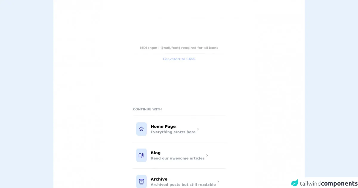
The preview of Responsive Navigation Menu ui component
To create a responsive navigation menu with Tailwind CSS, we will use a combination of HTML and CSS. The menu will consist of a logo, a list of links, and a toggle button that will appear on smaller screens.
Free download of the Responsive Navigation Menu's source code
The source code of Responsive Navigation Menu ui component
To create a responsive navigation menu with Tailwind CSS, we will use a combination of HTML and CSS. The menu will consist of a logo, a list of links, and a toggle button that will appear on smaller screens.
<!-- MDI Icons -->
<link rel="stylesheet" href="https://cdn.materialdesignicons.com/6.5.95/css/materialdesignicons.min.css">

<!-- Page Container -->
<div class="flex items-center justify-center min-h-screen bg-white py-48">
    <div class="flex flex-col">
        <!-- Notes -->
        <span class="text-center font-bold my-10 opacity-30">
            MDI (npm i @mdi/font) reuqired for all icons

            <hr class="my-4">

            <a href="https://egoistdeveloper.github.io/twcss-to-sass-playground/" target="_blank" class="text-blue-600">
                Convetert to SASS
            </a>
        </span>

        <!-- Continue With -->
        <div class="flex flex-col mt-48">
            <div class="text-gray-400 font-bold uppercase">
                Continue With
            </div>

            <div class="flex flex-col items-stretch mt-5">
                <!-- Nav Item #1 -->
                <div class="flex flex-row group px-4 py-8
                    border-t hover:cursor-pointer
                    transition-all duration-200 delay-100">

                    <!-- Nav Icon -->
                    <div class="rounded-xl bg-blue-100 px-3 py-2 md:py-4">
                        <i class="mdi mdi-home-outline mx-auto
                            text-indigo-900 text-2xl md:text-3xl"></i>
                    </div>

                    <!-- Text -->
                    <div class="grow flex flex-col pl-5 pt-2">
                        <div class="font-bold text-sm md:text-lg lg:text-xl group-hover:underline">
                            Home Page
                        </div>

                        <div class="font-semibold text-sm md:text-md lg:text-lg
                            text-gray-400 group-hover:text-gray-500
                            transition-all duration-200 delay-100">
                            Everything starts here
                        </div>
                    </div>

                    <!-- Chevron -->
                    <i class="mdi mdi-chevron-right text-gray-400 mdi-24px my-auto pr-2
                        group-hover:text-gray-700 transition-all duration-200 delay-100"></i>
                </div>

                <!-- Nav Item #2 -->
                <div class="flex flex-row group px-4 py-8
                    border-t hover:cursor-pointer
                    transition-all duration-200 delay-100">

                    <!-- Nav Icon -->
                    <div class="rounded-xl bg-blue-100 px-3 py-2 md:py-4">
                        <i class="mdi mdi-book-open-page-variant-outline mx-auto
                            text-indigo-800 text-2xl md:text-3xl"></i>
                    </div>

                    <!-- Text -->
                    <div class="grow flex flex-col pl-5 pt-2">
                        <div class="font-bold text-sm md:text-lg lg:text-xl group-hover:underline">
                            Blog
                        </div>

                        <div class="font-semibold text-sm md:text-md lg:text-lg
                            text-gray-400 group-hover:text-gray-500
                            transition-all duration-200 delay-100">
                            Read our awesome articles
                        </div>
                    </div>

                    <!-- Chevron -->
                    <i class="mdi mdi-chevron-right text-gray-400 mdi-24px my-auto pr-2
                        group-hover:text-gray-700 transition-all duration-200 delay-100"></i>
                </div>

                <!-- Nav Item #3 -->
                <div class="flex flex-row group px-4 py-8
                    border-t hover:cursor-pointer
                    transition-all duration-200 delay-100">

                    <!-- Nav Icon -->
                    <div class="rounded-xl bg-blue-100 px-3 py-2 md:py-4">
                        <i class="mdi mdi-archive-settings-outline
                            mx-auto text-indigo-800 text-2xl md:text-3xl"></i>
                    </div>

                    <!-- Text -->
                    <div class="grow flex flex-col pl-5 pt-2">
                        <div class="font-bold text-sm md:text-lg lg:text-xl group-hover:underline">
                            Archive
                        </div>

                        <div class="font-semibold text-sm md:text-md lg:text-lg
                            text-gray-400 group-hover:text-gray-500
                            transition-all duration-200 delay-100">
                            Archived posts but still readable
                        </div>
                    </div>

                    <!-- Chevron -->
                    <i class="mdi mdi-chevron-right text-gray-400 mdi-24px my-auto pr-2
                        group-hover:text-gray-700 transition-all duration-200 delay-100"></i>
                </div>

                <!-- Nav Item #3 -->
                <div class="flex flex-row group px-4 py-8
                    border-t hover:cursor-pointer
                    transition-all duration-200 delay-100">

                    <!-- Nav Icon -->
                    <div class="rounded-xl bg-blue-100 px-3 py-2 md:py-4">
                        <i class="mdi mdi-at mx-auto
                            text-indigo-800 text-2xl md:text-3xl"></i>
                    </div>

                    <!-- Text -->
                    <div class="grow flex flex-col pl-5 pt-2">
                        <div class="font-bold text-sm md:text-lg lg:text-xl group-hover:underline">
                            Contact
                        </div>

                        <div class="font-semibold text-sm md:text-md lg:text-lg
                            text-gray-400 group-hover:text-gray-500
                            transition-all duration-200 delay-100">
                            Contact us for your questions
                        </div>
                    </div>

                    <!-- Chevron -->
                    <i class="mdi mdi-chevron-right text-gray-400 mdi-24px my-auto pr-2
                        group-hover:text-gray-700 transition-all duration-200 delay-100"></i>
                </div>
            </div>
        </div>
    </div>
</div>
How to create a Responsive Navigation Menu with Tailwind CSS?
To create a responsive navigation menu with Tailwind CSS, follow these steps:
Step 1: Set up your HTML
The first step is to set up your HTML. Here is an example:
<nav class="bg-gray-800">
  <div class="max-w-7xl mx-auto px-2 sm:px-6 lg:px-8">
    <div class="relative flex items-center justify-between h-16">
      <div class="absolute inset-y-0 left-0 flex items-center sm:hidden">
        <!-- Mobile menu button -->
        <button type="button" class="inline-flex items-center justify-center p-2 rounded-md text-gray-400 hover:text-white hover:bg-gray-700 focus:outline-none focus:ring-2 focus:ring-inset focus:ring-white" aria-controls="mobile-menu" aria-expanded="false">
          <span class="sr-only">Open main menu</span>
          <!-- Icon when menu is closed. -->
          <!--
            Heroicon name: menu

            Menu open: "hidden", Menu closed: "block"
          -->
          <svg class="block h-6 w-6" xmlns="http://www.w3.org/2000/svg" fill="none" viewBox="0 0 24 24" stroke="currentColor" aria-hidden="true">
            <path stroke-linecap="round" stroke-linejoin="round" stroke-width="2" d="M4 6h16M4 12h16M4 18h16" />
          </svg>
          <!-- Icon when menu is open. -->
          <!--
            Heroicon name: x

            Menu open: "block", Menu closed: "hidden"
          -->
          <svg class="hidden h-6 w-6" xmlns="http://www.w3.org/2000/svg" fill="none" viewBox="0 0 24 24" stroke="currentColor" aria-hidden="true">
            <path stroke-linecap="round" stroke-linejoin="round" stroke-width="2" d="M6 18L18 6M6 6l12 12" />
          </svg>
        </button>
      </div>
      <div class="flex-1 flex items-center justify-center sm:items-stretch sm:justify-start">
        <div class="flex-shrink-0">
          <img class="block lg:hidden h-8 w-auto" src="https://tailwindui.com/img/logos/workflow-mark-indigo-500.svg" alt="Workflow">
          <img class="hidden lg:block h-8 w-auto" src="https://tailwindui.com/img/logos/workflow-logo-indigo-500-mark-white-text.svg" alt="Workflow">
        </div>
        <div class="hidden sm:block sm:ml-6">
          <div class="flex space-x-4">
            <a href="#" class="bg-gray-900 text-white px-3 py-2 rounded-md text-sm font-medium">Dashboard</a>

            <a href="#" class="text-gray-300 hover:bg-gray-700 hover:text-white px-3 py-2 rounded-md text-sm font-medium">Team</a>

            <a href="#" class="text-gray-300 hover:bg-gray-700 hover:text-white px-3 py-2 rounded-md text-sm font-medium">Projects</a>

            <a href="#" class="text-gray-300 hover:bg-gray-700 hover:text-white px-3 py-2 rounded-md text-sm font-medium">Calendar</a>
          </div>
        </div>
      </div>
    </div>
  </div>

  <!-- Mobile menu, show/hide based on menu state. -->
  <div class="sm:hidden" id="mobile-menu">
    <div class="px-2 pt-2 pb-3 space-y-1">
      <a href="#" class="bg-gray-900 text-white block px-3 py-2 rounded-md text-base font-medium">Dashboard</a>

      <a href="#" class="text-gray-300 hover:bg-gray-700 hover:text-white block px-3 py-2 rounded-md text-base font-medium">Team</a>

      <a href="#" class="text-gray-300 hover:bg-gray-700 hover:text-white block px-3 py-2 rounded-md text-base font-medium">Projects</a>

      <a href="#" class="text-gray-300 hover:bg-gray-700 hover:text-white block px-3 py-2 rounded-md text-base font-medium">Calendar</a>
    </div>
  </div>
</nav>
Step 2: Add Tailwind CSS
The next step is to add Tailwind CSS to your project. You can either download the CSS file and include it in your HTML or install it using npm. Here is an example of how to install Tailwind CSS using npm:
npm install tailwindcss
After installing Tailwind CSS, you need to create a configuration file. You can do this by running the following command:
npx tailwindcss init
This will create a tailwind.config.js file in your project's root directory.
Step 3: Customize your menu
Now that you have set up your HTML and added Tailwind CSS to your project, you can customize your menu. You can change the colors, fonts, and spacing of your menu by modifying the Tailwind CSS classes.
For example, if you want to change the background color of your menu, you can add the bg-blue-500 class to the nav element:
<nav class="bg-blue-500">
You can also change the font size of your menu by adding the text-lg class to the menu items:
<a href="#" class="text-gray-300 hover:bg-gray-700 hover:text-white px-3 py-2 rounded-md text-sm font-medium">Team</a>
Step 4: Make your menu responsive
To make your menu responsive, you need to add some CSS that will hide the menu items on smaller screens and display a toggle button instead. Here is an example:
@media (min-width: 640px) {
  .sm\:hidden {
    display: none !important;
  }
  .sm\:block {
    display: block !important;
  }
}
This CSS will hide the menu items on screens smaller than 640px and display the toggle button instead.
Step 5: Add JavaScript
Finally, you need to add some JavaScript to toggle the menu on smaller screens. Here is an example:
const button = document.querySelector('button');
const menu = document.querySelector('#mobile-menu');

button.addEventListener('click', () => {
  menu.classList.toggle('hidden');
});
This JavaScript will toggle the hidden class on the mobile menu when the toggle button is clicked.
Conclusion
In this article, we have shown you how to create a responsive navigation menu with Tailwind CSS. Tailwind CSS provides a set of pre-defined classes that make it easy to create custom designs without writing any CSS. With Tailwind CSS, you can create a responsive navigation menu that adapts to different screen sizes. We hope this guide has been helpful, and you can use it to create your own responsive navigation menu.