- Published on
Ultimate Guide: Create A Responsive Navbar With Tailwind CSS
- What is Tailwind CSS?
- The description of Responsive Navbar ui component
- Why use Tailwind CSS to create a Responsive Navbar ui component?
- The preview of Responsive Navbar ui component.
- The source code of Responsive Navbar ui component.
- How to create a Responsive Navbar with Tailwind CSS?
- Conclusion
As a FrontEnd technology blogger, it is important to stay up-to-date with the latest trends and tools in web development. One such tool that has gained popularity in recent years is Tailwind CSS. In this article, we will explore how to create a responsive navbar with Tailwind CSS.
What is Tailwind CSS?
Tailwind CSS is a utility-first CSS framework that allows you to rapidly build custom user interfaces. It provides a set of pre-defined classes that you can use to style your HTML elements. With Tailwind CSS, you can create complex layouts and designs without writing custom CSS.
The description of Responsive Navbar ui component
A responsive navbar is a user interface component that provides navigation links to different sections of a website. It is an essential part of any website as it allows users to easily navigate to different pages. A responsive navbar is designed to adapt to different screen sizes, making it accessible on all devices.
Why use Tailwind CSS to create a Responsive Navbar ui component?
Tailwind CSS provides a set of pre-defined classes that you can use to style your HTML elements. This makes it easy to create a responsive navbar without writing custom CSS. Tailwind CSS also provides responsive utilities that allow you to create layouts that adapt to different screen sizes. This makes it easy to create a navbar that is accessible on all devices.
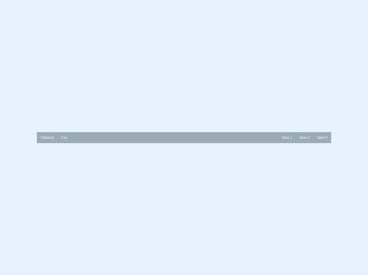
The preview of Responsive Navbar ui component.
To create a responsive navbar with Tailwind CSS, we will use a combination of HTML and CSS. The navbar will have a logo on the left, navigation links on the right, and a toggle button for small screens.
Free download of the Responsive Navbar's source code
The source code of Responsive Navbar ui component.
To create the responsive navbar, we will use HTML and Tailwind CSS classes. The HTML structure will consist of a navbar container, a logo, navigation links, and a toggle button. The CSS classes will be used to style the navbar and make it responsive.
<nav class="relative select-none bg-grey lg:flex lg:items-stretch w-full">
  <div class="flex flex-no-shrink items-stretch h-12">
    <a href="#" class="flex-no-grow flex-no-shrink relative py-2 px-4 leading-normal text-white no-underline flex items-center hover:bg-grey-dark">Tailwind</a>
    <a href="#" class="flex-no-grow flex-no-shrink relative py-2 px-4 leading-normal text-white no-underline flex items-center hover:bg-grey-dark">Css</a>
    <button class="block lg:hidden cursor-pointer ml-auto relative w-12 h-12 p-4">
      <svg class="fill-current text-white" xmlns="http://www.w3.org/2000/svg" viewBox="0 0 20 20"><path d="M0 3h20v2H0V3zm0 6h20v2H0V9zm0 6h20v2H0v-2z"/></svg>
      <svg class="fill-current text-white" xmlns="http://www.w3.org/2000/svg" viewBox="0 0 20 20"><path d="M10 8.586L2.929 1.515 1.515 2.929 8.586 10l-7.071 7.071 1.414 1.414L10 11.414l7.071 7.071 1.414-1.414L11.414 10l7.071-7.071-1.414-1.414L10 8.586z"/></svg>
    </button>
  </div>
  <div class="lg:flex lg:items-stretch lg:flex-no-shrink lg:flex-grow">
    <div class="lg:flex lg:items-stretch lg:justify-end ml-auto">
      <a href="#" class="flex-no-grow flex-no-shrink relative py-2 px-4 leading-normal text-white no-underline flex items-center hover:bg-grey-dark">Item 1</a>
      <a href="#" class="flex-no-grow flex-no-shrink relative py-2 px-4 leading-normal text-white no-underline flex items-center hover:bg-grey-dark">Item 2</a>
      <a href="#" class="flex-no-grow flex-no-shrink relative py-2 px-4 leading-normal text-white no-underline flex items-center hover:bg-grey-dark">Item 3</a>
    </div>
  </div>
</nav>
How to create a Responsive Navbar with Tailwind CSS?
- Create a new HTML file and add the following code:
<nav class="bg-gray-800">
  <div class="max-w-7xl mx-auto px-2 sm:px-6 lg:px-8">
    <div class="flex items-center justify-between h-16">
      <div class="flex-shrink-0">
        <img class="h-8 w-8" src="logo.svg" alt="Logo">
      </div>
      <div class="hidden md:block">
        <div class="ml-10 flex items-baseline space-x-4">
          <a href="#" class="text-gray-300 hover:bg-gray-700 hover:text-white px-3 py-2 rounded-md text-sm font-medium">Home</a>
          <a href="#" class="text-gray-300 hover:bg-gray-700 hover:text-white px-3 py-2 rounded-md text-sm font-medium">About</a>
          <a href="#" class="text-gray-300 hover:bg-gray-700 hover:text-white px-3 py-2 rounded-md text-sm font-medium">Contact</a>
        </div>
      </div>
      <div class="-mr-2 flex md:hidden">
        <button type="button" class="bg-gray-800 inline-flex items-center justify-center p-2 rounded-md text-gray-400 hover:text-white hover:bg-gray-700 focus:outline-none focus:ring-2 focus:ring-offset-2 focus:ring-offset-gray-800 focus:ring-white" aria-controls="mobile-menu" aria-expanded="false">
          <span class="sr-only">Open main menu</span>
          <!-- Icon when menu is closed. -->
          <!--
            Heroicon name: menu

            Menu open: "hidden", Menu closed: "block"
          -->
          <svg class="block h-6 w-6" xmlns="http://www.w3.org/2000/svg" fill="none" viewBox="0 0 24 24" stroke="currentColor" aria-hidden="true">
            <path stroke-linecap="round" stroke-linejoin="round" stroke-width="2" d="M4 6h16M4 12h16M4 18h16" />
          </svg>
          <!-- Icon when menu is open. -->
          <!--
            Heroicon name: x

            Menu open: "block", Menu closed: "hidden"
          -->
          <svg class="hidden h-6 w-6" xmlns="http://www.w3.org/2000/svg" fill="none" viewBox="0 0 24 24" stroke="currentColor" aria-hidden="true">
            <path stroke-linecap="round" stroke-linejoin="round" stroke-width="2" d="M6 18L18 6M6 6l12 12" />
          </svg>
        </button>
      </div>
    </div>
  </div>

  <!-- Mobile menu, show/hide based on menu state. -->
  <div class="md:hidden" id="mobile-menu">
    <div class="px-2 pt-2 pb-3 space-y-1 sm:px-3">
      <a href="#" class="text-gray-300 hover:bg-gray-700 hover:text-white block px-3 py-2 rounded-md text-base font-medium">Home</a>
      <a href="#" class="text-gray-300 hover:bg-gray-700 hover:text-white block px-3 py-2 rounded-md text-base font-medium">About</a>
      <a href="#" class="text-gray-300 hover:bg-gray-700 hover:text-white block px-3 py-2 rounded-md text-base font-medium">Contact</a>
    </div>
  </div>
</nav>
In the HTML code, we have added a navbar container with a gray background color. Inside the container, we have added a logo on the left and navigation links on the right. For small screens, we have added a toggle button to show/hide the navigation links.
We have used Tailwind CSS classes to style the navbar. The
bg-gray-800class is used to set the background color of the navbar. Themax-w-7xlclass is used to set the maximum width of the navbar container. Thepx-2 sm:px-6 lg:px-8class is used to set the padding of the navbar container.We have used the
flexanditems-centerclasses to align the logo and navigation links horizontally. Thehidden md:blockclass is used to hide the navigation links on small screens. Theml-10class is used to add margin to the navigation links.We have used the
bg-gray-800class to set the background color of the toggle button. Theinline-flexclass is used to make the button inline with the navigation links. Theitems-centerandjustify-centerclasses are used to center the icon inside the button. Thep-2class is used to set the padding of the button. Therounded-mdclass is used to add rounded corners to the button. Thetext-gray-400class is used to set the color of the icon. Thehover:text-whiteandhover:bg-gray-700classes are used to change the color of the button on hover. Thefocus:outline-noneclass is used to remove the outline when the button is focused. Thefocus:ring-2andfocus:ring-offset-2classes are used to add a ring around the button when it is focused. Thefocus:ring-offset-gray-800class is used to set the color of the ring. Thefocus:ring-whiteclass is used to set the color of the ring when it is focused.We have used the
hiddenandblockclasses to show/hide the icon based on the state of the menu. Theh-6andw-6classes are used to set the height and width of the icon.We have used the
md:hiddenclass to hide the navigation links on small screens. Theid="mobile-menu"attribute is used to identify the mobile menu. Thepx-2class is used to set the padding of the mobile menu. Thept-2class is used to set the top padding of the mobile menu. Thepb-3class is used to set the bottom padding of the mobile menu. Thespace-y-1class is used to add spacing between the navigation links.Save the HTML file and open it in a web browser. You should see a responsive navbar with a logo, navigation links, and a toggle button.
Conclusion
In this article, we have explored how to create a responsive navbar with Tailwind CSS. We have learned how to use Tailwind CSS classes to style HTML elements and make them responsive. With Tailwind CSS, you can create complex layouts and designs without writing custom CSS. We hope this article has been helpful in your web development journey.