- Published on
Learn How To Create A Responsive Info Cards With Tailwind CSS Like an Expert
- What is Tailwind CSS?
- The description of Responsive Info Cards UI component
- Why use Tailwind CSS to create a Responsive Info Cards UI component?
- The preview of Responsive Info Cards UI component
- The source code of Responsive Info Cards UI component
- How to create a Responsive Info Cards with Tailwind CSS?
- Step 1: Set up the HTML structure
- Step 2: Style the card using Tailwind CSS classes
- Step 3: Make the card responsive using Tailwind CSS classes
- Conclusion
As a FrontEnd developer, you always want to create the best user interface for your website or application. One of the most important aspects of a great user interface is responsiveness. In this article, we will learn how to create a responsive info cards UI component with Tailwind CSS.
What is Tailwind CSS?
Tailwind CSS is a utility-first CSS framework that allows you to create responsive and customizable UI components quickly. It provides a set of pre-defined classes that you can use to style your HTML elements. With Tailwind CSS, you can create complex layouts and designs without writing custom CSS code.
The description of Responsive Info Cards UI component
A responsive info cards UI component is a design pattern that presents information in a visually appealing and organized manner. It consists of a card that contains an image, a title, a description, and a call-to-action button. The card adjusts its size and layout based on the screen size, making it suitable for all devices.
Why use Tailwind CSS to create a Responsive Info Cards UI component?
Tailwind CSS provides a set of pre-defined classes that you can use to create a responsive info card UI component quickly. It also allows you to customize the component's style by modifying the classes. With Tailwind CSS, you can create a responsive info card UI component that looks great on all devices without writing custom CSS code.
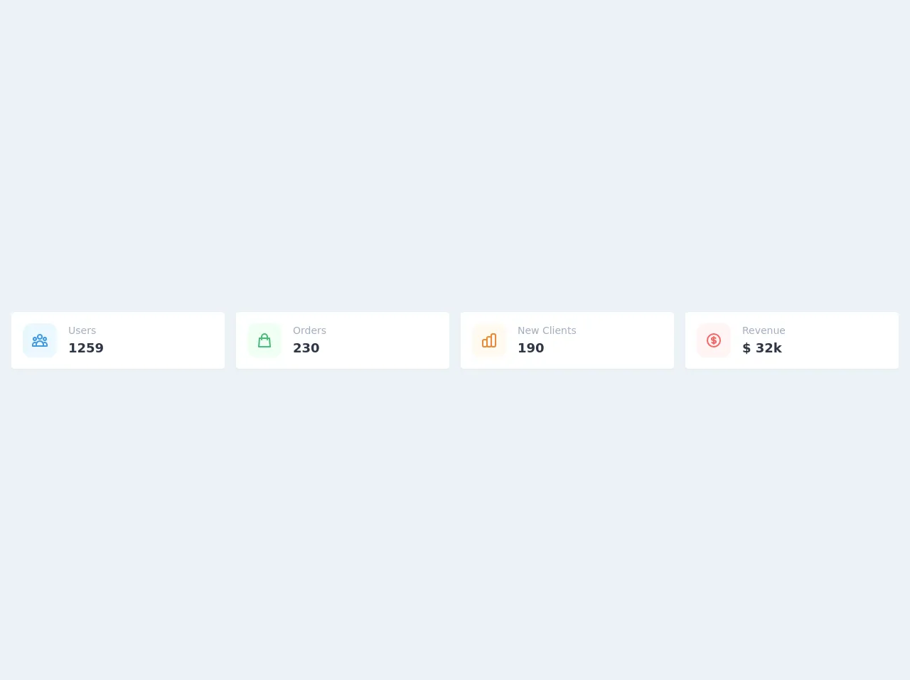
The preview of Responsive Info Cards UI component
To create a responsive info card UI component, we will use Tailwind CSS's pre-defined classes. The card will contain an image, a title, a description, and a call-to-action button. The card's layout will adjust based on the screen size, making it suitable for all devices.
Free download of the Responsive Info Cards's source code
The source code of Responsive Info Cards UI component
To create a responsive info card UI component, we will use HTML and Tailwind CSS classes. The HTML code will contain a div element with a class of "card" that contains an image, a title, a description, and a call-to-action button. We will use Tailwind CSS classes to style the card and its elements.
<div class="flex items-center min-h-screen bg-gray-200 text-gray-800">
  <div class="p-4 w-full">
    <div class="grid grid-cols-12 gap-4">
      <div class="col-span-12 sm:col-span-6 md:col-span-3">
        <div class="flex flex-row bg-white shadow-sm rounded p-4">
          <div class="flex items-center justify-center flex-shrink-0 h-12 w-12 rounded-xl bg-blue-100 text-blue-500">
            <svg class="w-6 h-6" fill="none" stroke="currentColor" viewBox="0 0 24 24" xmlns="http://www.w3.org/2000/svg"><path stroke-linecap="round" stroke-linejoin="round" stroke-width="2" d="M17 20h5v-2a3 3 0 00-5.356-1.857M17 20H7m10 0v-2c0-.656-.126-1.283-.356-1.857M7 20H2v-2a3 3 0 015.356-1.857M7 20v-2c0-.656.126-1.283.356-1.857m0 0a5.002 5.002 0 019.288 0M15 7a3 3 0 11-6 0 3 3 0 016 0zm6 3a2 2 0 11-4 0 2 2 0 014 0zM7 10a2 2 0 11-4 0 2 2 0 014 0z"></path></svg>
          </div>
          <div class="flex flex-col flex-grow ml-4">
            <div class="text-sm text-gray-500">Users</div>
            <div class="font-bold text-lg">1259</div>
          </div>
        </div>
      </div>
      <div class="col-span-12 sm:col-span-6 md:col-span-3">
        <div class="flex flex-row bg-white shadow-sm rounded p-4">
          <div class="flex items-center justify-center flex-shrink-0 h-12 w-12 rounded-xl bg-green-100 text-green-500">
            <svg class="w-6 h-6" fill="none" stroke="currentColor" viewBox="0 0 24 24" xmlns="http://www.w3.org/2000/svg"><path stroke-linecap="round" stroke-linejoin="round" stroke-width="2" d="M16 11V7a4 4 0 00-8 0v4M5 9h14l1 12H4L5 9z"></path></svg>
          </div>
          <div class="flex flex-col flex-grow ml-4">
            <div class="text-sm text-gray-500">Orders</div>
            <div class="font-bold text-lg">230</div>
          </div>
        </div>
      </div>
      <div class="col-span-12 sm:col-span-6 md:col-span-3">
        <div class="flex flex-row bg-white shadow-sm rounded p-4">
          <div class="flex items-center justify-center flex-shrink-0 h-12 w-12 rounded-xl bg-orange-100 text-orange-500">
            <svg class="w-6 h-6" fill="none" stroke="currentColor" viewBox="0 0 24 24" xmlns="http://www.w3.org/2000/svg"><path stroke-linecap="round" stroke-linejoin="round" stroke-width="2" d="M9 19v-6a2 2 0 00-2-2H5a2 2 0 00-2 2v6a2 2 0 002 2h2a2 2 0 002-2zm0 0V9a2 2 0 012-2h2a2 2 0 012 2v10m-6 0a2 2 0 002 2h2a2 2 0 002-2m0 0V5a2 2 0 012-2h2a2 2 0 012 2v14a2 2 0 01-2 2h-2a2 2 0 01-2-2z"></path></svg>
          </div>
          <div class="flex flex-col flex-grow ml-4">
            <div class="text-sm text-gray-500">New Clients</div>
            <div class="font-bold text-lg">190</div>
          </div>
        </div>
      </div>
      <div class="col-span-12 sm:col-span-6 md:col-span-3">
        <div class="flex flex-row bg-white shadow-sm rounded p-4">
          <div class="flex items-center justify-center flex-shrink-0 h-12 w-12 rounded-xl bg-red-100 text-red-500">
            <svg class="w-6 h-6" fill="none" stroke="currentColor" viewBox="0 0 24 24" xmlns="http://www.w3.org/2000/svg"><path stroke-linecap="round" stroke-linejoin="round" stroke-width="2" d="M12 8c-1.657 0-3 .895-3 2s1.343 2 3 2 3 .895 3 2-1.343 2-3 2m0-8c1.11 0 2.08.402 2.599 1M12 8V7m0 1v8m0 0v1m0-1c-1.11 0-2.08-.402-2.599-1M21 12a9 9 0 11-18 0 9 9 0 0118 0z"></path></svg>
          </div>
          <div class="flex flex-col flex-grow ml-4">
            <div class="text-sm text-gray-500">Revenue</div>
            <div class="font-bold text-lg">$ 32k</div>
          </div>
        </div>
      </div>
    </div>
  </div>
</div>
How to create a Responsive Info Cards with Tailwind CSS?
To create a responsive info card UI component with Tailwind CSS, follow these steps:
Step 1: Set up the HTML structure
Start by creating a div element with a class of "card". Inside the div element, create an img element with a class of "card-img", a h2 element with a class of "card-title", a p element with a class of "card-description", and a button element with a class of "card-button".
<div class="card">
  <img src="https://via.placeholder.com/150" alt="Card Image" class="card-img">
  <h2 class="card-title">Card Title</h2>
  <p class="card-description">Card Description</p>
  <button class="card-button">Learn More</button>
</div>
Step 2: Style the card using Tailwind CSS classes
Use Tailwind CSS classes to style the card and its elements. You can use the "w-" prefix to set the width of the card, the "bg-" prefix to set the background color, the "text-" prefix to set the text color, and the "p-" prefix to set the padding.
<div class="card w-64 bg-white rounded-lg shadow-lg overflow-hidden">
  <img src="https://via.placeholder.com/150" alt="Card Image" class="card-img">
  <div class="p-4">
    <h2 class="card-title text-gray-900 font-bold text-2xl mb-2">Card Title</h2>
    <p class="card-description text-gray-600 text-base">Card Description</p>
    <button class="card-button bg-blue-500 hover:bg-blue-700 text-white font-bold py-2 px-4 rounded-full mt-4">Learn More</button>
  </div>
</div>
Step 3: Make the card responsive using Tailwind CSS classes
Use Tailwind CSS classes to make the card responsive. You can use the "md:" prefix to set the style for medium screens and above and the "lg:" prefix to set the style for large screens and above.
<div class="card w-64 bg-white rounded-lg shadow-lg overflow-hidden">
  <img src="https://via.placeholder.com/150" alt="Card Image" class="card-img">
  <div class="p-4">
    <h2 class="card-title text-gray-900 font-bold text-2xl mb-2">Card Title</h2>
    <p class="card-description text-gray-600 text-base">Card Description</p>
    <button class="card-button bg-blue-500 hover:bg-blue-700 text-white font-bold py-2 px-4 rounded-full mt-4">Learn More</button>
  </div>
</div>
Conclusion
In this article, we learned how to create a responsive info cards UI component with Tailwind CSS. Tailwind CSS provides a set of pre-defined classes that you can use to create responsive and customizable UI components quickly. With Tailwind CSS, you can create a responsive info card UI component that looks great on all devices without writing custom CSS code.