- Published on
6 Easy Ways To Build A Responsive Horizontal Pricing With Tailwind CSS Without Even Thinking About It
- What is Tailwind CSS?
- The description of Responsive Horizontal Pricing ui component
- Why use Tailwind CSS to create a Responsive Horizontal Pricing ui component?
- The preview of Responsive Horizontal Pricing ui component
- The source code of Responsive Horizontal Pricing ui component
- How to create a Responsive Horizontal Pricing with Tailwind CSS?
- Step 1: Set up your HTML
- Step 2: Add Tailwind CSS to your project
- Step 3: Style the table
- Step 4: Style the pricing plan columns
- Step 5: Style the pricing plan titles
- Step 6: Make the table responsive
- Conclusion
As a FrontEnd technology blogger, you may be familiar with Tailwind CSS. It is a utility-first CSS framework that helps you quickly build custom designs. In this article, we will explore how to use Tailwind CSS to create a responsive horizontal pricing UI component.
What is Tailwind CSS?
Tailwind CSS is a utility-first CSS framework that provides a set of pre-defined classes to help you quickly build custom designs. It is different from other CSS frameworks like Bootstrap or Foundation, which provide pre-built components. Tailwind CSS provides utility classes that you can use to create your own custom components.
The description of Responsive Horizontal Pricing ui component
A responsive horizontal pricing UI component is a pricing table that displays pricing plans horizontally. It is a popular design pattern for pricing pages on websites. The component typically includes a title, a description, a set of features, and a price for each pricing plan.
Why use Tailwind CSS to create a Responsive Horizontal Pricing ui component?
Tailwind CSS makes it easy to create custom designs without writing a lot of CSS code. It provides a set of pre-defined utility classes that you can use to style your components. This saves you time and makes your code more maintainable.
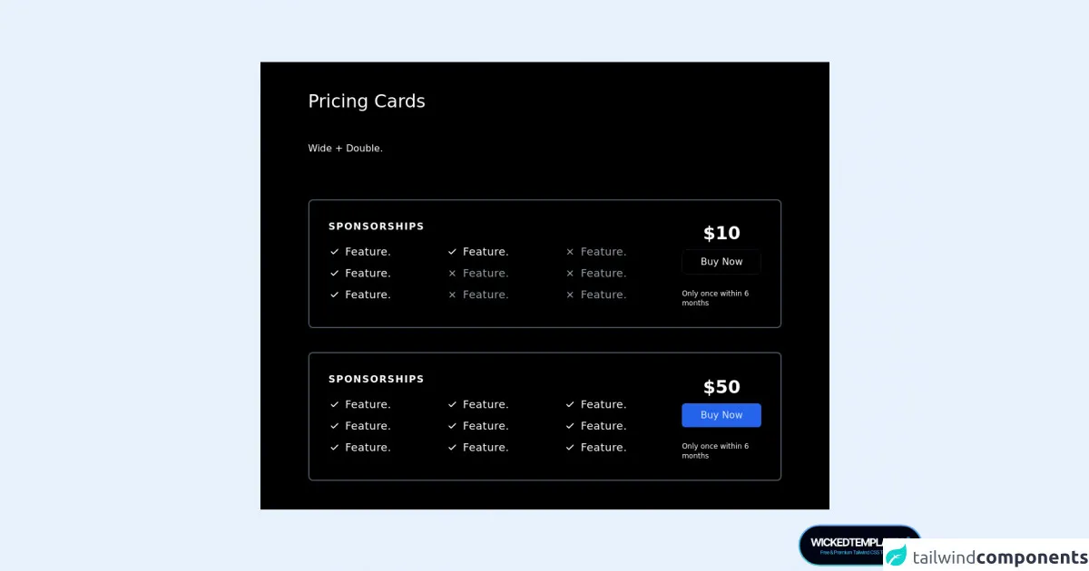
The preview of Responsive Horizontal Pricing ui component
To create a responsive horizontal pricing UI component, we will use Tailwind CSS to style a pricing table. The table will include three pricing plans, each with a title, description, a set of features, and a price.
Free download of the Responsive Horizontal Pricing's source code
The source code of Responsive Horizontal Pricing ui component
To create the responsive horizontal pricing UI component, we will use HTML and Tailwind CSS. We will create a table with three columns, one for each pricing plan.
<section class="bg-black ">
<div class="container px-5 py-12 mx-auto lg:px-20">
<div class="flex flex-col flex-wrap pb-6 mb-12 text-white ">
<h1 class="mb-12 text-3xl font-medium text-white">
Pricing Cards
</h1>
<p class="text-base leading-relaxed">
Wide + Double.</p>
</div>
<div
class="flex flex-wrap items-end justify-start w-full transition duration-500 ease-in-out transform bg-black border-2 border-gray-600 rounded-lg hover:border-white ">
<div class="w-full xl:w-1/4 md:w-1/4">
<div class="relative flex flex-col h-full p-8 ">
<h2 class="mb-4 font-semibold tracking-widest text-white uppercase title-font">
Sponsorships
</h2>
<p class="flex items-center mb-2 text-lg font-normal tracking-wide text-white">
<span
class="inline-flex items-center justify-center flex-shrink-0 w-5 h-5 mr-2 text-white rounded-full bg-blue-1300">
<svg fill="none" stroke="currentColor" stroke-linecap="round"
stroke-linejoin="round" stroke-width="2.5" class="w-4 h-4" viewBox="0 0 24 24">
<path d="M20 6L9 17l-5-5"></path>
</svg>
</span>Feature.
</p>
</div>
</div>
<div class="w-full xl:w-1/4 md:w-1/4">
<div class="relative flex flex-col h-full p-8 ">
<p class="flex items-center mb-2 text-lg font-normal tracking-wide text-white">
<span
class="inline-flex items-center justify-center flex-shrink-0 w-5 h-5 mr-2 text-white rounded-full bg-blue-1300">
<svg fill="none" stroke="currentColor" stroke-linecap="round"
stroke-linejoin="round" stroke-width="2.5" class="w-4 h-4" viewBox="0 0 24 24">
<path d="M20 6L9 17l-5-5"></path>
</svg>
</span>Feature.
</p>
<p class="flex items-center mb-2 text-lg font-normal tracking-wide text-gray-400">
<span
class="inline-flex items-center justify-center flex-shrink-0 w-5 h-5 mr-2 text-gray-400 rounded-full bg-blue-1300">
<svg fill="none" stroke="currentColor" stroke-linecap="round"
stroke-linejoin="round" stroke-width="2.5" class="w-4 h-4" viewBox="0 0 24 24">
<path
d="M6 18L18 6M6 6l12 12" />
</svg>
</span>Feature.
</p>
</div>
</div>
<div class="w-full xl:w-1/4 md:w-1/4">
<div class="relative flex flex-col h-full p-8 ">
<p class="flex items-center mb-2 text-lg font-normal tracking-wide text-gray-400">
<span
class="inline-flex items-center justify-center flex-shrink-0 w-5 h-5 mr-2 text-gray-400 rounded-full bg-blue-1300">
<svg fill="none" stroke="currentColor" stroke-linecap="round"
stroke-linejoin="round" stroke-width="2.5" class="w-4 h-4" viewBox="0 0 24 24">
<path
d="M6 18L18 6M6 6l12 12" />
</svg>
</span>Feature.
</p>
</div>
</div>
<div class="w-full xl:w-1/4 md:w-1/4 lg:ml-auto">
<div class="relative flex flex-col h-full p-8">
<h1 class="flex items-end mx-auto text-3xl font-black leading-none text-white ">
<span>$10 </span>
</h1>
<button
class="w-full px-4 py-2 mx-auto mt-3 text-white transition duration-500 ease-in-out transform border border-gray-900 rounded-lg text-md hover:bg-gray-900 focus:shadow-outline focus:outline-none focus:ring-2 ring-offset-current ring-offset-2 focus:border-gray-700 focus:bg-gray-800 ">Buy
Now
</button>
<p class="mx-auto mt-6 text-xs text-white">Only once within 6 months</p>
</div>
</div>
</div>
<div
class="flex flex-wrap items-end justify-start w-full mt-10 transition duration-500 ease-in-out transform bg-black border-2 border-gray-600 rounded-lg hover:border-white ">
<div class="w-full xl:w-1/4 md:w-1/4">
<div class="relative flex flex-col h-full p-8 ">
<h2 class="mb-4 font-semibold tracking-widest text-white uppercase title-font">
Sponsorships
</h2>
<p class="flex items-center mb-2 text-lg font-normal tracking-wide text-white">
<span
class="inline-flex items-center justify-center flex-shrink-0 w-5 h-5 mr-2 text-white rounded-full bg-blue-1300">
<svg fill="none" stroke="currentColor" stroke-linecap="round"
stroke-linejoin="round" stroke-width="2.5" class="w-4 h-4" viewBox="0 0 24 24">
<path d="M20 6L9 17l-5-5"></path>
</svg>
</span>Feature.
</p>
<p class="flex items-center mb-2 text-lg font-normal tracking-wide text-white">
<span
class="inline-flex items-center justify-center flex-shrink-0 w-5 h-5 mr-2 text-white rounded-full bg-blue-1300">
<svg fill="none" stroke="currentColor" stroke-linecap="round"
stroke-linejoin="round" stroke-width="2.5" class="w-4 h-4" viewBox="0 0 24 24">
<path d="M20 6L9 17l-5-5"></path>
</svg>
</span>Feature.
</p>
<p class="flex items-center mb-2 text-lg font-normal tracking-wide text-white">
<span
class="inline-flex items-center justify-center flex-shrink-0 w-5 h-5 mr-2 text-white rounded-full bg-blue-1300">
<svg fill="none" stroke="currentColor" stroke-linecap="round"
stroke-linejoin="round" stroke-width="2.5" class="w-4 h-4" viewBox="0 0 24 24">
<path d="M20 6L9 17l-5-5"></path>
</svg>
</span>Feature.
</p>
</div>
</div>
<div class="w-full xl:w-1/4 md:w-1/4">
<div class="relative flex flex-col h-full p-8 ">
<p class="flex items-center mb-2 text-lg font-normal tracking-wide text-white">
<span
class="inline-flex items-center justify-center flex-shrink-0 w-5 h-5 mr-2 text-white rounded-full bg-blue-1300">
<svg fill="none" stroke="currentColor" stroke-linecap="round"
stroke-linejoin="round" stroke-width="2.5" class="w-4 h-4" viewBox="0 0 24 24">
<path d="M20 6L9 17l-5-5"></path>
</svg>
</span>Feature.
</p>
</div>
</div>
<div class="w-full xl:w-1/4 md:w-1/4 lg:ml-auto">
<div class="relative flex flex-col h-full p-8">
<h1 class="flex items-end mx-auto text-3xl font-black leading-none text-white ">
<span>$50 </span>
</h1>
<button
class="w-full px-4 py-2 mx-auto mt-3 text-blue-100 transition duration-500 ease-in-out transform bg-blue-600 border-blue-600 rounded-md items-centerw-full text-md focus:shadow-outline focus:outline-none focus:ring-2 ring-offset-current ring-offset-2 hover:bg-blue-800 ">Buy
Now
</button>
<p class="mx-auto mt-6 text-xs text-white">Only once within 6 months</p>
</div>
</div>
</div>
</div>
<a href="http://wickedtemplates.com/?ref=codepen" target="_blank"
class="fixed bottom-0 right-0 z-10 m-2 rounded-full">
<div class="items-center justify-start hidden font-medium text-gray-900 lg:flex w-52 title-font">
<img class="object-cover object-center rounded-full bg-blue-1300" alt="badge"
src="https://www.colorsandfonts.com/WickedTemplates.svg">
</div>
</a>
</section>
How to create a Responsive Horizontal Pricing with Tailwind CSS?
Here are six easy steps to create a responsive horizontal pricing UI component with Tailwind CSS:
Step 1: Set up your HTML
First, create an HTML file and add a table element with three columns. Each column will represent a pricing plan. Add a title, description, features, and price for each plan.
Step 2: Add Tailwind CSS to your project
Next, add Tailwind CSS to your project. You can either download the CSS file and include it in your HTML file, or you can use a CDN link.
Step 3: Style the table
Use Tailwind CSS utility classes to style the table. Add padding, borders, and background colors to make the table look good.
Step 4: Style the pricing plan columns
Use Tailwind CSS to style each pricing plan column. Add padding, borders, and background colors to make each column stand out.
Step 5: Style the pricing plan titles
Use Tailwind CSS to style the pricing plan titles. Make them bold and add some margin to separate them from the other content.
Step 6: Make the table responsive
Use Tailwind CSS to make the table responsive. Add breakpoints to adjust the layout of the table on different screen sizes.
Conclusion
In this article, we have explored how to use Tailwind CSS to create a responsive horizontal pricing UI component. We have discussed the benefits of using Tailwind CSS and provided a step-by-step guide to creating the component. With these six easy steps, you can create a professional-looking pricing table for your website without even thinking about it. Happy coding!