- Published on
Imagine You Build A Responsive Header With Tailwind CSS Like An Expert. Follow These 6 Steps To Get There
- What is Tailwind CSS?
- The description of Responsive Header ui component
- Why use Tailwind CSS to create a Responsive Header ui component?
- The preview of Responsive Header ui component
- The source code of Responsive Header ui component
- How to create a Responsive Header with Tailwind CSS?
- Step 1: Set up your HTML
- Step 2: Add Tailwind CSS to your project
- Step 3: Add Tailwind CSS classes to your HTML
- Step 4: Add responsive classes
- Step 5: Customize your header
- Step 6: Test your header
- Conclusion
Are you looking to create a responsive header for your website or application? Do you want to do it quickly and efficiently? Look no further than Tailwind CSS. In this article, we will walk you through the process of building a responsive header using Tailwind CSS in just six easy steps.
What is Tailwind CSS?
Tailwind CSS is a utility-first CSS framework that allows you to quickly build custom user interfaces. It provides a set of pre-defined classes that you can use to style your HTML elements. With Tailwind CSS, you no longer need to write custom CSS code from scratch, which saves you time and effort.
The description of Responsive Header ui component
A responsive header is an essential component of any website or application. It is the first thing that users see when they land on your site, and it sets the tone for the rest of their experience. A responsive header adjusts its layout and design based on the size of the screen it is being viewed on. This ensures that the header looks great on desktop, tablet, and mobile devices.
Why use Tailwind CSS to create a Responsive Header ui component?
Tailwind CSS is an excellent choice for creating a responsive header for several reasons:
- Tailwind CSS provides a set of pre-defined classes that you can use to style your HTML elements. This makes it easy to create a responsive header without writing custom CSS code from scratch.
- Tailwind CSS is highly customizable, which means you can create a header that matches your brand's style and design.
- Tailwind CSS is lightweight, which means it won't slow down your website or application.
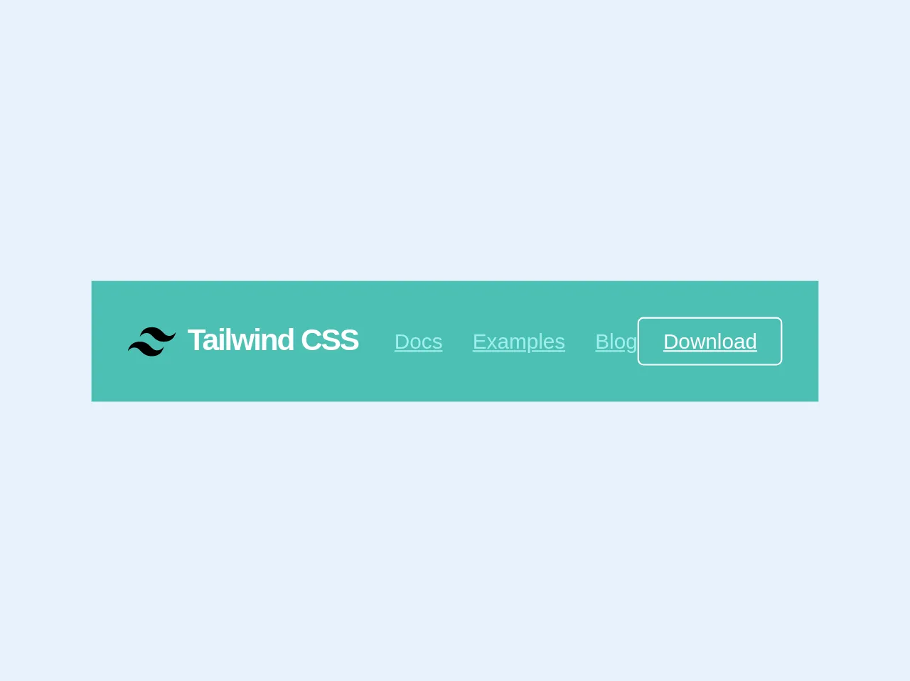
The preview of Responsive Header ui component
Creating a responsive header with Tailwind CSS is easy. Here's a preview of what our header will look like:
Free download of the Responsive Header's source code
The source code of Responsive Header ui component
Here's the source code for our responsive header:
<nav class="flex items-center justify-between flex-wrap bg-teal p-6">
  <div class="flex items-center flex-no-shrink text-white mr-6">
    <svg class="h-8 w-8 mr-2" width="54" height="54" viewBox="0 0 54 54" xmlns="http://www.w3.org/2000/svg"><path d="M13.5 22.1c1.8-7.2 6.3-10.8 13.5-10.8 10.8 0 12.15 8.1 17.55 9.45 3.6.9 6.75-.45 9.45-4.05-1.8 7.2-6.3 10.8-13.5 10.8-10.8 0-12.15-8.1-17.55-9.45-3.6-.9-6.75.45-9.45 4.05zM0 38.3c1.8-7.2 6.3-10.8 13.5-10.8 10.8 0 12.15 8.1 17.55 9.45 3.6.9 6.75-.45 9.45-4.05-1.8 7.2-6.3 10.8-13.5 10.8-10.8 0-12.15-8.1-17.55-9.45-3.6-.9-6.75.45-9.45 4.05z"/></svg>
    <span class="font-semibold text-xl tracking-tight">Tailwind CSS</span>
  </div>
  <div class="block lg:hidden">
    <button class="flex items-center px-3 py-2 border rounded text-teal-lighter border-teal-light hover:text-white hover:border-white">
      <svg class="h-3 w-3" viewBox="0 0 20 20" xmlns="http://www.w3.org/2000/svg"><title>Menu</title><path d="M0 3h20v2H0V3zm0 6h20v2H0V9zm0 6h20v2H0v-2z"/></svg>
    </button>
  </div>
  <div class="w-full block flex-grow lg:flex lg:items-center lg:w-auto">
    <div class="text-sm lg:flex-grow">
      <a href="#responsive-header" class="block mt-4 lg:inline-block lg:mt-0 text-teal-lighter hover:text-white mr-4">
        Docs
      </a>
      <a href="#responsive-header" class="block mt-4 lg:inline-block lg:mt-0 text-teal-lighter hover:text-white mr-4">
        Examples
      </a>
      <a href="#responsive-header" class="block mt-4 lg:inline-block lg:mt-0 text-teal-lighter hover:text-white">
        Blog
      </a>
    </div>
    <div>
      <a href="#" class="inline-block text-sm px-4 py-2 leading-none border rounded text-white border-white hover:border-transparent hover:text-teal hover:bg-white mt-4 lg:mt-0">Download</a>
    </div>
  </div>
</nav>
How to create a Responsive Header with Tailwind CSS?
Now that you know why Tailwind CSS is an excellent choice for creating a responsive header let's dive into the six steps to create it.
Step 1: Set up your HTML
The first step is to set up your HTML. Here's an example of what your HTML might look like:
<header class="bg-gray-900 text-white">
  <div class="container mx-auto flex justify-between items-center py-4">
    <a href="#" class="text-xl font-bold">Logo</a>
    <nav>
      <ul class="flex">
        <li><a href="#" class="px-4">Home</a></li>
        <li><a href="#" class="px-4">About</a></li>
        <li><a href="#" class="px-4">Contact</a></li>
      </ul>
    </nav>
  </div>
</header>
In this example, we have a header element that contains a div element with two child elements: an a element and a nav element. The nav element contains an unordered list (ul) with three list items (li), each containing an a element.
Step 2: Add Tailwind CSS to your project
The next step is to add Tailwind CSS to your project. You can do this by including the Tailwind CSS file in your HTML file or by using a package manager like npm or Yarn.
Step 3: Add Tailwind CSS classes to your HTML
Once you have added Tailwind CSS to your project, you can start using its pre-defined classes to style your HTML elements. Here's an updated version of our HTML with Tailwind CSS classes:
<header class="bg-gray-900 text-white">
  <div class="container mx-auto flex justify-between items-center py-4">
    <a href="#" class="text-xl font-bold">Logo</a>
    <nav>
      <ul class="flex">
        <li><a href="#" class="px-4">Home</a></li>
        <li><a href="#" class="px-4">About</a></li>
        <li><a href="#" class="px-4">Contact</a></li>
      </ul>
    </nav>
  </div>
</header>
In this example, we have added Tailwind CSS classes to the header, div, a, nav, ul, and li elements. These classes define the background color, text color, container width, flex layout, font size, and padding.
Step 4: Add responsive classes
To make our header responsive, we need to add responsive classes to our HTML. These classes adjust the layout and design of our header based on the size of the screen it is being viewed on. Here's an updated version of our HTML with responsive classes:
<header class="bg-gray-900 text-white">
  <div class="container mx-auto flex justify-between items-center py-4">
    <a href="#" class="text-xl font-bold">Logo</a>
    <nav class="hidden md:block">
      <ul class="flex">
        <li><a href="#" class="px-4">Home</a></li>
        <li><a href="#" class="px-4">About</a></li>
        <li><a href="#" class="px-4">Contact</a></li>
      </ul>
    </nav>
    <button class="md:hidden">
      <svg viewBox="0 0 20 20" fill="currentColor" class="menu w-6 h-6">
        <path fill-rule="evenodd" d="M2 4.75C2 4.33579 2.33579 4 2.75 4H17.25C17.6642 4 18 4.33579 18 4.75C18 5.16421 17.6642 5.5 17.25 5.5H2.75C2.33579 5.5 2 5.16421 2 4.75ZM2.75 8.5H17.25C17.6642 8.5 18 8.83579 18 9.25C18 9.66421 17.6642 10 17.25 10H2.75C2.33579 10 2 9.66421 2 9.25C2 8.83579 2.33579 8.5 2.75 8.5ZM17.25 14H2.75C2.33579 14 2 14.3358 2 14.75C2 15.1642 2.33579 15.5 2.75 15.5H17.25C17.6642 15.5 18 15.1642 18 14.75C18 14.3358 17.6642 14 17.25 14Z" clip-rule="evenodd"></path>
      </svg>
    </button>
  </div>
  <nav class="md:hidden">
    <ul class="flex flex-col items-center">
      <li><a href="#" class="py-2">Home</a></li>
      <li><a href="#" class="py-2">About</a></li>
      <li><a href="#" class="py-2">Contact</a></li>
    </ul>
  </nav>
</header>
In this example, we have added the hidden class to the nav element inside the div element. This class hides the navigation links on screens smaller than md (medium) size. We have also added a button element with an SVG icon that toggles the visibility of the navigation links on small screens.
We have added a new nav element after the header element. This nav element contains a ul element with three li elements, each containing an a element. These elements are displayed as a column on small screens and are centered vertically.
Step 5: Customize your header
Tailwind CSS is highly customizable, which means you can create a header that matches your brand's style and design. You can customize the colors, fonts, spacing, and more. Here's an example of how you can customize the colors:
<header class="bg-primary text-white">
  <div class="container mx-auto flex justify-between items-center py-4">
    <a href="#" class="text-xl font-bold">Logo</a>
    <nav class="hidden md:block">
      <ul class="flex">
        <li><a href="#" class="px-4">Home</a></li>
        <li><a href="#" class="px-4">About</a></li>
        <li><a href="#" class="px-4">Contact</a></li>
      </ul>
    </nav>
    <button class="md:hidden">
      <svg viewBox="0 0 20 20" fill="currentColor" class="menu w-6 h-6">
        <path fill-rule="evenodd" d="M2 4.75C2 4.33579 2.33579 4 2.75 4H17.25C17.6642 4 18 4.33579 18 4.75C18 5.16421 17.6642 5.5 17.25 5.5H2.75C2.33579 5.5 2 5.16421 2 4.75ZM2.75 8.5H17.25C17.6642 8.5 18 8.83579 18 9.25C18 9.66421 17.6642 10 17.25 10H2.75C2.33579 10 2 9.66421 2 9.25C2 8.83579 2.33579 8.5 2.75 8.5ZM17.25 14H2.75C2.33579 14 2 14.3358 2 14.75C2 15.1642 2.33579 15.5 2.75 15.5H17.25C17.6642 15.5 18 15.1642 18 14.75C18 14.3358 17.6642 14 17.25 14Z" clip-rule="evenodd"></path>
      </svg>
    </button>
  </div>
  <nav class="md:hidden">
    <ul class="flex flex-col items-center">
      <li><a href="#" class="py-2">Home</a></li>
      <li><a href="#" class="py-2">About</a></li>
      <li><a href="#" class="py-2">Contact</a></li>
    </ul>
  </nav>
</header>
In this example, we have changed the background color of the header to primary, which is a custom color defined in our Tailwind CSS configuration file.
Step 6: Test your header
The final step is to test your header on different screen sizes to ensure it looks great on desktop, tablet, and mobile devices.
Conclusion
Creating a responsive header with Tailwind CSS is easy and efficient. By following these six steps, you can create a custom header that matches your brand's style and design. With Tailwind CSS, you no longer need to write custom CSS code from scratch, which saves you time and effort. Give it a try and see how easy it is to create a responsive header like an expert.