- Published on
Learn How To Build A Responsive Grid Layout With Tailwind CSS from the Pros
- What is Tailwind CSS?
- The description of Responsive Grid Layout ui component
- Why use Tailwind CSS to create a Responsive Grid Layout ui component?
- The preview of Responsive Grid Layout ui component.
- The source code of Responsive Grid Layout ui component.
- How to create a Responsive Grid Layout with Tailwind CSS?
- Conclusion
As a FrontEnd technology blogger, it is essential to keep up with the latest trends and tools in the industry. One of the most popular CSS frameworks that have gained popularity in recent years is Tailwind CSS. It is a utility-first CSS framework that enables developers to create responsive and customizable UI components with ease. In this article, we will learn how to build a responsive grid layout with Tailwind CSS from the pros.
What is Tailwind CSS?
Tailwind CSS is a utility-first CSS framework that provides a set of pre-defined CSS classes that can be used to style HTML elements. It is designed to make the development process faster and more efficient by reducing the need for custom CSS. Tailwind CSS provides a comprehensive set of utility classes that can be used to create responsive and customizable UI components.
The description of Responsive Grid Layout ui component
A responsive grid layout is a UI component that allows developers to create a grid of columns and rows that adjust to different screen sizes. It is an essential component for building responsive websites that work well on different devices. A responsive grid layout enables developers to create a flexible and scalable layout that adjusts to different screen sizes.
Why use Tailwind CSS to create a Responsive Grid Layout ui component?
Tailwind CSS provides a set of utility classes that can be used to create a responsive grid layout quickly. It eliminates the need for custom CSS and reduces the development time significantly. Tailwind CSS provides a comprehensive set of utility classes that can be used to create a responsive and customizable UI component.
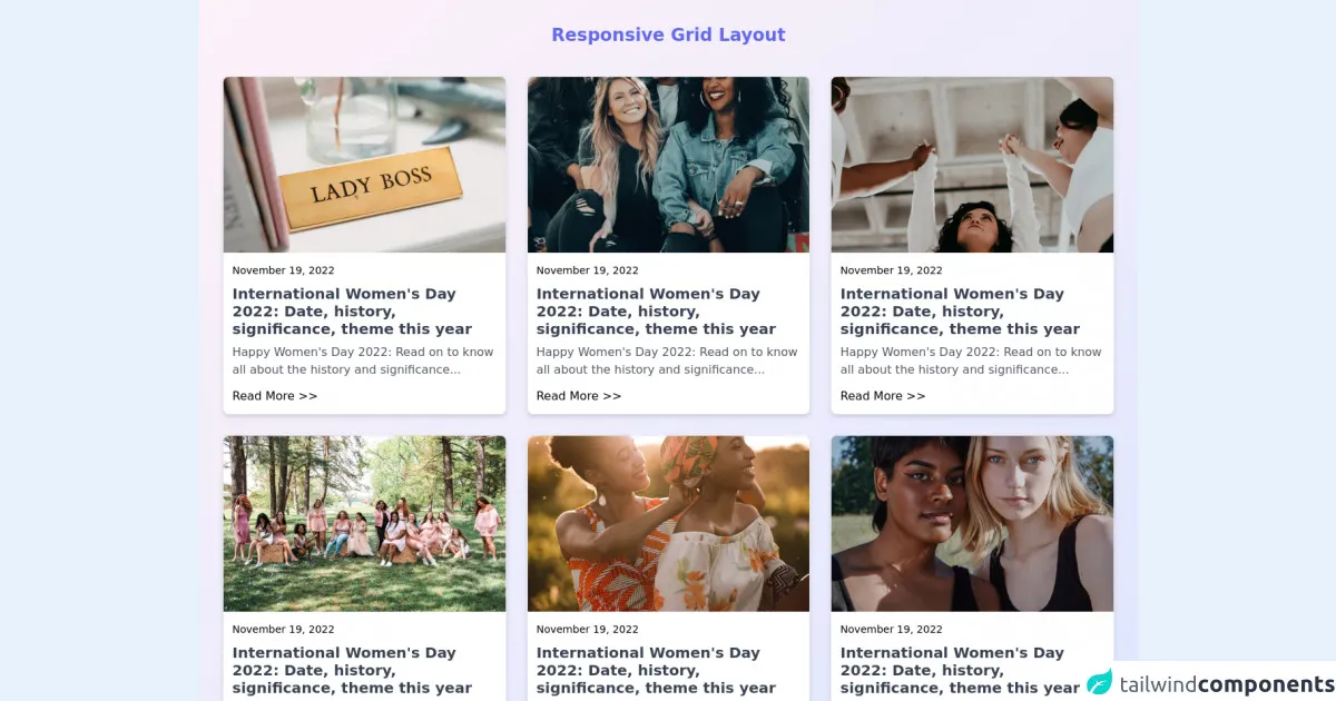
The preview of Responsive Grid Layout ui component.
To create a responsive grid layout with Tailwind CSS, we will use a combination of grid and flexbox classes. The grid classes define the grid layout, and the flexbox classes define how the grid items are positioned within the grid. Here is a preview of what the responsive grid layout will look like:
Free download of the Responsive Grid Layout's source code
The source code of Responsive Grid Layout ui component.
To create a responsive grid layout with Tailwind CSS, we will use a combination of grid and flexbox classes. The grid classes define the grid layout, and the flexbox classes define how the grid items are positioned within the grid. Here is the source code for the responsive grid layout:
<!--
  Date : April 14, 2022
  Author : Saad Hasan
  Github : https://github.com/saadh393
  Title : Responsive Grid Layout
  External Plugin : None

 -->

<section class="h-screen w-screen bg-gradient-to-br from-pink-50 to-indigo-100 p-8">
    <h1 class="text-center font-bold text-2xl text-indigo-500">Responsive Grid Layout </h1>

    <div class="grid justify-center md:grid-cols-2 lg:grid-cols-3 gap-5 lg:gap-7 my-10">
        <!-- Card 1 -->
        <div class="bg-white rounded-lg border shadow-md max-w-xs md:max-w-none overflow-hidden">
            <img class="h-56 lg:h-60 w-full object-cover" src="https://images.unsplash.com/photo-1523289217630-0dd16184af8e?ixlib=rb-1.2.1&ixid=MnwxMjA3fDB8MHxzZWFyY2h8OHx8d29tZW4lMjBlbXBvd2VybWVudHxlbnwwfHwwfHw%3D&auto=format&fit=crop&w=500&q=60" alt="" />
            <div class="p-3">
                <span class="text-sm text-primary">November 19, 2022</span>
                <h3 class="font-semibold text-xl leading-6 text-gray-700 my-2">
                International Women's Day 2022: Date, history, significance, theme this year
                </h3>
                <p class="paragraph-normal text-gray-600">
                Happy Women's Day 2022: Read on to know all about the history and significance...
                </p>
                <a class="mt-3 block" href="#">Read More >></a>
            </div>
        </div>

        <!-- Card 2 -->
        <div class="bg-white rounded-lg border shadow-md max-w-xs md:max-w-none overflow-hidden">
            <img class="h-56 lg:h-60 w-full object-cover" src="https://images.unsplash.com/photo-1607748862156-7c548e7e98f4?ixlib=rb-1.2.1&ixid=MnwxMjA3fDB8MHxzZWFyY2h8MTN8fHdvbWVuJTIwZW1wb3dlcm1lbnR8ZW58MHx8MHx8&auto=format&fit=crop&w=500&q=60" alt="" />
            <div class="p-3">
                <span class="text-sm text-primary">November 19, 2022</span>
                <h3 class="font-semibold text-xl leading-6 text-gray-700 my-2">
                International Women's Day 2022: Date, history, significance, theme this year
                </h3>
                <p class="paragraph-normal text-gray-600">
                Happy Women's Day 2022: Read on to know all about the history and significance...
                </p>
                <a class="mt-3 block" href="#">Read More >></a>
            </div>
        </div>

        <!-- Card 3 -->
        <div class="bg-white rounded-lg border shadow-md max-w-xs md:max-w-none overflow-hidden">
            <img class="h-56 lg:h-60 w-full object-cover" src="https://images.unsplash.com/photo-1637419450536-378d5457abb8?ixlib=rb-1.2.1&ixid=MnwxMjA3fDB8MHxzZWFyY2h8MTl8fHdvbWVuJTIwZW1wb3dlcm1lbnR8ZW58MHx8MHx8&auto=format&fit=crop&w=500&q=60" alt="" />
            <div class="p-3">
                <span class="text-sm text-primary">November 19, 2022</span>
                <h3 class="font-semibold text-xl leading-6 text-gray-700 my-2">
                International Women's Day 2022: Date, history, significance, theme this year
                </h3>
                <p class="paragraph-normal text-gray-600">
                Happy Women's Day 2022: Read on to know all about the history and significance...
                </p>
                <a class="mt-3 block" href="#">Read More >></a>
            </div>
        </div>

        <!-- Card 4 -->
        <div class="bg-white rounded-lg border shadow-md max-w-xs md:max-w-none overflow-hidden">
            <img class="h-56 lg:h-60 w-full object-cover" src="https://images.unsplash.com/photo-1621352404112-58e2468993a0?ixlib=rb-1.2.1&ixid=MnwxMjA3fDB8MHxzZWFyY2h8Mjd8fHdvbWVuJTIwZW1wb3dlcm1lbnR8ZW58MHx8MHx8&auto=format&fit=crop&w=500&q=60" alt="" />
            <div class="p-3">
                <span class="text-sm text-primary">November 19, 2022</span>
                <h3 class="font-semibold text-xl leading-6 text-gray-700 my-2">
                International Women's Day 2022: Date, history, significance, theme this year
                </h3>
                <p class="paragraph-normal text-gray-600">
                Happy Women's Day 2022: Read on to know all about the history and significance...
                </p>
                <a class="mt-3 block" href="#">Read More >></a>
            </div>
        </div>

        <!-- Card 5 -->
        <div class="bg-white rounded-lg border shadow-md max-w-xs md:max-w-none overflow-hidden">
            <img class="h-56 lg:h-60 w-full object-cover" src="https://images.unsplash.com/photo-1607868894064-2b6e7ed1b324?ixlib=rb-1.2.1&ixid=MnwxMjA3fDB8MHxzZWFyY2h8Mjl8fHdvbWVuJTIwZW1wb3dlcm1lbnR8ZW58MHx8MHx8&auto=format&fit=crop&w=500&q=60" alt="" />
            <div class="p-3">
                <span class="text-sm text-primary">November 19, 2022</span>
                <h3 class="font-semibold text-xl leading-6 text-gray-700 my-2">
                International Women's Day 2022: Date, history, significance, theme this year
                </h3>
                <p class="paragraph-normal text-gray-600">
                Happy Women's Day 2022: Read on to know all about the history and significance...
                </p>
                <a class="mt-3 block" href="#">Read More >></a>
            </div>
        </div>

        <!-- Card 6 -->
        <div class="bg-white rounded-lg border shadow-md max-w-xs md:max-w-none overflow-hidden">
            <img class="h-56 lg:h-60 w-full object-cover" src="https://images.unsplash.com/photo-1633329712176-4751f52ccc1b?ixlib=rb-1.2.1&ixid=MnwxMjA3fDB8MHxzZWFyY2h8MzV8fHdvbWVuJTIwZW1wb3dlcm1lbnR8ZW58MHx8MHx8&auto=format&fit=crop&w=500&q=60" alt="" />
            <div class="p-3">
                <span class="text-sm text-primary">November 19, 2022</span>
                <h3 class="font-semibold text-xl leading-6 text-gray-700 my-2">
                International Women's Day 2022: Date, history, significance, theme this year
                </h3>
                <p class="paragraph-normal text-gray-600">
                Happy Women's Day 2022: Read on to know all about the history and significance...
                </p>
                <a class="mt-3 block" href="#">Read More >></a>
            </div>
        </div>
    </div>
    <section class="mt-4 text-center">Build with ❤️ by <a href="https://github.com/saadh393" target="_blank">Saad Hasan </a></section>
</section>
How to create a Responsive Grid Layout with Tailwind CSS?
To create a responsive grid layout with Tailwind CSS, follow these steps:
- Create a container element for the grid layout.
- Use the grid classes to define the grid layout.
- Use the flexbox classes to position the grid items within the grid.
- Use the responsive utility classes to adjust the grid layout for different screen sizes.
Here is an example of how to create a responsive grid layout with Tailwind CSS:
<div class="container mx-auto">
  <div class="grid grid-cols-1 sm:grid-cols-2 md:grid-cols-3 lg:grid-cols-4 gap-4">
    <div class="bg-gray-200 p-4">Item 1</div>
    <div class="bg-gray-200 p-4">Item 2</div>
    <div class="bg-gray-200 p-4">Item 3</div>
    <div class="bg-gray-200 p-4">Item 4</div>
    <div class="bg-gray-200 p-4">Item 5</div>
    <div class="bg-gray-200 p-4">Item 6</div>
    <div class="bg-gray-200 p-4">Item 7</div>
    <div class="bg-gray-200 p-4">Item 8</div>
  </div>
</div>
In this example, we have created a container element with the container class. Inside the container, we have used the grid class to define the grid layout. We have specified that the grid should have one column by default (grid-cols-1) and should have two columns on small screens (sm:grid-cols-2), three columns on medium screens (md:grid-cols-3), and four columns on large screens (lg:grid-cols-4). We have also specified a gap of 4 pixels between the grid items (gap-4). Finally, we have added some content to the grid items (bg-gray-200 and p-4).
Conclusion
In conclusion, Tailwind CSS is a powerful CSS framework that enables developers to create responsive and customizable UI components with ease. In this article, we have learned how to build a responsive grid layout with Tailwind CSS from the pros. We have seen how Tailwind CSS provides a comprehensive set of utility classes that can be used to create a responsive and customizable UI component. We have also seen how to create a responsive grid layout with Tailwind CSS by using a combination of grid and flexbox classes. With Tailwind CSS, developers can create responsive and scalable layouts quickly and efficiently.