- Published on
Most Effective Ways To Create A Responsive Gallery With Tailwind CSS
- What is Tailwind CSS?
- The description of Responsive Gallery ui component
- Why use Tailwind CSS to create a Responsive Gallery ui component?
- The preview of Responsive Gallery ui component
- The source code of Responsive Gallery ui component
- How to create a Responsive Gallery with Tailwind CSS?
- Conclusion
In today's digital world, creating a responsive gallery is an essential part of any website or application. A responsive gallery allows users to view images and other media on any device, from desktops to mobile phones, without compromising the user experience. In this article, we will explore the most effective ways to create a responsive gallery with Tailwind CSS.
What is Tailwind CSS?
Tailwind CSS is a utility-first CSS framework that provides a set of pre-defined CSS classes that can be used to style HTML elements. It allows developers to create complex layouts and designs quickly and efficiently, without having to write custom CSS. Tailwind CSS is highly customizable, and it provides a wide range of pre-defined classes that can be used to create responsive designs.
The description of Responsive Gallery ui component
A responsive gallery is a user interface component that displays images or other media in a grid or a list. A responsive gallery adjusts its layout and size based on the screen size and device type, ensuring that the user can view the images without any distortion or loss of quality. A responsive gallery typically includes features such as zooming, panning, and scrolling, allowing users to interact with the images.
Why use Tailwind CSS to create a Responsive Gallery ui component?
Tailwind CSS provides a set of pre-defined classes that can be used to create responsive designs quickly and efficiently. It allows developers to focus on the functionality of the gallery rather than the design, which can save time and effort. Tailwind CSS also provides a wide range of customization options, allowing developers to create unique and visually appealing galleries that match the design of the website or application.
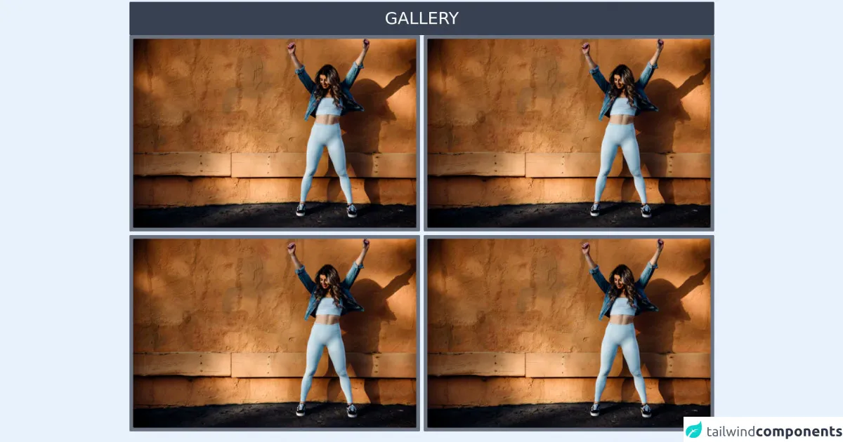
The preview of Responsive Gallery ui component
Creating a responsive gallery with Tailwind CSS is easy and straightforward. With just a few lines of code, you can create a beautiful and functional gallery that works on any device. Here is a preview of what a responsive gallery created with Tailwind CSS might look like:
Free download of the Responsive Gallery's source code
The source code of Responsive Gallery ui component
To create a responsive gallery with Tailwind CSS, you need to use a combination of HTML and CSS. The HTML code defines the structure of the gallery, while the CSS code defines the style and layout. Here is an example of the HTML and CSS code that you can use to create a responsive gallery with Tailwind CSS:
<div class='mx-auto'>

 <!--Gallery 1-->
<!--Responsive grid-->
<div class="mx-auto px-2 my-1">
 <h2 class="text-4xl bg-gray-700 p-4 rounded-sm text-white text-center">GALLERY  </h2>
<div class="grid grid-cols-1 md:grid-cols-2 lg:grid-cols-2 gap-2">
<div class="flex justify-center text-6xl border-1 border-gray-300 rounded-sm p-2 bg-gray-500 hover:bg-red-700"><img class="w-full rounded-sm bg-red-500" src="https://images.unsplash.com/photo-1636657156745-338e53598328?ixid=MnwxMjA3fDB8MHxlZGl0b3JpYWwtZmVlZHwxOXx8fGVufDB8fHx8&ixlib=rb-1.2.1&auto=format&fit=crop&w=500&q=60" /></div>
<div class="flex justify-center text-6xl border-1 border-gray-300 rounded-sm p-2 bg-gray-500 hover:bg-red-700"><img class="w-full rounded-sm" src="https://images.unsplash.com/photo-1636657156745-338e53598328?ixid=MnwxMjA3fDB8MHxlZGl0b3JpYWwtZmVlZHwxOXx8fGVufDB8fHx8&ixlib=rb-1.2.1&auto=format&fit=crop&w=500&q=60" /></div>
<div class="flex justify-center text-6xl border-1 border-gray-300 rounded-sm p-2 bg-gray-500 hover:bg-red-700"><img class="w-full rounded-sm" src="https://images.unsplash.com/photo-1636657156745-338e53598328?ixid=MnwxMjA3fDB8MHxlZGl0b3JpYWwtZmVlZHwxOXx8fGVufDB8fHx8&ixlib=rb-1.2.1&auto=format&fit=crop&w=500&q=60" /></div>
<div class="flex justify-center text-6xl border-1 border-gray-300 rounded-sm p-2 bg-gray-500 hover:bg-red-700"><img class="w-full rounded-sm" src="https://images.unsplash.com/photo-1636657156745-338e53598328?ixid=MnwxMjA3fDB8MHxlZGl0b3JpYWwtZmVlZHwxOXx8fGVufDB8fHx8&ixlib=rb-1.2.1&auto=format&fit=crop&w=500&q=60" /></div>
</div>
</div>
<!--/Gallery 1-->


<!--Gallery 2-->
<div class="mx-auto px-2 my-10">
<div class="grid grid-cols-1 md:grid-cols-2 lg:grid-cols-2 gap-2">
<div class="flex justify-center text-6xl border-1 border-gray-300 rounded-sm p-2 bg-gray-500"><img class="w-full rounded-sm" src="https://images.unsplash.com/photo-1636548646163-a14de6514ce0?ixid=MnwxMjA3fDB8MHxlZGl0b3JpYWwtZmVlZHwzOHx8fGVufDB8fHx8&ixlib=rb-1.2.1&auto=format&fit=crop&w=500&q=60" /></div>
<div class="flex justify-center text-6xl border-1 border-gray-300 rounded-sm p-2 bg-gray-500"><img class="w-full rounded-sm" src="https://images.unsplash.com/photo-1636548646163-a14de6514ce0?ixid=MnwxMjA3fDB8MHxlZGl0b3JpYWwtZmVlZHwzOHx8fGVufDB8fHx8&ixlib=rb-1.2.1&auto=format&fit=crop&w=500&q=60" /></div>
<div class="flex justify-center text-6xl border-1 border-gray-300 rounded-sm p-2 bg-gray-500"><img class="w-full rounded-sm" src="https://images.unsplash.com/photo-1636548646163-a14de6514ce0?ixid=MnwxMjA3fDB8MHxlZGl0b3JpYWwtZmVlZHwzOHx8fGVufDB8fHx8&ixlib=rb-1.2.1&auto=format&fit=crop&w=500&q=60" /></div>
<div class="flex justify-center text-6xl border-1 border-gray-300 rounded-sm p-2 bg-gray-500"><img class="w-full rounded-sm" src="https://images.unsplash.com/photo-1636548646163-a14de6514ce0?ixid=MnwxMjA3fDB8MHxlZGl0b3JpYWwtZmVlZHwzOHx8fGVufDB8fHx8&ixlib=rb-1.2.1&auto=format&fit=crop&w=500&q=60" /></div>
</div>
</div>
<!--/Gallery 2-->


</div>
How to create a Responsive Gallery with Tailwind CSS?
To create a responsive gallery with Tailwind CSS, follow these steps:
Define the structure of the gallery using HTML. You can use a grid or a list layout, depending on your preference.
Add the necessary CSS classes to the HTML elements to style and layout the gallery. You can use Tailwind CSS classes to create a responsive design that works on any device.
Add any additional features or functionality to the gallery, such as zooming, panning, or scrolling.
Test the gallery on different devices to ensure that it works correctly and looks good.
Conclusion
Creating a responsive gallery with Tailwind CSS is an effective way to ensure that your images and other media are displayed correctly on any device. With Tailwind CSS, you can create a beautiful and functional gallery quickly and efficiently, without having to write custom CSS. By following the steps outlined in this article, you can create a responsive gallery that enhances the user experience and adds value to your website or application.