- Published on
The 5 Really Obvious Ways To Make A Responsive footer With Tailwind CSS Better That You Ever Did
- What is Tailwind CSS?
- The description of Responsive footer ui component
- Why use Tailwind CSS to create a Responsive footer ui component?
- The preview of Responsive footer ui component.
- The source code of Responsive footer ui component.
- How to create a Responsive footer with Tailwind CSS?
- Conclusion
As a FrontEnd technology blogger, it's important to stay up-to-date with the latest trends and tools in the industry. One of the most popular tools for creating responsive UI components is Tailwind CSS. In this article, we will explore how to create a responsive footer UI component using Tailwind CSS and discuss the benefits of using this framework.
What is Tailwind CSS?
Tailwind CSS is a utility-first CSS framework that allows developers to quickly and easily create responsive UI components. It provides a set of pre-defined classes that can be used to style HTML elements without having to write custom CSS.
The description of Responsive footer ui component
A responsive footer UI component is an essential part of any website. It is the area at the bottom of the page that contains important information such as copyright notices, links to social media, and contact information.
A responsive footer is one that adjusts its layout and content based on the size of the screen it is being viewed on. This ensures that the footer looks great on all devices, from desktops to smartphones.
Why use Tailwind CSS to create a Responsive footer ui component?
Tailwind CSS is a great choice for creating a responsive footer UI component for several reasons:
It provides a set of pre-defined classes that can be used to style HTML elements without having to write custom CSS.
It is designed to be mobile-first, which means that it prioritizes the design of mobile devices over desktops.
It is highly customizable, allowing developers to create unique designs that match their brand.
It is easy to learn and use, making it a great choice for developers of all skill levels.
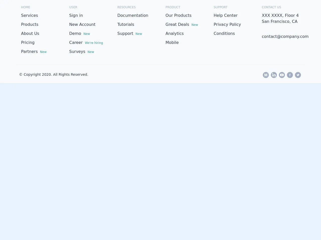
The preview of Responsive footer ui component.
To give you an idea of what a responsive footer UI component created with Tailwind CSS looks like, here is a preview:
Free download of the Responsive footer's source code
The source code of Responsive footer ui component.
Here is the source code for a responsive footer UI component created with Tailwind CSS:
<div class="bg-gray-100">
   <div class="max-w-6xl m-auto text-gray-800 flex flex-wrap justify-center">
      <div class="p-5 w-48 ">
         <div class="text-xs uppercase text-gray-500 font-medium">Home</div>
         <a class="my-3 block" href="/#">Services <span class="text-teal-600 text-xs p-1"></span></a><a class="my-3 block" href="/#">Products <span class="text-teal-600 text-xs p-1"></span></a><a class="my-3 block" href="/#">About Us <span class="text-teal-600 text-xs p-1"></span></a><a class="my-3 block" href="/#">Pricing <span class="text-teal-600 text-xs p-1"></span></a><a class="my-3 block" href="/#">Partners <span class="text-teal-600 text-xs p-1">New</span></a>
      </div>
      <div class="p-5 w-48 ">
         <div class="text-xs uppercase text-gray-500 font-medium">User</div>
         <a class="my-3 block" href="/#">Sign in <span class="text-teal-600 text-xs p-1"></span></a><a class="my-3 block" href="/#">New Account <span class="text-teal-600 text-xs p-1"></span></a><a class="my-3 block" href="/#">Demo <span class="text-teal-600 text-xs p-1">New</span></a><a class="my-3 block" href="/#">Career <span class="text-teal-600 text-xs p-1">We're hiring</span></a><a class="my-3 block" href="/#">Surveys <span class="text-teal-600 text-xs p-1">New</span></a>
      </div>
      <div class="p-5 w-48 ">
         <div class="text-xs uppercase text-gray-500 font-medium">Resources</div>
         <a class="my-3 block" href="/#">Documentation <span class="text-teal-600 text-xs p-1"></span></a><a class="my-3 block" href="/#">Tutorials <span class="text-teal-600 text-xs p-1"></span></a><a class="my-3 block" href="/#">Support <span class="text-teal-600 text-xs p-1">New</span></a>
      </div>
      <div class="p-5 w-48 ">
         <div class="text-xs uppercase text-gray-500 font-medium">Product</div>
         <a class="my-3 block" href="/#">Our Products <span class="text-teal-600 text-xs p-1"></span></a><a class="my-3 block" href="/#">Great Deals <span class="text-teal-600 text-xs p-1">New</span></a><a class="my-3 block" href="/#">Analytics <span class="text-teal-600 text-xs p-1"></span></a><a class="my-3 block" href="/#">Mobile <span class="text-teal-600 text-xs p-1"></span></a>
      </div>
      <div class="p-5 w-48 ">
         <div class="text-xs uppercase text-gray-500 font-medium">Support</div>
         <a class="my-3 block" href="/#">Help Center <span class="text-teal-600 text-xs p-1"></span></a><a class="my-3 block" href="/#">Privacy Policy <span class="text-teal-600 text-xs p-1"></span></a><a class="my-3 block" href="/#">Conditions <span class="text-teal-600 text-xs p-1"></span></a>
      </div>
      <div class="p-5 w-48 ">
         <div class="text-xs uppercase text-gray-500 font-medium">Contact us</div>
         <a class="my-3 block" href="/#">XXX XXXX, Floor 4 San Francisco, CA <span class="text-teal-600 text-xs p-1"></span></a><a class="my-3 block" href="/#">[email protected] <span class="text-teal-600 text-xs p-1"></span></a>
      </div>
   </div>
</div>

<div class="bg-gray-100 pt-2 ">
   <div class="flex pb-5 px-3 m-auto pt-5 border-t text-gray-800 text-sm flex-col
      md:flex-row max-w-6xl">
      <div class="mt-2">© Copyright 2020. All Rights Reserved.</div>
      <div class="md:flex-auto md:flex-row-reverse mt-2 flex-row flex">
         <a href="/#" class="w-6 mx-1">
            <svg class="fill-current cursor-pointer text-gray-500 hover:text-gray-400" width="100%" height="100%" viewBox="0 0 24 24" version="1.1" xmlns="http://www.w3.org/2000/svg" xmlns:xlink="http://www.w3.org/1999/xlink" xml:space="preserve" xmlns:serif="http://www.serif.com/" style="fill-rule: evenodd; clip-rule: evenodd; stroke-linejoin: round; stroke-miterlimit: 2;">
               <path id="Twitter" d="M24,12c0,6.627 -5.373,12 -12,12c-6.627,0 -12,-5.373 -12,-12c0,-6.627
                  5.373,-12 12,-12c6.627,0 12,5.373 12,12Zm-6.465,-3.192c-0.379,0.168
                  -0.786,0.281 -1.213,0.333c0.436,-0.262 0.771,-0.676
                  0.929,-1.169c-0.408,0.242 -0.86,0.418 -1.341,0.513c-0.385,-0.411
                  -0.934,-0.667 -1.541,-0.667c-1.167,0 -2.112,0.945 -2.112,2.111c0,0.166
                  0.018,0.327 0.054,0.482c-1.754,-0.088 -3.31,-0.929
                  -4.352,-2.206c-0.181,0.311 -0.286,0.674 -0.286,1.061c0,0.733 0.373,1.379
                  0.94,1.757c-0.346,-0.01 -0.672,-0.106 -0.956,-0.264c-0.001,0.009
                  -0.001,0.018 -0.001,0.027c0,1.023 0.728,1.877 1.694,2.07c-0.177,0.049
                  -0.364,0.075 -0.556,0.075c-0.137,0 -0.269,-0.014 -0.397,-0.038c0.268,0.838
                  1.048,1.449 1.972,1.466c-0.723,0.566 -1.633,0.904 -2.622,0.904c-0.171,0
                  -0.339,-0.01 -0.504,-0.03c0.934,0.599 2.044,0.949 3.237,0.949c3.883,0
                  6.007,-3.217 6.007,-6.008c0,-0.091 -0.002,-0.183 -0.006,-0.273c0.413,-0.298
                  0.771,-0.67 1.054,-1.093Z"></path>
            </svg>
         </a>
         <a href="/#" class="w-6 mx-1">
            <svg class="fill-current cursor-pointer text-gray-500 hover:text-gray-400" width="100%" height="100%" viewBox="0 0 24 24" version="1.1" xmlns="http://www.w3.org/2000/svg" xmlns:xlink="http://www.w3.org/1999/xlink" xml:space="preserve" xmlns:serif="http://www.serif.com/" style="fill-rule: evenodd; clip-rule: evenodd; stroke-linejoin: round; stroke-miterlimit: 2;">
               <path id="Facebook" d="M24,12c0,6.627 -5.373,12 -12,12c-6.627,0 -12,-5.373 -12,-12c0,-6.627
                  5.373,-12 12,-12c6.627,0 12,5.373
                  12,12Zm-11.278,0l1.294,0l0.172,-1.617l-1.466,0l0.002,-0.808c0,-0.422
                  0.04,-0.648 0.646,-0.648l0.809,0l0,-1.616l-1.295,0c-1.555,0 -2.103,0.784
                  -2.103,2.102l0,0.97l-0.969,0l0,1.617l0.969,0l0,4.689l1.941,0l0,-4.689Z"></path>
            </svg>
         </a>
         <a href="/#" class="w-6 mx-1">
            <svg class="fill-current cursor-pointer text-gray-500 hover:text-gray-400" width="100%" height="100%" viewBox="0 0 24 24" version="1.1" xmlns="http://www.w3.org/2000/svg" xmlns:xlink="http://www.w3.org/1999/xlink" xml:space="preserve" xmlns:serif="http://www.serif.com/" style="fill-rule: evenodd; clip-rule: evenodd; stroke-linejoin: round; stroke-miterlimit: 2;">
               <g id="Layer_1">
                  <circle id="Oval" cx="12" cy="12" r="12"></circle>
                  <path id="Shape" d="M19.05,8.362c0,-0.062 0,-0.125 -0.063,-0.187l0,-0.063c-0.187,-0.562
                     -0.687,-0.937 -1.312,-0.937l0.125,0c0,0 -2.438,-0.375 -5.75,-0.375c-3.25,0
                     -5.75,0.375 -5.75,0.375l0.125,0c-0.625,0 -1.125,0.375
                     -1.313,0.937l0,0.063c0,0.062 0,0.125 -0.062,0.187c-0.063,0.625 -0.25,1.938
                     -0.25,3.438c0,1.5 0.187,2.812 0.25,3.437c0,0.063 0,0.125
                     0.062,0.188l0,0.062c0.188,0.563 0.688,0.938 1.313,0.938l-0.125,0c0,0
                     2.437,0.375 5.75,0.375c3.25,0 5.75,-0.375 5.75,-0.375l-0.125,0c0.625,0
                     1.125,-0.375 1.312,-0.938l0,-0.062c0,-0.063 0,-0.125
                     0.063,-0.188c0.062,-0.625 0.25,-1.937 0.25,-3.437c0,-1.5 -0.125,-2.813
                     -0.25,-3.438Zm-4.634,3.927l-3.201,2.315c-0.068,0.068 -0.137,0.068
                     -0.205,0.068c-0.068,0 -0.136,0 -0.204,-0.068c-0.136,-0.068 -0.204,-0.204
                     -0.204,-0.34l0,-4.631c0,-0.136 0.068,-0.273 0.204,-0.341c0.136,-0.068
                     0.272,-0.068 0.409,0l3.201,2.316c0.068,0.068 0.136,0.204
                     0.136,0.34c0.068,0.136 0,0.273 -0.136,0.341Z" style="fill: rgb(255, 255, 255);"></path>
               </g>
            </svg>
         </a>
         <a href="/#" class="w-6 mx-1">
            <svg class="fill-current cursor-pointer text-gray-500 hover:text-gray-400" width="100%" height="100%" viewBox="0 0 24 24" version="1.1" xmlns="http://www.w3.org/2000/svg" xmlns:xlink="http://www.w3.org/1999/xlink" xml:space="preserve" xmlns:serif="http://www.serif.com/" style="fill-rule: evenodd; clip-rule: evenodd; stroke-linejoin: round; stroke-miterlimit: 2;">
               <path id="Shape" d="M7.3,0.9c1.5,-0.6 3.1,-0.9 4.7,-0.9c1.6,0 3.2,0.3 4.7,0.9c1.5,0.6 2.8,1.5
                  3.8,2.6c1,1.1 1.9,2.3 2.6,3.8c0.7,1.5 0.9,3 0.9,4.7c0,1.7 -0.3,3.2
                  -0.9,4.7c-0.6,1.5 -1.5,2.8 -2.6,3.8c-1.1,1 -2.3,1.9 -3.8,2.6c-1.5,0.7
                  -3.1,0.9 -4.7,0.9c-1.6,0 -3.2,-0.3 -4.7,-0.9c-1.5,-0.6 -2.8,-1.5
                  -3.8,-2.6c-1,-1.1 -1.9,-2.3 -2.6,-3.8c-0.7,-1.5 -0.9,-3.1 -0.9,-4.7c0,-1.6
                  0.3,-3.2 0.9,-4.7c0.6,-1.5 1.5,-2.8 2.6,-3.8c1.1,-1 2.3,-1.9
                  3.8,-2.6Zm-0.3,7.1c0.6,0 1.1,-0.2 1.5,-0.5c0.4,-0.3 0.5,-0.8 0.5,-1.3c0,-0.5
                  -0.2,-0.9 -0.6,-1.2c-0.4,-0.3 -0.8,-0.5 -1.4,-0.5c-0.6,0 -1.1,0.2
                  -1.4,0.5c-0.3,0.3 -0.6,0.7 -0.6,1.2c0,0.5 0.2,0.9 0.5,1.3c0.3,0.4 0.9,0.5
                  1.5,0.5Zm1.5,10l0,-8.5l-3,0l0,8.5l3,0Zm11,0l0,-4.5c0,-1.4 -0.3,-2.5
                  -0.9,-3.3c-0.6,-0.8 -1.5,-1.2 -2.6,-1.2c-0.6,0 -1.1,0.2 -1.5,0.5c-0.4,0.3
                  -0.8,0.8 -0.9,1.3l-0.1,-1.3l-3,0l0.1,2l0,6.5l3,0l0,-4.5c0,-0.6 0.1,-1.1
                  0.4,-1.5c0.3,-0.4 0.6,-0.5 1.1,-0.5c0.5,0 0.9,0.2 1.1,0.5c0.2,0.3 0.4,0.8
                  0.4,1.5l0,4.5l2.9,0Z"></path>
            </svg>
         </a>
         <a href="/#" class="w-6 mx-1">
            <svg class="fill-current cursor-pointer text-gray-500 hover:text-gray-400" width="100%" height="100%" viewBox="0 0 24 24" version="1.1" xmlns="http://www.w3.org/2000/svg" xmlns:xlink="http://www.w3.org/1999/xlink" xml:space="preserve" xmlns:serif="http://www.serif.com/" style="fill-rule: evenodd; clip-rule: evenodd; stroke-linejoin: round; stroke-miterlimit: 2;">
               <path id="Combined-Shape" d="M12,24c6.627,0 12,-5.373 12,-12c0,-6.627 -5.373,-12 -12,-12c-6.627,0
                  -12,5.373 -12,12c0,6.627 5.373,12 12,12Zm6.591,-15.556l-0.722,0c-0.189,0
                  -0.681,0.208 -0.681,0.385l0,6.422c0,0.178 0.492,0.323
                  0.681,0.323l0.722,0l0,1.426l-4.675,0l0,-1.426l0.935,0l0,-6.655l-0.163,0l-2.251,8.081l-1.742,0l-2.222,-8.081l-0.168,0l0,6.655l0.935,0l0,1.426l-3.74,0l0,-1.426l0.519,0c0.203,0
                  0.416,-0.145 0.416,-0.323l0,-6.422c0,-0.177 -0.213,-0.385
                  -0.416,-0.385l-0.519,0l0,-1.426l4.847,0l1.583,5.704l0.042,0l1.598,-5.704l5.021,0l0,1.426Z"></path>
            </svg>
         </a>
      </div>
   </div>
</div>
How to create a Responsive footer with Tailwind CSS?
Now that we have covered the benefits of using Tailwind CSS to create a responsive footer UI component, let's dive into how to do it.
Step 1: Create the HTML structure
The first step is to create the HTML structure for the footer. This will typically include a container element that wraps all of the content, as well as individual elements for each piece of content, such as links and social media icons.
Step 2: Add Tailwind CSS classes
Once the HTML structure is in place, it's time to start adding Tailwind CSS classes to style the elements. For example, you might use the "bg-gray-900" class to set the background color of the footer to dark gray.
Step 3: Use responsive classes
To make the footer responsive, you will need to use responsive classes that adjust the layout and styling based on the size of the screen. For example, you might use the "flex-col" class to stack the elements vertically on small screens, and the "flex-row" class to display them horizontally on larger screens.
Step 4: Customize the design
Tailwind CSS provides a wide range of customization options, so you can create a unique design that matches your brand. For example, you might use the "text-white" class to set the color of the text to white, and the "hover:text-gray-400" class to change the color of the text when it is hovered over.
Step 5: Test and refine
Once the footer is styled, it's important to test it on a range of devices to ensure that it looks great on all screen sizes. You may need to make some adjustments to the design to ensure that it is fully responsive.
Conclusion
Creating a responsive footer UI component is an essential part of any website design. By using Tailwind CSS, developers can quickly and easily create a responsive footer that looks great on all devices. With its pre-defined classes, mobile-first design, and customization options, Tailwind CSS is a great choice for creating responsive UI components.