- Published on
How to Build A Responsive fixed top navigation With Tailwind CSS?
- What is Tailwind CSS?
- The description of Responsive fixed top navigation ui component
- Why use Tailwind CSS to create a Responsive fixed top navigation ui component?
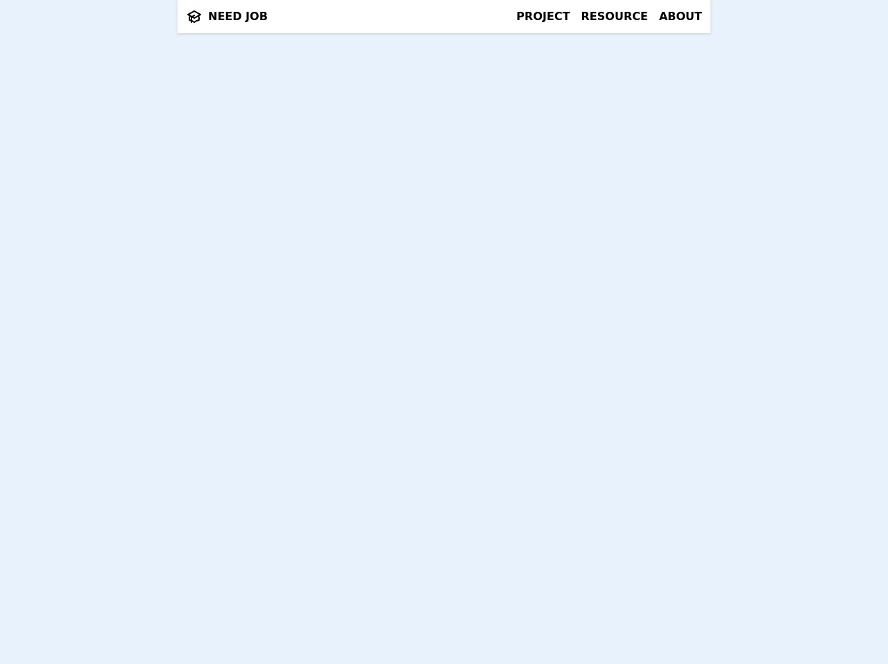
- The preview of Responsive fixed top navigation ui component
- The source code of Responsive fixed top navigation ui component
- How to create a Responsive fixed top navigation with Tailwind CSS?
- Conclusion
In today's world, responsive design is a must-have for any website. One of the most important components of a responsive website is the navigation bar. A fixed top navigation is an excellent way to keep your website's navigation accessible and visible at all times. In this article, we will show you how to create a responsive fixed top navigation using Tailwind CSS.
What is Tailwind CSS?
Tailwind CSS is a utility-first CSS framework that allows you to quickly build custom designs without writing any CSS code. It provides a set of pre-defined classes that you can use to style your HTML elements. Tailwind CSS is easy to learn and use, and it can save you a lot of time when building a website.
The description of Responsive fixed top navigation ui component
A responsive fixed top navigation is a navigation bar that is fixed at the top of the page and adjusts its size and layout based on the screen size. It is an essential component of any website, as it provides easy access to the website's pages and content.
Why use Tailwind CSS to create a Responsive fixed top navigation ui component?
Tailwind CSS provides a set of pre-defined classes that you can use to style your HTML elements. This makes it easy to create a responsive fixed top navigation without writing any CSS code. Additionally, Tailwind CSS is designed to be mobile-first, which means that it is optimized for mobile devices. This makes it an excellent choice for creating a responsive fixed top navigation.
The preview of Responsive fixed top navigation ui component
To create a responsive fixed top navigation using Tailwind CSS, we will use the following classes:
fixed: This class fixes the navigation bar at the top of the page.w-full: This class makes the navigation bar full-width.bg-white: This class sets the background color of the navigation bar to white.shadow-lg: This class adds a shadow effect to the navigation bar.px-4: This class adds padding to the left and right sides of the navigation bar.py-3: This class adds padding to the top and bottom of the navigation bar.flex: This class makes the navigation bar a flex container.justify-between: This class aligns the navigation items to the left and right sides of the navigation bar.items-center: This class centers the navigation items vertically.
Free download of the Responsive fixed top navigation's source code
The source code of Responsive fixed top navigation ui component
To create a responsive fixed top navigation using Tailwind CSS, you can use the following HTML code:
<nav class="fixed w-full bg-white shadow-lg px-4 py-3">
  <div class="flex justify-between items-center">
    <div class="logo">Logo</div>
    <div class="navigation">
      <a href="#">Home</a>
      <a href="#">About</a>
      <a href="#">Contact</a>
    </div>
  </div>
</nav>
To style the navigation bar, you can use the following CSS code:
.logo {
  font-size: 24px;
  font-weight: bold;
}

.navigation a {
  margin-left: 20px;
  color: #333;
  text-decoration: none;
}

.navigation a:hover {
  color: #555;
}
<!-- I've set max-w-screen-md, you may need to change it -->
    <nav class="bg-white shadow fixed max-w-screen-md z-10 mx-auto inset-x-0 top-0 flex justify-between items-center">

        <a href="#" class="font-extrabold m-3 uppercase inline-flex hover:text-pink-700 transition-all duration-500">
            <svg class="h-6 w-6 mr-2" xmlns="http://www.w3.org/2000/svg" fill="none" viewBox="0 0 24 24" stroke="currentColor">
                <path fill="#fff" d="M12 14l9-5-9-5-9 5 9 5z" />
                <path fill="#fff" d="M12 14l6.16-3.422a12.083 12.083 0 01.665 6.479A11.952 11.952 0 0012 20.055a11.952 11.952 0 00-6.824-2.998 12.078 12.078 0 01.665-6.479L12 14z" />
                <path stroke-linecap="round" stroke-linejoin="round" stroke-width="2" d="M12 14l9-5-9-5-9 5 9 5zm0 0l6.16-3.422a12.083 12.083 0 01.665 6.479A11.952 11.952 0 0012 20.055a11.952 11.952 0 00-6.824-2.998 12.078 12.078 0 01.665-6.479L12 14zm-4 6v-7.5l4-2.222" />
            </svg>
          NEED JOB
        </a>

        <button id="mobileMenuButton" class="p-3 focus:outline-none md:hidden" title="Open side menu">
          <!-- SVG For "x" button -->
            <svg id="mobileMenuButtonClose" class="w-6 h-6 hidden" xmlns="http://www.w3.org/2000/svg" fill="none" viewBox="0 0 24 24" stroke="currentColor">
                <path stroke-linecap="round" stroke-linejoin="round" stroke-width="2" d="M6 18L18 6M6 6l12 12" /></svg>
          <!-- SVG For "Menu burger" button -->
            <svg id="mobileMenuButtonOpen" class="w-6 h-6" xmlns="http://www.w3.org/2000/svg" fill="none" viewBox="0 0 24 24" stroke="currentColor">
                <path stroke-linecap="round" stroke-linejoin="round" stroke-width="2" d="M4 6h16M4 12h16M4 18h16" />
            </svg>
        </button>

      <!-- List of nav item -->
        <div id="sideMenuHideOnMobile" class="bg-white font-semibold z-10 rounded-bl-md flex absolute top-0 right-0 transition-all duration-500 transform translate-x-0
                                              w-1/2 md:w-auto
                                              px-3 md:px-0
                                              flex-col md:flex-row
                                              -translate-y-full md:translate-y-0
                                              md:mt-1 md:items-center md:mx-1 md:uppercase">
            <a href="#" class="mx-0 sm:mx-2 my-2 border-b-2 border-transparent hover:border-pink-600 hover:text-pink-700 transition-all duration-500 py-1 sm:p-0">Project</a>
            <a href="#" class="mx-0 sm:mx-2 my-2 border-b-2 border-transparent hover:border-pink-600 hover:text-pink-700 transition-all duration-500 py-1 sm:p-0">Resource</a>
            <a href="#" class="mx-0 sm:mx-2 my-2 border-b-2 border-transparent hover:border-pink-600 hover:text-pink-700 transition-all duration-500 py-1 sm:p-0">About</a>
        </div>

    </nav>

    <script>
    var mobileMenuButton = document.getElementById("mobileMenuButton");
    mobileMenuButton.onclick = function() {
        document.getElementById("sideMenuHideOnMobile").classList.toggle("-translate-y-full");
        document.getElementById("sideMenuHideOnMobile").classList.toggle("mt-12");
        document.getElementById("sideMenuHideOnMobile").classList.toggle("shadow");
        document.getElementById("mobileMenuButtonClose").classList.toggle("hidden");
        document.getElementById("mobileMenuButtonOpen").classList.toggle("hidden");
    }
      // Hide element when click outside nav
    var theElementContainer = document.getElementsByTagName("nav")[0];
    document.addEventListener('click', function(event) {
        if (!theElementContainer.contains(event.target)) {
            document.getElementById("sideMenuHideOnMobile").classList.add("-translate-y-full");
            document.getElementById("sideMenuHideOnMobile").classList.remove("mt-12");
            document.getElementById("sideMenuHideOnMobile").classList.remove("shadow");
            document.getElementById("mobileMenuButtonOpen").classList.remove("hidden");
            document.getElementById("mobileMenuButtonClose").classList.add("hidden");
        }
    });
    </script>
How to create a Responsive fixed top navigation with Tailwind CSS?
To create a responsive fixed top navigation using Tailwind CSS, follow these steps:
- Create a new HTML file and add the following code:
<!DOCTYPE html>
<html>
<head>
  <title>Responsive fixed top navigation with Tailwind CSS</title>
  <link rel="stylesheet" href="https://cdn.jsdelivr.net/npm/[email protected]/dist/tailwind.min.css">
</head>
<body>
  <nav class="fixed w-full bg-white shadow-lg px-4 py-3">
    <div class="flex justify-between items-center">
      <div class="logo">Logo</div>
      <div class="navigation">
        <a href="#">Home</a>
        <a href="#">About</a>
        <a href="#">Contact</a>
      </div>
    </div>
  </nav>
</body>
</html>
Save the file and open it in a web browser. You should see a navigation bar fixed at the top of the page.
To style the navigation bar, you can add the following classes to the
navelement:
<nav class="fixed w-full bg-white shadow-lg px-4 py-3">
- To align the navigation items to the left and right sides of the navigation bar, you can add the following classes to the
navigationelement:
<div class="navigation flex justify-between items-center">
- To style the logo and navigation items, you can add the following CSS code:
.logo {
  font-size: 24px;
  font-weight: bold;
}

.navigation a {
  margin-left: 20px;
  color: #333;
  text-decoration: none;
}

.navigation a:hover {
  color: #555;
}
- Save the file and open it in a web browser. You should see a responsive fixed top navigation bar.
Conclusion
In this article, we showed you how to create a responsive fixed top navigation using Tailwind CSS. Tailwind CSS provides a set of pre-defined classes that you can use to style your HTML elements, making it easy to create a responsive fixed top navigation without writing any CSS code. With a little bit of HTML and CSS knowledge, you can create a beautiful and functional navigation bar for your website.