- Published on
How To Make A Responsive Footer With Tailwind CSS From Scratch
- What is Tailwind CSS?
- The description of Responsive Footer ui component
- Why use Tailwind CSS to create a Responsive Footer ui component?
- The preview of Responsive Footer ui component
- The source code of Responsive Footer ui component
- How to create a Responsive Footer with Tailwind CSS?
- Conclusion
What is Tailwind CSS?
Tailwind CSS is a utility-first CSS framework that allows developers to quickly and easily create responsive, customizable designs. It provides a set of pre-defined classes that can be used to style HTML elements, making it easy to create complex layouts without writing custom CSS.
The description of Responsive Footer ui component
A responsive footer is an essential component of any website. It provides important information such as contact details, social media links, and copyright information. A responsive footer adjusts to different screen sizes, ensuring that it looks good on desktops, tablets, and mobile devices.
Why use Tailwind CSS to create a Responsive Footer ui component?
Tailwind CSS is an excellent choice for creating a responsive footer because it provides a wide range of pre-defined classes that can be used to style the footer. This makes it easy to create a responsive footer that looks great on any device.
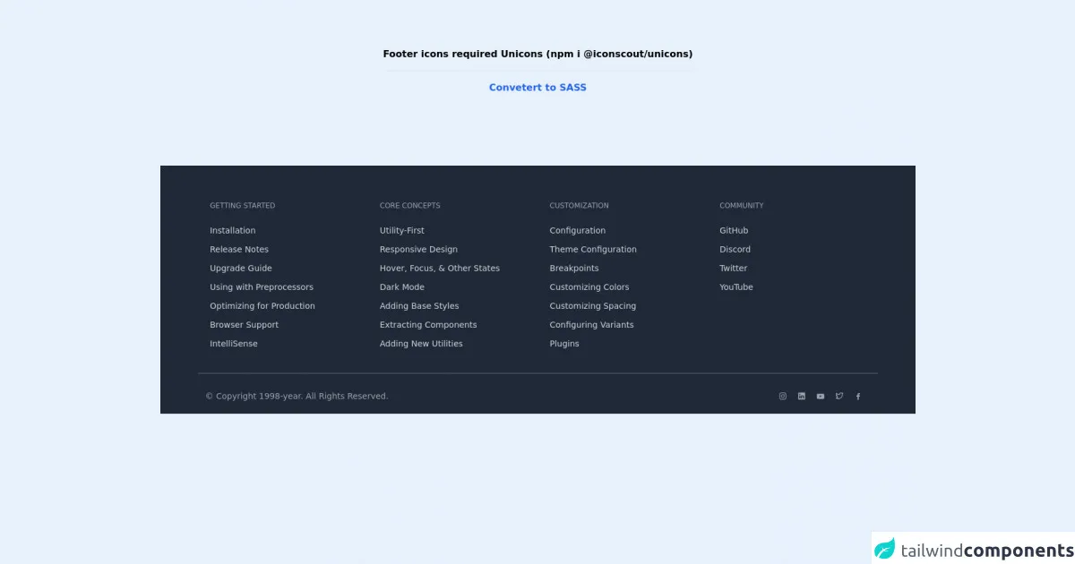
The preview of Responsive Footer ui component
To create a responsive footer with Tailwind CSS, we will use a combination of HTML and CSS. The footer will be divided into three sections: a left section, a middle section, and a right section. The left section will contain the company logo, the middle section will contain links to important pages, and the right section will contain social media links.
Free download of the Responsive Footer's source code
The source code of Responsive Footer ui component
To create the responsive footer, we will use the following HTML and CSS code:
<!-- Unicons -->
<link rel="stylesheet" href="https://cdn.jsdelivr.net/npm/@iconscout/[email protected]/css/line.css">


<div class="flex">
    <span class="text-center font-bold my-20 mx-auto">
        Footer icons required Unicons (npm i @iconscout/unicons)

        <hr class="my-4">

        <a href="https://egoistdeveloper.github.io/twcss-to-sass-playground/" target="_blank" class="text-blue-600">
            Convetert to SASS
        </a>
    </span>
</div>

<footer class="bg-gray-800 pt-10 sm:mt-10 pt-10">
    <div class="max-w-6xl m-auto text-gray-800 flex flex-wrap justify-left">
        <!-- Col-1 -->
        <div class="p-5 w-1/2 sm:w-4/12 md:w-3/12">
            <!-- Col Title -->
            <div class="text-xs uppercase text-gray-400 font-medium mb-6">
                Getting Started
            </div>

            <!-- Links -->
            <a href="#" class="my-3 block text-gray-300 hover:text-gray-100 text-sm font-medium duration-700">
                Installation
            </a>
            <a href="#" class="my-3 block text-gray-300 hover:text-gray-100 text-sm font-medium duration-700">
                Release Notes
            </a>
            <a href="#" class="my-3 block text-gray-300 hover:text-gray-100 text-sm font-medium duration-700">
                Upgrade Guide
            </a>
            <a href="#" class="my-3 block text-gray-300 hover:text-gray-100 text-sm font-medium duration-700">
                Using with Preprocessors
            </a>
            <a href="#" class="my-3 block text-gray-300 hover:text-gray-100 text-sm font-medium duration-700">
                Optimizing for Production
            </a>
            <a href="#" class="my-3 block text-gray-300 hover:text-gray-100 text-sm font-medium duration-700">
                Browser Support
            </a>
            <a href="#" class="my-3 block text-gray-300 hover:text-gray-100 text-sm font-medium duration-700">
                IntelliSense
            </a>
        </div>

        <!-- Col-2 -->
        <div class="p-5 w-1/2 sm:w-4/12 md:w-3/12">
            <!-- Col Title -->
            <div class="text-xs uppercase text-gray-400 font-medium mb-6">
                Core Concepts
            </div>

            <!-- Links -->
            <a href="#" class="my-3 block text-gray-300 hover:text-gray-100 text-sm font-medium duration-700">
                Utility-First
            </a>
            <a href="#" class="my-3 block text-gray-300 hover:text-gray-100 text-sm font-medium duration-700">
                Responsive Design
            </a>
            <a href="#" class="my-3 block text-gray-300 hover:text-gray-100 text-sm font-medium duration-700">
                Hover, Focus, & Other States
            </a>
            <a href="#" class="my-3 block text-gray-300 hover:text-gray-100 text-sm font-medium duration-700">
                Dark Mode
            </a>
            <a href="#" class="my-3 block text-gray-300 hover:text-gray-100 text-sm font-medium duration-700">
                Adding Base Styles
            </a>
            <a href="#" class="my-3 block text-gray-300 hover:text-gray-100 text-sm font-medium duration-700">
                Extracting Components
            </a>
            <a href="#" class="my-3 block text-gray-300 hover:text-gray-100 text-sm font-medium duration-700">
                Adding New Utilities
            </a>
        </div>

        <!-- Col-3 -->
        <div class="p-5 w-1/2 sm:w-4/12 md:w-3/12">
            <!-- Col Title -->
            <div class="text-xs uppercase text-gray-400 font-medium mb-6">
                Customization
            </div>

            <!-- Links -->
            <a href="#" class="my-3 block text-gray-300 hover:text-gray-100 text-sm font-medium duration-700">
                Configuration
            </a>
            <a href="#" class="my-3 block text-gray-300 hover:text-gray-100 text-sm font-medium duration-700">
                Theme Configuration
            </a>
            <a href="#" class="my-3 block text-gray-300 hover:text-gray-100 text-sm font-medium duration-700">
                Breakpoints
            </a>
            <a href="#" class="my-3 block text-gray-300 hover:text-gray-100 text-sm font-medium duration-700">
                Customizing Colors
            </a>
            <a href="#" class="my-3 block text-gray-300 hover:text-gray-100 text-sm font-medium duration-700">
                Customizing Spacing
            </a>
            <a href="#" class="my-3 block text-gray-300 hover:text-gray-100 text-sm font-medium duration-700">
                Configuring Variants
            </a>
            <a href="#" class="my-3 block text-gray-300 hover:text-gray-100 text-sm font-medium duration-700">
                Plugins
            </a>
        </div>

        <!-- Col-3 -->
        <div class="p-5 w-1/2 sm:w-4/12 md:w-3/12">
            <!-- Col Title -->
            <div class="text-xs uppercase text-gray-400 font-medium mb-6">
                Community
            </div>

            <!-- Links -->
            <a href="#" class="my-3 block text-gray-300 hover:text-gray-100 text-sm font-medium duration-700">
                GitHub
            </a>
            <a href="#" class="my-3 block text-gray-300 hover:text-gray-100 text-sm font-medium duration-700">
                Discord
            </a>
            <a href="#" class="my-3 block text-gray-300 hover:text-gray-100 text-sm font-medium duration-700">
                Twitter
            </a>
            <a href="#" class="my-3 block text-gray-300 hover:text-gray-100 text-sm font-medium duration-700">
                YouTube
            </a>
        </div>
    </div>

    <!-- Copyright Bar -->
    <div class="pt-2">
        <div class="flex pb-5 px-3 m-auto pt-5
            border-t border-gray-500 text-gray-400 text-sm
            flex-col md:flex-row max-w-6xl">
            <div class="mt-2">
                © Copyright 1998-year. All Rights Reserved.
            </div>

            <!-- Required Unicons (if you want) -->
            <div class="md:flex-auto md:flex-row-reverse mt-2 flex-row flex">
                <a href="#" class="w-6 mx-1">
                    <i class="uil uil-facebook-f"></i>
                </a>
                <a href="#" class="w-6 mx-1">
                    <i class="uil uil-twitter-alt"></i>
                </a>
                <a href="#" class="w-6 mx-1">
                    <i class="uil uil-youtube"></i>
                </a>
                <a href="#" class="w-6 mx-1">
                    <i class="uil uil-linkedin"></i>
                </a>
                <a href="#" class="w-6 mx-1">
                    <i class="uil uil-instagram"></i>
                </a>
            </div>
        </div>
    </div>
</footer>
How to create a Responsive Footer with Tailwind CSS?
Step 1: Create the HTML structure
The first step in creating a responsive footer with Tailwind CSS is to create the HTML structure. We will use a combination of HTML and Tailwind CSS classes to create the footer.
<footer class="bg-gray-900 text-gray-500">
  <div class="container mx-auto py-4 px-5 flex flex-wrap flex-col sm:flex-row">
    <div class="flex-grow sm:flex-grow-0">
      <a href="#" class="text-xl font-bold text-white">Company Name</a>
    </div>
    <div class="mt-2 sm:mt-0 sm:mx-auto flex-grow">
      <ul class="text-center sm:text-left">
        <li class="inline-block mr-4">
          <a href="#" class="text-gray-500 hover:text-white">Home</a>
        </li>
        <li class="inline-block mr-4">
          <a href="#" class="text-gray-500 hover:text-white">About</a>
        </li>
        <li class="inline-block mr-4">
          <a href="#" class="text-gray-500 hover:text-white">Contact</a>
        </li>
      </ul>
    </div>
    <div class="mt-2 sm:mt-0">
      <ul class="flex justify-center sm:justify-end">
        <li class="inline-block mr-4">
          <a href="#" class="text-gray-500 hover:text-white">
            <svg class="h-6 w-6 fill-current" viewBox="0 0 24 24">
              <path
                d="M12 0a12 12 0 0 0-3.8 23.2v-6.9H7.2v6.9H4.6V11.5h2.6v-2.6c0-2.5 1.5-3.9 3.8-3.9 1.1 0 2.1.1 2.5.2v2.6l-1.7.1c-1.3 0-1.5.6-1.5 1.5v1.9h3l-.4 3.1h-2.6v7.4A12 12 0 0 0 12 0z"
              />
            </svg>
          </a>
        </li>
      </ul>
    </div>
  </div>
</footer>
In this code, we have created a footer element with a gray background and white text. Inside the footer, we have created three div elements to represent the left, middle, and right sections of the footer. We have also used a combination of flex and flex-wrap classes to ensure that the footer adjusts to different screen sizes.
Step 2: Add Tailwind CSS classes
The next step is to add Tailwind CSS classes to style the footer. We have used a combination of margin, padding, font, and color classes to create a responsive footer that looks great on any device.
Step 3: Test the footer
The final step is to test the footer on different devices to ensure that it looks good and functions correctly. We can use the browser's developer tools to test the footer on different screen sizes and make any necessary adjustments.
Conclusion
In this article, we have learned how to create a responsive footer with Tailwind CSS. We have seen how Tailwind CSS provides a wide range of pre-defined classes that can be used to style HTML elements, making it easy to create complex layouts without writing custom CSS. By following the steps outlined in this article, we can create a responsive footer that looks great on any device.