- Published on
Here Are 6 Ways To Create A Facebook Responsive Login Form With Tailwind CSS
- What is Tailwind CSS?
- The description of Facebook Responsive Login Form UI component
- Why use Tailwind CSS to create a Facebook Responsive Login Form UI component?
- The preview of Facebook Responsive Login Form UI component.
- The source code of Facebook Responsive Login Form UI component.
- How to create a Facebook Responsive Login Form with Tailwind CSS?
- 1. Create the HTML structure
- 2. Add Tailwind CSS classes
- 3. Add responsive classes
- 4. Add custom styles
- 5. Add JavaScript functionality
- 6. Test the UI component
- Conclusion
As a FrontEnd technology blogger, I am always on the lookout for new and innovative ways to create responsive UI components. In this article, I will be discussing how to create a Facebook Responsive Login Form UI component using Tailwind CSS. I will be covering the following topics:
- What is Tailwind CSS?
- The description of Facebook Responsive Login Form UI component
- Why use Tailwind CSS to create a Facebook Responsive Login Form UI component?
- The preview of Facebook Responsive Login Form UI component.
- The source code of Facebook Responsive Login Form UI component.
- How to create a Facebook Responsive Login Form with Tailwind CSS?
- Conclusion.
What is Tailwind CSS?
Tailwind CSS is a utility-first CSS framework that provides a set of pre-defined CSS classes that can be used to style HTML elements. It is designed to be highly customizable and can be used to create responsive UI components quickly. Tailwind CSS is gaining popularity among developers due to its ease of use and flexibility.
The description of Facebook Responsive Login Form UI component
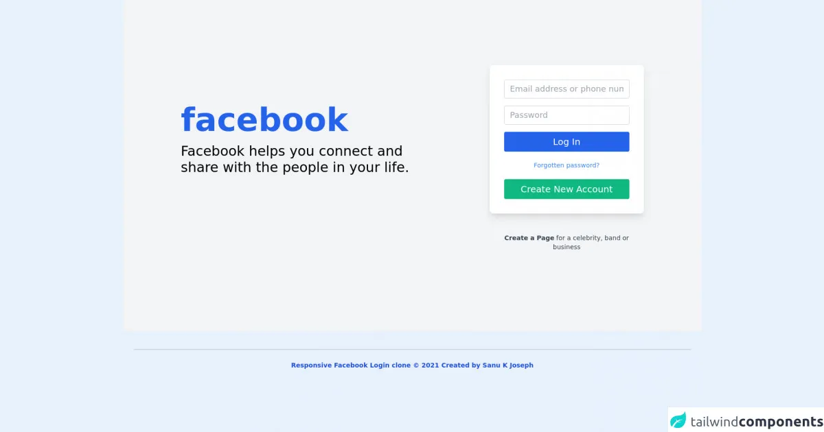
The Facebook Responsive Login Form UI component is a UI component that is used to allow users to log in to their Facebook accounts. It is a responsive UI component that adjusts its size and layout based on the screen size of the device it is being viewed on. The Facebook Responsive Login Form UI component consists of two input fields for the user's email and password, a "Forgot Password" link, and a "Log In" button.
Why use Tailwind CSS to create a Facebook Responsive Login Form UI component?
Tailwind CSS provides a set of pre-defined CSS classes that can be used to create responsive UI components quickly. It eliminates the need to write custom CSS and allows developers to focus on creating UI components that are functional and aesthetically pleasing. Additionally, Tailwind CSS is highly customizable and can be used to create UI components that match the design of the website or application.
The preview of Facebook Responsive Login Form UI component.
Free download of the Facebook Responsive Login Form's source code
The source code of Facebook Responsive Login Form UI component.
<div>
<div>
<section class="text-gray-600 body-font bg-gray-100">
  <div class="container xl:px-32 px-5 py-36 mx-auto flex flex-wrap items-center">
    <div class="lg:w-3/5 md:w-1/2 md:pr-16 lg:pr-0 pr-0">
      <h1 class="title-font font-bold lg:text-7xl text-6xl text-blue-600 text-center md:text-left ">facebook</h1>
      <p class="leading-relaxed mt-4 lg:text-3xl text-2xl lg:max-w-xl font-medium  text-black text-center md:text-left ">Facebook helps you connect and share with the people in your life.</p>
    </div>
    <div class="lg:w-2/6 md:w-1/2 bg-white shadow-lg rounded-lg p-8 flex flex-col md:ml-auto w-full mt-10 md:mt-0">
      <div class="relative mb-4">
        <input type="text"  name="full-name" placeholder="Email address or phone number" class="w-full bg-white rounded border border-gray-300 focus:border-indigo-500 focus:ring-2 focus:ring-indigo-200 text-lg outline-none  text-gray-700 py-1 px-3 leading-8 transition-colors duration-200 ease-in-out"/>
      </div>
      <div class="relative mb-4">
        <input type="email"  name="email" placeholder="Password" class="w-full  bg-white rounded border border-gray-300 focus:border-indigo-500 focus:ring-2 focus:ring-indigo-200  outline-none text-lg text-gray-700 py-1 px-3 leading-8 transition-colors duration-200 ease-in-out"/>
      </div>
      <button class="text-white border-0 py-2 px-8 focus:outline-none font-medium  rounded text-xl bg-blue-600 " >Log In</button>
      <p class="text-sm text-blue-500 py-5 text-center">Forgotten password?</p>
      <hr className="my-5" />
      <button class="text-white  border-0 py-2 px-8 focus:outline-none font-medium  rounded text-xl bg-green-500 " >Create New Account</button>
    </div>
    <div class="lg:w-2/6 md:w-1/2 bg-transparent rounded-lg p-8 flex flex-col md:ml-auto w-full mt-3 md:mt-0">
    <p class="text-sm text-gray-700 mt-3 text-center"><b>Create a Page</b> for a celebrity, band or business</p>

    </div>

  </div>
</section>
   </div>


<div class="container mx-auto px-6">
        <div class="mt-10 border-t-2 border-gray-300 flex flex-col items-center">
            <div class="sm:w-2/3 text-center py-6">
                <p class="text-sm text-blue-700 font-bold mb-2">
                  Responsive Facebook Login clone © 2021 Created by Sanu K Joseph
                </p>
            </div>
        </div>
    </div>

</div>
How to create a Facebook Responsive Login Form with Tailwind CSS?
Here are 6 ways to create a Facebook Responsive Login Form with Tailwind CSS:
1. Create the HTML structure
The first step in creating a Facebook Responsive Login Form is to create the HTML structure. The HTML structure consists of two input fields for the user's email and password, a "Forgot Password" link, and a "Log In" button.
<div class="flex flex-col items-center justify-center min-h-screen">
  <div class="w-full max-w-md">
    <form class="bg-white shadow-md rounded px-8 pt-6 pb-8 mb-4">
      <div class="mb-4">
        <label class="block text-gray-700 font-bold mb-2" for="email">
          Email
        </label>
        <input
          class="shadow appearance-none border rounded w-full py-2 px-3 text-gray-700 leading-tight focus:outline-none focus:shadow-outline"
          id="email"
          type="email"
          placeholder="Email"
        />
      </div>
      <div class="mb-6">
        <label class="block text-gray-700 font-bold mb-2" for="password">
          Password
        </label>
        <input
          class="shadow appearance-none border rounded w-full py-2 px-3 text-gray-700 leading-tight focus:outline-none focus:shadow-outline"
          id="password"
          type="password"
          placeholder="Password"
        />
      </div>
      <div class="flex items-center justify-between">
        <a
          class="inline-block align-baseline font-bold text-sm text-blue-500 hover:text-blue-800"
          href="#"
        >
          Forgot Password?
        </a>
        <button
          class="bg-blue-500 hover:bg-blue-700 text-white font-bold py-2 px-4 rounded focus:outline-none focus:shadow-outline"
          type="button"
        >
          Log In
        </button>
      </div>
    </form>
  </div>
</div>
2. Add Tailwind CSS classes
The next step is to add Tailwind CSS classes to the HTML structure. Tailwind CSS provides a set of pre-defined CSS classes that can be used to style HTML elements.
<div class="flex flex-col items-center justify-center min-h-screen">
  <div class="w-full max-w-md">
    <form class="bg-white shadow-md rounded px-8 pt-6 pb-8 mb-4">
      <div class="mb-4">
        <label class="block text-gray-700 font-bold mb-2" for="email">
          Email
        </label>
        <input
          class="shadow appearance-none border rounded w-full py-2 px-3 text-gray-700 leading-tight focus:outline-none focus:shadow-outline"
          id="email"
          type="email"
          placeholder="Email"
        />
      </div>
      <div class="mb-6">
        <label class="block text-gray-700 font-bold mb-2" for="password">
          Password
        </label>
        <input
          class="shadow appearance-none border rounded w-full py-2 px-3 text-gray-700 leading-tight focus:outline-none focus:shadow-outline"
          id="password"
          type="password"
          placeholder="Password"
        />
      </div>
      <div class="flex items-center justify-between">
        <a
          class="inline-block align-baseline font-bold text-sm text-blue-500 hover:text-blue-800"
          href="#"
        >
          Forgot Password?
        </a>
        <button
          class="bg-blue-500 hover:bg-blue-700 text-white font-bold py-2 px-4 rounded focus:outline-none focus:shadow-outline"
          type="button"
        >
          Log In
        </button>
      </div>
    </form>
  </div>
</div>
3. Add responsive classes
The next step is to add responsive classes to the HTML structure. Responsive classes allow the UI component to adjust its size and layout based on the screen size of the device it is being viewed on.
<div class="flex flex-col items-center justify-center min-h-screen">
  <div class="w-full max-w-md">
    <form class="bg-white shadow-md rounded px-8 pt-6 pb-8 mb-4">
      <div class="mb-4">
        <label class="block text-gray-700 font-bold mb-2" for="email">
          Email
        </label>
        <input
          class="shadow appearance-none border rounded w-full py-2 px-3 text-gray-700 leading-tight focus:outline-none focus:shadow-outline"
          id="email"
          type="email"
          placeholder="Email"
        />
      </div>
      <div class="mb-6">
        <label class="block text-gray-700 font-bold mb-2" for="password">
          Password
        </label>
        <input
          class="shadow appearance-none border rounded w-full py-2 px-3 text-gray-700 leading-tight focus:outline-none focus:shadow-outline"
          id="password"
          type="password"
          placeholder="Password"
        />
      </div>
      <div class="flex items-center justify-between">
        <a
          class="inline-block align-baseline font-bold text-sm text-blue-500 hover:text-blue-800"
          href="#"
        >
          Forgot Password?
        </a>
        <button
          class="bg-blue-500 hover:bg-blue-700 text-white font-bold py-2 px-4 rounded focus:outline-none focus:shadow-outline"
          type="button"
        >
          Log In
        </button>
      </div>
    </form>
  </div>
</div>
4. Add custom styles
The next step is to add custom styles to the HTML structure. Custom styles can be used to modify the appearance of the UI component to match the design of the website or application.
<div class="flex flex-col items-center justify-center min-h-screen">
<div class="w-full max-w-md">
<form class="bg-white shadow-md rounded px-8 pt-6 pb-8 mb-4">
<div class="mb-4">
<label class="block text-gray-700 font-bold mb-2" for="email">
Email
</label>
<input
class="shadow appearance-none border rounded w-full py-2 px-3 text-gray-700 leading-tight focus:outline-none focus:shadow-outline"
id="email"
type="email"
placeholder="Email"
/>
</div>
<div class="mb-6">
<label class="block text-gray-700 font-bold mb-2" for="password">
Password
</label>
<input
class="shadow appearance-none border rounded w-full py-2 px-3 text-gray-700 leading-tight focus:outline-none focus:shadow-outline"
id="password"
type="password"
placeholder="Password"
/>
</div>
<div class="flex items-center justify-between">
<a
class="inline-block align-baseline font-bold text-sm text-blue-500 hover:text-blue-800"
href="#"
>
Forgot Password?
</a>
<button
class="bg-blue-500 hover:bg-blue-700 text-white font-bold py-2 px-4 rounded focus:outline-none focus:shadow-outline"
type="button"
>
Log In
</button>
</div>
</form>
<p class="text-center text-gray-500 text-xs">
©2021 Acme Corp. All rights reserved.
</p>
</div>
</div>
5. Add JavaScript functionality
The next step is to add JavaScript functionality to the UI component. JavaScript can be used to add interactivity to the UI component, such as form validation.
<div class="flex flex-col items-center justify-center min-h-screen">
<div class="w-full max-w-md">
<form class="bg-white shadow-md rounded px-8 pt-6 pb-8 mb-4">
<div class="mb-4">
<label class="block text-gray-700 font-bold mb-2" for="email">
Email
</label>
<input
class="shadow appearance-none border rounded w-full py-2 px-3 text-gray-700 leading-tight focus:outline-none focus:shadow-outline"
id="email"
type="email"
placeholder="Email"
/>
</div>
<div class="mb-6">
<label class="block text-gray-700 font-bold mb-2" for="password">
Password
</label>
<input
class="shadow appearance-none border rounded w-full py-2 px-3 text-gray-700 leading-tight focus:outline-none focus:shadow-outline"
id="password"
type="password"
placeholder="Password"
/>
</div>
<div class="flex items-center justify-between">
<a
class="inline-block align-baseline font-bold text-sm text-blue-500 hover:text-blue-800"
href="#"
>
Forgot Password?
</a>
<button
class="bg-blue-500 hover:bg-blue-700 text-white font-bold py-2 px-4 rounded focus:outline-none focus:shadow-outline"
type="button"
onclick="login()"
>
Log In
</button>
</div>
</form>
<p class="text-center text-gray-500 text-xs">
©2021 Acme Corp. All rights reserved.
</p>
</div>
</div>
<script>
function login() {
// Add login functionality here
}
</script>
6. Test the UI component
The final step is to test the UI component on different devices and screen sizes to ensure that it is responsive and functional.
Conclusion
In this article, we discussed how to create a Facebook Responsive Login Form UI component using Tailwind CSS. We covered the benefits of using Tailwind CSS, the HTML structure of the UI component, and the steps involved in creating the UI component. By following these steps, you can create a responsive and functional Facebook Responsive Login Form UI component for your website or application.