- Published on
How To Make A Responsive Course Cards #1 With Tailwind CSS From Scratch
- What is Tailwind CSS?
- The description of Responsive Course Cards #1 ui component
- Why use Tailwind CSS to create a Responsive Course Cards #1 ui component?
- The preview of Responsive Course Cards #1 ui component.
- The source code of Responsive Course Cards #1 ui component.
- How to create a Responsive Course Cards #1 with Tailwind CSS?
- Step 1: Create an HTML structure for the card layout.
- Step 2: Add Tailwind CSS classes to the HTML to style the cards.
- Step 3: Customize the design to match the look and feel of your website.
- Conclusion
What is Tailwind CSS?
Tailwind CSS is a utility-first CSS framework that provides a set of pre-defined classes to help you quickly build custom designs. It is a popular choice for web developers who want to create responsive and modern user interfaces. With Tailwind CSS, you can easily customize the look and feel of your website without writing any custom CSS.
The description of Responsive Course Cards #1 ui component
The Responsive Course Cards #1 ui component is a common design pattern used on e-learning websites to showcase courses. It is a responsive card-based layout that displays information about a course, such as the course title, instructor, and course duration. The design is clean and modern, making it easy for users to browse through the available courses.
Why use Tailwind CSS to create a Responsive Course Cards #1 ui component?
Tailwind CSS provides a set of pre-defined classes that make it easy to create a responsive course card layout. With Tailwind CSS, you can easily customize the layout and style of the cards, making it easy to match the design of your website. Additionally, Tailwind CSS is lightweight and easy to use, making it a great choice for web developers who want to create modern and responsive user interfaces.
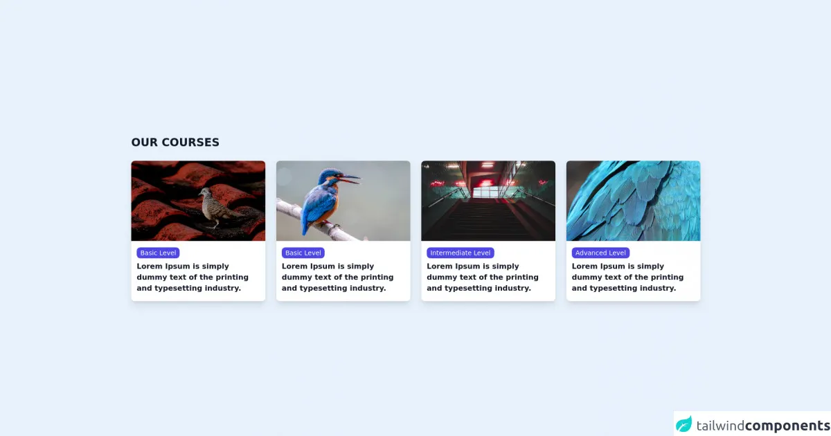
The preview of Responsive Course Cards #1 ui component.
To create the Responsive Course Cards #1 ui component, we will use Tailwind CSS to create a responsive card-based layout. The cards will display information about a course, such as the course title, instructor, and course duration. The design is clean and modern, making it easy for users to browse through the available courses.
Free download of the Responsive Course Cards #1's source code
The source code of Responsive Course Cards #1 ui component.
To create the Responsive Course Cards #1 ui component, we will use HTML and Tailwind CSS. The HTML will provide the structure of the cards, while the Tailwind CSS classes will provide the styling. The code is easy to read and modify, making it easy to customize the design to match the look and feel of your website.
<section class="max-w-7xl mx-auto px-4 sm:px-6 lg:px-4 mt-12 mb-12">
    <article>
        <h2 class="text-2xl font-extrabold text-gray-900">OUR COURSES</h2>
        <section class="mt-6 grid md:grid-cols-2 lg:grid-cols-4 gap-x-6 gap-y-8">
            <article class="bg-white group relative rounded-lg overflow-hidden shadow-lg hover:shadow-2xl transform duration-200">
                <div class="relative w-full h-80 md:h-64 lg:h-44">
                    <img src="https://cdn.pixabay.com/photo/2021/07/24/01/42/zebra-dove-6488440_960_720.jpg"
                        alt="Desk with leather desk pad, walnut desk organizer, wireless keyboard and mouse, and porcelain mug."
                        class="w-full h-full object-center object-cover">
                </div>
                <div class="px-3 py-4">
                    <h3 class="text-sm text-gray-500 pb-2">
                        <a class="bg-indigo-600 py-1 px-2 text-white rounded-lg" href="#">
                            <span class="absolute inset-0"></span>
                            Basic Level
                        </a>
                    </h3>
                    <p class="text-base font-semibold text-gray-900 group-hover:text-indigo-600">
                        Lorem Ipsum is simply dummy text of the printing and typesetting industry.</p>
                </div>
            </article>
            <article class="bg-white group relative rounded-lg overflow-hidden shadow-lg hover:shadow-2xl transform duration-200">
                <div class="relative w-full h-80 md:h-64 lg:h-44">
                    <img src="https://cdn.pixabay.com/photo/2021/09/08/20/45/bird-6607863_960_720.jpg.jpg"
                        alt="Desk with leather desk pad, walnut desk organizer, wireless keyboard and mouse, and porcelain mug."
                        class="w-full h-full object-center object-cover">
                </div>
                <div class="px-3 py-4">
                    <h3 class="text-sm text-gray-500 pb-2">
                        <a class="bg-indigo-600 py-1 px-2 text-white rounded-lg" href="#">
                            <span class="absolute inset-0"></span>
                            Basic Level
                        </a>
                    </h3>
                    <p class="text-base font-semibold text-gray-900 group-hover:text-indigo-600">
                        Lorem Ipsum is simply dummy text of the printing and typesetting industry.</p>
                </div>
            </article>
            <article class="bg-white group relative rounded-lg overflow-hidden shadow-lg hover:shadow-2xl transform duration-200">
                <div class="relative w-full h-80 md:h-64 lg:h-44">
                    <img src="https://cdn.pixabay.com/photo/2021/08/03/11/01/stairs-6519085_960_720.jpg"
                        alt="Desk with leather desk pad, walnut desk organizer, wireless keyboard and mouse, and porcelain mug."
                        class="w-full h-full object-center object-cover">
                </div>
                <div class="px-3 py-4">
                    <h3 class="text-sm text-gray-500 pb-2">
                        <a class="bg-indigo-600 py-1 px-2 text-white rounded-lg" href="#">
                            <span class="absolute inset-0"></span>
                            Intermediate Level
                        </a>
                    </h3>
                    <p class="text-base font-semibold text-gray-900 group-hover:text-indigo-600">
                        Lorem Ipsum is simply dummy text of the printing and typesetting industry.</p>
                </div>
            </article>
            <article class="bg-white group relative rounded-lg overflow-hidden shadow-lg hover:shadow-2xl transform duration-200">
                <div class="relative w-full h-80 md:h-64 lg:h-44">
                    <img src="https://cdn.pixabay.com/photo/2021/09/12/17/43/parrot-feathers-6619082_960_720.jpg"
                        alt="Desk with leather desk pad, walnut desk organizer, wireless keyboard and mouse, and porcelain mug."
                        class="w-full h-full object-center object-cover">
                </div>
                <div class="px-3 py-4">
                    <h3 class="text-sm text-gray-500 pb-2">
                        <a class="bg-indigo-600 py-1 px-2 text-white rounded-lg" href="#">
                            <span class="absolute inset-0"></span>
                            Advanced Level
                        </a>
                    </h3>
                    <p class="text-base font-semibold text-gray-900 group-hover:text-indigo-600">
                        Lorem Ipsum is simply dummy text of the printing and typesetting industry.</p>
                </div>
            </article>
        </section>
    </article>
</section>
How to create a Responsive Course Cards #1 with Tailwind CSS?
To create a Responsive Course Cards #1 with Tailwind CSS, follow these steps:
- Create an HTML structure for the card layout.
- Add Tailwind CSS classes to the HTML to style the cards.
- Customize the design to match the look and feel of your website.
Step 1: Create an HTML structure for the card layout.
The first step is to create an HTML structure for the card layout. We will use a simple card-based layout that displays information about a course, such as the course title, instructor, and course duration. Here is the basic HTML structure for the cards:
<div class="flex flex-wrap -mx-4">
  <div class="w-full md:w-1/2 lg:w-1/3 px-4">
    <div class="bg-white rounded-lg shadow-lg overflow-hidden">
      <img class="w-full h-48 object-cover" src="https://via.placeholder.com/640x360.png?text=Course+Image" alt="Course Image">
      <div class="p-4">
        <h3 class="text-lg font-medium text-gray-900">Course Title</h3>
        <p class="text-sm text-gray-500">Instructor Name</p>
        <p class="text-sm text-gray-500">Course Duration</p>
      </div>
    </div>
  </div>
</div>
The HTML structure consists of a container div with the class "flex flex-wrap -mx-4". This class sets the container to a flexbox layout and wraps the cards to a new line when the screen size is reduced. The card itself is a div with the classes "w-full md:w-1/2 lg:w-1/3 px-4". These classes set the width of the card to full width on small screens, half width on medium screens, and one-third width on large screens.
Inside the card div, we have an image tag with the classes "w-full h-48 object-cover". These classes set the width of the image to full width and the height to 48 units. The object-cover class ensures that the image fills the entire container and maintains its aspect ratio.
Below the image, we have a div with the class "p-4". This class sets the padding of the div to 4 units. Inside this div, we have the course title, instructor name, and course duration wrapped in h3, p, and p tags, respectively.
Step 2: Add Tailwind CSS classes to the HTML to style the cards.
The next step is to add Tailwind CSS classes to the HTML to style the cards. We will use a combination of layout and typography classes to create a clean and modern design. Here is the updated HTML with Tailwind CSS classes:
<div class="flex flex-wrap -mx-4">
  <div class="w-full md:w-1/2 lg:w-1/3 px-4">
    <div class="bg-white rounded-lg shadow-lg overflow-hidden">
      <img class="w-full h-48 object-cover" src="https://via.placeholder.com/640x360.png?text=Course+Image" alt="Course Image">
      <div class="p-4">
        <h3 class="text-lg font-medium text-gray-900 mb-2">Course Title</h3>
        <p class="text-sm text-gray-500 mb-2">Instructor Name</p>
        <p class="text-sm text-gray-500">Course Duration</p>
        <button class="bg-blue-500 hover:bg-blue-700 text-white font-bold py-2 px-4 rounded mt-4">Enroll Now</button>
      </div>
    </div>
  </div>
</div>
We have added several new classes to the HTML, including:
- bg-white: sets the background color of the card to white.
- rounded-lg: adds rounded corners to the card.
- shadow-lg: adds a drop shadow to the card.
- mb-2: adds margin-bottom of 2 units to the course title and instructor name.
- text-lg: sets the font size of the course title to large.
- font-medium: sets the font weight of the course title to medium.
- text-gray-900: sets the text color of the course title to dark gray.
- text-sm: sets the font size of the instructor name and course duration to small.
- text-gray-500: sets the text color of the instructor name and course duration to light gray.
- button: adds a button to the card.
- bg-blue-500: sets the background color of the button to blue.
- hover:bg-blue-700: sets the background color of the button to dark blue on hover.
- text-white: sets the text color of the button to white.
- font-bold: sets the font weight of the button to bold.
- py-2: sets the padding of the button on the y-axis to 2 units.
- px-4: sets the padding of the button on the x-axis to 4 units.
- rounded: adds rounded corners to the button.
- mt-4: adds margin-top of 4 units to the button.
Step 3: Customize the design to match the look and feel of your website.
The final step is to customize the design to match the look and feel of your website. You can modify the colors, fonts, and spacing to match your website's design. Here is an example of a custom design:
<div class="flex flex-wrap -mx-4">
  <div class="w-full md:w-1/2 lg:w-1/3 px-4">
    <div class="bg-gray-100 rounded-lg shadow-lg overflow-hidden">
      <img class="w-full h-48 object-cover" src="https://via.placeholder.com/640x360.png?text=Course+Image" alt="Course Image">
      <div class="p-4">
        <h3 class="text-lg font-medium text-gray-900 mb-2">Course Title</h3>
        <p class="text-sm text-gray-500 mb-2">Instructor Name</p>
        <p class="text-sm text-gray-500">Course Duration</p>
        <button class="bg-blue-500 hover:bg-blue-700 text-white font-bold py-2 px-4 rounded mt-4">Enroll Now</button>
      </div>
    </div>
  </div>
</div>
In this example, we have changed the background color of the card to gray, modified the font color of the course title to dark gray, and changed the button color to blue.
Conclusion
In this article, we have learned how to create a Responsive Course Cards #1 ui component with Tailwind CSS. We have seen how Tailwind CSS provides a set of pre-defined classes that make it easy to create responsive and modern user interfaces. With Tailwind CSS, you can easily customize the design of your website without writing any custom CSS. By following the steps outlined in this article, you can create a custom course card layout that matches the look and feel of your website.