- Published on
6 Easy Ways To Make A Responsive Dashboard Layout With Tailwind CSS
- What is Tailwind CSS?
- The description of responsive dashboard layout UI component
- Why use Tailwind CSS to create a responsive dashboard layout UI component?
- The preview of responsive dashboard layout UI component
- The source code of responsive dashboard layout UI component
- How to create a responsive dashboard layout with Tailwind CSS?
- Step 1: Set up the HTML structure
- Step 2: Style the navigation bar
- Step 3: Style the sidebar
- Step 4: Style the main content area
- Step 5: Add responsiveness to the layout
- Step 6: Add interactivity to the layout
- Conclusion
As a front-end developer, creating a responsive dashboard layout can be a daunting task. However, with the help of Tailwind CSS, it can be made a lot easier. In this article, we will explore 6 easy ways to make a responsive dashboard layout with Tailwind CSS.
What is Tailwind CSS?
Tailwind CSS is a utility-first CSS framework that enables developers to quickly build custom designs without having to write any CSS. It provides a set of pre-defined classes that can be added to HTML elements to style them. Tailwind CSS is highly customizable and can be configured to suit your specific needs.
The description of responsive dashboard layout UI component
A responsive dashboard layout is a user interface component that displays data in a clear and concise manner. It is designed to be easily navigable and provide users with a quick overview of important information. A good dashboard layout should be visually appealing, easy to use, and responsive.
Why use Tailwind CSS to create a responsive dashboard layout UI component?
Tailwind CSS provides a set of pre-defined classes that can be used to quickly style HTML elements. This makes it easy to create a responsive dashboard layout without having to write any CSS. Tailwind CSS also provides a responsive grid system that makes it easy to create layouts that work well on different screen sizes.
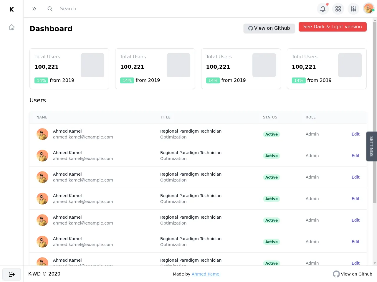
The preview of responsive dashboard layout UI component
In this article, we will create a responsive dashboard layout that displays data in a tabular format. The layout will include a navigation bar, a sidebar, and a main content area.
Free download of the responsive dashboard layout's source code
The source code of responsive dashboard layout UI component
To create our responsive dashboard layout, we will use HTML and Tailwind CSS. The HTML will define the structure of the layout, while the Tailwind CSS classes will be used to style the layout.
<div>
<div class="flex h-screen overflow-y-hidden bg-white" x-data="setup()" x-init="$refs.loading.classList.add('hidden')">
<!-- Loading screen -->
<div
x-ref="loading"
class="fixed inset-0 z-50 flex items-center justify-center text-white bg-black bg-opacity-50"
style="backdrop-filter: blur(14px); -webkit-backdrop-filter: blur(14px)"
>
Loading.....
</div>
<!-- Sidebar backdrop -->
<div
x-show.in.out.opacity="isSidebarOpen"
class="fixed inset-0 z-10 bg-black bg-opacity-20 lg:hidden"
style="backdrop-filter: blur(14px); -webkit-backdrop-filter: blur(14px)"
></div>
<!-- Sidebar -->
<aside
x-transition:enter="transition transform duration-300"
x-transition:enter-start="-translate-x-full opacity-30 ease-in"
x-transition:enter-end="translate-x-0 opacity-100 ease-out"
x-transition:leave="transition transform duration-300"
x-transition:leave-start="translate-x-0 opacity-100 ease-out"
x-transition:leave-end="-translate-x-full opacity-0 ease-in"
class="fixed inset-y-0 z-10 flex flex-col flex-shrink-0 w-64 max-h-screen overflow-hidden transition-all transform bg-white border-r shadow-lg lg:z-auto lg:static lg:shadow-none"
:class="{'-translate-x-full lg:translate-x-0 lg:w-20': !isSidebarOpen}"
>
<!-- sidebar header -->
<div class="flex items-center justify-between flex-shrink-0 p-2" :class="{'lg:justify-center': !isSidebarOpen}">
<span class="p-2 text-xl font-semibold leading-8 tracking-wider uppercase whitespace-nowrap">
K<span :class="{'lg:hidden': !isSidebarOpen}">-WD</span>
</span>
<button @click="toggleSidbarMenu()" class="p-2 rounded-md lg:hidden">
<svg
class="w-6 h-6 text-gray-600"
xmlns="http://www.w3.org/2000/svg"
fill="none"
viewBox="0 0 24 24"
stroke="currentColor"
>
<path stroke-linecap="round" stroke-linejoin="round" stroke-width="2" d="M6 18L18 6M6 6l12 12" />
</svg>
</button>
</div>
<!-- Sidebar links -->
<nav class="flex-1 overflow-hidden hover:overflow-y-auto">
<ul class="p-2 overflow-hidden">
<li>
<a
href="#"
class="flex items-center p-2 space-x-2 rounded-md hover:bg-gray-100"
:class="{'justify-center': !isSidebarOpen}"
>
<span>
<svg
class="w-6 h-6 text-gray-400"
xmlns="http://www.w3.org/2000/svg"
fill="none"
viewBox="0 0 24 24"
stroke="currentColor"
>
<path
stroke-linecap="round"
stroke-linejoin="round"
stroke-width="2"
d="M3 12l2-2m0 0l7-7 7 7M5 10v10a1 1 0 001 1h3m10-11l2 2m-2-2v10a1 1 0 01-1 1h-3m-6 0a1 1 0 001-1v-4a1 1 0 011-1h2a1 1 0 011 1v4a1 1 0 001 1m-6 0h6"
/>
</svg>
</span>
<span :class="{ 'lg:hidden': !isSidebarOpen }">Dashboard</span>
</a>
</li>
<!-- Sidebar Links... -->
</ul>
</nav>
<!-- Sidebar footer -->
<div class="flex-shrink-0 p-2 border-t max-h-14">
<button
class="flex items-center justify-center w-full px-4 py-2 space-x-1 font-medium tracking-wider uppercase bg-gray-100 border rounded-md focus:outline-none focus:ring"
>
<span>
<svg
class="w-6 h-6"
xmlns="http://www.w3.org/2000/svg"
fill="none"
viewBox="0 0 24 24"
stroke="currentColor"
>
<path
stroke-linecap="round"
stroke-linejoin="round"
stroke-width="2"
d="M17 16l4-4m0 0l-4-4m4 4H7m6 4v1a3 3 0 01-3 3H6a3 3 0 01-3-3V7a3 3 0 013-3h4a3 3 0 013 3v1"
/>
</svg>
</span>
<span :class="{'lg:hidden': !isSidebarOpen}"> Logout </span>
</button>
</div>
</aside>
<div class="flex flex-col flex-1 h-full overflow-hidden">
<!-- Navbar -->
<header class="flex-shrink-0 border-b">
<div class="flex items-center justify-between p-2">
<!-- Navbar left -->
<div class="flex items-center space-x-3">
<span class="p-2 text-xl font-semibold tracking-wider uppercase lg:hidden">K-WD</span>
<!-- Toggle sidebar button -->
<button @click="toggleSidbarMenu()" class="p-2 rounded-md focus:outline-none focus:ring">
<svg
class="w-4 h-4 text-gray-600"
:class="{'transform transition-transform -rotate-180': isSidebarOpen}"
xmlns="http://www.w3.org/2000/svg"
fill="none"
viewBox="0 0 24 24"
stroke="currentColor"
>
<path stroke-linecap="round" stroke-linejoin="round" stroke-width="2" d="M13 5l7 7-7 7M5 5l7 7-7 7" />
</svg>
</button>
</div>
<!-- Mobile search box -->
<div
x-show.transition="isSearchBoxOpen"
class="fixed inset-0 z-10 bg-black bg-opacity-20"
style="backdrop-filter: blur(14px); -webkit-backdrop-filter: blur(14px)"
>
<div
@click.away="isSearchBoxOpen = false"
class="absolute inset-x-0 flex items-center justify-between p-2 bg-white shadow-md"
>
<div class="flex items-center flex-1 px-2 space-x-2">
<!-- search icon -->
<span>
<svg
class="w-6 h-6 text-gray-500"
xmlns="http://www.w3.org/2000/svg"
fill="none"
viewBox="0 0 24 24"
stroke="currentColor"
>
<path
stroke-linecap="round"
stroke-linejoin="round"
stroke-width="2"
d="M21 21l-6-6m2-5a7 7 0 11-14 0 7 7 0 0114 0z"
/>
</svg>
</span>
<input
type="text"
placeholder="Search"
class="w-full px-4 py-3 text-gray-600 rounded-md focus:bg-gray-100 focus:outline-none"
/>
</div>
<!-- close button -->
<button @click="isSearchBoxOpen = false" class="flex-shrink-0 p-4 rounded-md">
<svg
class="w-4 h-4 text-gray-500"
xmlns="http://www.w3.org/2000/svg"
fill="none"
viewBox="0 0 24 24"
stroke="currentColor"
>
<path stroke-linecap="round" stroke-linejoin="round" stroke-width="2" d="M6 18L18 6M6 6l12 12" />
</svg>
</button>
</div>
</div>
<!-- Desktop search box -->
<div class="items-center hidden px-2 space-x-2 md:flex-1 md:flex md:mr-auto md:ml-5">
<!-- search icon -->
<span>
<svg
class="w-5 h-5 text-gray-500"
xmlns="http://www.w3.org/2000/svg"
fill="none"
viewBox="0 0 24 24"
stroke="currentColor"
>
<path
stroke-linecap="round"
stroke-linejoin="round"
stroke-width="2"
d="M21 21l-6-6m2-5a7 7 0 11-14 0 7 7 0 0114 0z"
/>
</svg>
</span>
<input
type="text"
placeholder="Search"
class="px-4 py-3 rounded-md hover:bg-gray-100 lg:max-w-sm md:py-2 md:flex-1 focus:outline-none md:focus:bg-gray-100 md:focus:shadow md:focus:border"
/>
</div>
<!-- Navbar right -->
<div class="relative flex items-center space-x-3">
<!-- Search button -->
<button
@click="isSearchBoxOpen = true"
class="p-2 bg-gray-100 rounded-full md:hidden focus:outline-none focus:ring hover:bg-gray-200"
>
<svg
class="w-6 h-6 text-gray-500"
xmlns="http://www.w3.org/2000/svg"
fill="none"
viewBox="0 0 24 24"
stroke="currentColor"
>
<path
stroke-linecap="round"
stroke-linejoin="round"
stroke-width="2"
d="M21 21l-6-6m2-5a7 7 0 11-14 0 7 7 0 0114 0z"
/>
</svg>
</button>
<div class="items-center hidden space-x-3 md:flex">
<!-- Notification Button -->
<div class="relative" x-data="{ isOpen: false }">
<!-- red dot -->
<div class="absolute right-0 p-1 bg-red-400 rounded-full animate-ping"></div>
<div class="absolute right-0 p-1 bg-red-400 border rounded-full"></div>
<button
@click="isOpen = !isOpen"
class="p-2 bg-gray-100 rounded-full hover:bg-gray-200 focus:outline-none focus:ring"
>
<svg
class="w-6 h-6 text-gray-500"
xmlns="http://www.w3.org/2000/svg"
fill="none"
viewBox="0 0 24 24"
stroke="currentColor"
>
<path
stroke-linecap="round"
stroke-linejoin="round"
stroke-width="2"
d="M15 17h5l-1.405-1.405A2.032 2.032 0 0118 14.158V11a6.002 6.002 0 00-4-5.659V5a2 2 0 10-4 0v.341C7.67 6.165 6 8.388 6 11v3.159c0 .538-.214 1.055-.595 1.436L4 17h5m6 0v1a3 3 0 11-6 0v-1m6 0H9"
/>
</svg>
</button>
<!-- Dropdown card -->
<div
@click.away="isOpen = false"
x-show.transition.opacity="isOpen"
class="absolute w-48 max-w-md mt-3 transform bg-white rounded-md shadow-lg -translate-x-3/4 min-w-max"
>
<div class="p-4 font-medium border-b">
<span class="text-gray-800">Notification</span>
</div>
<ul class="flex flex-col p-2 my-2 space-y-1">
<li>
<a href="#" class="block px-2 py-1 transition rounded-md hover:bg-gray-100">Link</a>
</li>
<li>
<a href="#" class="block px-2 py-1 transition rounded-md hover:bg-gray-100">Another Link</a>
</li>
</ul>
<div class="flex items-center justify-center p-4 text-blue-700 underline border-t">
<a href="#">See All</a>
</div>
</div>
</div>
<!-- Services Button -->
<div x-data="{ isOpen: false }">
<button
@click="isOpen = !isOpen"
class="p-2 bg-gray-100 rounded-full hover:bg-gray-200 focus:outline-none focus:ring"
>
<svg
class="w-6 h-6 text-gray-500"
xmlns="http://www.w3.org/2000/svg"
fill="none"
viewBox="0 0 24 24"
stroke="currentColor"
>
<path
stroke-linecap="round"
stroke-linejoin="round"
stroke-width="2"
d="M4 6a2 2 0 012-2h2a2 2 0 012 2v2a2 2 0 01-2 2H6a2 2 0 01-2-2V6zM14 6a2 2 0 012-2h2a2 2 0 012 2v2a2 2 0 01-2 2h-2a2 2 0 01-2-2V6zM4 16a2 2 0 012-2h2a2 2 0 012 2v2a2 2 0 01-2 2H6a2 2 0 01-2-2v-2zM14 16a2 2 0 012-2h2a2 2 0 012 2v2a2 2 0 01-2 2h-2a2 2 0 01-2-2v-2z"
/>
</svg>
</button>
<!-- Dropdown -->
<div
@click.away="isOpen = false"
@keydown.escape="isOpen = false"
x-show.transition.opacity="isOpen"
class="absolute mt-3 transform bg-white rounded-md shadow-lg -translate-x-3/4 min-w-max"
>
<div class="p-4 text-lg font-medium border-b">Web apps & services</div>
<ul class="flex flex-col p-2 my-3 space-y-3">
<li>
<a href="#" class="flex items-start px-2 py-1 space-x-2 rounded-md hover:bg-gray-100">
<span class="block mt-1">
<svg
class="w-6 h-6 text-gray-500"
xmlns="http://www.w3.org/2000/svg"
fill="none"
viewBox="0 0 24 24"
stroke="currentColor"
>
<path fill="#fff" d="M12 14l9-5-9-5-9 5 9 5z" />
<path
fill="#fff"
d="M12 14l6.16-3.422a12.083 12.083 0 01.665 6.479A11.952 11.952 0 0012 20.055a11.952 11.952 0 00-6.824-2.998 12.078 12.078 0 01.665-6.479L12 14z"
/>
<path
stroke-linecap="round"
stroke-linejoin="round"
stroke-width="2"
d="M12 14l9-5-9-5-9 5 9 5zm0 0l6.16-3.422a12.083 12.083 0 01.665 6.479A11.952 11.952 0 0012 20.055a11.952 11.952 0 00-6.824-2.998 12.078 12.078 0 01.665-6.479L12 14zm-4 6v-7.5l4-2.222"
/>
</svg>
</span>
<span class="flex flex-col">
<span class="text-lg">Atlassian</span>
<span class="text-sm text-gray-400">Lorem ipsum dolor sit.</span>
</span>
</a>
</li>
<li>
<a href="#" class="flex items-start px-2 py-1 space-x-2 rounded-md hover:bg-gray-100">
<span class="block mt-1">
<svg
class="w-6 h-6 text-gray-500"
xmlns="http://www.w3.org/2000/svg"
fill="none"
viewBox="0 0 24 24"
stroke="currentColor"
>
<path
stroke-linecap="round"
stroke-linejoin="round"
stroke-width="2"
d="M16 12a4 4 0 10-8 0 4 4 0 008 0zm0 0v1.5a2.5 2.5 0 005 0V12a9 9 0 10-9 9m4.5-1.206a8.959 8.959 0 01-4.5 1.207"
/>
</svg>
</span>
<span class="flex flex-col">
<span class="text-lg">Slack</span>
<span class="text-sm text-gray-400"
>Lorem ipsum, dolor sit amet consectetur adipisicing elit.</span
>
</span>
</a>
</li>
</ul>
<div class="flex items-center justify-center p-4 text-blue-700 underline border-t">
<a href="#">Show all apps</a>
</div>
</div>
</div>
<!-- Options Button -->
<div class="relative" x-data="{ isOpen: false }">
<button
@click="isOpen = !isOpen"
class="p-2 bg-gray-100 rounded-full hover:bg-gray-200 focus:outline-none focus:ring"
>
<svg
class="w-6 h-6 text-gray-500"
xmlns="http://www.w3.org/2000/svg"
fill="none"
viewBox="0 0 24 24"
stroke="currentColor"
>
<path
stroke-linecap="round"
stroke-linejoin="round"
stroke-width="2"
d="M12 6V4m0 2a2 2 0 100 4m0-4a2 2 0 110 4m-6 8a2 2 0 100-4m0 4a2 2 0 110-4m0 4v2m0-6V4m6 6v10m6-2a2 2 0 100-4m0 4a2 2 0 110-4m0 4v2m0-6V4"
/>
</svg>
</button>
<!-- Dropdown card -->
<div
@click.away="isOpen = false"
x-show.transition.opacity="isOpen"
class="absolute w-40 max-w-sm mt-3 transform bg-white rounded-md shadow-lg -translate-x-3/4 min-w-max"
>
<div class="p-4 font-medium border-b">
<span class="text-gray-800">Options</span>
</div>
<ul class="flex flex-col p-2 my-2 space-y-1">
<li>
<a href="#" class="block px-2 py-1 transition rounded-md hover:bg-gray-100">Link</a>
</li>
<li>
<a href="#" class="block px-2 py-1 transition rounded-md hover:bg-gray-100">Another Link</a>
</li>
</ul>
<div class="flex items-center justify-center p-4 text-blue-700 underline border-t">
<a href="#">See All</a>
</div>
</div>
</div>
</div>
<!-- avatar button -->
<div class="relative" x-data="{ isOpen: false }">
<button @click="isOpen = !isOpen" class="p-1 bg-gray-200 rounded-full focus:outline-none focus:ring">
<img
class="object-cover w-8 h-8 rounded-full"
src="https://avatars0.githubusercontent.com/u/57622665?s=460&u=8f581f4c4acd4c18c33a87b3e6476112325e8b38&v=4"
alt="Ahmed Kamel"
/>
</button>
<!-- green dot -->
<div class="absolute right-0 p-1 bg-green-400 rounded-full bottom-3 animate-ping"></div>
<div class="absolute right-0 p-1 bg-green-400 border border-white rounded-full bottom-3"></div>
<!-- Dropdown card -->
<div
@click.away="isOpen = false"
x-show.transition.opacity="isOpen"
class="absolute mt-3 transform -translate-x-full bg-white rounded-md shadow-lg min-w-max"
>
<div class="flex flex-col p-4 space-y-1 font-medium border-b">
<span class="text-gray-800">Ahmed Kamel</span>
<span class="text-sm text-gray-400">[email protected]</span>
</div>
<ul class="flex flex-col p-2 my-2 space-y-1">
<li>
<a href="#" class="block px-2 py-1 transition rounded-md hover:bg-gray-100">Link</a>
</li>
<li>
<a href="#" class="block px-2 py-1 transition rounded-md hover:bg-gray-100">Another Link</a>
</li>
</ul>
<div class="flex items-center justify-center p-4 text-blue-700 underline border-t">
<a href="#">Logout</a>
</div>
</div>
</div>
</div>
</div>
</header>
<!-- Main content -->
<main class="flex-1 max-h-full p-5 overflow-hidden overflow-y-scroll">
<!-- Main content header -->
<div
class="flex flex-col items-start justify-between pb-6 space-y-4 border-b lg:items-center lg:space-y-0 lg:flex-row"
>
<h1 class="text-2xl font-semibold whitespace-nowrap">Dashboard</h1>
<div class="space-y-6 md:space-x-2 md:space-y-0">
<a
href="https://github.com/Kamona-WD/starter-dashboard-layout"
target="_blank"
class="inline-flex items-center justify-center px-4 py-1 space-x-1 bg-gray-200 rounded-md shadow hover:bg-opacity-20"
>
<span>
<svg class="w-4 h-4 text-gray-500" viewBox="0 0 16 16" fill="currentColor" aria-hidden="true">
<path
fill-rule="evenodd"
d="M8 0C3.58 0 0 3.58 0 8c0 3.54 2.29 6.53 5.47 7.59.4.07.55-.17.55-.38 0-.19-.01-.82-.01-1.49-2.01.37-2.53-.49-2.69-.94-.09-.23-.48-.94-.82-1.13-.28-.15-.68-.52-.01-.53.63-.01 1.08.58 1.23.82.72 1.21 1.87.87 2.33.66.07-.52.28-.87.51-1.07-1.78-.2-3.64-.89-3.64-3.95 0-.87.31-1.59.82-2.15-.08-.2-.36-1.02.08-2.12 0 0 .67-.21 2.2.82.64-.18 1.32-.27 2-.27.68 0 1.36.09 2 .27 1.53-1.04 2.2-.82 2.2-.82.44 1.1.16 1.92.08 2.12.51.56.82 1.27.82 2.15 0 3.07-1.87 3.75-3.65 3.95.29.25.54.73.54 1.48 0 1.07-.01 1.93-.01 2.2 0 .21.15.46.55.38A8.013 8.013 0 0016 8c0-4.42-3.58-8-8-8z"
></path>
</svg>
</span>
<span>View on Github</span>
</a>
<a
href="https://kamona-wd.github.io/kwd-dashboard/"
target="_blank"
class="inline-flex items-center justify-center px-4 py-1 space-x-1 bg-red-500 text-white rounded-md shadow animate-bounce hover:bg-red-600"
>
<span>See Dark & Light version</span>
</a>
</div>
</div>
<!-- Start Content -->
<div class="grid grid-cols-1 gap-5 mt-6 sm:grid-cols-2 lg:grid-cols-4">
<template x-for="i in 4" :key="i">
<div class="p-4 transition-shadow border rounded-lg shadow-sm hover:shadow-lg">
<div class="flex items-start justify-between">
<div class="flex flex-col space-y-2">
<span class="text-gray-400">Total Users</span>
<span class="text-lg font-semibold">100,221</span>
</div>
<div class="p-10 bg-gray-200 rounded-md"></div>
</div>
<div>
<span class="inline-block px-2 text-sm text-white bg-green-300 rounded">14%</span>
<span>from 2019</span>
</div>
</div>
</template>
</div>
<!-- Table see (https://tailwindui.com/components/application-ui/lists/tables) -->
<h3 class="mt-6 text-xl">Users</h3>
<div class="flex flex-col mt-6">
<div class="-my-2 overflow-x-auto sm:-mx-6 lg:-mx-8">
<div class="inline-block min-w-full py-2 align-middle sm:px-6 lg:px-8">
<div class="overflow-hidden border-b border-gray-200 rounded-md shadow-md">
<table class="min-w-full overflow-x-scroll divide-y divide-gray-200">
<thead class="bg-gray-50">
<tr>
<th
scope="col"
class="px-6 py-3 text-xs font-medium tracking-wider text-left text-gray-500 uppercase"
>
Name
</th>
<th
scope="col"
class="px-6 py-3 text-xs font-medium tracking-wider text-left text-gray-500 uppercase"
>
Title
</th>
<th
scope="col"
class="px-6 py-3 text-xs font-medium tracking-wider text-left text-gray-500 uppercase"
>
Status
</th>
<th
scope="col"
class="px-6 py-3 text-xs font-medium tracking-wider text-left text-gray-500 uppercase"
>
Role
</th>
<th scope="col" class="relative px-6 py-3">
<span class="sr-only">Edit</span>
</th>
</tr>
</thead>
<tbody class="bg-white divide-y divide-gray-200">
<template x-for="i in 10" :key="i">
<tr class="transition-all hover:bg-gray-100 hover:shadow-lg">
<td class="px-6 py-4 whitespace-nowrap">
<div class="flex items-center">
<div class="flex-shrink-0 w-10 h-10">
<img
class="w-10 h-10 rounded-full"
src="https://avatars0.githubusercontent.com/u/57622665?s=460&u=8f581f4c4acd4c18c33a87b3e6476112325e8b38&v=4"
alt=""
/>
</div>
<div class="ml-4">
<div class="text-sm font-medium text-gray-900">Ahmed Kamel</div>
<div class="text-sm text-gray-500">[email protected]</div>
</div>
</div>
</td>
<td class="px-6 py-4 whitespace-nowrap">
<div class="text-sm text-gray-900">Regional Paradigm Technician</div>
<div class="text-sm text-gray-500">Optimization</div>
</td>
<td class="px-6 py-4 whitespace-nowrap">
<span
class="inline-flex px-2 text-xs font-semibold leading-5 text-green-800 bg-green-100 rounded-full"
>
Active
</span>
</td>
<td class="px-6 py-4 text-sm text-gray-500 whitespace-nowrap">Admin</td>
<td class="px-6 py-4 text-sm font-medium text-right whitespace-nowrap">
<a href="#" class="text-indigo-600 hover:text-indigo-900">Edit</a>
</td>
</tr>
</template>
</tbody>
</table>
</div>
</div>
</div>
</div>
</main>
<!-- Main footer -->
<footer class="flex items-center justify-between flex-shrink-0 p-4 border-t max-h-14">
<div>K-WD © 2020</div>
<div class="text-sm">
Made by
<a
class="text-blue-400 underline"
href="https://github.com/Kamona-WD"
target="_blank"
rel="noopener noreferrer"
>Ahmed Kamel</a
>
</div>
<div>
<!-- Github svg -->
<a
href="https://github.com/Kamona-WD/starter-dashboard-layout"
target="_blank"
class="flex items-center space-x-1"
>
<svg class="w-6 h-6 text-gray-400" viewBox="0 0 16 16" fill="currentColor" aria-hidden="true">
<path
fill-rule="evenodd"
d="M8 0C3.58 0 0 3.58 0 8c0 3.54 2.29 6.53 5.47 7.59.4.07.55-.17.55-.38 0-.19-.01-.82-.01-1.49-2.01.37-2.53-.49-2.69-.94-.09-.23-.48-.94-.82-1.13-.28-.15-.68-.52-.01-.53.63-.01 1.08.58 1.23.82.72 1.21 1.87.87 2.33.66.07-.52.28-.87.51-1.07-1.78-.2-3.64-.89-3.64-3.95 0-.87.31-1.59.82-2.15-.08-.2-.36-1.02.08-2.12 0 0 .67-.21 2.2.82.64-.18 1.32-.27 2-.27.68 0 1.36.09 2 .27 1.53-1.04 2.2-.82 2.2-.82.44 1.1.16 1.92.08 2.12.51.56.82 1.27.82 2.15 0 3.07-1.87 3.75-3.65 3.95.29.25.54.73.54 1.48 0 1.07-.01 1.93-.01 2.2 0 .21.15.46.55.38A8.013 8.013 0 0016 8c0-4.42-3.58-8-8-8z"
></path>
</svg>
<span class="hidden text-sm md:block">View on Github</span>
</a>
</div>
</footer>
</div>
<!-- Setting panel button -->
<div>
<button
@click="isSettingsPanelOpen = true"
class="fixed right-0 px-4 py-2 text-sm font-medium text-white uppercase transform rotate-90 translate-x-8 bg-gray-600 top-1/2 rounded-b-md"
>
Settings
</button>
</div>
<!-- Settings panel -->
<div
x-show="isSettingsPanelOpen"
@click.away="isSettingsPanelOpen = false"
x-transition:enter="transition transform duration-300"
x-transition:enter-start="translate-x-full opacity-30 ease-in"
x-transition:enter-end="translate-x-0 opacity-100 ease-out"
x-transition:leave="transition transform duration-300"
x-transition:leave-start="translate-x-0 opacity-100 ease-out"
x-transition:leave-end="translate-x-full opacity-0 ease-in"
class="fixed inset-y-0 right-0 flex flex-col bg-white shadow-lg bg-opacity-20 w-80"
style="backdrop-filter: blur(14px); -webkit-backdrop-filter: blur(14px)"
>
<div class="flex items-center justify-between flex-shrink-0 p-2">
<h6 class="p-2 text-lg">Settings</h6>
<button @click="isSettingsPanelOpen = false" class="p-2 rounded-md focus:outline-none focus:ring">
<svg
class="w-6 h-6 text-gray-600"
xmlns="http://www.w3.org/2000/svg"
fill="none"
viewBox="0 0 24 24"
stroke="currentColor"
>
<path stroke-linecap="round" stroke-linejoin="round" stroke-width="2" d="M6 18L18 6M6 6l12 12" />
</svg>
</button>
</div>
<div class="flex-1 max-h-full p-4 overflow-hidden hover:overflow-y-scroll">
<span>Settings Content</span>
<!-- Settings Panel Content ... -->
</div>
</div>
</div>
<script src="https://cdn.jsdelivr.net/gh/alpinejs/[email protected]/dist/alpine.min.js" defer></script>
<script>
const setup = () => {
return {
loading: true,
isSidebarOpen: false,
toggleSidbarMenu() {
this.isSidebarOpen = !this.isSidebarOpen
},
isSettingsPanelOpen: false,
isSearchBoxOpen: false,
}
}
</script>
</div>
How to create a responsive dashboard layout with Tailwind CSS?
Now that we have an understanding of what Tailwind CSS is and why it is useful for creating a responsive dashboard layout, let's dive into the steps involved in creating one.
Step 1: Set up the HTML structure
The first step in creating a responsive dashboard layout is to define the HTML structure. We will use a container div to wrap the entire layout, and then create separate divs for the navigation bar, sidebar, and main content area.
<div class="container mx-auto">
  <nav class="bg-gray-800">
    <!-- Navigation bar content -->
  </nav>
  <div class="flex">
    <div class="w-1/4 bg-gray-900">
      <!-- Sidebar content -->
    </div>
    <div class="w-3/4 bg-gray-100">
      <!-- Main content area content -->
    </div>
  </div>
</div>
Step 2: Style the navigation bar
Next, we will style the navigation bar. We will use the bg-gray-800 class to set the background color of the navigation bar to gray, and the text-white class to set the text color to white.
<nav class="bg-gray-800 text-white">
  <!-- Navigation bar content -->
</nav>
Step 3: Style the sidebar
We will use the bg-gray-900 class to set the background color of the sidebar to gray, and the h-screen class to set the height of the sidebar to the height of the screen.
<div class="w-1/4 bg-gray-900 h-screen">
  <!-- Sidebar content -->
</div>
Step 4: Style the main content area
We will use the bg-gray-100 class to set the background color of the main content area to light gray, and the px-4 class to add padding to the left and right sides of the main content area.
<div class="w-3/4 bg-gray-100 px-4">
  <!-- Main content area content -->
</div>
Step 5: Add responsiveness to the layout
To make our dashboard layout responsive, we will use Tailwind CSS's responsive grid system. We will use the grid-cols-1 class to set the layout to a single column on small screens, and the grid-cols-2 class to set the layout to two columns on larger screens.
<div class="flex flex-col md:flex-row">
  <div class="md:w-1/4 bg-gray-900 h-screen">
    <!-- Sidebar content -->
  </div>
  <div class="md:w-3/4 bg-gray-100 px-4">
    <!-- Main content area content -->
  </div>
</div>
Step 6: Add interactivity to the layout
Finally, we can add interactivity to our dashboard layout by using Tailwind CSS's built-in classes. We can use the hover:bg-gray-200 class to change the background color of elements when they are hovered over, and the transition duration-500 class to add a smooth transition effect.
<div class="flex flex-col md:flex-row">
  <div class="md:w-1/4 bg-gray-900 h-screen hover:bg-gray-800 transition duration-500">
    <!-- Sidebar content -->
  </div>
  <div class="md:w-3/4 bg-gray-100 px-4 hover:bg-gray-200 transition duration-500">
    <!-- Main content area content -->
  </div>
</div>
Conclusion
In this article, we explored 6 easy ways to make a responsive dashboard layout with Tailwind CSS. We learned about what Tailwind CSS is, why it is useful for creating a responsive dashboard layout, and how to create a responsive dashboard layout step-by-step. With the help of Tailwind CSS, creating a responsive dashboard layout can be made a lot easier and less time-consuming.