- Published on
3 Things You Must Know To Make A Responsive Contact Form With Tailwind CSS
- What is Tailwind CSS?
- The description of Responsive Contact Form ui component
- Why use Tailwind CSS to create a Responsive Contact Form ui component?
- The preview of Responsive Contact Form ui component
- The source code of Responsive Contact Form ui component
- How to create a Responsive Contact Form with Tailwind CSS?
- Step 1: Set up the HTML structure
- Step 2: Add Tailwind CSS classes
- Step 3: Test the contact form
- Conclusion
As a FrontEnd technology blogger, you must have heard of Tailwind CSS, a utility-first CSS framework that helps you quickly build custom designs. In this article, we will explore how to create a responsive contact form with Tailwind CSS.
What is Tailwind CSS?
Tailwind CSS is a utility-first CSS framework that provides pre-defined classes to style HTML elements. It is designed to be highly customizable and provides a wide range of options to create custom designs. With Tailwind CSS, you can quickly build responsive and modern web applications.
The description of Responsive Contact Form ui component
A responsive contact form is an essential component of any website that allows users to contact the website owner. It should be easy to use, visually appealing, and responsive to different screen sizes. In this tutorial, we will create a responsive contact form using Tailwind CSS.
Why use Tailwind CSS to create a Responsive Contact Form ui component?
Tailwind CSS provides a wide range of utility classes that can be used to create custom designs. It is highly customizable and provides a responsive design out of the box. With Tailwind CSS, you can quickly create a responsive contact form that looks great on all devices.
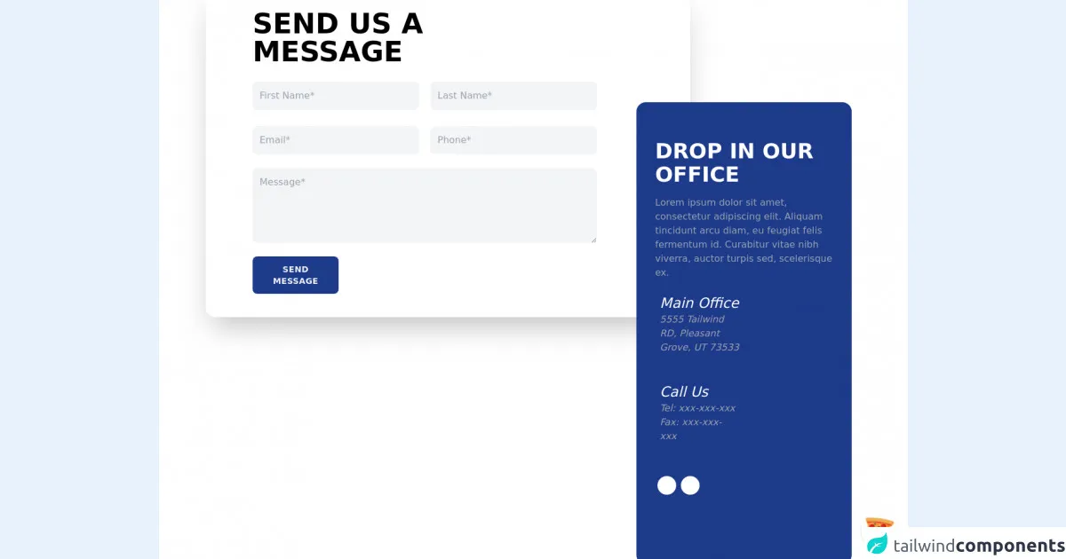
The preview of Responsive Contact Form ui component
To create a responsive contact form, we will use Tailwind CSS classes to style the form elements. The form will have fields for name, email, subject, and message. We will also include a submit button.
Free download of the Responsive Contact Form's source code
The source code of Responsive Contact Form ui component
To create the responsive contact form, we will use HTML and Tailwind CSS classes. We will use the form element to create the form and add input fields for name, email, subject, and message. We will also include a submit button.
<div class="flex justify-center items-center w-screen h-screen bg-white">
	<!-- COMPONENT CODE -->
	<div class="container mx-auto my-4 px-4 lg:px-20">

		<div class="w-full p-8 my-4 md:px-12 lg:w-9/12 lg:pl-20 lg:pr-40 mr-auto rounded-2xl shadow-2xl">
			<div class="flex">
				<h1 class="font-bold uppercase text-5xl">Send us a <br /> message</h1>
			</div>
			<div class="grid grid-cols-1 gap-5 md:grid-cols-2 mt-5">
				<input class="w-full bg-gray-100 text-gray-900 mt-2 p-3 rounded-lg focus:outline-none focus:shadow-outline"
            type="text" placeholder="First Name*" />
				<input class="w-full bg-gray-100 text-gray-900 mt-2 p-3 rounded-lg focus:outline-none focus:shadow-outline"
            type="text" placeholder="Last Name*" />
				<input class="w-full bg-gray-100 text-gray-900 mt-2 p-3 rounded-lg focus:outline-none focus:shadow-outline"
            type="email" placeholder="Email*" />
				<input class="w-full bg-gray-100 text-gray-900 mt-2 p-3 rounded-lg focus:outline-none focus:shadow-outline"
            type="number" placeholder="Phone*" />
        </div>
				<div class="my-4">
					<textarea placeholder="Message*" class="w-full h-32 bg-gray-100 text-gray-900 mt-2 p-3 rounded-lg focus:outline-none focus:shadow-outline"></textarea>
				</div>
				<div class="my-2 w-1/2 lg:w-1/4">
					<button class="uppercase text-sm font-bold tracking-wide bg-blue-900 text-gray-100 p-3 rounded-lg w-full
                      focus:outline-none focus:shadow-outline">
            Send Message
          </button>
				</div>
			</div>

			<div
				class="w-full lg:-mt-96 lg:w-2/6 px-8 py-12 ml-auto bg-blue-900 rounded-2xl">
				<div class="flex flex-col text-white">
					<h1 class="font-bold uppercase text-4xl my-4">Drop in our office</h1>
					<p class="text-gray-400">Lorem ipsum dolor sit amet, consectetur adipiscing elit. Aliquam
						tincidunt arcu diam,
						eu feugiat felis fermentum id. Curabitur vitae nibh viverra, auctor turpis sed, scelerisque ex.
					</p>

					<div class="flex my-4 w-2/3 lg:w-1/2">
						<div class="flex flex-col">
							<i class="fas fa-map-marker-alt pt-2 pr-2" />
            </div>
            <div class="flex flex-col">
              <h2 class="text-2xl">Main Office</h2>
              <p class="text-gray-400">5555 Tailwind RD, Pleasant Grove, UT 73533</p>
            </div>
          </div>

          <div class="flex my-4 w-2/3 lg:w-1/2">
            <div class="flex flex-col">
              <i class="fas fa-phone-alt pt-2 pr-2" />
            </div>
            <div class="flex flex-col">
              <h2 class="text-2xl">Call Us</h2>
              <p class="text-gray-400">Tel: xxx-xxx-xxx</p>
              <p class="text-gray-400">Fax: xxx-xxx-xxx</p>
            </div>
          </div>

          <div class="flex my-4 w-2/3 lg:w-1/2">
            <a href="https://www.facebook.com/ENLIGHTENEERING/" target="_blank" rel="noreferrer" class="rounded-full bg-white h-8 w-8 inline-block mx-1 text-center pt-1">
              <i class="fab fa-facebook-f text-blue-900" />
            </a>
            <a href="https://www.linkedin.com/company/enlighteneering-inc-" target="_blank" rel="noreferrer" class="rounded-full bg-white h-8 w-8 inline-block mx-1 text-center pt-1">
              <i class="fab fa-linkedin-in text-blue-900" />
            </a>
          </div>
        </div>
      </div>
    </div>
    <!-- COMPONENT CODE -->
</div>

<!-- BUY ME A PIZZA AND HELP SUPPORT OPEN-SOURCE RESOURCES -->
<div class="flex items-end justify-end fixed bottom-0 right-0 mb-4 mr-4 z-10">
  <div>
    <a title="Buy me a pizza" href="https://www.buymeacoffee.com/Dekartmc" target="_blank" class="block w-16 h-16 rounded-full transition-all shadow hover:shadow-lg transform hover:scale-110 hover:rotate-12">
      <img class="object-cover object-center w-full h-full rounded-full" src="https://img.icons8.com/emoji/48/000000/pizza-emoji.png"/>
    </a>
  </div>
</div>
How to create a Responsive Contact Form with Tailwind CSS?
To create a responsive contact form with Tailwind CSS, follow these three steps:
Step 1: Set up the HTML structure
The first step is to set up the HTML structure for the contact form. We will use the form element to create the form and add input fields for name, email, subject, and message. We will also include a submit button.
<form class="w-full max-w-lg mx-auto">
  <div class="flex flex-wrap -mx-3 mb-6">
    <div class="w-full md:w-1/2 px-3 mb-6 md:mb-0">
      <label class="block uppercase tracking-wide text-gray-700 text-xs font-bold mb-2" for="grid-first-name">
        Name
      </label>
      <input class="appearance-none block w-full bg-gray-200 text-gray-700 border border-gray-200 rounded py-3 px-4 mb-3 leading-tight focus:outline-none focus:bg-white" id="grid-first-name" type="text" placeholder="John Doe">
    </div>
    <div class="w-full md:w-1/2 px-3">
      <label class="block uppercase tracking-wide text-gray-700 text-xs font-bold mb-2" for="grid-last-name">
        Email
      </label>
      <input class="appearance-none block w-full bg-gray-200 text-gray-700 border border-gray-200 rounded py-3 px-4 leading-tight focus:outline-none focus:bg-white focus:border-gray-500" id="grid-last-name" type="email" placeholder="[email protected]">
    </div>
  </div>
  <div class="flex flex-wrap -mx-3 mb-6">
    <div class="w-full px-3">
      <label class="block uppercase tracking-wide text-gray-700 text-xs font-bold mb-2" for="grid-password">
        Subject
      </label>
      <input class="appearance-none block w-full bg-gray-200 text-gray-700 border border-gray-200 rounded py-3 px-4 mb-3 leading-tight focus:outline-none focus:bg-white focus:border-gray-500" id="grid-password" type="text" placeholder="Enter subject">
    </div>
  </div>
  <div class="flex flex-wrap -mx-3 mb-6">
    <div class="w-full px-3">
      <label class="block uppercase tracking-wide text-gray-700 text-xs font-bold mb-2" for="grid-password">
        Message
      </label>
      <textarea class="appearance-none block w-full bg-gray-200 text-gray-700 border border-gray-200 rounded py-3 px-4 mb-3 leading-tight focus:outline-none focus:bg-white focus:border-gray-500" id="grid-password" placeholder="Enter message"></textarea>
    </div>
  </div>
  <div class="md:flex md:items-center">
    <div class="md:w-1/3">
      <button class="shadow bg-blue-500 hover:bg-blue-400 focus:shadow-outline focus:outline-none text-white font-bold py-2 px-4 rounded" type="button">
        Send
      </button>
    </div>
    <div class="md:w-2/3"></div>
  </div>
</form>
Step 2: Add Tailwind CSS classes
The next step is to add Tailwind CSS classes to style the form elements. We will use classes like w-full, max-w-lg, mx-auto, flex, flex-wrap, px-3, mb-6, md:w-1/2, uppercase, tracking-wide, text-gray-700, text-xs, font-bold, appearance-none, bg-gray-200, text-gray-700, border, rounded, py-3, px-4, leading-tight, focus:outline-none, focus:bg-white, focus:border-gray-500, md:flex, md:items-center, shadow, bg-blue-500, hover:bg-blue-400, focus:shadow-outline, focus:outline-none, text-white, and font-bold.
Step 3: Test the contact form
The final step is to test the contact form on different devices to ensure that it is responsive. You can use the browser's developer tools to test the form on different screen sizes.
Conclusion
In this article, we have explored how to create a responsive contact form using Tailwind CSS. We have discussed why Tailwind CSS is a great choice for creating custom designs and how to use it to create a responsive contact form. By following the steps outlined in this tutorial, you can quickly create a responsive contact form that looks great on all devices.