- Published on
Advanced Guide: Build A Responsive Contact Form #1 With Tailwind CSS
- What is Tailwind CSS?
- The description of Responsive Contact Form #1 ui component
- Why use Tailwind CSS to create a Responsive Contact Form #1 ui component?
- The preview of Responsive Contact Form #1 ui component.
- The source code of Responsive Contact Form #1 ui component.
- How to create a Responsive Contact Form #1 with Tailwind CSS?
- Step 1: Set up your HTML structure
- Step 2: Add Tailwind CSS to your project
- Step 3: Style your form with Tailwind CSS
- Step 4: Preview and test your form
- Conclusion
In today's world, responsive design is a must-have feature for any website. A responsive design ensures that your website looks great on any device, whether it's a desktop, laptop, tablet, or mobile phone. One of the most important features of a responsive website is a responsive contact form. In this article, we'll show you how to create a responsive contact form #1 with Tailwind CSS.
What is Tailwind CSS?
Tailwind CSS is a utility-first CSS framework that provides a set of pre-defined classes that you can use to style your HTML elements. It's designed to be highly customizable, allowing you to create unique designs quickly and easily. Tailwind CSS is a popular choice among web developers because it helps them write less CSS code and focus more on the functionality of the website.
The description of Responsive Contact Form #1 ui component
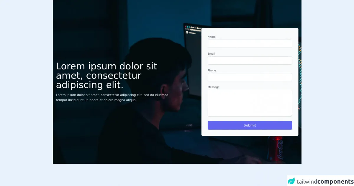
A responsive contact form #1 is a simple and elegant way to collect user information. It's a one-column form that includes fields for name, email, subject, and message. The form is designed to be easy to use and visually appealing, with a clean and modern design.
Why use Tailwind CSS to create a Responsive Contact Form #1 ui component?
Tailwind CSS is an excellent choice for creating a responsive contact form #1 because it provides a set of pre-defined classes that you can use to style your form quickly and easily. With Tailwind CSS, you can create a responsive contact form #1 that looks great on any device without writing a lot of custom CSS code.
The preview of Responsive Contact Form #1 ui component.
Free download of the Responsive Contact Form #1's source code
The source code of Responsive Contact Form #1 ui component.
<section class="w-full text-gray-900 py-36 bg-center bg-cover bg-no-repeat"
    style="background:url('https://images.unsplash.com/photo-1623479322729-28b25c16b011?ixid=MnwxMjA3fDB8MHxwaG90by1wYWdlfHx8fGVufDB8fHx8&ixlib=rb-1.2.1&auto=format&fit=crop&w=1920&q=1280')">
    <div class="max-w-7xl mx-auto px-4 sm:px-6 lg:px-4 flex items-center justify-center">
        <div class="lg:w-3/6 lg:pr-0 pr-0">
            <h1 class="font-medium text-5xl text-white">Lorem ipsum dolor sit amet, consectetur adipiscing elit.</h1>
            <p class="leading-relaxed mt-4 text-white">
                Lorem ipsum dolor sit amet, consectetur adipiscing elit,
                sed do eiusmod tempor incididunt ut labore et dolore magna aliqua.</p>
        </div>
        <div class="lg:w-3/6 xl:w-2/5 md:w-full bg-gray-50 p-8 flex flex-col lg:ml-auto w-full mt-10 lg:mt-0 rounded-md">
            <div class="relative mb-4">
                <label for="full-name" class="leading-7 text-sm text-gray-600">Name</label>
                <input type="text" id="name" name="name" class="w-full bg-white rounded-md border border-gray-300 focus:border-indigo-600 focus:ring-2 focus:ring-indigo-200 text-sm outline-none text-gray-900 py-1 px-3 leading-8 transition-colors duration-150 ease-in-out">
            </div>
            <div class="relative mb-4">
                <label for="email" class="leading-7 text-sm text-gray-600">Email</label>
                <input type="email" id="email" name="email" class="w-full bg-white rounded-md border border-gray-300 focus:border-indigo-600 focus:ring-2 focus:ring-indigo-200 text-sm outline-none text-gray-900 py-1 px-3 leading-8 transition-colors duration-150 ease-in-out">
            </div>
            <div class="relative mb-4">
                <label for="email" class="leading-7 text-sm text-gray-600">Phone</label>
                <input type="email" id="phone" name="phone" class="w-full bg-white rounded-md border border-gray-300 focus:border-indigo-600 focus:ring-2 focus:ring-indigo-200 text-sm outline-none text-gray-900 py-1 px-3 leading-8 transition-colors duration-150 ease-in-out">
            </div>
            <div class="relative mb-4">
                <label for="email" class="leading-7 text-sm text-gray-600">Message</label>
                <textarea id="message" name="message" rows="4" class="w-full bg-white rounded-md border border-gray-300 focus:border-indigo-600 focus:ring-2 focus:ring-indigo-200 text-sm outline-none text-gray-900 py-1 px-3 leading-8 transition-colors duration-150 ease-in-out"> </textarea>
            </div>
            <button class="text-white bg-indigo-500 rounded-md border-0 py-2 px-8 focus:outline-none hover:bg-indigo-600 text-lg">Submit</button>
        </div>
    </div>
</section>
How to create a Responsive Contact Form #1 with Tailwind CSS?
To create a responsive contact form #1 with Tailwind CSS, follow these steps:
Step 1: Set up your HTML structure
The first step is to set up your HTML structure. Create a new HTML file and add the following code:
<form class="max-w-lg mx-auto">
  <div class="mb-4">
    <label class="block text-gray-700 font-bold mb-2" for="name">
      Name
    </label>
    <input
      class="appearance-none border rounded w-full py-2 px-3 text-gray-700 leading-tight focus:outline-none focus:shadow-outline"
      id="name"
      type="text"
      placeholder="John Doe"
    />
  </div>
  <div class="mb-4">
    <label class="block text-gray-700 font-bold mb-2" for="email">
      Email
    </label>
    <input
      class="appearance-none border rounded w-full py-2 px-3 text-gray-700 leading-tight focus:outline-none focus:shadow-outline"
      id="email"
      type="email"
      placeholder="[email protected]"
    />
  </div>
  <div class="mb-4">
    <label class="block text-gray-700 font-bold mb-2" for="subject">
      Subject
    </label>
    <input
      class="appearance-none border rounded w-full py-2 px-3 text-gray-700 leading-tight focus:outline-none focus:shadow-outline"
      id="subject"
      type="text"
      placeholder="Enter your subject"
    />
  </div>
  <div class="mb-4">
    <label class="block text-gray-700 font-bold mb-2" for="message">
      Message
    </label>
    <textarea
      class="appearance-none border rounded w-full py-2 px-3 text-gray-700 leading-tight focus:outline-none focus:shadow-outline"
      id="message"
      rows="5"
      placeholder="Enter your message"
    ></textarea>
  </div>
  <div class="flex items-center justify-between">
    <button
      class="bg-blue-500 hover:bg-blue-700 text-white font-bold py-2 px-4 rounded focus:outline-none focus:shadow-outline"
      type="button"
    >
      Send
    </button>
  </div>
</form>
Step 2: Add Tailwind CSS to your project
The next step is to add Tailwind CSS to your project. You can either download the CSS file from the official website or use a CDN. In this example, we'll use the CDN:
<link
  rel="stylesheet"
  href="https://cdn.jsdelivr.net/npm/[email protected]/dist/tailwind.min.css"
/>
Step 3: Style your form with Tailwind CSS
Now it's time to style your form with Tailwind CSS. Add the following classes to your HTML elements:
<form class="max-w-lg mx-auto">
  <div class="mb-4">
    <label class="block text-gray-700 font-bold mb-2" for="name">
      Name
    </label>
    <input
      class="appearance-none border rounded w-full py-2 px-3 text-gray-700 leading-tight focus:outline-none focus:shadow-outline"
      id="name"
      type="text"
      placeholder="John Doe"
    />
  </div>
  <div class="mb-4">
    <label class="block text-gray-700 font-bold mb-2" for="email">
      Email
    </label>
    <input
      class="appearance-none border rounded w-full py-2 px-3 text-gray-700 leading-tight focus:outline-none focus:shadow-outline"
      id="email"
      type="email"
      placeholder="[email protected]"
    />
  </div>
  <div class="mb-4">
    <label class="block text-gray-700 font-bold mb-2" for="subject">
      Subject
    </label>
    <input
      class="appearance-none border rounded w-full py-2 px-3 text-gray-700 leading-tight focus:outline-none focus:shadow-outline"
      id="subject"
      type="text"
      placeholder="Enter your subject"
    />
  </div>
  <div class="mb-4">
    <label class="block text-gray-700 font-bold mb-2" for="message">
      Message
    </label>
    <textarea
      class="appearance-none border rounded w-full py-2 px-3 text-gray-700 leading-tight focus:outline-none focus:shadow-outline"
      id="message"
      rows="5"
      placeholder="Enter your message"
    ></textarea>
  </div>
  <div class="flex items-center justify-between">
    <button
      class="bg-blue-500 hover:bg-blue-700 text-white font-bold py-2 px-4 rounded focus:outline-none focus:shadow-outline"
      type="button"
    >
      Send
    </button>
  </div>
</form>
Step 4: Preview and test your form
Finally, preview and test your form in different devices to ensure it's responsive and functional.
Conclusion
In this article, we've shown you how to create a responsive contact form #1 with Tailwind CSS. With Tailwind CSS, you can create a responsive contact form #1 that looks great on any device without writing a lot of custom CSS code. We hope this article has been helpful, and you can use these techniques to create your own responsive contact forms.