- Published on
Ultimate Guide: Make A Responsive Contact Form #2 - Dark Mode With Tailwind CSS
- What is Tailwind CSS?
- The description of Responsive Contact Form #2 - Dark Mode ui component
- Why use Tailwind CSS to create a Responsive Contact Form #2 - Dark Mode ui component?
- The preview of Responsive Contact Form #2 - Dark Mode ui component
- The source code of Responsive Contact Form #2 - Dark Mode ui component
- How to create a Responsive Contact Form #2 - Dark Mode with Tailwind CSS?
- Conclusion
In this tutorial, we will be creating a responsive contact form with a dark mode theme using Tailwind CSS. Tailwind CSS is a utility-first CSS framework that provides a set of pre-defined classes that can be used to style HTML elements. This makes it easy to create responsive and customizable UI components.
What is Tailwind CSS?
Tailwind CSS is a utility-first CSS framework that provides a set of pre-defined classes that can be used to style HTML elements. It is designed to be highly customizable and provides a wide range of utility classes that can be used to create responsive and customizable UI components.
The description of Responsive Contact Form #2 - Dark Mode ui component
The Responsive Contact Form #2 - Dark Mode ui component is a form that allows users to send messages to the website owner. It is designed with a dark mode theme and is fully responsive, which means it can be viewed on any device, including desktops, tablets, and mobile phones.
Why use Tailwind CSS to create a Responsive Contact Form #2 - Dark Mode ui component?
Tailwind CSS provides a set of pre-defined classes that can be used to create responsive and customizable UI components. This makes it easy to create a contact form that is fully responsive and can be viewed on any device. Additionally, Tailwind CSS provides a wide range of utility classes that can be used to style the form and make it look great.
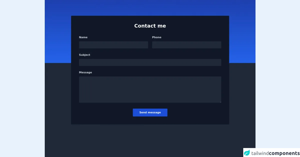
The preview of Responsive Contact Form #2 - Dark Mode ui component
Free download of the Responsive Contact Form #2 - Dark Mode's source code
The source code of Responsive Contact Form #2 - Dark Mode ui component
<div class="w-full bg-gray-800 h-screen">
    <div class="bg-gradient-to-b from-blue-800 to-blue-600 h-96"></div>
    <div class="max-w-5xl mx-auto px-6 sm:px-6 lg:px-8 mb-12">
        <div class="bg-gray-900 w-full shadow rounded p-8 sm:p-12 -mt-72">
            <p class="text-3xl font-bold leading-7 text-center text-white">Contact me</p>
            <form action="" method="post">
                <div class="md:flex items-center mt-12">
                    <div class="w-full md:w-1/2 flex flex-col">
                        <label class="font-semibold leading-none text-gray-300">Name</label>
                        <input type="text" class="leading-none text-gray-50 p-3 focus:outline-none focus:border-blue-700 mt-4 border-0 bg-gray-800 rounded" />
                    </div>
                    <div class="w-full md:w-1/2 flex flex-col md:ml-6 md:mt-0 mt-4">
                        <label class="font-semibold leading-none text-gray-300">Phone</label>
                        <input type="email" class="leading-none text-gray-50 p-3 focus:outline-none focus:border-blue-700 mt-4 border-0 bg-gray-800 rounded"/>
                    </div>
                </div>
                <div class="md:flex items-center mt-8">
                    <div class="w-full flex flex-col">
                        <label class="font-semibold leading-none text-gray-300">Subject</label>
                        <input type="text" class="leading-none text-gray-50 p-3 focus:outline-none focus:border-blue-700 mt-4 border-0 bg-gray-800 rounded"/>
                    </div>

                </div>
                <div>
                    <div class="w-full flex flex-col mt-8">
                        <label class="font-semibold leading-none text-gray-300">Message</label>
                        <textarea type="text" class="h-40 text-base leading-none text-gray-50 p-3 focus:outline-none focus:border-blue-700 mt-4 bg-gray-800 border-0 rounded"></textarea>
                    </div>
                </div>
                <div class="flex items-center justify-center w-full">
                    <button class="mt-9 font-semibold leading-none text-white py-4 px-10 bg-blue-700 rounded hover:bg-blue-600 focus:ring-2 focus:ring-offset-2 focus:ring-blue-700 focus:outline-none">
                        Send message
                    </button>
                </div>
            </form>
        </div>
    </div>
</div>
How to create a Responsive Contact Form #2 - Dark Mode with Tailwind CSS?
To create a responsive contact form with a dark mode theme using Tailwind CSS, follow these steps:
Create a new HTML file and add the necessary HTML code for the form. This includes the form element, input fields, and a submit button.
Add the necessary Tailwind CSS classes to style the form. This includes classes for the form element, input fields, and submit button.
Add the necessary JavaScript code to validate the form and submit the data to the server.
Test the form on different devices to ensure that it is fully responsive and works as expected.
Conclusion
In this tutorial, we have learned how to create a responsive contact form with a dark mode theme using Tailwind CSS. Tailwind CSS provides a set of pre-defined classes that can be used to create responsive and customizable UI components, making it easy to create a contact form that looks great on any device. By following the steps outlined in this tutorial, you can create your own responsive contact form with a dark mode theme using Tailwind CSS.