- Published on
6 Tips To Make A Responsive Coming Soon With Tailwind CSS
- What is Tailwind CSS?
- The description of Responsive Coming Soon UI component
- Why use Tailwind CSS to create a Responsive Coming Soon UI component?
- The preview of Responsive Coming Soon UI component
- The source code of Responsive Coming Soon UI component
- How to create a Responsive Coming Soon with Tailwind CSS?
- 1. Use the grid system
- 2. Use responsive classes
- 3. Use the text-center class
- 4. Use the bg-gray-900 class
- 5. Use the text-white class
- 6. Use the border-gray-700 class
- Conclusion
As a FrontEnd technology blogger, I am always looking for ways to create responsive UI components that work across all devices. In this article, I will share with you 6 tips to make a responsive coming soon UI component with Tailwind CSS.
What is Tailwind CSS?
Tailwind CSS is a utility-first CSS framework that allows you to create custom designs quickly and easily. It provides a set of pre-defined classes that you can use to style your HTML elements. With Tailwind CSS, you can create responsive designs that work across all devices.
The description of Responsive Coming Soon UI component
A responsive coming soon UI component is a design element that you can use to inform your users that your website or application is not yet available. It usually includes a countdown timer, a message, and a call-to-action button. The component should be responsive, meaning that it should work on all devices, including desktops, tablets, and mobile devices.
Why use Tailwind CSS to create a Responsive Coming Soon UI component?
Tailwind CSS is an excellent choice for creating a responsive coming soon UI component because it provides a set of pre-defined classes that you can use to style your HTML elements. You don't need to write custom CSS code, which saves you time and effort. Additionally, Tailwind CSS is responsive by default, meaning that your UI component will work on all devices without any additional effort.
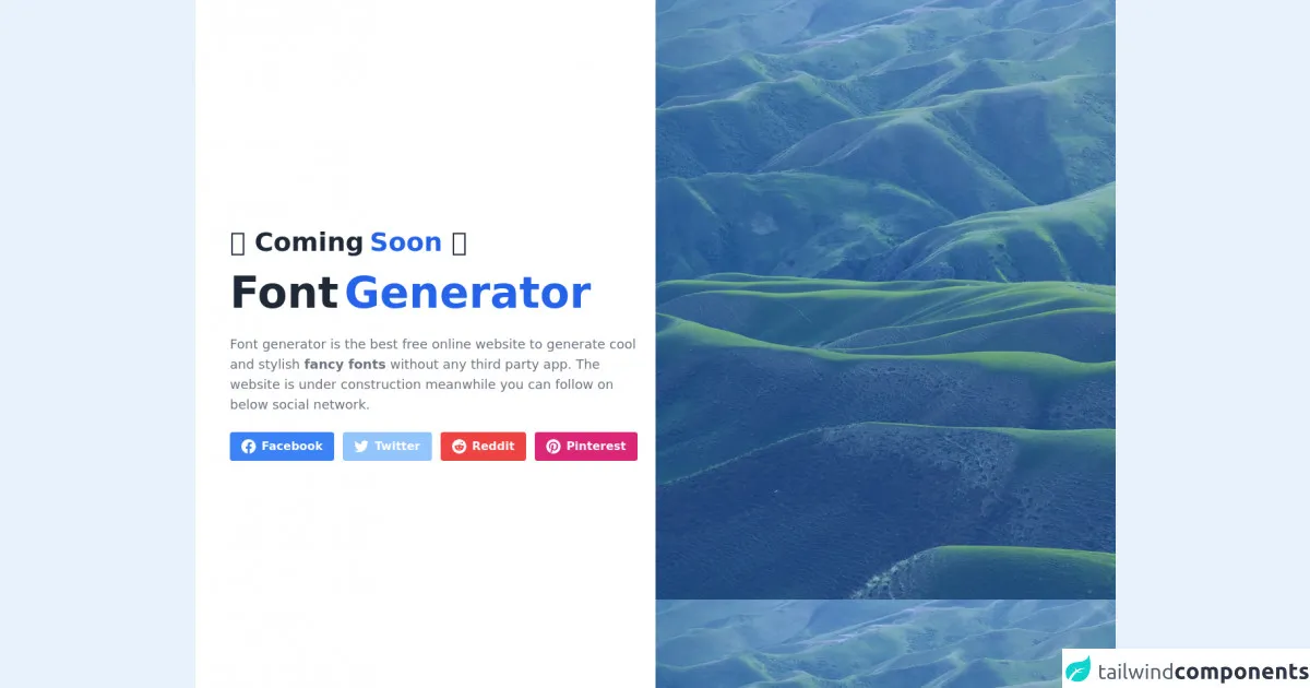
The preview of Responsive Coming Soon UI component
To create a responsive coming soon UI component, you need to use HTML and CSS code. Here is a preview of what the component might look like:
Free download of the Responsive Coming Soon's source code
The source code of Responsive Coming Soon UI component
To create a responsive coming soon UI component, you need to use HTML and CSS code. Here is the source code for the component:
<div class="w-full">
    <div class="flex bg-white h-screen">
        <div class="flex items-center text-center lg:text-left px-8 md:px-12 lg:w-1/2">
            <div>
                 <span class="text-2xl font-semibold text-gray-800 md:text-4xl">⏰ Coming<span class="ml-2 text-blue-600">Soon</span> ⏰</span>
                <h1 class="py-5 text-5xl font-semibold text-gray-800 md:text-6xl">Font<span class="ml-2 text-blue-600">Generator</span></h1>

              <p class="mt-2 text-sm text-gray-500 md:text-lg"><a href="https://fontgenerator.org/">Font generator</a> is the best free online website to generate cool and stylish <strong>fancy fonts</strong> without any third party app. The website is under construction meanwhile you can follow on below social network.</p>
                <div class="flex space-x-3 justify-center lg:justify-start mt-6">
                        <a href="https://www.facebook.com/FontGen/" class="bg-blue-500 px-4 py-2 font-semibold text-white inline-flex items-center space-x-2 rounded">
        <svg class="w-5 h-5 fill-current" role="img" xmlns="http://www.w3.org/2000/svg" viewBox="0 0 24 24"><path d="M24 12.073c0-6.627-5.373-12-12-12s-12 5.373-12 12c0 5.99 4.388 10.954 10.125 11.854v-8.385H7.078v-3.47h3.047V9.43c0-3.007 1.792-4.669 4.533-4.669 1.312 0 2.686.235 2.686.235v2.953H15.83c-1.491 0-1.956.925-1.956 1.874v2.25h3.328l-.532 3.47h-2.796v8.385C19.612 23.027 24 18.062 24 12.073z"/></svg>
        <span>Facebook</span>
    </a>
                        <a href="https://twitter.com/FontGen" class="bg-blue-300 px-4 py-2 font-semibold text-white inline-flex items-center space-x-2 rounded">
                                <svg class="w-5 h-5 fill-current" role="img" xmlns="http://www.w3.org/2000/svg" viewBox="0 0 24 24"><path d="M23.953 4.57a10 10 0 01-2.825.775 4.958 4.958 0 002.163-2.723c-.951.555-2.005.959-3.127 1.184a4.92 4.92 0 00-8.384 4.482C7.69 8.095 4.067 6.13 1.64 3.162a4.822 4.822 0 00-.666 2.475c0 1.71.87 3.213 2.188 4.096a4.904 4.904 0 01-2.228-.616v.06a4.923 4.923 0 003.946 4.827 4.996 4.996 0 01-2.212.085 4.936 4.936 0 004.604 3.417 9.867 9.867 0 01-6.102 2.105c-.39 0-.779-.023-1.17-.067a13.995 13.995 0 007.557 2.209c9.053 0 13.998-7.496 13.998-13.985 0-.21 0-.42-.015-.63A9.935 9.935 0 0024 4.59z"/></svg>
                                <span>Twitter</span>
                            </a>
                  <a href="#" class="bg-red-500 px-4 py-2 font-semibold text-white inline-flex items-center space-x-2 rounded">
        <svg class="w-5 h-5 fill-current" role="img" viewBox="0 0 24 24" xmlns="http://www.w3.org/2000/svg"><path d="M12 0A12 12 0 0 0 0 12a12 12 0 0 0 12 12 12 12 0 0 0 12-12A12 12 0 0 0 12 0zm5.01 4.744c.688 0 1.25.561 1.25 1.249a1.25 1.25 0 0 1-2.498.056l-2.597-.547-.8 3.747c1.824.07 3.48.632 4.674 1.488.308-.309.73-.491 1.207-.491.968 0 1.754.786 1.754 1.754 0 .716-.435 1.333-1.01 1.614a3.111 3.111 0 0 1 .042.52c0 2.694-3.13 4.87-7.004 4.87-3.874 0-7.004-2.176-7.004-4.87 0-.183.015-.366.043-.534A1.748 1.748 0 0 1 4.028 12c0-.968.786-1.754 1.754-1.754.463 0 .898.196 1.207.49 1.207-.883 2.878-1.43 4.744-1.487l.885-4.182a.342.342 0 0 1 .14-.197.35.35 0 0 1 .238-.042l2.906.617a1.214 1.214 0 0 1 1.108-.701zM9.25 12C8.561 12 8 12.562 8 13.25c0 .687.561 1.248 1.25 1.248.687 0 1.248-.561 1.248-1.249 0-.688-.561-1.249-1.249-1.249zm5.5 0c-.687 0-1.248.561-1.248 1.25 0 .687.561 1.248 1.249 1.248.688 0 1.249-.561 1.249-1.249 0-.687-.562-1.249-1.25-1.249zm-5.466 3.99a.327.327 0 0 0-.231.094.33.33 0 0 0 0 .463c.842.842 2.484.913 2.961.913.477 0 2.105-.056 2.961-.913a.361.361 0 0 0 .029-.463.33.33 0 0 0-.464 0c-.547.533-1.684.73-2.512.73-.828 0-1.979-.196-2.512-.73a.326.326 0 0 0-.232-.095z"/></svg>
        <span>Reddit</span>
    </a>
    <a href="#" class="bg-pink-600 px-4 py-2 font-semibold text-white inline-flex items-center space-x-2 rounded">
        <svg class="w-5 h-5 fill-current" role="img" viewBox="0 0 24 24" xmlns="http://www.w3.org/2000/svg"><title>Pinterest icon</title><path d="M12.017 0C5.396 0 .029 5.367.029 11.987c0 5.079 3.158 9.417 7.618 11.162-.105-.949-.199-2.403.041-3.439.219-.937 1.406-5.957 1.406-5.957s-.359-.72-.359-1.781c0-1.663.967-2.911 2.168-2.911 1.024 0 1.518.769 1.518 1.688 0 1.029-.653 2.567-.992 3.992-.285 1.193.6 2.165 1.775 2.165 2.128 0 3.768-2.245 3.768-5.487 0-2.861-2.063-4.869-5.008-4.869-3.41 0-5.409 2.562-5.409 5.199 0 1.033.394 2.143.889 2.741.099.12.112.225.085.345-.09.375-.293 1.199-.334 1.363-.053.225-.172.271-.401.165-1.495-.69-2.433-2.878-2.433-4.646 0-3.776 2.748-7.252 7.92-7.252 4.158 0 7.392 2.967 7.392 6.923 0 4.135-2.607 7.462-6.233 7.462-1.214 0-2.354-.629-2.758-1.379l-.749 2.848c-.269 1.045-1.004 2.352-1.498 3.146 1.123.345 2.306.535 3.55.535 6.607 0 11.985-5.365 11.985-11.987C23.97 5.39 18.592.026 11.985.026L12.017 0z"/></svg>
        <span>Pinterest</span>
    </a>
                </div>
            </div>
        </div>
        <div class="hidden lg:block lg:w-1/2" >
            <div class="h-full object-cover" style="background-image: url(https://images.unsplash.com/photo-1501854140801-50d01698950b?ixlib=rb-1.2.1&ixid=eyJhcHBfaWQiOjEyMDd9&auto=format&fit=crop&w=1400&q=80)">
                <div class="h-full bg-blue-500 opacity-50"></div>
            </div>
        </div>
    </div>
</div>
How to create a Responsive Coming Soon with Tailwind CSS?
Here are 6 tips to make a responsive coming soon UI component with Tailwind CSS:
1. Use the grid system
The grid system is a powerful feature of Tailwind CSS that allows you to create responsive layouts quickly and easily. To use the grid system, you need to add the grid class to a parent element and then add the col class to its child elements. You can also use the row class to create rows within the grid.
2. Use responsive classes
Tailwind CSS provides a set of responsive classes that allow you to create designs that work on all devices. For example, you can use the sm: prefix to apply a style only on small screens and the md: prefix to apply a style only on medium screens.
3. Use the text-center class
The text-center class centers the text within an element. You can use this class to center the message and the call-to-action button within the coming soon UI component.
4. Use the bg-gray-900 class
The bg-gray-900 class sets the background color of an element to dark gray. You can use this class to set the background color of the coming soon UI component.
5. Use the text-white class
The text-white class sets the text color of an element to white. You can use this class to set the text color of the message and the call-to-action button within the coming soon UI component.
6. Use the border-gray-700 class
The border-gray-700 class sets the border color of an element to dark gray. You can use this class to set the border color of the countdown timer within the coming soon UI component.
Conclusion
In this article, we have discussed 6 tips to make a responsive coming soon UI component with Tailwind CSS. By using the grid system, responsive classes, and pre-defined classes such as text-center, bg-gray-900, text-white, and border-gray-700, you can create a responsive coming soon UI component that works on all devices. With Tailwind CSS, you can create custom designs quickly and easily, saving you time and effort.