- Published on
6 Easy Ways To Build A Responsive Coming Soon Page With Tailwind CSS Without Even Thinking About It
- What is Tailwind CSS?
- The description of Responsive Coming Soon Page ui component
- Why use Tailwind CSS to create a Responsive Coming Soon Page ui component?
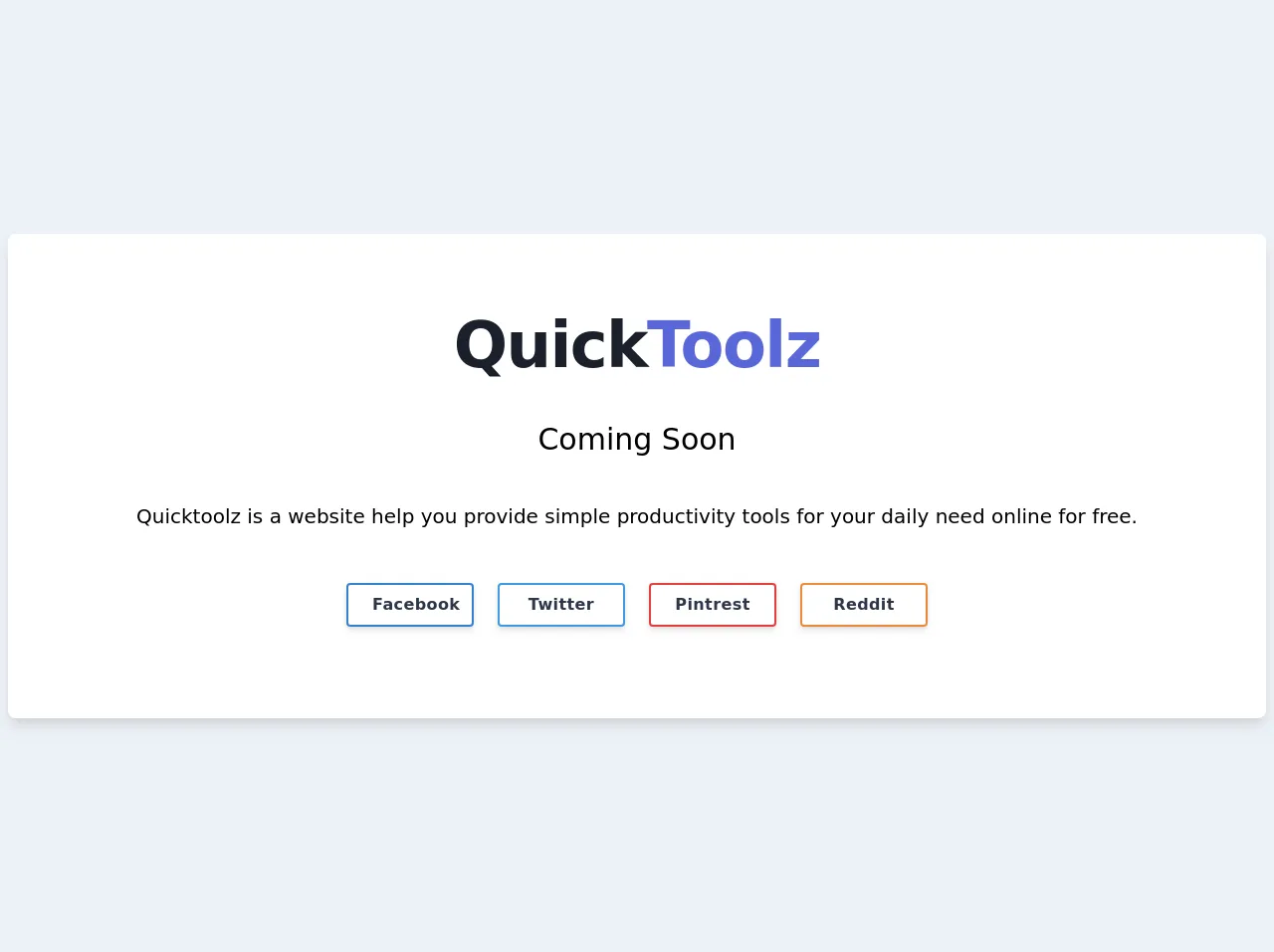
- The preview of Responsive Coming Soon Page ui component.
- The source code of Responsive Coming Soon Page ui component.
- How to create a Responsive Coming Soon Page with Tailwind CSS?
- Step 1: Set up your HTML
- Step 2: Add a logo
- Step 3: Add a heading
- Step 4: Add a countdown timer
- Step 5: Add a form
- Step 6: Style the page
- Conclusion
Are you looking for a way to create a responsive coming soon page for your website? Look no further than Tailwind CSS! In this article, we'll explore what Tailwind CSS is, why it's a great tool for creating UI components like a coming soon page, and provide step-by-step instructions on how to build one.
What is Tailwind CSS?
Tailwind CSS is a utility-first CSS framework that allows you to quickly build custom user interfaces. It provides a set of pre-defined CSS classes that you can use to style your HTML elements. With Tailwind CSS, you can easily create responsive designs, custom color schemes, and unique typography without writing any CSS from scratch.
The description of Responsive Coming Soon Page ui component
A coming soon page is a placeholder page that informs visitors that the website is under construction or will be launched soon. It's a great way to build anticipation and excitement for your website's launch. A responsive coming soon page is one that adjusts to different screen sizes, ensuring that it looks great on desktops, tablets, and mobile devices.
Why use Tailwind CSS to create a Responsive Coming Soon Page ui component?
Tailwind CSS is an excellent choice for creating a responsive coming soon page for several reasons:
- Easy to use: Tailwind CSS provides a set of pre-defined CSS classes that you can use to style your HTML elements. You don't need to write any CSS from scratch, making it easy to create a custom design quickly.
- Responsive: Tailwind CSS includes built-in responsive design classes, allowing you to create a coming soon page that looks great on any device.
- Customizable: Tailwind CSS allows you to customize every aspect of your design, including colors, typography, and spacing.
- Fast: Tailwind CSS is designed to be fast and efficient, which means your coming soon page will load quickly.
The preview of Responsive Coming Soon Page ui component.
Free download of the Responsive Coming Soon Page's source code
The source code of Responsive Coming Soon Page ui component.
<div class="flex items-center justify-center h-screen bg-gray-200">
  <div class="container">
    <div class="bg-white rounded-lg shadow-lg p-5 md:p-20 mx-2">
      <div class="text-center">
        <h2 class="text-4xl tracking-tight leading-10 font-extrabold text-gray-900 sm:text-5xl sm:leading-none md:text-6xl">
          Quick<span class="text-indigo-600">Toolz</span>
        </h2>
        <h3 class='text-xl md:text-3xl mt-10'>Coming Soon</h3>
        <p class="text-md md:text-xl mt-10"><a class="hover:underline" href="https://www.quicktoolz.com">Quicktoolz</a> is a website help you provide simple productivity tools for your daily need online for free.</p>
      </div>
      <div class="flex flex-wrap mt-10 justify-center">
        <div class="m-3">
          <a href="https://www.facebook.com/QuickToolz" title="Quicktoolz On Facebook"
             class="md:w-32 bg-white tracking-wide text-gray-800 font-bold rounded border-2 border-blue-600 hover:border-blue-600 hover:bg-blue-600 hover:text-white shadow-md py-2 px-6 inline-flex items-center">
            <span class="mx-auto">Facebook</span>
          </a>
        </div>
        <div class="m-3">
          <a href="https://twitter.com/quicktoolz" title="Quicktoolz On Twitter"
             class="md:w-32 bg-white tracking-wide text-gray-800 font-bold rounded border-2 border-blue-500 hover:border-blue-500 hover:bg-blue-500 hover:text-white shadow-md py-2 px-6 inline-flex items-center">
            <span class="mx-auto">Twitter</span>
          </a>
        </div>
        <div class="m-3">
          <a href="https://pinterest.com/quicktoolz/" title="Quicktoolz On Pinterest"
             class="md:w-32 bg-white tracking-wide text-gray-800 font-bold rounded border-2 border-red-600 hover:border-red-600 hover:bg-red-600 hover:text-white shadow-md py-2 px-6 inline-flex items-center">
            <span class="mx-auto">Pintrest</span>
          </a>
        </div>
        <div class="m-3">
          <a href="https://www.reddit.com/user/quicktoolz/" title="Quicktoolz On Facebook"
             class="md:w-32 bg-white tracking-wide text-gray-800 font-bold rounded border-2 border-orange-500 hover:border-orange-500 hover:bg-orange-500 hover:text-white shadow-md py-2 px-6 inline-flex items-center">
            <span class="mx-auto">Reddit</span>
          </a>
        </div>
      </div>
    </div>
  </div>
</div>
How to create a Responsive Coming Soon Page with Tailwind CSS?
Now that you understand why Tailwind CSS is an excellent choice for creating a responsive coming soon page, let's dive into the step-by-step instructions on how to build one.
Step 1: Set up your HTML
First, create a new HTML file and add the basic structure of an HTML page. Then, create a container div with a class of "flex flex-col items-center justify-center h-screen" to center the content vertically and horizontally on the page.
<!DOCTYPE html>
<html>
  <head>
    <title>Coming Soon</title>
    <link rel="stylesheet" href="https://cdn.jsdelivr.net/npm/[email protected]/dist/tailwind.min.css">
  </head>
  <body>
    <div class="flex flex-col items-center justify-center h-screen">
      <!-- Content goes here -->
    </div>
  </body>
</html>
Step 2: Add a logo
Next, add your logo to the page. You can use the Tailwind CSS "w-" classes to set the width of the logo and the "mb-" class to add some margin to the bottom of the logo.
<div class="flex flex-col items-center justify-center h-screen">
  <img src="logo.png" alt="Logo" class="w-32 mb-4">
  <!-- Content goes here -->
</div>
Step 3: Add a heading
Add a heading to your coming soon page using the Tailwind CSS "text-" classes to set the font size and color.
<div class="flex flex-col items-center justify-center h-screen">
  <img src="logo.png" alt="Logo" class="w-32 mb-4">
  <h1 class="text-3xl text-gray-800 font-bold mb-2">Coming Soon</h1>
  <!-- Content goes here -->
</div>
Step 4: Add a countdown timer
Add a countdown timer to your coming soon page using JavaScript. You can use the Moment.js library to make working with dates and times easier.
<div class="flex flex-col items-center justify-center h-screen">
  <img src="logo.png" alt="Logo" class="w-32 mb-4">
  <h1 class="text-3xl text-gray-800 font-bold mb-2">Coming Soon</h1>
  <div id="countdown" class="text-2xl text-gray-700 font-semibold mb-4"></div>
  <!-- Content goes here -->
</div>

<script src="https://cdnjs.cloudflare.com/ajax/libs/moment.js/2.29.1/moment.min.js"></script>
<script>
  const countdown = document.getElementById('countdown');
  const launchDate = moment('2022-01-01');

  function updateCountdown() {
    const now = moment();
    const diff = launchDate.diff(now);
    const duration = moment.duration(diff);

    countdown.textContent = `${duration.days()} days, ${duration.hours()} hours, ${duration.minutes()} minutes, ${duration.seconds()} seconds`;
  }

  setInterval(updateCountdown, 1000);
</script>
Step 5: Add a form
Add a form to your coming soon page to allow visitors to sign up for updates. You can use the Tailwind CSS "form-" classes to style the form elements.
<div class="flex flex-col items-center justify-center h-screen">
  <img src="logo.png" alt="Logo" class="w-32 mb-4">
  <h1 class="text-3xl text-gray-800 font-bold mb-2">Coming Soon</h1>
  <div id="countdown" class="text-2xl text-gray-700 font-semibold mb-4"></div>
  <form class="w-full max-w-sm">
    <div class="flex items-center border-b border-b-2 border-teal-500 py-2">
      <input class="appearance-none bg-transparent border-none w-full text-gray-700 mr-3 py-1 px-2 leading-tight focus:outline-none" type="email" placeholder="Enter your email address">
      <button class="flex-shrink-0 bg-teal-500 hover:bg-teal-700 border-teal-500 hover:border-teal-700 text-sm border-4 text-white py-1 px-2 rounded" type="button">
        Sign up
      </button>
    </div>
  </form>
</div>
Step 6: Style the page
Finally, add some custom styles to your coming soon page to make it look great. You can use the Tailwind CSS "bg-", "text-", and "p-" classes to set the background color, text color, and padding of the container div.
<div class="flex flex-col items-center justify-center h-screen bg-gray-100">
  <img src="logo.png" alt="Logo" class="w-32 mb-4">
  <h1 class="text-3xl text-gray-800 font-bold mb-2">Coming Soon</h1>
  <div id="countdown" class="text-2xl text-gray-700 font-semibold mb-4"></div>
  <form class="w-full max-w-sm">
    <div class="flex items-center border-b border-b-2 border-teal-500 py-2">
      <input class="appearance-none bg-transparent border-none w-full text-gray-700 mr-3 py-1 px-2 leading-tight focus:outline-none" type="email" placeholder="Enter your email address">
      <button class="flex-shrink-0 bg-teal-500 hover:bg-teal-700 border-teal-500 hover:border-teal-700 text-sm border-4 text-white py-1 px-2 rounded" type="button">
        Sign up
      </button>
    </div>
  </form>
</div>
Conclusion
In conclusion, creating a responsive coming soon page with Tailwind CSS is easy and straightforward. With just a few lines of HTML and some pre-defined CSS classes, you can create a custom design that looks great on any device. So why not give it a try and see how easy it is to build a coming soon page with Tailwind CSS?