- Published on
Most Effective Ways To Build A Responsive Cards With Tailwind CSS
- What is Tailwind CSS?
- The description of Responsive cards UI component
- Why use Tailwind CSS to create a Responsive cards UI component?
- The preview of Responsive cards UI component
- The source code of Responsive cards UI component
- How to create a Responsive cards with Tailwind CSS?
- Step 1: Create the HTML structure
- Step 2: Add Tailwind CSS classes
- Step 3: Customize the card
- Conclusion
As a FrontEnd technology blogger, it is important to stay up-to-date with the latest tools and technologies. One such tool that has gained immense popularity in recent times is Tailwind CSS. Tailwind CSS is a utility-first CSS framework that allows developers to create responsive and customizable UI components quickly and easily. In this article, we will discuss the most effective ways to build a responsive cards UI component with Tailwind CSS.
What is Tailwind CSS?
Tailwind CSS is a utility-first CSS framework that provides a set of pre-defined CSS classes that can be used to style HTML elements. It is designed to be highly customizable and allows developers to create unique and responsive UI components quickly and easily. Tailwind CSS is gaining popularity among developers due to its ease of use and flexibility.
The description of Responsive cards UI component
A responsive card UI component is a container that holds information in a visually appealing way. It is commonly used to display information such as product details, user profiles, and news articles. A responsive card UI component adjusts its size and layout based on the screen size and device type, making it suitable for use on all types of devices.
Why use Tailwind CSS to create a Responsive cards UI component?
Tailwind CSS provides a set of pre-defined CSS classes that can be used to create a responsive card UI component quickly and easily. The utility-first approach of Tailwind CSS allows developers to style HTML elements without writing custom CSS code. This makes it easy to create a unique and responsive UI component without spending too much time on styling.
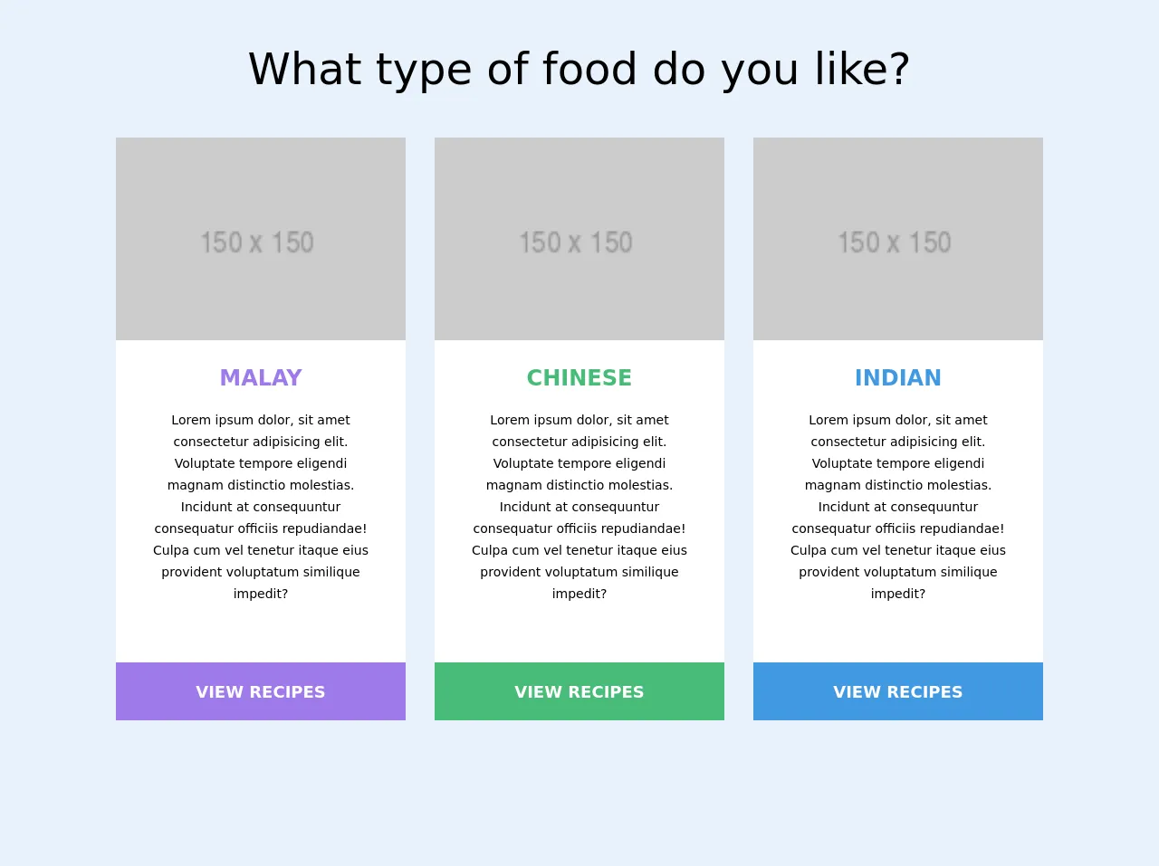
The preview of Responsive cards UI component
To create a responsive card UI component with Tailwind CSS, we will use a combination of HTML and CSS code. The HTML code will define the structure of the card, while the CSS code will style the card. Here is a preview of what the responsive card UI component will look like:
Free download of the Responsive cards's source code
The source code of Responsive cards UI component
To create a responsive card UI component with Tailwind CSS, we will use a combination of HTML and CSS code. The HTML code will define the structure of the card, while the CSS code will style the card. Here is the source code for the responsive card UI component:
<!-- This is an example component -->
<main class="px-3">
      <div class="text-4xl sm:text-5xl text-center my-10">What type of food do you like?</div>

      <div class="grid md:grid-cols-3 gap-8 m-5 max-w-5xl m-auto">
        <div class="bg-white">
          <img src="https://via.placeholder.com/150" alt="" class="w-full h-48 sm:h-56 object-cover" />

          <div class="px-10 py-6 mb-10 text-center">
            <div class="text-2xl font-bold text-purple-500 mb-4">MALAY</div>
            <span class="text-sm">
              Lorem ipsum dolor, sit amet consectetur adipisicing elit. Voluptate tempore eligendi magnam distinctio molestias. Incidunt at consequuntur consequatur
              officiis repudiandae! Culpa cum vel tenetur itaque eius provident voluptatum similique impedit?
            </span>
          </div>

          <button class="w-full text-lg h-16 text-white font-extrabold bg-purple-500">VIEW RECIPES</button>
        </div>

        <div class="bg-white">
          <img src="https://via.placeholder.com/150" alt="" class="w-full h-48 sm:h-56 object-cover" />
          <div class="px-10 py-6 mb-10 text-center">
            <div class="text-2xl font-bold text-green-500 mb-4">CHINESE</div>
            <span class="text-sm">Lorem ipsum dolor, sit amet consectetur adipisicing elit. Voluptate tempore eligendi magnam distinctio molestias. Incidunt
              at consequuntur consequatur officiis repudiandae! Culpa cum vel tenetur itaque eius provident voluptatum similique impedit?</span>
          </div>
          <button class="w-full text-lg h-16 text-white font-extrabold bg-green-500">VIEW RECIPES</button>
        </div>

        <div class="bg-white">
          <img src="https://via.placeholder.com/150" alt="" class="w-full h-48 sm:h-56 object-cover" />
          <div class="px-10 py-6 mb-10 text-center">
            <div class="text-2xl font-bold text-blue-500 mb-4">INDIAN</div>

            <span class="text-sm">Lorem ipsum dolor, sit amet consectetur adipisicing elit. Voluptate tempore eligendi magnam distinctio molestias. Incidunt
               at consequuntur consequatur officiis repudiandae! Culpa cum vel tenetur itaque eius provident voluptatum similique impedit?</span>
          </div>

          <button class="w-full text-lg h-16 text-white font-extrabold bg-blue-500">VIEW RECIPES</button>
        </div>
      </div>
    </main>
How to create a Responsive cards with Tailwind CSS?
To create a responsive card UI component with Tailwind CSS, follow these steps:
Step 1: Create the HTML structure
The first step is to create the HTML structure of the card. This can be done using the div element. Here is an example of the HTML structure:
<div class="max-w-sm rounded overflow-hidden shadow-lg">
  <img class="w-full" src="img/card-image.jpg" alt="Sunset in the mountains">
  <div class="px-6 py-4">
    <div class="font-bold text-xl mb-2">Mountain Sunset</div>
    <p class="text-gray-700 text-base">
      Lorem ipsum dolor sit amet, consectetur adipiscing elit. Fusce non est vitae lacus tristique elementum.
    </p>
  </div>
  <div class="px-6 py-4">
    <span class="inline-block bg-gray-200 rounded-full px-3 py-1 text-sm font-semibold text-gray-700 mr-2">#mountains</span>
    <span class="inline-block bg-gray-200 rounded-full px-3 py-1 text-sm font-semibold text-gray-700 mr-2">#sunset</span>
    <span class="inline-block bg-gray-200 rounded-full px-3 py-1 text-sm font-semibold text-gray-700">#nature</span>
  </div>
</div>
Step 2: Add Tailwind CSS classes
The next step is to add Tailwind CSS classes to the HTML elements to style the card. Here is an example of the CSS classes that can be used:
<div class="max-w-sm rounded overflow-hidden shadow-lg">
  <img class="w-full" src="img/card-image.jpg" alt="Sunset in the mountains">
  <div class="px-6 py-4">
    <div class="font-bold text-xl mb-2">Mountain Sunset</div>
    <p class="text-gray-700 text-base">
      Lorem ipsum dolor sit amet, consectetur adipiscing elit. Fusce non est vitae lacus tristique elementum.
    </p>
  </div>
  <div class="px-6 py-4">
    <span class="inline-block bg-gray-200 rounded-full px-3 py-1 text-sm font-semibold text-gray-700 mr-2">#mountains</span>
    <span class="inline-block bg-gray-200 rounded-full px-3 py-1 text-sm font-semibold text-gray-700 mr-2">#sunset</span>
    <span class="inline-block bg-gray-200 rounded-full px-3 py-1 text-sm font-semibold text-gray-700">#nature</span>
  </div>
</div>
Step 3: Customize the card
The final step is to customize the card by changing the values of the Tailwind CSS classes. For example, the max-w-sm class can be changed to max-w-md to increase the maximum width of the card. Similarly, the text-xl class can be changed to text-lg to decrease the font size of the card title.
Conclusion
Tailwind CSS is a powerful CSS framework that allows developers to create responsive and customizable UI components quickly and easily. In this article, we discussed the most effective ways to build a responsive cards UI component with Tailwind CSS. By following the steps outlined in this article, you can create a unique and responsive card UI component for your website or application.