- Published on
How To Create A Responsive Cards With Tailwind CSS In 5 Easy Steps
- What is Tailwind CSS?
- The description of Responsive Cards ui component
- Why use Tailwind CSS to create a Responsive Cards ui component?
- The preview of Responsive Cards ui component
- The source code of Responsive Cards ui component
- How to create a Responsive Cards with Tailwind CSS?
- Step 1: Set up your HTML structure
- Step 2: Add content to your cards
- Step 3: Style your cards with Tailwind CSS
- Step 4: Make your cards responsive
- Step 5: Add interactivity to your cards
- Conclusion
What is Tailwind CSS?
Tailwind CSS is a utility-first CSS framework that allows developers to quickly build custom user interfaces. It provides a set of pre-defined CSS classes that can be used to style HTML elements. Tailwind CSS is easy to use, highly customizable, and can be integrated with any front-end framework.
The description of Responsive Cards ui component
Responsive Cards are a popular user interface component used to display information in a visually appealing and organized way. They are commonly used to showcase products, services, or articles on websites. Responsive Cards are designed to adapt to different screen sizes and are optimized for mobile devices.
Why use Tailwind CSS to create a Responsive Cards ui component?
Tailwind CSS provides a set of pre-defined CSS classes that can be used to create Responsive Cards quickly and easily. These classes are designed to be responsive, meaning they will adapt to different screen sizes automatically. Tailwind CSS also provides a wide range of customization options, allowing developers to create unique and visually appealing Responsive Cards.
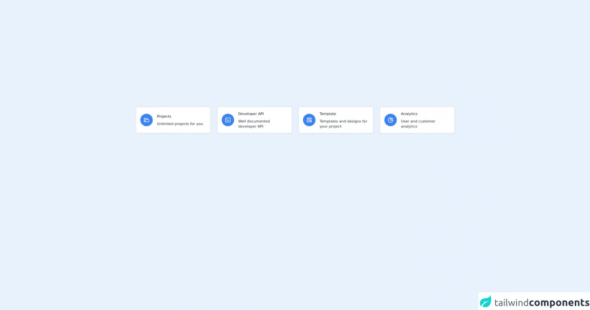
The preview of Responsive Cards ui component
Responsive Cards are a versatile and visually appealing way to display information on a website. They are designed to adapt to different screen sizes and are optimized for mobile devices. With Tailwind CSS, creating Responsive Cards is easy and customizable.
Free download of the Responsive Cards's source code
The source code of Responsive Cards ui component
To create Responsive Cards with Tailwind CSS, you only need to use a few CSS classes. These classes are designed to be responsive, meaning they will adapt to different screen sizes automatically.
<section class="container px-6 py-4 mx-auto">
  <div class="grid gap-6 mb-8 md:grid-cols-2 lg:grid-cols-4">
    <!-- Card 1 -->
    <div class="flex items-center p-4 bg-white border-2 border-gray-200 rounded-lg shadow-sm dark:bg-gray-800">
      <div class="p-3 mr-4 bg-blue-500 text-white rounded-full">
        <svg class="w-6 h-6" fill="none" stroke="currentColor" viewBox="0 0 24 24" xmlns="http://www.w3.org/2000/svg"><path stroke-linecap="round" stroke-linejoin="round" stroke-width="2" d="M5 19a2 2 0 01-2-2V7a2 2 0 012-2h4l2 2h4a2 2 0 012 2v1M5 19h14a2 2 0 002-2v-5a2 2 0 00-2-2H9a2 2 0 00-2 2v5a2 2 0 01-2 2z"></path></svg>
      </div>
      <div>
        <p class="mb-2 text-sm font-medium text-gray-900">Projects</p>
        <p class="text-sm font-normal text-gray-800">Unlimted projects for you</p>
      </div>
    </div>
    <!-- Card 2 -->
    <div class="flex items-center p-4 bg-white border-2 border-gray-200 rounded-lg shadow-sm dark:bg-gray-800">
      <div class="p-3 mr-4 bg-blue-500 text-white rounded-full">
        <svg class="w-6 h-6" fill="none" stroke="currentColor" viewBox="0 0 24 24" xmlns="http://www.w3.org/2000/svg"><path stroke-linecap="round" stroke-linejoin="round" stroke-width="2" d="M8 9l3 3-3 3m5 0h3M5 20h14a2 2 0 002-2V6a2 2 0 00-2-2H5a2 2 0 00-2 2v12a2 2 0 002 2z"></path></svg>
      </div>
      <div>
        <p class="mb-2 text-sm font-medium text-gray-900">Developer API</p>
        <p class="text-sm font-normal text-gray-800">Well documented developer API</p>
      </div>
    </div>
    <!-- Card 3 -->
    <div class="flex items-center p-4 bg-white border-2 border-gray-200 rounded-lg shadow-sm dark:bg-gray-800">
      <div class="p-3 mr-4 bg-blue-500 text-white rounded-full">
        <svg class="w-6 h-6" fill="none" stroke="currentColor" viewBox="0 0 24 24" xmlns="http://www.w3.org/2000/svg"><path stroke-linecap="round" stroke-linejoin="round" stroke-width="2" d="M4 5a1 1 0 011-1h14a1 1 0 011 1v2a1 1 0 01-1 1H5a1 1 0 01-1-1V5zM4 13a1 1 0 011-1h6a1 1 0 011 1v6a1 1 0 01-1 1H5a1 1 0 01-1-1v-6zM16 13a1 1 0 011-1h2a1 1 0 011 1v6a1 1 0 01-1 1h-2a1 1 0 01-1-1v-6z"></path></svg>
      </div>
      <div>
        <p class="mb-2 text-sm font-medium text-gray-900">Template</p>
        <p class="text-sm font-normal text-gray-800">Templates and designs for your project</p>
      </div>
    </div>
    <!-- Card 4 -->
    <div class="flex items-center p-4 bg-white border-2 border-gray-200 rounded-lg shadow-sm dark:bg-gray-800">
      <div class="p-3 mr-4 bg-blue-500 text-white rounded-full">
        <svg class="w-6 h-6" fill="none" stroke="currentColor" viewBox="0 0 24 24" xmlns="http://www.w3.org/2000/svg"><path stroke-linecap="round" stroke-linejoin="round" stroke-width="2" d="M11 3.055A9.001 9.001 0 1020.945 13H11V3.055z"></path><path stroke-linecap="round" stroke-linejoin="round" stroke-width="2" d="M20.488 9H15V3.512A9.025 9.025 0 0120.488 9z"></path></svg>
      </div>
      <div>
        <p class="mb-2 text-sm font-medium text-gray-900">Analytics</p>
        <p class="text-sm font-normal text-gray-800">User and customer analytics</p>
      </div>
    </div>
  </div>
</section>
How to create a Responsive Cards with Tailwind CSS?
Creating Responsive Cards with Tailwind CSS is easy and can be done in 5 easy steps.
Step 1: Set up your HTML structure
The first step is to set up your HTML structure. You will need to create a container element and add a series of child elements to represent each card. Here is an example:
<div class="container mx-auto">
  <div class="flex flex-wrap -mx-4">
    <div class="w-full md:w-1/2 lg:w-1/3 xl:w-1/4 px-4 mb-8">
      <!-- Card 1 -->
    </div>
    <div class="w-full md:w-1/2 lg:w-1/3 xl:w-1/4 px-4 mb-8">
      <!-- Card 2 -->
    </div>
    <div class="w-full md:w-1/2 lg:w-1/3 xl:w-1/4 px-4 mb-8">
      <!-- Card 3 -->
    </div>
    <div class="w-full md:w-1/2 lg:w-1/3 xl:w-1/4 px-4 mb-8">
      <!-- Card 4 -->
    </div>
  </div>
</div>
In this example, we have created a container element with a class of container mx-auto. Inside the container, we have added a series of child elements to represent each card. We have used the flex and flex-wrap classes to create a responsive grid layout. We have also used the w-full and w-1/2 classes to set the width of each card.
Step 2: Add content to your cards
The next step is to add content to your cards. You can add any HTML content you like, such as images, text, or buttons. Here is an example:
<div class="w-full md:w-1/2 lg:w-1/3 xl:w-1/4 px-4 mb-8">
  <div class="bg-white rounded-lg shadow-lg overflow-hidden">
    <img class="w-full h-48 object-cover" src="https://via.placeholder.com/640x480.png?text=Card+Image" alt="Card Image">
    <div class="p-4">
      <h2 class="text-lg font-medium text-gray-800 mb-2">Card Title</h2>
      <p class="text-gray-600">Lorem ipsum dolor sit amet, consectetur adipiscing elit. In vel urna euismod, bibendum enim nec, consectetur dolor.</p>
      <a href="#" class="block mt-4 bg-blue-500 hover:bg-blue-600 text-white font-medium py-2 px-4 rounded">Read More</a>
    </div>
  </div>
</div>
In this example, we have added an image, a title, a description, and a button to our card. We have used the bg-white, rounded-lg, and shadow-lg classes to give our card a background color, rounded corners, and a shadow effect. We have also used the overflow-hidden class to hide any content that exceeds the boundaries of the card.
Step 3: Style your cards with Tailwind CSS
The next step is to style your cards with Tailwind CSS. You can use a variety of Tailwind CSS classes to customize the appearance of your cards. Here is an example:
.bg-white {
  background-color: #fff;
}

.rounded-lg {
  border-radius: 0.5rem;
}

.shadow-lg {
  box-shadow: 0 10px 15px -3px rgba(0, 0, 0, 0.1), 0 4px 6px -2px rgba(0, 0, 0, 0.05);
}

.overflow-hidden {
  overflow: hidden;
}

.object-cover {
  object-fit: cover;
}

.text-lg {
  font-size: 1.125rem;
  line-height: 1.75rem;
}

.text-gray-800 {
  color: #2d3748;
}

.text-gray-600 {
  color: #4a5568;
}

.bg-blue-500 {
  background-color: #4299e1;
}

.hover\:bg-blue-600:hover {
  background-color: #2b6cb0;
}

.text-white {
  color: #fff;
}

.font-medium {
  font-weight: 500;
}

.py-2 {
  padding-top: 0.5rem;
  padding-bottom: 0.5rem;
}

.px-4 {
  padding-left: 1rem;
  padding-right: 1rem;
}

.block {
  display: block;
}

.mt-4 {
  margin-top: 1rem;
}
In this example, we have defined a set of CSS classes that can be used to style our cards. We have used the bg-white, rounded-lg, and shadow-lg classes to give our card a background color, rounded corners, and a shadow effect. We have also used the overflow-hidden class to hide any content that exceeds the boundaries of the card.
Step 4: Make your cards responsive
The next step is to make your cards responsive. You can use a variety of Tailwind CSS classes to make your cards adapt to different screen sizes. Here is an example:
@media (min-width: 640px) {
  .md\:w-1\/2 {
    width: 50%;
  }
}

@media (min-width: 768px) {
  .lg\:w-1\/3 {
    width: 33.333333%;
  }
}

@media (min-width: 1024px) {
  .xl\:w-1\/4 {
    width: 25%;
  }
}
In this example, we have used media queries to set the width of our cards based on the screen size. We have used the md:w-1/2, lg:w-1/3, and xl:w-1/4 classes to set the width of our cards to 50%, 33.333333%, and 25% respectively.
Step 5: Add interactivity to your cards
The final step is to add interactivity to your cards. You can use JavaScript or CSS to add hover effects, animations, or other interactive features to your cards. Here is an example:
.hover\:bg-blue-600:hover {
  background-color: #2b6cb0;
}
In this example, we have used the hover:bg-blue-600 class to change the background color of our card when the user hovers over it.
Conclusion
Responsive Cards are a popular user interface component used to display information in a visually appealing and organized way. With Tailwind CSS, creating Responsive Cards is easy and customizable. By following these 5 easy steps, you can create your own Responsive Cards quickly and easily.