- Published on
Beginners Guide: Create A Rating Popup With Tailwind CSS
- What is Tailwind CSS?
- The description of Rating popup UI component
- Why use Tailwind CSS to create a Rating popup UI component?
- The preview of Rating popup UI component
- The source code of Rating popup UI component
- How to create a Rating popup with Tailwind CSS?
- Step 1: Set up your HTML
- Step 2: Style your HTML with Tailwind CSS
- Step 3: Add JavaScript functionality
- Conclusion
As a beginner in front-end development, you may find it challenging to create a rating popup UI component. However, with the help of Tailwind CSS, you can easily create a beautiful and functional rating popup. In this article, we will guide you through the process of creating a rating popup UI component with Tailwind CSS.
What is Tailwind CSS?
Tailwind CSS is a utility-first CSS framework that makes it easy to create custom designs quickly. It provides a set of pre-defined CSS classes that you can use to style your HTML elements. With Tailwind CSS, you can create complex layouts and designs without writing any custom CSS.
The description of Rating popup UI component
A rating popup UI component is a small window that appears when a user clicks on a rating icon or button. The popup usually contains a set of stars or other rating symbols that the user can click on to rate a product, service, or experience. The popup may also contain a comment box where the user can leave feedback.
Why use Tailwind CSS to create a Rating popup UI component?
Tailwind CSS provides a set of pre-defined CSS classes that you can use to create a rating popup UI component quickly. You don't need to write any custom CSS, which saves you time and effort. Tailwind CSS also provides responsive design classes that allow you to create a rating popup that looks great on any device.
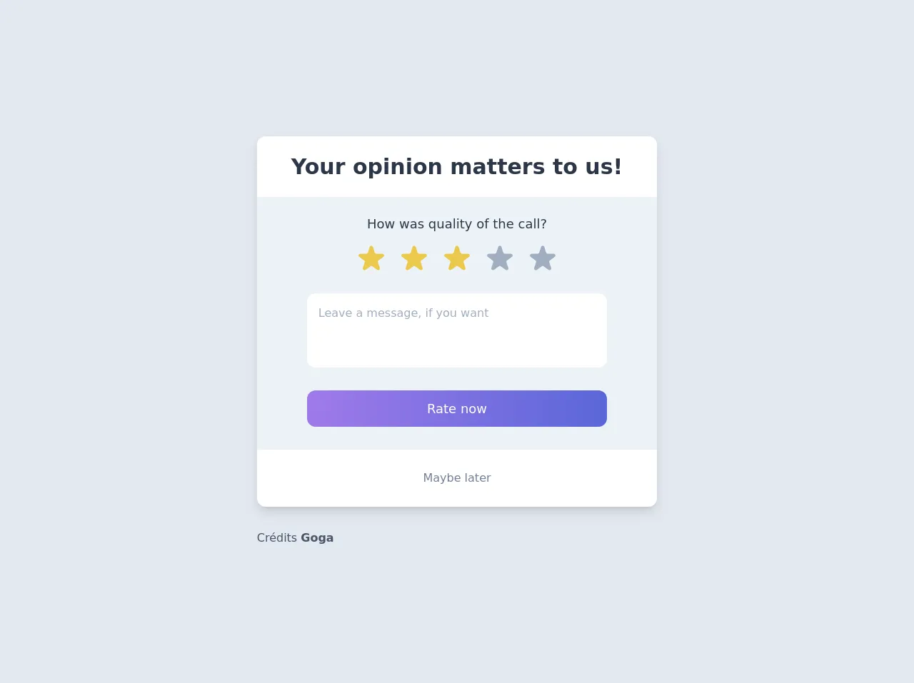
The preview of Rating popup UI component
To create a rating popup UI component, you will need to use HTML, CSS, and JavaScript. Here is a preview of what the rating popup UI component will look like:
Free download of the Rating popup's source code
The source code of Rating popup UI component
Here is the source code for the rating popup UI component:
<div class="min-h-screen bg-gray-300 py-6 flex flex-col justify-center sm:py-12">
  <div class="py-3 sm:max-w-xl sm:mx-auto">
    <div class="bg-white min-w-1xl flex flex-col rounded-xl shadow-lg">
      <div class="px-12 py-5">
        <h2 class="text-gray-800 text-3xl font-semibold">Your opinion matters to us!</h2>
      </div>
      <div class="bg-gray-200 w-full flex flex-col items-center">
        <div class="flex flex-col items-center py-6 space-y-3">
          <span class="text-lg text-gray-800">How was quality of the call?</span>
          <div class="flex space-x-3">
            <svg class="w-12 h-12 text-yellow-500" xmlns="http://www.w3.org/2000/svg" viewBox="0 0 20 20" fill="currentColor">
              <path d="M9.049 2.927c.3-.921 1.603-.921 1.902 0l1.07 3.292a1 1 0 00.95.69h3.462c.969 0 1.371 1.24.588 1.81l-2.8 2.034a1 1 0 00-.364 1.118l1.07 3.292c.3.921-.755 1.688-1.54 1.118l-2.8-2.034a1 1 0 00-1.175 0l-2.8 2.034c-.784.57-1.838-.197-1.539-1.118l1.07-3.292a1 1 0 00-.364-1.118L2.98 8.72c-.783-.57-.38-1.81.588-1.81h3.461a1 1 0 00.951-.69l1.07-3.292z" />
            </svg>
            <svg class="w-12 h-12 text-gray-500" xmlns="http://www.w3.org/2000/svg" viewBox="0 0 20 20" fill="currentColor">
              <path d="M9.049 2.927c.3-.921 1.603-.921 1.902 0l1.07 3.292a1 1 0 00.95.69h3.462c.969 0 1.371 1.24.588 1.81l-2.8 2.034a1 1 0 00-.364 1.118l1.07 3.292c.3.921-.755 1.688-1.54 1.118l-2.8-2.034a1 1 0 00-1.175 0l-2.8 2.034c-.784.57-1.838-.197-1.539-1.118l1.07-3.292a1 1 0 00-.364-1.118L2.98 8.72c-.783-.57-.38-1.81.588-1.81h3.461a1 1 0 00.951-.69l1.07-3.292z" />
            </svg>
          </div>
        </div>
        <div class="w-3/4 flex flex-col">
          <textarea rows="3" class="p-4 text-gray-500 rounded-xl resize-none">Leave a message, if you want</textarea>
          <button class="py-3 my-8 text-lg bg-gradient-to-r from-purple-500 to-indigo-600 rounded-xl text-white">Rate now</button>
        </div>
      </div>
      <div class="h-20 flex items-center justify-center">
        <a href="#" class="text-gray-600">Maybe later</a>
      </div>
    </div>

    <div class="mt-8 text-gray-700">
      Crédits <a class="font-bold" href="https://dribbble.com/shots/12052834-Rating-popup">Goga</a>
    </div>
  </div>
</div>
How to create a Rating popup with Tailwind CSS?
To create a rating popup with Tailwind CSS, follow these steps:
Step 1: Set up your HTML
Create an HTML file and add the following code:
<div class="rating-popup">
  <div class="rating-popup__header">
    <h3 class="rating-popup__title">Rate this product</h3>
    <button class="rating-popup__close-btn">X</button>
  </div>
  <div class="rating-popup__body">
    <div class="rating-popup__stars">
      <i class="fas fa-star"></i>
      <i class="fas fa-star"></i>
      <i class="fas fa-star"></i>
      <i class="fas fa-star"></i>
      <i class="fas fa-star"></i>
    </div>
    <textarea class="rating-popup__comment" placeholder="Leave a comment"></textarea>
    <button class="rating-popup__submit-btn">Submit</button>
  </div>
</div>
In this code, we have created a container div with the class "rating-popup". Inside the container, we have a header div with the class "rating-popup__header" and a body div with the class "rating-popup__body". The header contains a title and a close button, while the body contains the rating stars, comment box, and submit button.
Step 2: Style your HTML with Tailwind CSS
Add the following Tailwind CSS classes to your HTML:
<div class="rating-popup fixed inset-0 bg-gray-900 bg-opacity-50 flex justify-center items-center z-50">
  <div class="rating-popup__container bg-white rounded-lg p-8">
    <div class="rating-popup__header flex justify-between items-center mb-4">
      <h3 class="rating-popup__title text-lg font-medium">Rate this product</h3>
      <button class="rating-popup__close-btn text-gray-500 hover:text-gray-700">
        <svg class="w-6 h-6 fill-current" viewBox="0 0 24 24">
          <path
            d="M6.707 6.293a1 1 0 0 1 0 1.414L3.414 12l3.293 3.293a1 1 0 1 1-1.414 1.414L2 13.414l3.293 3.293a1 1 0 0 1-1.414 1.414L.586 13a1 1 0 0 1 0-1.414l3.293-3.293a1 1 0 0 1 1.414 0L6.707 6.293z"
            fill-rule="evenodd"
            clip-rule="evenodd"
          ></path>
        </svg>
      </button>
    </div>
    <div class="rating-popup__body">
      <div class="rating-popup__stars flex justify-center items-center mb-4">
        <i class="fas fa-star text-yellow-500 text-2xl cursor-pointer"></i>
        <i class="fas fa-star text-yellow-500 text-2xl cursor-pointer"></i>
        <i class="fas fa-star text-yellow-500 text-2xl cursor-pointer"></i>
        <i class="fas fa-star text-yellow-500 text-2xl cursor-pointer"></i>
        <i class="fas fa-star text-yellow-500 text-2xl cursor-pointer"></i>
      </div>
      <textarea
        class="rating-popup__comment block w-full rounded-lg bg-gray-100 border-transparent focus:border-gray-500 focus:bg-white focus:ring-0 mb-4"
        placeholder="Leave a comment"
      ></textarea>
      <button class="rating-popup__submit-btn bg-blue-500 hover:bg-blue-700 text-white font-bold py-2 px-4 rounded">
        Submit
      </button>
    </div>
  </div>
</div>
In this code, we have added Tailwind CSS classes to style the rating popup. We have used the "fixed" and "inset-0" classes to position the popup in the center of the screen. We have also used the "bg-gray-900" and "bg-opacity-50" classes to create a semi-transparent background. The "bg-white" class is used to set the background color of the popup container.
Step 3: Add JavaScript functionality
Add the following JavaScript code to your HTML file:
<script>
  const ratingStars = document.querySelectorAll(".rating-popup__stars i");
  const ratingPopup = document.querySelector(".rating-popup");
  const closeBtn = document.querySelector(".rating-popup__close-btn");

  ratingStars.forEach((star) => {
    star.addEventListener("click", () => {
      ratingStars.forEach((s) => s.classList.remove("text-yellow-500"));
      star.classList.add("text-yellow-500");
    });
  });

  closeBtn.addEventListener("click", () => {
    ratingPopup.classList.add("hidden");
  });
</script>
In this code, we have added JavaScript functionality to the rating popup. We have selected all the rating stars and added a click event listener to each star. When a star is clicked, we remove the "text-yellow-500" class from all the stars and add it to the clicked star. We have also selected the close button and added a click event listener to hide the rating popup.
Conclusion
Creating a rating popup UI component with Tailwind CSS is easy and straightforward. With the pre-defined CSS classes provided by Tailwind CSS, you can create a beautiful and functional rating popup in no time. We hope this beginner's guide has been helpful in guiding you through the process of creating a rating popup UI component with Tailwind CSS. Happy coding!