- Published on
Here Are 6 Ways To Make A Rating With Tailwind CSS
- What is Tailwind CSS?
- The description of Rating ui component
- Why use Tailwind CSS to create a Rating ui component?
- The preview of Rating ui component
- The source code of Rating ui component
- How to create a Rating with Tailwind CSS?
- Step 1: Add the HTML code
- Step 2: Add the Tailwind CSS classes
- Step 3: Add interactivity
- Conclusion
What is Tailwind CSS?
Tailwind CSS is a utility-first CSS framework that helps you quickly create custom designs without the need to write any CSS code. It provides a set of pre-defined classes for common CSS properties, making it easy to create responsive and modern designs.
The description of Rating ui component
A rating UI component is a common element in many websites and applications. It allows users to rate a product, service, or experience on a scale of 1 to 5 stars. The rating component typically displays a set of stars, with the number of filled stars indicating the rating.
Why use Tailwind CSS to create a Rating ui component?
Tailwind CSS provides a simple and efficient way to create a rating UI component. It offers a set of pre-defined classes for common CSS properties, such as colors, spacing, and typography. This makes it easy to customize the rating component to match the design of your website or application.
The preview of Rating ui component
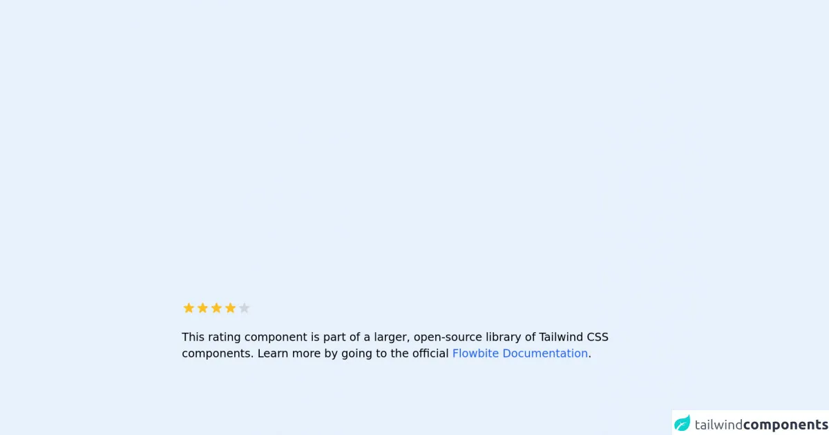
Creating a rating UI component with Tailwind CSS is easy. You can use a combination of CSS classes to style the stars and the rating value. Here's a preview of what the rating component could look like:
Free download of the Rating's source code
The source code of Rating ui component
To create a rating UI component with Tailwind CSS, you can use a combination of CSS classes to style the stars and the rating value. Here's an example of the HTML and CSS code you could use:
<!-- This is an example component -->
<div class="max-w-2xl mx-auto">

	<div class="flex items-center">
		<svg class="w-5 h-5 text-yellow-400" fill="currentColor" viewBox="0 0 20 20" xmlns="http://www.w3.org/2000/svg">
			<path
				d="M9.049 2.927c.3-.921 1.603-.921 1.902 0l1.07 3.292a1 1 0 00.95.69h3.462c.969 0 1.371 1.24.588 1.81l-2.8 2.034a1 1 0 00-.364 1.118l1.07 3.292c.3.921-.755 1.688-1.54 1.118l-2.8-2.034a1 1 0 00-1.175 0l-2.8 2.034c-.784.57-1.838-.197-1.539-1.118l1.07-3.292a1 1 0 00-.364-1.118L2.98 8.72c-.783-.57-.38-1.81.588-1.81h3.461a1 1 0 00.951-.69l1.07-3.292z">
			</path>
		</svg>
		<svg class="w-5 h-5 text-gray-300 dark:text-gray-500" fill="currentColor" viewBox="0 0 20 20"
			xmlns="http://www.w3.org/2000/svg">
			<path
				d="M9.049 2.927c.3-.921 1.603-.921 1.902 0l1.07 3.292a1 1 0 00.95.69h3.462c.969 0 1.371 1.24.588 1.81l-2.8 2.034a1 1 0 00-.364 1.118l1.07 3.292c.3.921-.755 1.688-1.54 1.118l-2.8-2.034a1 1 0 00-1.175 0l-2.8 2.034c-.784.57-1.838-.197-1.539-1.118l1.07-3.292a1 1 0 00-.364-1.118L2.98 8.72c-.783-.57-.38-1.81.588-1.81h3.461a1 1 0 00.951-.69l1.07-3.292z">
			</path>
		</svg>
	</div>

	<p class="mt-5">This rating component is part of a larger, open-source library of Tailwind CSS components. Learn
		more by going to the official <a class="text-blue-600 hover:underline"
			href="https://flowbite.com/docs/getting-started/introduction/" target="_blank">Flowbite
			Documentation</a>.
	</p>
</div>
How to create a Rating with Tailwind CSS?
Now that you have seen the preview and source code of the rating UI component, let's dive into the steps to create it with Tailwind CSS.
Step 1: Add the HTML code
First, add the HTML code for the rating component to your webpage or application. You can use the code from the source code section as a starting point.
Step 2: Add the Tailwind CSS classes
Next, add the Tailwind CSS classes to style the rating component. You can use the classes for colors, spacing, and typography to customize the component to match your design.
Step 3: Add interactivity
If you want to make the rating component interactive, you can use JavaScript to update the rating value when a user clicks on a star. You can also use CSS transitions to animate the rating value change.
Conclusion
Creating a rating UI component with Tailwind CSS is easy and efficient. It provides a simple way to customize the component to match the design of your website or application. By following the steps outlined in this article, you can create a rating component that is both functional and visually appealing.