- Published on
6 Incredibly Easy Ways To Build A Quote Card With Image With Tailwind CSS Better While Spending Less
- What is Tailwind CSS?
- The description of Quote Card with Image UI component
- Why use Tailwind CSS to create a Quote Card with Image UI component?
- The preview of Quote Card with Image UI component
- The source code of Quote Card with Image UI component
- How to create a Quote Card with Image with Tailwind CSS?
- 1. Set up your HTML structure
- 2. Style the container element
- 3. Style the image element
- 4. Style the quote element
- 5. Style the author element
- 6. Put it all together
- Conclusion
As a FrontEnd technology blogger, you're probably always looking for ways to improve your UI components while spending less time and effort. One way to do this is by using Tailwind CSS, a utility-first CSS framework that can help you create beautiful UI components quickly and easily. In this article, we'll show you how to use Tailwind CSS to build a Quote Card with Image UI component in 6 incredibly easy ways.
What is Tailwind CSS?
Tailwind CSS is a utility-first CSS framework that helps you create beautiful UI components quickly and easily. It provides a set of pre-defined CSS classes that you can use to style your HTML elements. With Tailwind CSS, you can create complex UI components without writing a single line of CSS code.
The description of Quote Card with Image UI component
A Quote Card with Image UI component is a card that displays a quote along with an image. It's a popular UI component that's used on many websites and applications. The Quote Card with Image UI component is usually used to display a quote from a famous person or an inspirational quote.
Why use Tailwind CSS to create a Quote Card with Image UI component?
Tailwind CSS can help you create a Quote Card with Image UI component quickly and easily. It provides a set of pre-defined CSS classes that you can use to style your HTML elements. With Tailwind CSS, you don't need to write a single line of CSS code to create a beautiful UI component. This can save you a lot of time and effort.
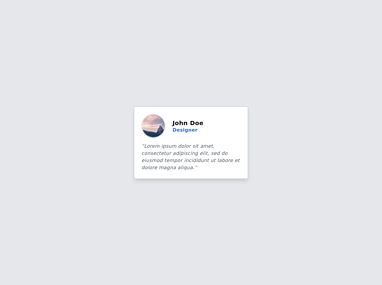
The preview of Quote Card with Image UI component
To create a Quote Card with Image UI component, we'll use Tailwind CSS. The final result will look like this:
Free download of the Quote Card with Image's source code
The source code of Quote Card with Image UI component
To create a Quote Card with Image UI component, we'll use HTML and Tailwind CSS. The source code will look like this:
<div class="min-h-screen bg-gray-200 flex justify-center items-center">
   <!-- Start of component -->
   <div class="max-w-sm bg-white border-2 border-gray-300 p-6 rounded-md tracking-wide shadow-lg">
      <div id="header" class="flex items-center mb-4">
         <img alt="avatar" class="w-20 rounded-full border-2 border-gray-300" src="https://picsum.photos/seed/picsum/200" />
         <div id="header-text" class="leading-5 ml-6 sm">
            <h4 id="name" class="text-xl font-semibold">John Doe</h4>
            <h5 id="job" class="font-semibold text-blue-600">Designer</h5>
         </div>
      </div>
      <div id="quote">
         <q class="italic text-gray-600">Lorem ipsum dolor sit amet, consectetur adipiscing elit, sed do eiusmod tempor incididunt ut labore et dolore magna aliqua.</q>
      </div>
   </div>
   <!-- End of component -->
</div>
How to create a Quote Card with Image with Tailwind CSS?
Now that we've seen the preview and source code of the Quote Card with Image UI component, let's dive into the 6 incredibly easy ways to create it with Tailwind CSS.
1. Set up your HTML structure
The first step is to set up your HTML structure. You'll need a container element, an image element, a quote element, and an author element. Here's an example:
<div class="quote-card">
  <img src="https://via.placeholder.com/150" alt="Quote Image" class="quote-image">
  <blockquote class="quote-text">
    <p class="quote">This is a quote.</p>
    <cite class="author">- Author</cite>
  </blockquote>
</div>
2. Style the container element
Next, we'll style the container element. We'll use the bg-white, shadow-lg, rounded-lg, and p-4 classes to give it a white background, a shadow, rounded corners, and some padding. Here's the code:
.quote-card {
  @apply bg-white shadow-lg rounded-lg p-4;
}
3. Style the image element
Now, we'll style the image element. We'll use the w-full and rounded-lg classes to make it full-width and rounded. Here's the code:
.quote-image {
  @apply w-full rounded-lg;
}
4. Style the quote element
Next, we'll style the quote element. We'll use the text-lg, font-medium, and text-gray-800 classes to make the text larger, bold, and dark gray. Here's the code:
.quote {
  @apply text-lg font-medium text-gray-800;
}
5. Style the author element
Finally, we'll style the author element. We'll use the text-sm, font-medium, and text-gray-600 classes to make the text smaller, bold, and light gray. Here's the code:
.author {
  @apply text-sm font-medium text-gray-600;
}
6. Put it all together
Now that we've styled all the elements, let's put it all together. Here's the final code:
.quote-card {
  @apply bg-white shadow-lg rounded-lg p-4;
}

.quote-image {
  @apply w-full rounded-lg;
}

.quote {
  @apply text-lg font-medium text-gray-800;
}

.author {
  @apply text-sm font-medium text-gray-600;
}
Conclusion
In this article, we've shown you how to create a Quote Card with Image UI component in 6 incredibly easy ways using Tailwind CSS. With Tailwind CSS, you can create beautiful UI components quickly and easily without writing a single line of CSS code. We hope this article has been helpful to you and that you'll try using Tailwind CSS to create your next UI component.