- Published on
Surprisingly Effective Ways To Make A Quote Card With Image With Tailwind CSS
- What is Tailwind CSS?
- The description of Quote Card with Image ui component
- Why use Tailwind CSS to create a Quote Card with Image ui component?
- The preview of Quote Card with Image ui component
- The source code of Quote Card with Image ui component
- How to create a Quote Card with Image with Tailwind CSS?
- Conclusion
What is Tailwind CSS?
Tailwind CSS is a utility-first CSS framework that provides a set of pre-defined CSS classes to help developers quickly build responsive and customizable web interfaces. It is a popular choice among developers due to its flexibility and ease of use.
The description of Quote Card with Image ui component
A Quote Card with Image is a UI component that displays a quote along with an image. It is commonly used in websites and applications to display quotes from famous people, testimonials, or other types of content that require a visual element.
Why use Tailwind CSS to create a Quote Card with Image ui component?
Tailwind CSS provides a set of pre-defined CSS classes that make it easy to create a Quote Card with Image UI component. With Tailwind CSS, you can easily customize the appearance of the component by adjusting the pre-defined classes or adding your own custom classes.
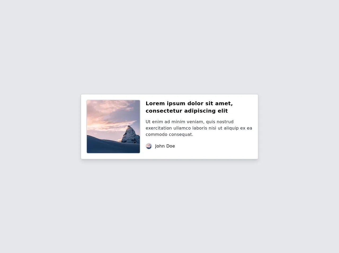
The preview of Quote Card with Image ui component
To create a Quote Card with Image UI component, we will use Tailwind CSS classes to style the component. Here is a preview of what the component will look like:
Free download of the Quote Card with Image's source code
The source code of Quote Card with Image ui component
Here is the source code for the Quote Card with Image UI component:
<div class="min-h-screen bg-gray-200 flex justify-center items-center">
   <!-- Start of component -->
   <div class="max-w-2xl bg-white border-2 border-gray-300 p-5 rounded-md tracking-wide shadow-lg">
      <div id="header" class="flex">
         <img alt="mountain" class="w-45 rounded-md border-2 border-gray-300" src="https://picsum.photos/seed/picsum/200" />
         <div id="body" class="flex flex-col ml-5">
            <h4 id="name" class="text-xl font-semibold mb-2">Lorem ipsum dolor sit amet, consectetur adipiscing elit</h4>
            <p id="job" class="text-gray-800 mt-2">Ut enim ad minim veniam, quis nostrud exercitation ullamco laboris nisi ut aliquip ex ea commodo consequat.</p>
            <div class="flex mt-5">
               <img alt="avatar" class="w-6 rounded-full border-2 border-gray-300" src="https://picsum.photos/seed/picsum/200" />
               <p class="ml-3">John Doe</p>
            </div>
         </div>
      </div>
   </div>
   <!-- End of component -->
</div>
How to create a Quote Card with Image with Tailwind CSS?
To create a Quote Card with Image UI component with Tailwind CSS, follow these steps:
- Create a new HTML file and add the following code:
<div class="max-w-md mx-auto bg-white rounded-xl shadow-md overflow-hidden md:max-w-2xl">
  <div class="md:flex">
    <div class="md:flex-shrink-0">
      <img class="h-48 w-full object-cover md:w-48" src="https://via.placeholder.com/150" alt="Quote Image">
    </div>
    <div class="p-8">
      <div class="uppercase tracking-wide text-sm text-indigo-500 font-semibold">Quote</div>
      <a href="#" class="block mt-1 text-lg leading-tight font-medium text-black hover:underline">Lorem ipsum dolor sit amet, consectetur adipiscing elit. Sed non risus. Suspendisse lectus tortor, dignissim sit amet, adipiscing nec, ultricies sed, dolor. Cras elementum ultrices diam. Maecenas ligula massa, varius a, semper congue, euismod non, mi.</a>
      <div class="mt-4">
        <div class="flex items-center">
          <div class="flex-shrink-0">
            <img class="h-10 w-10 rounded-full" src="https://via.placeholder.com/150" alt="Author Image">
          </div>
          <div class="ml-3">
            <div class="text-sm font-medium text-black">John Doe</div>
            <div class="text-sm text-gray-500">CEO, Company</div>
          </div>
        </div>
      </div>
    </div>
  </div>
</div>
- Add the necessary Tailwind CSS classes to style the component. Here is a breakdown of the classes used:
max-w-md: sets the maximum width of the component to medium.mx-auto: centers the component horizontally.bg-white: sets the background color of the component to white.rounded-xl: adds rounded corners to the component.shadow-md: adds a shadow effect to the component.overflow-hidden: hides any content that overflows the component.md:max-w-2xl: sets the maximum width of the component to extra-large on medium and larger screens.md:flex: sets the flexbox layout for medium and larger screens.md:flex-shrink-0: prevents the image from shrinking on medium and larger screens.h-48: sets the height of the image to 48 pixels.w-full: sets the width of the image to 100% of its container.object-cover: scales the image to cover its container.p-8: adds padding to the content area.uppercase: sets the text to uppercase.tracking-wide: adds letter spacing to the text.text-sm: sets the font size to small.text-indigo-500: sets the text color to indigo.font-semibold: sets the font weight to semi-bold.block: sets the display property to block.mt-1: adds margin to the top of the text.text-lg: sets the font size to large.leading-tight: sets the line height to be tight.font-medium: sets the font weight to medium.text-black: sets the text color to black.hover:underline: underlines the text on hover.mt-4: adds margin to the top of the author section.flex: sets the flexbox layout for the author section.items-center: centers the content vertically.flex-shrink-0: prevents the author image from shrinking.h-10: sets the height of the author image to 10 pixels.w-10: sets the width of the author image to 10 pixels.rounded-full: adds rounded corners to the author image.ml-3: adds margin to the left of the author information.text-gray-500: sets the text color to gray.
- Customize the component by adjusting the Tailwind CSS classes or adding your own custom classes.
Conclusion
In this article, we have shown you how to create a Quote Card with Image UI component using Tailwind CSS. With Tailwind CSS, you can easily customize the appearance of the component and create a unique design that fits your needs. We hope this article has been helpful in getting you started with Tailwind CSS and creating your own UI components.