- Published on
Ways To Build A QuickChat - Chat Layout. With Tailwind CSS In 60 Minutes
- What is Tailwind CSS?
- The description of QuickChat - Chat Layout. ui component
- Why use Tailwind CSS to create a QuickChat - Chat Layout. ui component?
- The preview of QuickChat - Chat Layout. ui component.
- The source code of QuickChat - Chat Layout. ui component.
- How to create a QuickChat - Chat Layout. with Tailwind CSS?
- Step 1: Set up your project
- Step 2: Create the HTML structure
- Step 3: Style the HTML elements with Tailwind CSS
- Conclusion
Are you looking for a way to create a chat layout for your web application? Look no further than Tailwind CSS. In this article, we will walk through the steps to create a QuickChat - Chat Layout using Tailwind CSS in just 60 minutes.
What is Tailwind CSS?
Tailwind CSS is a utility-first CSS framework that allows you to rapidly build custom user interfaces. It provides a set of pre-defined CSS classes that you can use to style your HTML elements. With Tailwind CSS, you can create complex layouts and designs without writing any custom CSS.
The description of QuickChat - Chat Layout. ui component
The QuickChat - Chat Layout is a UI component that allows users to chat with each other. It typically consists of a chat window, a message input box, and a list of messages. The chat window displays the conversation between the users, while the message input box allows users to type and send messages. The list of messages displays the history of the conversation.
Why use Tailwind CSS to create a QuickChat - Chat Layout. ui component?
Tailwind CSS is an excellent choice for creating a QuickChat - Chat Layout because it provides a set of pre-defined CSS classes that you can use to style your HTML elements. This means that you can create a complex layout without writing any custom CSS. Additionally, Tailwind CSS is highly customizable, so you can easily modify the styles to fit your specific needs.
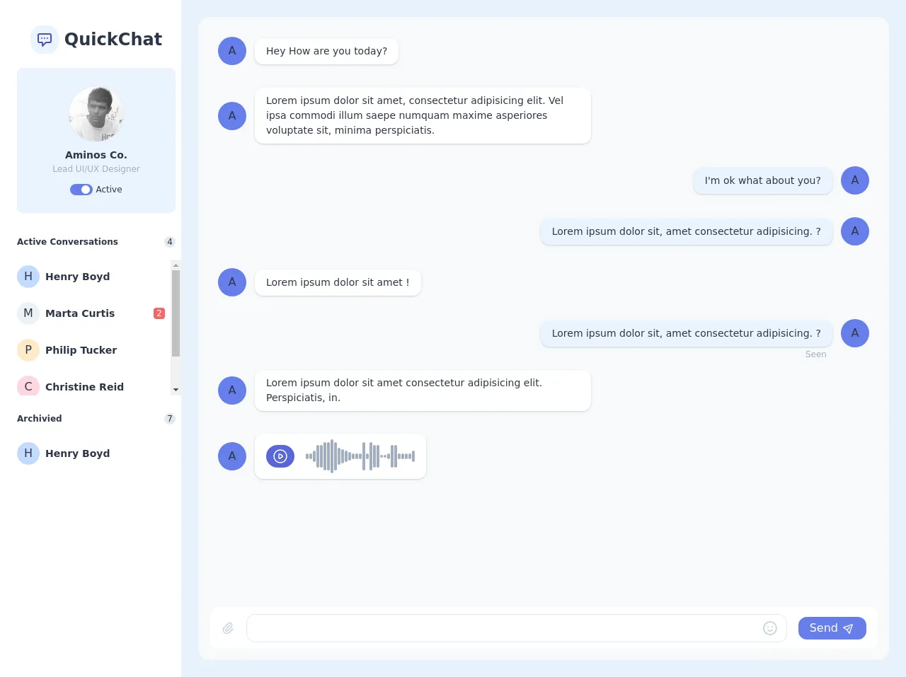
The preview of QuickChat - Chat Layout. ui component.
To create a QuickChat - Chat Layout with Tailwind CSS, we will use a combination of HTML and CSS. Here is a preview of what the final product will look like:
Free download of the QuickChat - Chat Layout.'s source code
The source code of QuickChat - Chat Layout. ui component.
Here is the source code for the QuickChat - Chat Layout. ui component:
<div class="flex h-screen antialiased text-gray-800">
<div class="flex flex-row h-full w-full overflow-x-hidden">
<div class="flex flex-col py-8 pl-6 pr-2 w-64 bg-white flex-shrink-0">
<div class="flex flex-row items-center justify-center h-12 w-full">
<div
class="flex items-center justify-center rounded-2xl text-indigo-700 bg-indigo-100 h-10 w-10"
>
<svg
class="w-6 h-6"
fill="none"
stroke="currentColor"
viewBox="0 0 24 24"
xmlns="http://www.w3.org/2000/svg"
>
<path
stroke-linecap="round"
stroke-linejoin="round"
stroke-width="2"
d="M8 10h.01M12 10h.01M16 10h.01M9 16H5a2 2 0 01-2-2V6a2 2 0 012-2h14a2 2 0 012 2v8a2 2 0 01-2 2h-5l-5 5v-5z"
></path>
</svg>
</div>
<div class="ml-2 font-bold text-2xl">QuickChat</div>
</div>
<div
class="flex flex-col items-center bg-indigo-100 border border-gray-200 mt-4 w-full py-6 px-4 rounded-lg"
>
<div class="h-20 w-20 rounded-full border overflow-hidden">
<img
src="https://avatars3.githubusercontent.com/u/2763884?s=128"
alt="Avatar"
class="h-full w-full"
/>
</div>
<div class="text-sm font-semibold mt-2">Aminos Co.</div>
<div class="text-xs text-gray-500">Lead UI/UX Designer</div>
<div class="flex flex-row items-center mt-3">
<div
class="flex flex-col justify-center h-4 w-8 bg-indigo-500 rounded-full"
>
<div class="h-3 w-3 bg-white rounded-full self-end mr-1"></div>
</div>
<div class="leading-none ml-1 text-xs">Active</div>
</div>
</div>
<div class="flex flex-col mt-8">
<div class="flex flex-row items-center justify-between text-xs">
<span class="font-bold">Active Conversations</span>
<span
class="flex items-center justify-center bg-gray-300 h-4 w-4 rounded-full"
>4</span
>
</div>
<div class="flex flex-col space-y-1 mt-4 -mx-2 h-48 overflow-y-auto">
<button
class="flex flex-row items-center hover:bg-gray-100 rounded-xl p-2"
>
<div
class="flex items-center justify-center h-8 w-8 bg-indigo-200 rounded-full"
>
H
</div>
<div class="ml-2 text-sm font-semibold">Henry Boyd</div>
</button>
<button
class="flex flex-row items-center hover:bg-gray-100 rounded-xl p-2"
>
<div
class="flex items-center justify-center h-8 w-8 bg-gray-200 rounded-full"
>
M
</div>
<div class="ml-2 text-sm font-semibold">Marta Curtis</div>
<div
class="flex items-center justify-center ml-auto text-xs text-white bg-red-500 h-4 w-4 rounded leading-none"
>
2
</div>
</button>
<button
class="flex flex-row items-center hover:bg-gray-100 rounded-xl p-2"
>
<div
class="flex items-center justify-center h-8 w-8 bg-orange-200 rounded-full"
>
P
</div>
<div class="ml-2 text-sm font-semibold">Philip Tucker</div>
</button>
<button
class="flex flex-row items-center hover:bg-gray-100 rounded-xl p-2"
>
<div
class="flex items-center justify-center h-8 w-8 bg-pink-200 rounded-full"
>
C
</div>
<div class="ml-2 text-sm font-semibold">Christine Reid</div>
</button>
<button
class="flex flex-row items-center hover:bg-gray-100 rounded-xl p-2"
>
<div
class="flex items-center justify-center h-8 w-8 bg-purple-200 rounded-full"
>
J
</div>
<div class="ml-2 text-sm font-semibold">Jerry Guzman</div>
</button>
</div>
<div class="flex flex-row items-center justify-between text-xs mt-6">
<span class="font-bold">Archivied</span>
<span
class="flex items-center justify-center bg-gray-300 h-4 w-4 rounded-full"
>7</span
>
</div>
<div class="flex flex-col space-y-1 mt-4 -mx-2">
<button
class="flex flex-row items-center hover:bg-gray-100 rounded-xl p-2"
>
<div
class="flex items-center justify-center h-8 w-8 bg-indigo-200 rounded-full"
>
H
</div>
<div class="ml-2 text-sm font-semibold">Henry Boyd</div>
</button>
</div>
</div>
</div>
<div class="flex flex-col flex-auto h-full p-6">
<div
class="flex flex-col flex-auto flex-shrink-0 rounded-2xl bg-gray-100 h-full p-4"
>
<div class="flex flex-col h-full overflow-x-auto mb-4">
<div class="flex flex-col h-full">
<div class="grid grid-cols-12 gap-y-2">
<div class="col-start-1 col-end-8 p-3 rounded-lg">
<div class="flex flex-row items-center">
<div
class="flex items-center justify-center h-10 w-10 rounded-full bg-indigo-500 flex-shrink-0"
>
A
</div>
<div
class="relative ml-3 text-sm bg-white py-2 px-4 shadow rounded-xl"
>
<div>Hey How are you today?</div>
</div>
</div>
</div>
<div class="col-start-1 col-end-8 p-3 rounded-lg">
<div class="flex flex-row items-center">
<div
class="flex items-center justify-center h-10 w-10 rounded-full bg-indigo-500 flex-shrink-0"
>
A
</div>
<div
class="relative ml-3 text-sm bg-white py-2 px-4 shadow rounded-xl"
>
<div>
Lorem ipsum dolor sit amet, consectetur adipisicing
elit. Vel ipsa commodi illum saepe numquam maxime
asperiores voluptate sit, minima perspiciatis.
</div>
</div>
</div>
</div>
<div class="col-start-6 col-end-13 p-3 rounded-lg">
<div class="flex items-center justify-start flex-row-reverse">
<div
class="flex items-center justify-center h-10 w-10 rounded-full bg-indigo-500 flex-shrink-0"
>
A
</div>
<div
class="relative mr-3 text-sm bg-indigo-100 py-2 px-4 shadow rounded-xl"
>
<div>I'm ok what about you?</div>
</div>
</div>
</div>
<div class="col-start-6 col-end-13 p-3 rounded-lg">
<div class="flex items-center justify-start flex-row-reverse">
<div
class="flex items-center justify-center h-10 w-10 rounded-full bg-indigo-500 flex-shrink-0"
>
A
</div>
<div
class="relative mr-3 text-sm bg-indigo-100 py-2 px-4 shadow rounded-xl"
>
<div>
Lorem ipsum dolor sit, amet consectetur adipisicing. ?
</div>
</div>
</div>
</div>
<div class="col-start-1 col-end-8 p-3 rounded-lg">
<div class="flex flex-row items-center">
<div
class="flex items-center justify-center h-10 w-10 rounded-full bg-indigo-500 flex-shrink-0"
>
A
</div>
<div
class="relative ml-3 text-sm bg-white py-2 px-4 shadow rounded-xl"
>
<div>Lorem ipsum dolor sit amet !</div>
</div>
</div>
</div>
<div class="col-start-6 col-end-13 p-3 rounded-lg">
<div class="flex items-center justify-start flex-row-reverse">
<div
class="flex items-center justify-center h-10 w-10 rounded-full bg-indigo-500 flex-shrink-0"
>
A
</div>
<div
class="relative mr-3 text-sm bg-indigo-100 py-2 px-4 shadow rounded-xl"
>
<div>
Lorem ipsum dolor sit, amet consectetur adipisicing. ?
</div>
<div
class="absolute text-xs bottom-0 right-0 -mb-5 mr-2 text-gray-500"
>
Seen
</div>
</div>
</div>
</div>
<div class="col-start-1 col-end-8 p-3 rounded-lg">
<div class="flex flex-row items-center">
<div
class="flex items-center justify-center h-10 w-10 rounded-full bg-indigo-500 flex-shrink-0"
>
A
</div>
<div
class="relative ml-3 text-sm bg-white py-2 px-4 shadow rounded-xl"
>
<div>
Lorem ipsum dolor sit amet consectetur adipisicing elit.
Perspiciatis, in.
</div>
</div>
</div>
</div>
<div class="col-start-1 col-end-8 p-3 rounded-lg">
<div class="flex flex-row items-center">
<div
class="flex items-center justify-center h-10 w-10 rounded-full bg-indigo-500 flex-shrink-0"
>
A
</div>
<div
class="relative ml-3 text-sm bg-white py-2 px-4 shadow rounded-xl"
>
<div class="flex flex-row items-center">
<button
class="flex items-center justify-center bg-indigo-600 hover:bg-indigo-800 rounded-full h-8 w-10"
>
<svg
class="w-6 h-6 text-white"
fill="none"
stroke="currentColor"
viewBox="0 0 24 24"
xmlns="http://www.w3.org/2000/svg"
>
<path
stroke-linecap="round"
stroke-linejoin="round"
stroke-width="1.5"
d="M14.752 11.168l-3.197-2.132A1 1 0 0010 9.87v4.263a1 1 0 001.555.832l3.197-2.132a1 1 0 000-1.664z"
></path>
<path
stroke-linecap="round"
stroke-linejoin="round"
stroke-width="1.5"
d="M21 12a9 9 0 11-18 0 9 9 0 0118 0z"
></path>
</svg>
</button>
<div class="flex flex-row items-center space-x-px ml-4">
<div class="h-2 w-1 bg-gray-500 rounded-lg"></div>
<div class="h-2 w-1 bg-gray-500 rounded-lg"></div>
<div class="h-4 w-1 bg-gray-500 rounded-lg"></div>
<div class="h-8 w-1 bg-gray-500 rounded-lg"></div>
<div class="h-8 w-1 bg-gray-500 rounded-lg"></div>
<div class="h-10 w-1 bg-gray-500 rounded-lg"></div>
<div class="h-10 w-1 bg-gray-500 rounded-lg"></div>
<div class="h-12 w-1 bg-gray-500 rounded-lg"></div>
<div class="h-10 w-1 bg-gray-500 rounded-lg"></div>
<div class="h-6 w-1 bg-gray-500 rounded-lg"></div>
<div class="h-5 w-1 bg-gray-500 rounded-lg"></div>
<div class="h-4 w-1 bg-gray-500 rounded-lg"></div>
<div class="h-3 w-1 bg-gray-500 rounded-lg"></div>
<div class="h-2 w-1 bg-gray-500 rounded-lg"></div>
<div class="h-2 w-1 bg-gray-500 rounded-lg"></div>
<div class="h-2 w-1 bg-gray-500 rounded-lg"></div>
<div class="h-10 w-1 bg-gray-500 rounded-lg"></div>
<div class="h-2 w-1 bg-gray-500 rounded-lg"></div>
<div class="h-10 w-1 bg-gray-500 rounded-lg"></div>
<div class="h-8 w-1 bg-gray-500 rounded-lg"></div>
<div class="h-8 w-1 bg-gray-500 rounded-lg"></div>
<div class="h-1 w-1 bg-gray-500 rounded-lg"></div>
<div class="h-1 w-1 bg-gray-500 rounded-lg"></div>
<div class="h-2 w-1 bg-gray-500 rounded-lg"></div>
<div class="h-8 w-1 bg-gray-500 rounded-lg"></div>
<div class="h-8 w-1 bg-gray-500 rounded-lg"></div>
<div class="h-2 w-1 bg-gray-500 rounded-lg"></div>
<div class="h-2 w-1 bg-gray-500 rounded-lg"></div>
<div class="h-2 w-1 bg-gray-500 rounded-lg"></div>
<div class="h-2 w-1 bg-gray-500 rounded-lg"></div>
<div class="h-4 w-1 bg-gray-500 rounded-lg"></div>
</div>
</div>
</div>
</div>
</div>
</div>
</div>
</div>
<div
class="flex flex-row items-center h-16 rounded-xl bg-white w-full px-4"
>
<div>
<button
class="flex items-center justify-center text-gray-400 hover:text-gray-600"
>
<svg
class="w-5 h-5"
fill="none"
stroke="currentColor"
viewBox="0 0 24 24"
xmlns="http://www.w3.org/2000/svg"
>
<path
stroke-linecap="round"
stroke-linejoin="round"
stroke-width="2"
d="M15.172 7l-6.586 6.586a2 2 0 102.828 2.828l6.414-6.586a4 4 0 00-5.656-5.656l-6.415 6.585a6 6 0 108.486 8.486L20.5 13"
></path>
</svg>
</button>
</div>
<div class="flex-grow ml-4">
<div class="relative w-full">
<input
type="text"
class="flex w-full border rounded-xl focus:outline-none focus:border-indigo-300 pl-4 h-10"
/>
<button
class="absolute flex items-center justify-center h-full w-12 right-0 top-0 text-gray-400 hover:text-gray-600"
>
<svg
class="w-6 h-6"
fill="none"
stroke="currentColor"
viewBox="0 0 24 24"
xmlns="http://www.w3.org/2000/svg"
>
<path
stroke-linecap="round"
stroke-linejoin="round"
stroke-width="2"
d="M14.828 14.828a4 4 0 01-5.656 0M9 10h.01M15 10h.01M21 12a9 9 0 11-18 0 9 9 0 0118 0z"
></path>
</svg>
</button>
</div>
</div>
<div class="ml-4">
<button
class="flex items-center justify-center bg-indigo-500 hover:bg-indigo-600 rounded-xl text-white px-4 py-1 flex-shrink-0"
>
<span>Send</span>
<span class="ml-2">
<svg
class="w-4 h-4 transform rotate-45 -mt-px"
fill="none"
stroke="currentColor"
viewBox="0 0 24 24"
xmlns="http://www.w3.org/2000/svg"
>
<path
stroke-linecap="round"
stroke-linejoin="round"
stroke-width="2"
d="M12 19l9 2-9-18-9 18 9-2zm0 0v-8"
></path>
</svg>
</span>
</button>
</div>
</div>
</div>
</div>
</div>
</div>
How to create a QuickChat - Chat Layout. with Tailwind CSS?
Now that we have an understanding of what Tailwind CSS is and why it is a good choice for creating a QuickChat - Chat Layout, let's dive into the steps to create one.
Step 1: Set up your project
The first step is to set up your project. You can either create a new project or add Tailwind CSS to an existing project. To add Tailwind CSS to an existing project, you can use a package manager like npm or yarn.
Step 2: Create the HTML structure
The next step is to create the HTML structure for the QuickChat - Chat Layout. This typically consists of a chat window, a message input box, and a list of messages. Here is an example HTML structure:
<div class="chat-window">
  <div class="messages">
    <div class="message">
      <div class="message-header">
        <div class="message-sender">John Doe</div>
        <div class="message-timestamp">10:30 AM</div>
      </div>
      <div class="message-body">Hey, how's it going?</div>
    </div>
    <!-- more messages -->
  </div>
  <div class="message-input">
    <input type="text" placeholder="Type your message...">
    <button>Send</button>
  </div>
</div>
Step 3: Style the HTML elements with Tailwind CSS
The final step is to style the HTML elements with Tailwind CSS. You can use the pre-defined CSS classes provided by Tailwind CSS to style the HTML elements. Here is an example CSS:
.chat-window {
  display: flex;
  flex-direction: column;
  height: 100%;
}

.messages {
  flex: 1;
  overflow-y: scroll;
}

.message {
  display: flex;
  flex-direction: column;
  margin-bottom: 1rem;
}

.message-header {
  display: flex;
  justify-content: space-between;
  margin-bottom: 0.5rem;
}

.message-sender {
  font-weight: bold;
}

.message-timestamp {
  color: #666;
}

.message-body {
  background-color: #f0f0f0;
  padding: 0.5rem;
  border-radius: 0.5rem;
}

.message-body:last-child {
  margin-bottom: 0;
}

.message-input {
  display: flex;
  margin-top: 1rem;
}

.message-input input[type="text"] {
  flex: 1;
  padding: 0.5rem;
  border: 1px solid #ccc;
  border-radius: 0.5rem 0 0 0.5rem;
}

.message-input button {
  padding: 0.5rem;
  border: 1px solid #ccc;
  border-radius: 0 0.5rem 0.5rem 0;
  background-color: #f0f0f0;
}
Conclusion
In this article, we walked through the steps to create a QuickChat - Chat Layout using Tailwind CSS in just 60 minutes. We started by discussing what Tailwind CSS is and why it is a good choice for creating a QuickChat - Chat Layout. We then provided a preview of what the final product will look like and shared the source code for the QuickChat - Chat Layout. Finally, we walked through the steps to create a QuickChat - Chat Layout with Tailwind CSS. With these steps, you should be able to create your own custom chat layout in no time.