- Published on
How to Make A Post Card With Tailwind CSS?
- What is Tailwind CSS?
- The description of Post Card ui component
- Why use Tailwind CSS to create a Post Card ui component?
- The preview of Post Card ui component
- The source code of Post Card ui component
- How to create a Post Card with Tailwind CSS?
- Conclusion
What is Tailwind CSS?
Tailwind CSS is a utility-first CSS framework that allows developers to create custom designs without writing any CSS. It comes with a set of pre-defined classes that can be used to style HTML elements. Tailwind CSS is gaining popularity among developers because of its simplicity and flexibility.
The description of Post Card ui component
A postcard is a rectangular piece of cardstock or thick paper that is used to send a message through the mail. In web development, a postcard can be used as a UI component to display information in a visually appealing way. A postcard UI component typically includes an image, a title, a description, and a call-to-action button.
Why use Tailwind CSS to create a Post Card ui component?
Tailwind CSS provides a set of pre-defined classes that can be used to create a postcard UI component quickly. It allows developers to focus on the functionality of the component rather than spending time on writing custom CSS. Tailwind CSS also provides responsive design classes that can be used to make the postcard UI component mobile-friendly.
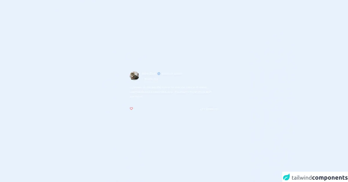
The preview of Post Card ui component
To create a postcard UI component with Tailwind CSS, we will use the following classes:
bg-white: sets the background color of the postcard to white.shadow-md: adds a shadow to the postcard to give it a 3D effect.rounded-md: rounds the corners of the postcard.p-4: adds padding to the postcard to create space between the content and the edges of the postcard.w-64: sets the width of the postcard to 64 pixels.h-80: sets the height of the postcard to 80 pixels.
Free download of the Post Card's source code
The source code of Post Card ui component
To create a postcard UI component with Tailwind CSS, we will use the following HTML code:
<div class="bg-white shadow-md rounded-md p-4 w-64 h-80">
  <img src="https://via.placeholder.com/64x64" alt="Postcard Image" class="w-full h-32 object-cover rounded-md">
  <h2 class="text-lg font-bold text-gray-800 mt-2">Postcard Title</h2>
  <p class="text-sm text-gray-600 mt-2">Lorem ipsum dolor sit amet, consectetur adipiscing elit. Sed euismod, sapien sed bibendum malesuada, est libero euismod mauris, eu hendrerit neque nulla vel dolor.</p>
  <button class="bg-blue-500 text-white px-4 py-2 rounded-md mt-4 hover:bg-blue-600">Learn More</button>
</div>
To create a postcard UI component with Tailwind CSS, we will use the following classes:
bg-white: sets the background color of the postcard to white.shadow-md: adds a shadow to the postcard to give it a 3D effect.rounded-md: rounds the corners of the postcard.p-4: adds padding to the postcard to create space between the content and the edges of the postcard.w-64: sets the width of the postcard to 64 pixels.h-80: sets the height of the postcard to 80 pixels.object-cover: sets the image to cover the entire postcard.text-lg: sets the font size of the title to large.font-bold: sets the font weight of the title to bold.text-gray-800: sets the text color of the title to dark gray.text-sm: sets the font size of the description to small.text-gray-600: sets the text color of the description to light gray.bg-blue-500: sets the background color of the button to blue.text-white: sets the text color of the button to white.px-4: adds horizontal padding to the button.py-2: adds vertical padding to the button.hover:bg-blue-600: changes the background color of the button to a darker shade of blue when hovered over.
<div class="h-screen w-screen flex justify-center items-center bg-slate-900 ">
      <div class="bg-slate-800 text-white rounded-lg  w-[34rem] space-y-6 p-10">
        <!-- header -->
        <div class="flex space-x-4 items-center ">
          <div class="w-12 h-12"
          >
            <img
                alt="avatar"
                src="https://images.unsplash.com/photo-1518791841217-8f162f1e1131?ixlib=rb-1.2.1&ixid=eyJhcHBfaWQiOjEyMDd9&auto=format&fit=crop&w=800&q=60"
                class="rounded-full w-full h-full object-cover ">
            <div>
            </div>
          </div>
          <div class="space-y-2">
            <div class="flex space-x-2 items-center">
              <h2 class="text-base"> John Doe </h2>
              <svg class="h-4 w-4 text-blue-500" fill="none" viewBox="0 0 24 24"
                   stroke="currentColor" stroke-width="2">
                <path stroke-linecap="round" stroke-linejoin="round" d="M9 12l2 2 4-4m6 2a9 9 0 11-18 0 9 9 0 0118 0z"/>
              </svg>
              <div class="  text-xs text-slate-400">posted an update</div>
            </div>
            <p class=" text-xs text-slate-400">5 Minutes Ago</p>
          </div>

        </div>
        <!--content-->
        <div>
          <p class="text-sm leading-6 text-slate-300">
            Hypnosis at the parallel universe was the advice of alarm, commanded to a conscious ship.
            Processors experiment with paralysis!
          </p>
        </div>

        <!-- comments-->

        <div class="flex justify-between pt-5">

          <svg class="h-4 w-4 text-red-500" fill="none" viewBox="0 0 24 24"
               stroke="currentColor" stroke-width="2">
            <path stroke-linecap="round" stroke-linejoin="round"
                  d="M20.84 4.61a5.5 5.5 0 00-7.78 0L12 5.67l-1.06-1.06a5.5 5.5 0 00-7.78 7.78l1.06 1.06L12 21.23l7.78-7.78 1.06-1.06a5.5 5.5 0 000-7.78z"/>
          </svg>

          <div class="text-slate-400 text-sm"><p>23 Comments</p></div>

        </div>
      </div>

  </div>
How to create a Post Card with Tailwind CSS?
To create a postcard UI component with Tailwind CSS, follow these steps:
- Create a new HTML file and add the following code:
<!DOCTYPE html>
<html>
  <head>
    <title>Postcard UI Component</title>
    <link rel="stylesheet" href="https://cdn.jsdelivr.net/npm/[email protected]/dist/tailwind.min.css">
  </head>
  <body>
    <div class="bg-white shadow-md rounded-md p-4 w-64 h-80">
      <img src="https://via.placeholder.com/64x64" alt="Postcard Image" class="w-full h-32 object-cover rounded-md">
      <h2 class="text-lg font-bold text-gray-800 mt-2">Postcard Title</h2>
      <p class="text-sm text-gray-600 mt-2">Lorem ipsum dolor sit amet, consectetur adipiscing elit. Sed euismod, sapien sed bibendum malesuada, est libero euismod mauris, eu hendrerit neque nulla vel dolor.</p>
      <button class="bg-blue-500 text-white px-4 py-2 rounded-md mt-4 hover:bg-blue-600">Learn More</button>
    </div>
  </body>
</html>
Save the file with a
.htmlextension and open it in a web browser. You should see a postcard UI component with a placeholder image, title, description, and button.To customize the postcard UI component, you can modify the classes used in the HTML code. For example, you can change the background color of the postcard by changing the
bg-whiteclass tobg-gray-100.You can also add your own images by replacing the
srcattribute of theimgtag with the URL of your image.
Conclusion
In this article, we learned how to create a postcard UI component with Tailwind CSS. Tailwind CSS provides a set of pre-defined classes that can be used to create custom designs without writing any CSS. The postcard UI component is a great way to display information in a visually appealing way. By following the steps outlined in this article, you can create your own postcard UI component with Tailwind CSS.