- Published on
Learn How To Build A Quick Popover Feedback With Tailwind CSS Like an Expert
- What is Tailwind CSS?
- The description of Quick Popover Feedback ui component
- Why use Tailwind CSS to create a Quick Popover Feedback ui component?
- The preview of Quick Popover Feedback ui component
- The source code of Quick Popover Feedback ui component
- How to create a Quick Popover Feedback with Tailwind CSS?
- Conclusion
What is Tailwind CSS?
Tailwind CSS is a utility-first CSS framework that provides a set of pre-defined classes to style your HTML elements. It helps you to build responsive and customizable user interfaces quickly. Tailwind CSS is a popular choice among developers because it allows you to create complex UI components with minimal CSS code.
The description of Quick Popover Feedback ui component
Quick Popover Feedback is a user interface component that allows users to provide feedback quickly and easily. It is a small pop-up window that appears when the user clicks on a button or icon. The user can provide feedback by selecting one of the predefined options or by typing in their own feedback.
Why use Tailwind CSS to create a Quick Popover Feedback ui component?
Tailwind CSS provides a set of pre-defined classes that can be used to style the Quick Popover Feedback component quickly. It also allows you to customize the component easily by adding your own CSS classes. Tailwind CSS is a lightweight framework, which means that it does not add unnecessary bloat to your project.
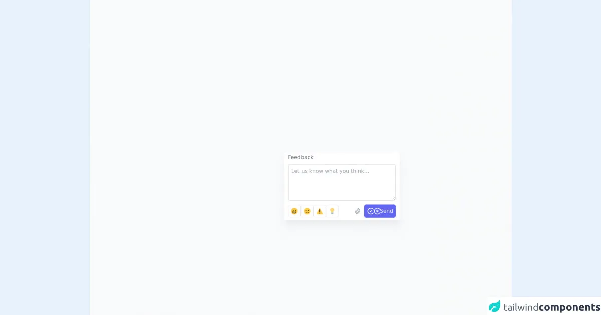
The preview of Quick Popover Feedback ui component
To create a Quick Popover Feedback component with Tailwind CSS, we will use a combination of HTML and CSS code. The component will consist of a button or icon that the user can click to open the feedback form. When the user clicks on the button, a small pop-up window will appear with options for providing feedback.
Free download of the Quick Popover Feedback's source code
The source code of Quick Popover Feedback ui component
To create the Quick Popover Feedback component, we will use the following HTML and CSS code:
<!--
    =======================================================================
    Name    :   Quick Popover Feedback
    Author  :   Surjith S M
    Twitter :   @surjithctly

    Get more components here 👉 https://web3templates.com/components

    Copyright © 2021
    =======================================================================
 -->


<style>
    input[type="radio"]:checked+label {
        /*   @apply ring-1 ring-indigo-400  border-indigo-400; */
        --tw-border-opacity: 1;
        border-color: rgba(129, 140, 248, var(--tw-border-opacity));
        --tw-ring-offset-shadow: var(--tw-ring-inset) 0 0 0 var(--tw-ring-offset-width) var(--tw-ring-offset-color);
        --tw-ring-shadow: var(--tw-ring-inset) 0 0 0 calc(1px + var(--tw-ring-offset-width)) var(--tw-ring-color);
        box-shadow: var(--tw-ring-offset-shadow),
            var(--tw-ring-shadow),
            var(--tw-shadow, 0 0 #0000);
        --tw-ring-opacity: 1;
        --tw-ring-color: rgba(129, 140, 248, var(--tw-ring-opacity));
    }

    .is-invalid,
    .was-validated :invalid,
    .was-validated :invalid~label {
        border-color: #dc3545;
    }

    .is-invalid,
    .was-validated :invalid:focus {
        --tw-ring-color: rgba(220, 53, 69, 0.2);
    }
</style>


<script type="module" src="https://cdn.skypack.dev/twind/shim"></script>

<script src="https://cdn.jsdelivr.net/gh/alpinejs/[email protected]/dist/alpine.min.js" defer></script>


  <div class="flex items-center justify-center min-h-screen py-6 bg-gray-50 sm:py-12">

    <!-- // For demo purposes, I have open true by default and added open false on a time out
    // For your project, its not needed. Just use x-data="{ open: false }" instead -->

    <div class="relative" x-data=" data()" x-init="() => setTimeout(() => open = false, 2000)">
      <button @click="open= !open; if (open) $nextTick(()=>{$refs.input.focus()});"
        class="px-3 py-1 text-gray-500 bg-white rounded-md cursor-text ring-1 ring-gray-300 focus:outline-none ring-inset focus:ring-indigo-400 hover:ring-indigo-400">Feedback</button>
      <div x-show="open" @click.away="open = false"
        class="flex flex-col space-y-2 px-3 pt-1 pb-2 absolute z-10 w-[350px] min-h-[180px] bg-white top-0 left-0 rounded-md shadow-xl"
        style="	--tw-shadow: 0 20px 25px -5px rgba(0, 0, 0, 0.04), 0 10px 10px -5px rgba(0, 0, 0, 0.03);">
        <div class="text-gray-500">Feedback</div>
        <div>

          <!--
  =======================================================================

  This is a working feedback form. To receive email,
  Replace "YOUR_ACCESS_KEY_HERE" with your actual Access Key below.

  Create Access Key here 👉 https://web3forms.com/
  =======================================================================
  -->


          <form action="https://api.web3forms.com/submit" method="POST" id="form" enctype="multipart/form-data"
            @submit.prevent="submitForm($event.currentTarget)" class="needs-validation" novalidate>
            <!-- Add your access key from Web3Forms here -->
            <input type="hidden" name="apikey" value="YOUR_ACCESS_KEY_HERE" />
            <input type="hidden" name="subject" value="New Feedback for your Website" />
            <!-- {You might also want to pre-populate email if the user is logged in} -->
            <!-- <input type="hidden" name="email" value="{user.email}" /> -->
            <input type="checkbox" name="botcheck" id="" style="display: none;" />
            <div class="mb-1">
              <textarea x-ref="input" required name="message" id=""
                class="w-full min-h-[100px] max-h-[300px] h-28 border-2 border-gray-200 rounded-md p-2 focus:outline-none focus:ring-4 focus:ring-indigo-50 focus:border-indigo-300"
                placeholder="Let us know what you think..."></textarea>
            </div>
            <div class="flex items-center justify-between">
              <div class="flex gap-2">
                <div>
                  <input class="absolute opacity-0 appearance-none" required type="radio" id="happy" name="type"
                    value="happy" />
                  <label class="flex p-2 border border-gray-200 rounded-md cursor-pointer" for="happy">
                    <svg xmlns="http://www.w3.org/2000/svg" class="w-5 h-5" width="20" height="20" viewBox="0 0 36 36">
                      <circle fill="#FFCC4D" cx="18" cy="18" r="18" />
                      <path fill="#664500"
                        d="M18 21c-3.623 0-6.027-.422-9-1-.679-.131-2 0-2 2 0 4 4.595 9 11 9 6.404 0 11-5 11-9 0-2-1.321-2.132-2-2-2.973.578-5.377 1-9 1z" />
                      <path fill="#FFF" d="M9 22s3 1 9 1 9-1 9-1-2 4-9 4-9-4-9-4z" />
                      <ellipse fill="#664500" cx="12" cy="13.5" rx="2.5" ry="3.5" />
                      <ellipse fill="#664500" cx="24" cy="13.5" rx="2.5" ry="3.5" />
                    </svg>
                  </label>
                </div>
                <div>
                  <input class="absolute opacity-0 appearance-none" required type="radio" id="sad" name="type"
                    value="sad" />
                  <label class="flex p-2 border border-gray-200 rounded-md cursor-pointer" for="sad">
                    <svg xmlns="http://www.w3.org/2000/svg" class="w-5 h-5" width="20" height="20" viewBox="0 0 36 36">
                      <path fill="#FFCC4D"
                        d="M36 18c0 9.941-8.059 18-18 18-9.94 0-18-8.059-18-18C0 8.06 8.06 0 18 0c9.941 0 18 8.06 18 18" />
                      <ellipse fill="#664500" cx="11.5" cy="14.5" rx="2.5" ry="3.5" />
                      <ellipse fill="#664500" cx="24.5" cy="14.5" rx="2.5" ry="3.5" />
                      <path fill="#664500"
                        d="M8.665 27.871c.178.161.444.171.635.029.039-.029 3.922-2.9 8.7-2.9 4.766 0 8.662 2.871 8.7 2.9.191.142.457.13.635-.029.177-.16.217-.424.094-.628C27.3 27.029 24.212 22 18 22s-9.301 5.028-9.429 5.243c-.123.205-.084.468.094.628z" />
                    </svg>
                  </label>
                </div>
                <div>
                  <input class="absolute opacity-0 appearance-none" required type="radio" id="bug" name="type"
                    value="bug" />
                  <label class="flex p-2 border border-gray-200 rounded-md cursor-pointer" for="bug">
                    <svg xmlns="http://www.w3.org/2000/svg" class="w-5 h-5" width="20" height="20" viewBox="0 0 36 36">
                      <path fill="#FFCC4D"
                        d="M2.653 35C.811 35-.001 33.662.847 32.027L16.456 1.972c.849-1.635 2.238-1.635 3.087 0l15.609 30.056c.85 1.634.037 2.972-1.805 2.972H2.653z" />
                      <path fill="#231F20"
                        d="M15.583 28.953c0-1.333 1.085-2.418 2.419-2.418 1.333 0 2.418 1.085 2.418 2.418 0 1.334-1.086 2.419-2.418 2.419-1.334 0-2.419-1.085-2.419-2.419zm.186-18.293c0-1.302.961-2.108 2.232-2.108 1.241 0 2.233.837 2.233 2.108v11.938c0 1.271-.992 2.108-2.233 2.108-1.271 0-2.232-.807-2.232-2.108V10.66z" />
                    </svg>
                  </label>
                </div>
                <div>
                  <input class="absolute opacity-0 appearance-none" required type="radio" id="idea" name="type"
                    value="idea" />
                  <label class="flex p-2 border border-gray-200 rounded-md cursor-pointer" for="idea">
                    <svg xmlns="http://www.w3.org/2000/svg" class="w-5 h-5" width="20" height="20" viewBox="0 0 36 36">
                      <path fill="#FFD983"
                        d="M29 11.06c0 6.439-5 7.439-5 13.44 0 3.098-3.123 3.359-5.5 3.359-2.053 0-6.586-.779-6.586-3.361C11.914 18.5 7 17.5 7 11.06 7 5.029 12.285.14 18.083.14 23.883.14 29 5.029 29 11.06z" />
                      <path fill="#CCD6DD"
                        d="M22.167 32.5c0 .828-2.234 2.5-4.167 2.5-1.933 0-4.167-1.672-4.167-2.5 0-.828 2.233-.5 4.167-.5 1.933 0 4.167-.328 4.167.5z" />
                      <path fill="#FFCC4D"
                        d="M22.707 10.293c-.391-.391-1.023-.391-1.414 0L18 13.586l-3.293-3.293c-.391-.391-1.023-.391-1.414 0s-.391 1.023 0 1.414L17 15.414V26c0 .553.448 1 1 1s1-.447 1-1V15.414l3.707-3.707c.391-.391.391-1.023 0-1.414z" />
                      <path fill="#99AAB5" d="M24 31c0 1.104-.896 2-2 2h-8c-1.104 0-2-.896-2-2v-6h12v6z" />
                      <path fill="#CCD6DD"
                        d="M11.999 32c-.48 0-.904-.347-.985-.836-.091-.544.277-1.06.822-1.15l12-2c.544-.098 1.06.277 1.15.822.091.544-.277 1.06-.822 1.15l-12 2c-.055.01-.111.014-.165.014zm0-4c-.48 0-.904-.347-.985-.836-.091-.544.277-1.06.822-1.15l12-2c.544-.097 1.06.277 1.15.822.091.544-.277 1.06-.822 1.15l-12 2c-.055.01-.111.014-.165.014z" />
                    </svg>
                  </label>
                </div>
              </div>
              <div class="flex items-center space-x-2">
                <div id="thenga"> <label for="attachment"
                    :title="(files && files.length > 0) ? files.map(file => file.name).join(', ') : 'Choose a file...'"
                    class="relative flex items-center justify-center w-6 h-6 cursor-pointer">
                    <svg xmlns="http://www.w3.org/2000/svg" class="w-5 h-5 text-gray-400" width="20" height="20"
                      fill="none" viewBox="0 0 24 24" stroke="currentColor">
                      <path stroke-linecap="round" stroke-linejoin="round" stroke-width="2"
                        d="M15.172 7l-6.586 6.586a2 2 0 102.828 2.828l6.414-6.586a4 4 0 00-5.656-5.656l-6.415 6.585a6 6 0 108.486 8.486L20.5 13" />
                    </svg>
                    <div id="badge"
                      class="absolute z-10 items-center justify-center w-4 h-4 text-xs font-bold text-white bg-red-500 rounded-full -right-1 -top-1"
                      :class="(files && files.length > 0) ? 'flex' : 'hidden'">
                      <span x-text="files?.length > 0 ? files.length : '0'">1</span></div>
                    <input type="file" id="attachment" name="attachment" accept="image/*"
                      x-on:change="files = Object.values($event.target.files); checkMaxSize($event.target.files) "
                      class="absolute w-px h-px overflow-hidden opacity-0 appearance-none ">
                  </label></div>
                <button type="submit"
                  class="flex justify-center w-24 px-2 py-2 text-white bg-indigo-500 rounded-md focus:outline-none focus:ring focus:ring-indigo-300"
                  :disabled="submitting" id="submit">

                  <svg x-show="success" class="w-6 h-6">
                    <use href="#success" /></svg>
                  <svg x-show="error" class="w-6 h-6">
                    <use href="#error" /></svg>
                  <span x-show="!success && !error" x-text="submitting ? 'Sending...' : 'Send'">Send</span>
                </button>
              </div>
            </div>
          </form>
        </div>
      </div>
    </div>
  </div>

  <script>
    function data() {
      return {
        open: true,
        files: null,
        submitting: false,
        success: false,
        error: false,
        checkMaxSize(files) {
          //console.table(files);
          if (files.length > 0) {
            {
              for (const [key, value] of Object.entries(files)) {
                const fileSize = value.size / 1024;
                if (fileSize > 500) {
                  console.log(fileSize);
                  alert('Please upload image less than 500 KB');
                  this.files = null;
                  return;
                }
              }
            }
          };
        },
        async submitForm(form) {
          console.log(form);
          form.classList.add("was-validated");
          if (!form.checkValidity()) {
            console.log("Please fill all the fields");
            form.querySelectorAll(":invalid")[0].focus();
          } else {
            const formData = new FormData(form);
            this.submitting = true;
            // needed for converting to JSON app/json
            // const object = {};
            // formData.forEach((value, key) => {
            //   object[key] = value;
            // });
            // const json = JSON.stringify(object);

            // console.log(object);

            try {
              const response = await fetch("https://api.web3forms.com/submit", {
                method: "POST",
                body: formData
              });

              let json = await response.json();
              this.submitting = false;

              if (response.status == 200) {
                this.success = true;
                form.reset();
                this.files = null;

              } else {
                this.error = true;

              }
            } catch (error) {
              console.log(error);
            }

            form.classList.remove("was-validated");
            setTimeout(() => {
              this.open = false;
              this.error = false;
              this.success = false;
              this.files = null;
            }, 5000);

          }

        }
      }
    }
  </script>

  <div class="hidden">
    <!-- Hidden SVG will show when it success -->
    <svg id="success" xmlns="http://www.w3.org/2000/svg" class="w-6 h-6 text-white" width="24" height="24" fill="none"
      viewBox="0 0 24 24" stroke="currentColor">
      <path stroke-linecap="round" stroke-linejoin="round" stroke-width="2"
        d="M9 12l2 2 4-4m6 2a9 9 0 11-18 0 9 9 0 0118 0z" />
    </svg>
    <svg id="error" xmlns="http://www.w3.org/2000/svg" class="w-6 h-6 text-white" width="24" height="24" fill="none"
      viewBox="0 0 24 24" stroke="currentColor">
      <path stroke-linecap="round" stroke-linejoin="round" stroke-width="2"
        d="M10 14l2-2m0 0l2-2m-2 2l-2-2m2 2l2 2m7-2a9 9 0 11-18 0 9 9 0 0118 0z" />
    </svg>
  </div>
How to create a Quick Popover Feedback with Tailwind CSS?
To create a Quick Popover Feedback component with Tailwind CSS, follow these steps:
- Create a new HTML file and add the following code:
<button class="bg-blue-500 hover:bg-blue-700 text-white font-bold py-2 px-4 rounded">
  Feedback
</button>
This code creates a button with a blue background color and white text. The button will have rounded corners and a padding of 2 pixels on the top and bottom and 4 pixels on the left and right.
- Add the following CSS code to the head section of your HTML file:
<head>
  <link rel="stylesheet" href="https://cdn.jsdelivr.net/npm/[email protected]/dist/tailwind.min.css">
  <style>
    .feedback-form {
      position: absolute;
      top: 50%;
      left: 50%;
      transform: translate(-50%, -50%);
      background-color: white;
      border: 1px solid gray;
      padding: 20px;
      width: 300px;
      height: 200px;
      z-index: 999;
      display: none;
    }
  </style>
</head>
This code includes the Tailwind CSS stylesheet and adds a custom CSS class called "feedback-form" that will be used to style the feedback form.
- Add the following JavaScript code to the bottom of your HTML file:
<script>
  const feedbackButton = document.querySelector('button');
  const feedbackForm = document.querySelector('.feedback-form');

  feedbackButton.addEventListener('click', () => {
    feedbackForm.style.display = 'block';
  });
</script>
This code selects the button and feedback form elements and adds an event listener to the button that will display the feedback form when the button is clicked.
- Add the following HTML code after the button element:
<div class="feedback-form">
  <h2 class="text-lg font-bold mb-4">Leave Feedback</h2>
  <label class="block mb-2">
    <input class="mr-2" type="radio" name="feedback" value="good">
    Good
  </label>
  <label class="block mb-2">
    <input class="mr-2" type="radio" name="feedback" value="bad">
    Bad
  </label>
  <label class="block">
    <textarea class="w-full border border-gray-400 p-2" placeholder="Enter your feedback"></textarea>
  </label>
  <button class="bg-blue-500 hover:bg-blue-700 text-white font-bold py-2 px-4 rounded mt-4">
    Submit
  </button>
</div>
This code creates the feedback form with two radio buttons for selecting feedback options and a text area for typing in feedback. It also includes a submit button.
- Save your HTML file and open it in a web browser. Click on the feedback button to open the feedback form.
Conclusion
In this article, we learned how to create a Quick Popover Feedback component with Tailwind CSS. We used a combination of HTML, CSS, and JavaScript code to create the component. Tailwind CSS allowed us to style the component quickly and easily, and the lightweight framework did not add unnecessary bloat to our project. With the skills you learned in this article, you can create other UI components with Tailwind CSS quickly and easily.