- Published on
Here Are 6 Ways To Build A Progress Bar With Tailwind CSS
- What is Tailwind CSS?
- The description of Progress bar UI component
- Why use Tailwind CSS to create a Progress bar UI component?
- The preview of Progress bar UI component
- The source code of Progress bar UI component
- How to create a Progress bar with Tailwind CSS?
- 1. Basic Progress bar
- 2. Colored Progress bar
- 3. Progress bar with percentage
- 4. Striped Progress bar
- 5. Animated Progress bar
- 6. Vertical Progress bar
- Conclusion
As a FrontEnd technology blogger, you may have heard of Tailwind CSS. It is a utility-first CSS framework that provides a set of pre-designed CSS classes to help you build websites and applications faster. In this article, we will explore how to use Tailwind CSS to create a Progress bar UI component.
What is Tailwind CSS?
Tailwind CSS is a utility-first CSS framework that provides a set of pre-designed CSS classes to help you build websites and applications faster. It allows you to design your website or application by using pre-designed CSS classes that can be easily customized to fit your needs.
The description of Progress bar UI component
A progress bar is a graphical representation of the progress of a task. It is commonly used in web applications to show the progress of a file upload, a form submission, or any other task that takes time to complete.
Why use Tailwind CSS to create a Progress bar UI component?
Tailwind CSS provides a set of pre-designed CSS classes that can be easily customized to fit your needs. It allows you to create a Progress bar UI component quickly and easily without having to write a lot of custom CSS code.
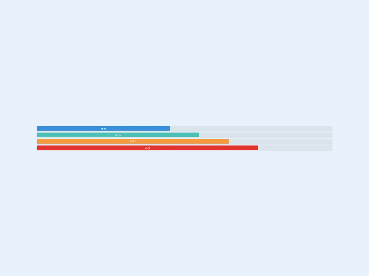
The preview of Progress bar UI component
A Progress bar UI component is a graphical representation of the progress of a task. It can be displayed horizontally or vertically and can be customized to fit your needs.
Free download of the Progress bar's source code
The source code of Progress bar UI component
To create a Progress bar UI component with Tailwind CSS, you can use a combination of pre-designed CSS classes and custom CSS code.
<div class="w-full">

  <div class="shadow w-full bg-grey-light">
    <div class="bg-blue text-xs leading-none py-1 text-center text-white" style="width: 45%">45%</div>
  </div>


  <div class="shadow w-full bg-grey-light mt-2">
    <div class="bg-teal text-xs leading-none py-1 text-center text-white" style="width: 55%">55%</div>
  </div>


  <div class="shadow w-full bg-grey-light mt-2">
    <div class="bg-orange text-xs leading-none py-1 text-center text-white" style="width: 65%">65%</div>
  </div>


  <div class="shadow w-full bg-grey-light mt-2">
    <div class="bg-red text-xs leading-none py-1 text-center text-white" style="width: 75%">75%</div>
  </div>
<div>
How to create a Progress bar with Tailwind CSS?
There are several ways to create a Progress bar with Tailwind CSS. Here are six different methods:
1. Basic Progress bar
The basic Progress bar can be created by using the bg-gray-300 class to set the background color and the h-2 class to set the height of the Progress bar. You can also use the w-full class to set the width of the Progress bar to 100%.
<div class="bg-gray-300 h-2 w-full"></div>
2. Colored Progress bar
To create a colored Progress bar, you can use the bg-green-500 class to set the background color. You can replace green with any other color name to change the color of the Progress bar.
<div class="bg-green-500 h-2 w-full"></div>
3. Progress bar with percentage
To add a percentage label to the Progress bar, you can use the relative class to set the position of the percentage label and the text-xs class to set the font size.
<div class="bg-green-500 h-2 w-full relative">
  <div class="absolute top-0 left-0 text-xs">50%</div>
</div>
4. Striped Progress bar
To create a striped Progress bar, you can use the bg-green-500 class to set the background color and the bg-green-200 animate-pulse classes to create the stripes.
<div class="bg-green-500 h-2 w-full bg-green-200 animate-pulse"></div>
5. Animated Progress bar
To create an animated Progress bar, you can use the bg-green-500 class to set the background color and the animate-pulse class to animate the Progress bar.
<div class="bg-green-500 h-2 w-full animate-pulse"></div>
6. Vertical Progress bar
To create a vertical Progress bar, you can use the bg-green-500 class to set the background color and the w-2 class to set the width of the Progress bar. You can also use the h-full class to set the height of the Progress bar to 100%.
<div class="bg-green-500 w-2 h-full"></div>
Conclusion
In conclusion, Tailwind CSS provides a set of pre-designed CSS classes that can be easily customized to create a Progress bar UI component. There are several ways to create a Progress bar with Tailwind CSS, including basic Progress bar, colored Progress bar, Progress bar with percentage, striped Progress bar, animated Progress bar, and vertical Progress bar. With these methods, you can create a Progress bar that fits your needs and enhances the user experience of your web application.