- Published on
6 Ideas To Help You Build A Progress Bar With Tailwind CSS Like A Pro
- What is Tailwind CSS?
- The description of Progress Bar ui component
- Why use Tailwind CSS to create a Progress Bar ui component?
- The preview of Progress Bar ui component
- The source code of Progress Bar ui component
- How to create a Progress Bar with Tailwind CSS?
- 1. Use the progress class
- 2. Use the from-{color}-500 and to-{color}-500 classes
- 3. Use the animate-pulse class
- 4. Use the border-{size} class
- 5. Use the shadow class
- 6. Use the rounded-{size} class
- Conclusion
What is Tailwind CSS?
Tailwind CSS is a utility-first CSS framework that allows developers to quickly build custom user interfaces. It provides a set of pre-defined CSS classes that can be combined to create complex UI components. Tailwind CSS is gaining popularity among developers due to its flexibility and ease of use.
The description of Progress Bar ui component
A progress bar is a UI component that indicates the progress of a task. It is commonly used in web applications to show the status of a file upload, form submission, or any other task that takes time to complete. A progress bar typically consists of a horizontal bar that fills up as the task progresses.
Why use Tailwind CSS to create a Progress Bar ui component?
Tailwind CSS provides a set of pre-defined classes that can be used to create a progress bar quickly. It eliminates the need to write custom CSS and saves time. Additionally, Tailwind CSS is highly customizable, which means you can easily modify the appearance of the progress bar to match your application's design.
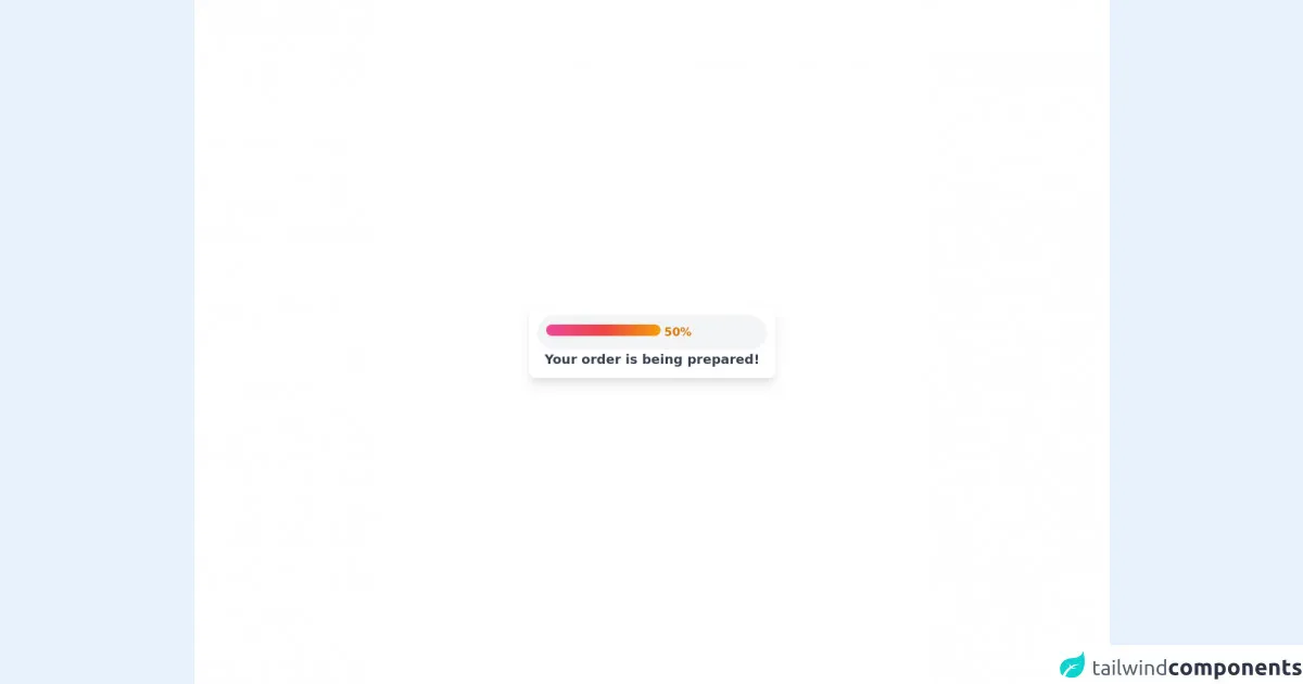
The preview of Progress Bar ui component
To create a progress bar with Tailwind CSS, you can use the progress class. This class creates a horizontal bar with a default height of 1rem and a background color of gray. You can customize the appearance of the progress bar by using additional classes.
Free download of the Progress Bar's source code
The source code of Progress Bar ui component
To create a progress bar with Tailwind CSS, you can use the following HTML code:
<div class="w-full bg-gray-300 rounded-lg">
  <div class="h-2 bg-blue-500 rounded-lg" style="width: 50%;"></div>
</div>
The outer div element has a gray background color and a rounded border. The inner div element has a blue background color and a rounded border. The style attribute sets the width of the inner div element to 50%, which indicates the progress of the task.
<div class="flex h-screen bg-white">
  <div class="m-auto">
    <div class="p-3 shadow-lg rounded-lg">
      <div class="w-80 h-auto bg-gray-100 p-3 rounded-full">
        <div class="inline-block w-40 h-auto bg-gradient-to-r from-pink-500 via-red-500 to-yellow-500 rounded-full p-2"></div>
        <div class="inline-block font-bold text-yellow-600">
          50%
        </div>
      </div>
      <div class="text-lg text-center text-gray-700 font-bold">
        Your order is being prepared!
      </div>
    </div>
  </div>
</div>
How to create a Progress Bar with Tailwind CSS?
Here are six ideas to help you build a progress bar with Tailwind CSS like a pro:
1. Use the progress class
As mentioned earlier, the progress class creates a horizontal bar with a default height of 1rem and a background color of gray. You can use this class to create a basic progress bar.
<div class="w-full bg-gray-300 rounded-lg">
  <div class="progress bg-blue-500 rounded-lg" style="width: 50%;"></div>
</div>
The bg-blue-500 class sets the background color of the progress bar to blue. The style attribute sets the width of the progress bar to 50%.
2. Use the from-{color}-500 and to-{color}-500 classes
You can create a gradient effect on the progress bar by using the from-{color}-500 and to-{color}-500 classes. These classes create a linear gradient from the specified color to transparent.
<div class="w-full bg-gray-300 rounded-lg">
  <div class="progress bg-gradient-to-r from-blue-500 to-green-500 rounded-lg" style="width: 50%;"></div>
</div>
The bg-gradient-to-r class creates a linear gradient from left to right. The from-blue-500 class sets the starting color of the gradient to blue, and the to-green-500 class sets the ending color of the gradient to green.
3. Use the animate-pulse class
You can add an animation effect to the progress bar by using the animate-pulse class. This class creates a pulsating effect on the progress bar.
<div class="w-full bg-gray-300 rounded-lg">
  <div class="progress bg-blue-500 animate-pulse rounded-lg" style="width: 50%;"></div>
</div>
The animate-pulse class creates a pulsating effect on the progress bar.
4. Use the border-{size} class
You can add a border to the progress bar by using the border-{size} class. This class sets the size of the border in pixels.
<div class="w-full bg-gray-300 rounded-lg">
  <div class="progress bg-blue-500 border-2 border-gray-400 rounded-lg" style="width: 50%;"></div>
</div>
The border-2 class sets the size of the border to 2 pixels. The border-gray-400 class sets the color of the border to gray.
5. Use the shadow class
You can add a shadow effect to the progress bar by using the shadow class. This class creates a drop shadow effect on the progress bar.
<div class="w-full bg-gray-300 rounded-lg">
  <div class="progress bg-blue-500 shadow rounded-lg" style="width: 50%;"></div>
</div>
The shadow class creates a drop shadow effect on the progress bar.
6. Use the rounded-{size} class
You can change the corner radius of the progress bar by using the rounded-{size} class. This class sets the size of the corner radius in pixels.
<div class="w-full bg-gray-300 rounded-lg">
  <div class="progress bg-blue-500 rounded-full" style="width: 50%;"></div>
</div>
The rounded-full class sets the corner radius of the progress bar to half of its height, which creates a circular shape.
Conclusion
In conclusion, Tailwind CSS provides a set of pre-defined classes that can be used to create a progress bar quickly. You can customize the appearance of the progress bar by using additional classes. By following the six ideas discussed in this article, you can build a progress bar with Tailwind CSS like a pro.