- Published on
6 Incredibly Easy Ways To Build A Product List With Tailwind CSS Better While Spending Less
- What is Tailwind CSS?
- The description of Product List ui component
- Why use Tailwind CSS to create a Product List ui component?
- The preview of Product List ui component
- The source code of Product List ui component
- How to create a Product List with Tailwind CSS?
- Step 1: Create the HTML structure
- Step 2: Add product image
- Step 3: Add product name and description
- Step 4: Add product price
- Step 5: Add responsive classes
- Step 6: Customize the styles
- Conclusion
Are you looking for an easy way to create a product list with Tailwind CSS? Look no further! In this article, we will show you how to create a product list with Tailwind CSS in 6 easy steps.
What is Tailwind CSS?
Tailwind CSS is a utility-first CSS framework that allows developers to quickly create custom user interfaces. It provides a set of pre-defined classes that can be used to style HTML elements. With Tailwind CSS, you can create beautiful and responsive user interfaces without writing any custom CSS.
The description of Product List ui component
A product list is a common user interface component that displays a list of products. It typically includes an image, product name, description, and price. It is commonly used in e-commerce websites and applications.
Why use Tailwind CSS to create a Product List ui component?
Tailwind CSS provides a set of pre-defined classes that can be used to create a product list quickly and easily. It eliminates the need to write custom CSS, which can save time and reduce the risk of errors. Additionally, Tailwind CSS is highly customizable, allowing you to create a unique product list that matches your brand.
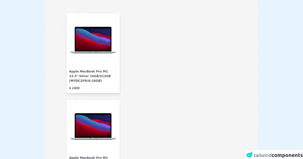
The preview of Product List ui component
Creating a product list with Tailwind CSS is incredibly easy. With just a few lines of code, you can create a beautiful and responsive product list that will impress your users.
Free download of the Product List's source code
The source code of Product List ui component
To create a product list with Tailwind CSS, you will need to write some HTML and apply Tailwind CSS classes to style the elements. Here is an example of the HTML and CSS code you can use to create a product list:
<div>
<div class="px-32 py-20 bg-gray-100 grid gap-10">
<div class="max-w-xs rounded-md overflow-hidden shadow-lg hover:scale-105 transition duration-500 cursor-pointer">
<div>
<img src="https://media.ldlc.com/r1600/ld/products/00/05/82/02/LD0005820208_1.jpg" alt="" />
</div>
<div class="py-4 px-4 bg-white">
<h3 class="text-lg font-semibold text-gray-600">Apple MacBook Pro M1 13.3" Silver 16GB/512GB (MYDC2FN/A-16GB)</h3>
<p class="mt-4 text-lg font-thin">$ 2400</p>
</div>
</div>
<div class="max-w-xs rounded-md overflow-hidden shadow-md hover:scale-105 transition duration-500 cursor-pointer">
<div>
<img src="https://media.ldlc.com/r1600/ld/products/00/05/82/02/LD0005820208_1.jpg" alt="" />
</div>
<div class="py-4 px-4 bg-white">
<h3 class="text-lg font-semibold text-gray-600">Apple MacBook Pro M1 13.3" Silver 16GB/512GB (MYDC2FN/A-16GB)</h3>
<p class="mt-4 text-lg font-thin">$ 2400</p>
</div>
</div>
</div>
</div>
How to create a Product List with Tailwind CSS?
Now that you know why Tailwind CSS is the perfect choice for creating a product list, let's dive into the steps to create one.
Step 1: Create the HTML structure
The first step is to create the HTML structure for the product list. You will need to create a container element and add a list of products inside it. Each product should be wrapped in a div element.
<div class="container mx-auto">
  <div class="grid grid-cols-1 sm:grid-cols-2 md:grid-cols-3 lg:grid-cols-4 gap-4">
    <div class="bg-white rounded-lg shadow-lg overflow-hidden">
      <!-- Product content goes here -->
    </div>
    <!-- Repeat for each product -->
  </div>
</div>
Step 2: Add product image
The next step is to add the product image. You can use the object-cover class to ensure that the image fills the container without distorting the aspect ratio.
<div class="bg-white rounded-lg shadow-lg overflow-hidden">
  <img src="product-image.jpg" alt="Product image" class="w-full h-48 object-cover">
  <!-- Product content goes here -->
</div>
Step 3: Add product name and description
The next step is to add the product name and description. You can use the text-gray-900 class to ensure that the text is legible.
<div class="bg-white rounded-lg shadow-lg overflow-hidden">
  <img src="product-image.jpg" alt="Product image" class="w-full h-48 object-cover">
  <div class="p-4">
    <h2 class="text-xl font-bold text-gray-900">Product Name</h2>
    <p class="text-gray-900">Product description goes here</p>
    <!-- Product price goes here -->
  </div>
</div>
Step 4: Add product price
The next step is to add the product price. You can use the text-gray-900 font-bold class to ensure that the price stands out.
<div class="bg-white rounded-lg shadow-lg overflow-hidden">
  <img src="product-image.jpg" alt="Product image" class="w-full h-48 object-cover">
  <div class="p-4">
    <h2 class="text-xl font-bold text-gray-900">Product Name</h2>
    <p class="text-gray-900">Product description goes here</p>
    <p class="text-gray-900 font-bold">$99.99</p>
  </div>
</div>
Step 5: Add responsive classes
The next step is to add responsive classes to ensure that the product list looks great on all devices. You can use the grid-cols-1 sm:grid-cols-2 md:grid-cols-3 lg:grid-cols-4 classes to create a responsive grid.
<div class="container mx-auto">
  <div class="grid grid-cols-1 sm:grid-cols-2 md:grid-cols-3 lg:grid-cols-4 gap-4">
    <div class="bg-white rounded-lg shadow-lg overflow-hidden">
      <img src="product-image.jpg" alt="Product image" class="w-full h-48 object-cover">
      <div class="p-4">
        <h2 class="text-xl font-bold text-gray-900">Product Name</h2>
        <p class="text-gray-900">Product description goes here</p>
        <p class="text-gray-900 font-bold">$99.99</p>
      </div>
    </div>
    <!-- Repeat for each product -->
  </div>
</div>
Step 6: Customize the styles
The final step is to customize the styles to match your brand. You can use the Tailwind CSS documentation to find the classes you need to achieve the desired style.
Conclusion
Creating a product list with Tailwind CSS is incredibly easy and can save you a lot of time. With just a few lines of code, you can create a beautiful and responsive product list that will impress your users. By following the steps outlined in this article, you can create a product list that matches your brand and meets your users' needs.