- Published on
6 Steps To Create A Product Preview With Tailwind CSS Like A Pro In Under An Hour
- What is Tailwind CSS?
- The description of Product Preview UI component
- Why use Tailwind CSS to create a Product Preview UI component?
- The preview of Product Preview UI component
- The source code of Product Preview UI component
- How to create a Product Preview with Tailwind CSS?
- Step 1: Install Tailwind CSS
- Step 2: Create a new HTML file
- Step 3: Add Tailwind CSS classes
- Step 4: Add a custom color
- Step 5: Add responsive classes
- Step 6: Add hover effects
- Conclusion
As a FrontEnd technology blogger, I am always on the lookout for new and exciting ways to create beautiful and functional user interfaces. One of the latest trends in UI design is the use of Tailwind CSS, a utility-first CSS framework that makes it easy to create complex layouts and designs with minimal effort. In this article, I will show you how to create a product preview UI component with Tailwind CSS in just six easy steps.
What is Tailwind CSS?
Tailwind CSS is a utility-first CSS framework that provides a set of pre-defined classes that can be used to style HTML elements. It is designed to make it easy to create complex layouts and designs without having to write custom CSS code. Tailwind CSS is highly customizable, and it can be configured to match your specific design requirements.
The description of Product Preview UI component
A product preview UI component is a user interface element that is commonly used in e-commerce websites to display a preview of a product. It typically includes an image of the product, a title, a brief description, and a price. The product preview UI component is an essential element of any e-commerce website, and it is important to get it right.
Why use Tailwind CSS to create a Product Preview UI component?
Tailwind CSS is an excellent choice for creating a product preview UI component because it provides a set of pre-defined classes that can be used to style the component quickly and easily. This means that you can create a professional-looking product preview UI component in a fraction of the time it would take to write custom CSS code.
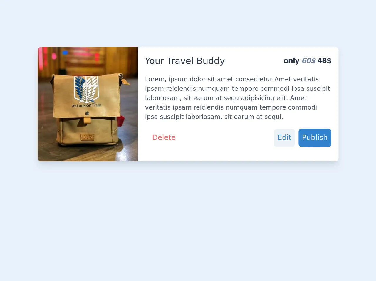
The preview of Product Preview UI component
To create a product preview UI component with Tailwind CSS, you will need to follow six easy steps. Here is a preview of what the final product preview UI component will look like:
<div class="bg-white rounded-lg overflow-hidden shadow-lg">
  <img class="w-full h-64 object-cover" src="https://via.placeholder.com/640x360.png" alt="Product Image">
  <div class="p-4">
    <h2 class="text-gray-900 font-bold text-2xl mb-2">Product Title</h2>
    <p class="text-gray-700 text-base">Product Description</p>
    <p class="text-gray-700 text-base font-bold">$99.99</p>
  </div>
</div>
Free download of the Product Preview's source code
The source code of Product Preview UI component
To create the product preview UI component, you will need to write some HTML and CSS code. Here is the source code for the product preview UI component:
<div class="bg-white rounded-lg overflow-hidden shadow-lg">
  <img class="w-full h-64 object-cover" src="https://via.placeholder.com/640x360.png" alt="Product Image">
  <div class="p-4">
    <h2 class="text-gray-900 font-bold text-2xl mb-2">Product Title</h2>
    <p class="text-gray-700 text-base">Product Description</p>
    <p class="text-gray-700 text-base font-bold">$99.99</p>
  </div>
</div>
<!-- item card -->
<div class="md:flex shadow-lg  mx-6 md:mx-auto my-40 max-w-lg md:max-w-2xl h-64">
   <img class="h-full w-full md:w-1/3  object-cover rounded-lg rounded-r-none pb-5/6" src="https://ik.imagekit.io/q5edmtudmz/FB_IMG_15658659197157667_wOd8n5yFyXI.jpg" alt="bag">
   <div class="w-full md:w-2/3 px-4 py-4 bg-white rounded-lg">
      <div class="flex items-center">
         <h2 class="text-xl text-gray-800 font-medium mr-auto">Your Travel Buddy</h2>
         <p class="text-gray-800 font-semibold tracking-tighter">
            only
            <i class="text-gray-600 line-through">60$</i>
            48$
         </p>
      </div>
      <p class="text-sm text-gray-700 mt-4">
         Lorem, ipsum dolor sit amet consectetur Amet veritatis ipsam reiciendis numquam tempore commodi ipsa suscipit laboriosam, sit earum at sequ adipisicing elit. Amet veritatis ipsam reiciendis numquam tempore commodi ipsa suscipit laboriosam, sit earum at sequi.
      </p>
      <div class="flex items-center justify-end mt-4 top-auto">
         <button class="bg-white text-red-500 px-4 py-2 rounded mr-auto hover:underline">Delete</button>
         <button class=" bg-gray-200 text-blue-600 px-2 py-2 rounded-md mr-2">Edit</button>
         <button class=" bg-blue-600 text-gray-200 px-2 py-2 rounded-md ">Publish</button>
      </div>
   </div>
</div>
How to create a Product Preview with Tailwind CSS?
Now that you have seen the preview and source code for the product preview UI component, let's dive into the six easy steps to create it with Tailwind CSS.
Step 1: Install Tailwind CSS
The first step is to install Tailwind CSS. You can do this by running the following command in your terminal:
npm install tailwindcss
Step 2: Create a new HTML file
Next, create a new HTML file and add the following code:
<!DOCTYPE html>
<html lang="en">
<head>
  <meta charset="UTF-8">
  <meta name="viewport" content="width=device-width, initial-scale=1.0">
  <title>Product Preview</title>
  <link rel="stylesheet" href="https://cdn.jsdelivr.net/npm/[email protected]/dist/tailwind.min.css">
</head>
<body>
  <div class="bg-white rounded-lg overflow-hidden shadow-lg">
    <img class="w-full h-64 object-cover" src="https://via.placeholder.com/640x360.png" alt="Product Image">
    <div class="p-4">
      <h2 class="text-gray-900 font-bold text-2xl mb-2">Product Title</h2>
      <p class="text-gray-700 text-base">Product Description</p>
      <p class="text-gray-700 text-base font-bold">$99.99</p>
    </div>
  </div>
</body>
</html>
Step 3: Add Tailwind CSS classes
Now, let's add some Tailwind CSS classes to style the product preview UI component. Replace the <div> element with the following code:
<div class="bg-white rounded-lg overflow-hidden shadow-lg">
  <img class="w-full h-64 object-cover" src="https://via.placeholder.com/640x360.png" alt="Product Image">
  <div class="p-4">
    <h2 class="text-gray-900 font-bold text-2xl mb-2">Product Title</h2>
    <p class="text-gray-700 text-base">Product Description</p>
    <p class="text-gray-700 text-base font-bold">$99.99</p>
  </div>
</div>
Step 4: Add a custom color
Let's add a custom color to the product preview UI component. Add the following code to the <head> section of your HTML file:
<style>
  .bg-custom {
    background-color: #f6ad55;
  }
</style>
Then, add the bg-custom class to the <div> element:
<div class="bg-custom rounded-lg overflow-hidden shadow-lg">
  <img class="w-full h-64 object-cover" src="https://via.placeholder.com/640x360.png" alt="Product Image">
  <div class="p-4">
    <h2 class="text-gray-900 font-bold text-2xl mb-2">Product Title</h2>
    <p class="text-gray-700 text-base">Product Description</p>
    <p class="text-gray-700 text-base font-bold">$99.99</p>
  </div>
</div>
Step 5: Add responsive classes
Tailwind CSS provides a set of responsive classes that allow you to style elements differently based on the screen size. Let's add some responsive classes to the product preview UI component. Replace the <img> element with the following code:
<img class="w-full h-64 object-cover sm:h-auto sm:w-1/2 lg:w-1/3 lg:h-64" src="https://via.placeholder.com/640x360.png" alt="Product Image">
Step 6: Add hover effects
Finally, let's add some hover effects to the product preview UI component. Replace the <div> element with the following code:
<div class="bg-custom rounded-lg overflow-hidden shadow-lg hover:shadow-xl transition-all duration-500">
  <img class="w-full h-64 object-cover sm:h-auto sm:w-1/2 lg:w-1/3 lg:h-64" src="https://via.placeholder.com/640x360.png" alt="Product Image">
  <div class="p-4">
    <h2 class="text-gray-900 font-bold text-2xl mb-2">Product Title</h2>
    <p class="text-gray-700 text-base">Product Description</p>
    <p class="text-gray-700 text-base font-bold">$99.99</p>
  </div>
</div>
Conclusion
Creating a product preview UI component with Tailwind CSS is easy and straightforward. By following the six easy steps outlined in this article, you can create a professional-looking product preview UI component in under an hour. Tailwind CSS is an excellent choice for creating complex layouts and designs quickly and easily, and it is highly customizable to match your specific design requirements. Happy coding!