- Published on
The 5 Really Obvious Ways To Make A Product Detail With Tailwind CSS Better That You Ever Did
- What is Tailwind CSS?
- The description of Product Detail ui component
- Why use Tailwind CSS to create a Product Detail ui component?
- The preview of Product Detail ui component
- The source code of Product Detail ui component
- How to create a Product Detail with Tailwind CSS?
- 1. Use Flexbox for Layout
- 2. Use Responsive Design
- 3. Use Custom Colors
- 4. Use Hover Effects
- 5. Use Animations
- Conclusion
As a FrontEnd technology blogger, I am always on the lookout for new and innovative ways to create beautiful and functional user interfaces. One tool that has caught my attention recently is Tailwind CSS. In this article, I will share with you five really obvious ways to make a Product Detail with Tailwind CSS better than you ever did.
What is Tailwind CSS?
Tailwind CSS is a utility-first CSS framework that allows you to quickly and easily create custom designs without having to write any CSS code. It provides a set of pre-defined classes that you can use to style your HTML elements.
The description of Product Detail ui component
The Product Detail ui component is a crucial part of any e-commerce website. It allows users to view detailed information about a product, including its name, price, description, and images. The Product Detail ui component should be visually appealing, easy to navigate, and provide all the necessary information to make an informed purchase decision.
Why use Tailwind CSS to create a Product Detail ui component?
Tailwind CSS is an excellent choice for creating a Product Detail ui component for several reasons. Firstly, it provides a comprehensive set of pre-defined classes that can be used to style all the different elements of the Product Detail ui component. Secondly, it allows for easy customization, so you can create a unique design that matches your brand's aesthetic. Finally, it is lightweight and fast, which is essential for creating a seamless user experience.
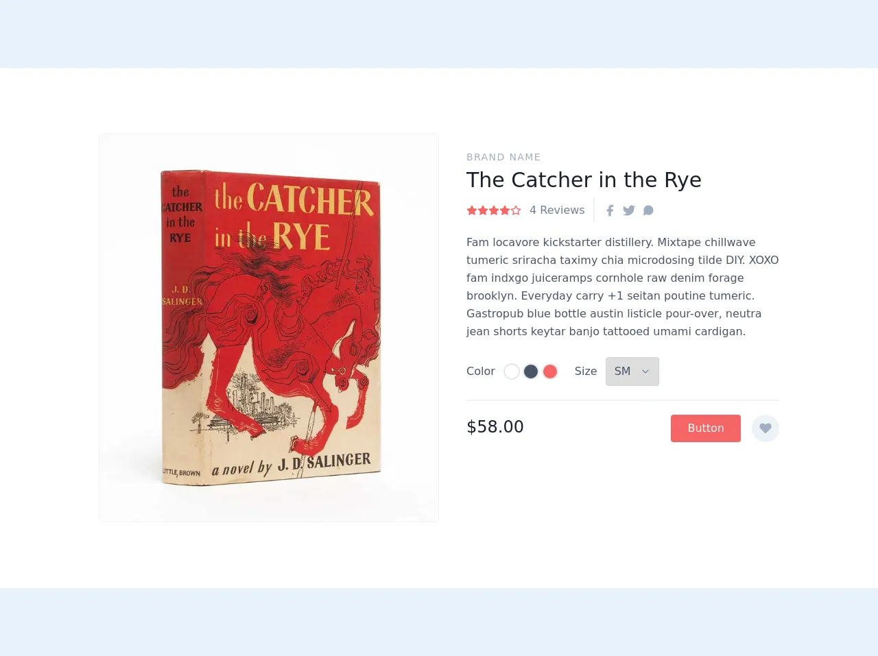
The preview of Product Detail ui component
To give you an idea of what a Product Detail ui component created with Tailwind CSS might look like, here is a preview:
Free download of the Product Detail's source code
The source code of Product Detail ui component
If you're interested in seeing the source code for a Product Detail ui component created with Tailwind CSS, here is an example:
<section class="text-gray-700 body-font overflow-hidden bg-white">
  <div class="container px-5 py-24 mx-auto">
    <div class="lg:w-4/5 mx-auto flex flex-wrap">
      <img alt="ecommerce" class="lg:w-1/2 w-full object-cover object-center rounded border border-gray-200" src="https://www.whitmorerarebooks.com/pictures/medium/2465.jpg">
      <div class="lg:w-1/2 w-full lg:pl-10 lg:py-6 mt-6 lg:mt-0">
        <h2 class="text-sm title-font text-gray-500 tracking-widest">BRAND NAME</h2>
        <h1 class="text-gray-900 text-3xl title-font font-medium mb-1">The Catcher in the Rye</h1>
        <div class="flex mb-4">
          <span class="flex items-center">
            <svg fill="currentColor" stroke="currentColor" stroke-linecap="round" stroke-linejoin="round" stroke-width="2" class="w-4 h-4 text-red-500" viewBox="0 0 24 24">
              <path d="M12 2l3.09 6.26L22 9.27l-5 4.87 1.18 6.88L12 17.77l-6.18 3.25L7 14.14 2 9.27l6.91-1.01L12 2z"></path>
            </svg>
            <svg fill="none" stroke="currentColor" stroke-linecap="round" stroke-linejoin="round" stroke-width="2" class="w-4 h-4 text-red-500" viewBox="0 0 24 24">
              <path d="M12 2l3.09 6.26L22 9.27l-5 4.87 1.18 6.88L12 17.77l-6.18 3.25L7 14.14 2 9.27l6.91-1.01L12 2z"></path>
            </svg>
            <span class="text-gray-600 ml-3">4 Reviews</span>
          </span>
          <span class="flex ml-3 pl-3 py-2 border-l-2 border-gray-200">
            <a class="text-gray-500">
              <svg fill="currentColor" stroke-linecap="round" stroke-linejoin="round" stroke-width="2" class="w-5 h-5" viewBox="0 0 24 24">
                <path d="M18 2h-3a5 5 0 00-5 5v3H7v4h3v8h4v-8h3l1-4h-4V7a1 1 0 011-1h3z"></path>
              </svg>
            </a>
            <a class="ml-2 text-gray-500">
              <svg fill="currentColor" stroke-linecap="round" stroke-linejoin="round" stroke-width="2" class="w-5 h-5" viewBox="0 0 24 24">
                <path d="M23 3a10.9 10.9 0 01-3.14 1.53 4.48 4.48 0 00-7.86 3v1A10.66 10.66 0 013 4s-4 9 5 13a11.64 11.64 0 01-7 2c9 5 20 0 20-11.5a4.5 4.5 0 00-.08-.83A7.72 7.72 0 0023 3z"></path>
              </svg>
            </a>
            <a class="ml-2 text-gray-500">
              <svg fill="currentColor" stroke-linecap="round" stroke-linejoin="round" stroke-width="2" class="w-5 h-5" viewBox="0 0 24 24">
                <path d="M21 11.5a8.38 8.38 0 01-.9 3.8 8.5 8.5 0 01-7.6 4.7 8.38 8.38 0 01-3.8-.9L3 21l1.9-5.7a8.38 8.38 0 01-.9-3.8 8.5 8.5 0 014.7-7.6 8.38 8.38 0 013.8-.9h.5a8.48 8.48 0 018 8v.5z"></path>
              </svg>
            </a>
          </span>
        </div>
        <p class="leading-relaxed">Fam locavore kickstarter distillery. Mixtape chillwave tumeric sriracha taximy chia microdosing tilde DIY. XOXO fam indxgo juiceramps cornhole raw denim forage brooklyn. Everyday carry +1 seitan poutine tumeric. Gastropub blue bottle austin listicle pour-over, neutra jean shorts keytar banjo tattooed umami cardigan.</p>
        <div class="flex mt-6 items-center pb-5 border-b-2 border-gray-200 mb-5">
          <div class="flex">
            <span class="mr-3">Color</span>
            <button class="border-2 border-gray-300 rounded-full w-6 h-6 focus:outline-none"></button>
            <button class="border-2 border-gray-300 ml-1 bg-gray-700 rounded-full w-6 h-6 focus:outline-none"></button>
            <button class="border-2 border-gray-300 ml-1 bg-red-500 rounded-full w-6 h-6 focus:outline-none"></button>
          </div>
          <div class="flex ml-6 items-center">
            <span class="mr-3">Size</span>
            <div class="relative">
              <select class="rounded border appearance-none border-gray-400 py-2 focus:outline-none focus:border-red-500 text-base pl-3 pr-10">
                <option>SM</option>
                <option>M</option>
                <option>L</option>
                <option>XL</option>
              </select>
              <span class="absolute right-0 top-0 h-full w-10 text-center text-gray-600 pointer-events-none flex items-center justify-center">
                <svg fill="none" stroke="currentColor" stroke-linecap="round" stroke-linejoin="round" stroke-width="2" class="w-4 h-4" viewBox="0 0 24 24">
                  <path d="M6 9l6 6 6-6"></path>
                </svg>
              </span>
            </div>
          </div>
        </div>
        <div class="flex">
          <span class="title-font font-medium text-2xl text-gray-900">$58.00</span>
          <button class="flex ml-auto text-white bg-red-500 border-0 py-2 px-6 focus:outline-none hover:bg-red-600 rounded">Button</button>
          <button class="rounded-full w-10 h-10 bg-gray-200 p-0 border-0 inline-flex items-center justify-center text-gray-500 ml-4">
            <svg fill="currentColor" stroke-linecap="round" stroke-linejoin="round" stroke-width="2" class="w-5 h-5" viewBox="0 0 24 24">
              <path d="M20.84 4.61a5.5 5.5 0 00-7.78 0L12 5.67l-1.06-1.06a5.5 5.5 0 00-7.78 7.78l1.06 1.06L12 21.23l7.78-7.78 1.06-1.06a5.5 5.5 0 000-7.78z"></path>
            </svg>
          </button>
        </div>
      </div>
    </div>
  </div>
</section>
How to create a Product Detail with Tailwind CSS?
Now that you understand why Tailwind CSS is an excellent choice for creating a Product Detail ui component, let's dive into the five really obvious ways to make it better.
1. Use Flexbox for Layout
Flexbox is a powerful layout tool that allows you to create complex layouts with ease. Tailwind CSS provides a set of classes that make it easy to use Flexbox for layout. For example, you can use the flex class to create a flex container and the justify-between class to evenly distribute the space between two elements.
2. Use Responsive Design
Responsive design is essential for creating a Product Detail ui component that looks great on all devices. Tailwind CSS provides a set of classes that make it easy to create responsive designs. For example, you can use the sm, md, lg, and xl classes to apply different styles based on the screen size.
3. Use Custom Colors
Tailwind CSS provides a set of pre-defined colors that you can use in your designs. However, if you want to create a unique design that matches your brand's aesthetic, you can define your own custom colors. Tailwind CSS makes it easy to define custom colors using the -- prefix.
4. Use Hover Effects
Hover effects can add an extra layer of interactivity to your Product Detail ui component. Tailwind CSS provides a set of classes that make it easy to create hover effects. For example, you can use the hover:bg-gray-100 class to change the background color of an element when it is hovered over.
5. Use Animations
Animations can make your Product Detail ui component feel more dynamic and engaging. Tailwind CSS provides a set of classes that make it easy to create animations. For example, you can use the animate-pulse class to create a pulsing animation on an element.
Conclusion
In conclusion, Tailwind CSS is an excellent choice for creating a Product Detail ui component. By using Flexbox for layout, responsive design, custom colors, hover effects, and animations, you can create a beautiful and functional design that will enhance the user experience. I hope these five really obvious ways to make a Product Detail with Tailwind CSS better than you ever did will inspire you to create your own unique designs using this powerful CSS framework.