- Published on
Learn How To Make A Product Card With Tailwind CSS from the Pros
- What is Tailwind CSS?
- The description of Product Card ui component
- Why use Tailwind CSS to create a Product Card ui component?
- The preview of Product Card ui component.
- The source code of Product Card ui component.
- How to create a Product Card with Tailwind CSS?
- Conclusion
Are you tired of spending countless hours trying to style your product cards? Look no further than Tailwind CSS. In this article, we'll walk you through how to create a beautiful and functional product card using Tailwind CSS.
What is Tailwind CSS?
Tailwind CSS is a utility-first CSS framework that allows you to quickly and easily style your HTML elements. With Tailwind CSS, you can create complex layouts and designs without having to write custom CSS. Tailwind CSS provides a wide range of pre-built classes that you can use to style your elements.
The description of Product Card ui component
A product card is a UI component that displays information about a product. It typically includes an image of the product, a description, and a price. Product cards are commonly used in e-commerce websites to showcase products.
Why use Tailwind CSS to create a Product Card ui component?
Tailwind CSS makes it easy to create a product card UI component. With Tailwind CSS, you can quickly style your product card without having to write custom CSS. Tailwind CSS provides a wide range of pre-built classes that you can use to style your product card.
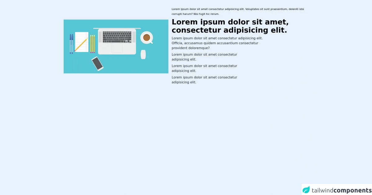
The preview of Product Card ui component.
To create a product card with Tailwind CSS, you'll need to use a combination of classes to style your HTML elements. Here's a preview of what your product card could look like:
Free download of the Product Card's source code
The source code of Product Card ui component.
To create a product card with Tailwind CSS, you'll need to use a combination of classes to style your HTML elements. Here's the source code for a basic product card:
<!-- This is an example component -->
   <div class="flex flex-col lg:flex-row justify-around items-center lg:mx-10 py-8">
      <div class="w-1/2" >
        <img  src="https://cdn.pixabay.com/photo/2016/07/12/19/08/laptop-1512838_1280.png" className="h-auto " alt="" />
      </div>
      <div class="lg:w-2/3 w-1/2 mt-4 lg:mt-0 pl-4">
 <small class="dark:text-gray-200">
          Lorem ipsum dolor sit amet consectetur adipisicing elit. Voluptates
          sit sunt praesentium, deleniti iste corrupti harum? Nisi fugit hic
          rerum.
        </small>
        <h2 class="dark:text-white font-bold text-lg lg:text-4xl my-2 ">
          Lorem ipsum dolor sit amet, consectetur adipisicing elit.
        </h2>
        <p class="dark:text-white text-base lg:w-3/4  text-gray-800 mt-2 mr-2">
          Lorem ipsum dolor sit amet consectetur adipisicing elit. Officia,
          accusamus quidem accusantium consectetur provident doloremque?
        </p>
        <div class="flex justify-start items-center my-2">
          <FaCheckSquare class="text-2xl text-yellow-600 mr-2" />
          <p class="dark:text-white text-base lg:w-3/4  text-gray-800">
            Lorem ipsum dolor sit amet consectetur adipisicing elit.
          </p>
        </div>
        <div class="flex justify-start items-center my-2">
          <FaCheckSquare class="text-2xl text-red-600 mr-2" />
          <p class="dark:text-white text-base lg:w-3/4  text-gray-800">
            Lorem ipsum dolor sit amet consectetur adipisicing elit.
          </p>
        </div>
        <div class="flex justify-start items-center my-2">
          <FaCheckSquare class="text-2xl text-blue-600 mr-2" />
          <p class="dark:text-white text-base lg:w-3/4  text-gray-800">
            Lorem ipsum dolor sit amet consectetur adipisicing elit.
          </p>
        </div>
      </div>
    </div>
How to create a Product Card with Tailwind CSS?
To create a product card with Tailwind CSS, follow these steps:
- Create an HTML element for your product card.
- Add an image element to your product card.
- Add a div element to your product card to hold the product information.
- Add a heading element to your product information div to display the product name.
- Add a paragraph element to your product information div to display the product description.
- Add a span element to your product information div to display the product price.
- Use Tailwind CSS classes to style your HTML elements.
Here's an example of what your HTML code could look like:
<div class="max-w-sm rounded overflow-hidden shadow-lg">
  <img class="w-full" src="product-image.jpg" alt="Product Image">
  <div class="px-6 py-4">
    <div class="font-bold text-xl mb-2">Product Name</div>
    <p class="text-gray-700 text-base">Product Description</p>
    <p class="text-gray-700 text-base">$9.99</p>
  </div>
</div>
In this example, we've used the max-w-sm, rounded, overflow-hidden, shadow-lg, w-full, px-6, py-4, font-bold, text-xl, mb-2, text-gray-700, and text-base classes to style our HTML elements.
Conclusion
In this article, we've shown you how to create a product card UI component using Tailwind CSS. With Tailwind CSS, you can quickly and easily style your product card without having to write custom CSS. We hope this article has been helpful in getting you started with Tailwind CSS. Happy coding!