- Published on
How To Make A Product Card Like Themeforest With Tailwind CSS In 5 Easy Steps
- What is Tailwind CSS?
- The description of Product Card Like Themeforest ui component
- Why use Tailwind CSS to create a Product Card Like Themeforest ui component?
- The preview of Product Card Like Themeforest ui component.
- The source code of Product Card Like Themeforest ui component.
- How to create a Product Card Like Themeforest with Tailwind CSS?
- Step 1: Create a container for the product card
- Step 2: Add an image of the product
- Step 3: Add the product name, price, and description
- Step 4: Style the product name, price, and description
- Step 5: Customize the product card
- Conclusion
What is Tailwind CSS?
Tailwind CSS is a utility-first CSS framework that provides a set of pre-defined classes for styling HTML elements. It allows developers to create responsive and customizable user interfaces quickly and efficiently.
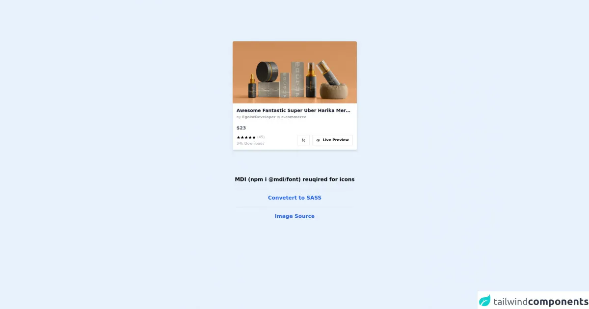
The description of Product Card Like Themeforest ui component
A product card is a UI component commonly used in e-commerce websites to display information about a product. The Themeforest product card is a popular design that features an image of the product, its name, price, and a short description.
Why use Tailwind CSS to create a Product Card Like Themeforest ui component?
Tailwind CSS provides a set of pre-defined classes that can be used to create a product card quickly and efficiently. It also allows developers to customize the design easily by overriding the default styles or creating new classes.
The preview of Product Card Like Themeforest ui component.
Free download of the Product Card Like Themeforest's source code
The source code of Product Card Like Themeforest ui component.
<style>
	.text-xxs {
		font-size: 0.70rem;
		line-height: 0.90rem;
	}

	.rounded-xss {
		border-radius: 2px !important;
	}
</style>

<!-- MDI Icons -->
<link rel="stylesheet" href="https://cdn.materialdesignicons.com/6.5.95/css/materialdesignicons.min.css" />

<!-- Product Card Container -->
<div class="flex flex-col items-center justify-center mt-32">
    <!-- Product Card -->
    <div class="flex flex-col shadow-md cursor-pointer w-96 hover:-translate-y-1 duration-300">
        <!-- Preview -->
        <div class="inline relative group h-48">
            <!-- Thumbnail -->
            <img class="absolute rounded-t object-cover h-full w-full"
                src="https://images.unsplash.com/photo-1627384113858-ce93ff568d1f?auto=format&fit=crop&w=1170&q=80"
                alt="Product Preview" />

                <!-- Hover Bar -->
                <div class="flex flex-row absolute justify-end
                    h-16 w-full bottom-0 px-3 space-x-2
                    bg-none opacity-0 group-hover:opacity-100
                    group-hover:bg-gradient-to-t from-black/20 via-gray-800/20 to-transparent
                    transition-all ease-in-out duration-200 delay-100">

                    <!-- Add to Bookmarks Button -->
                    <button class="bg-gray-50/10 rounded-full
                        px-1 h-9 w-9 my-auto hover:bg-gray-50/20
                        transition-colors duration-200">
                        <i class="mdi mdi-playlist-plus text-xl text-gray-200
                            hover:text-white transition-all duration-200"
                            title="Add to Bookmarks"></i>
                    </button>

                    <!-- Add to Favorites Button -->
                    <button class="bg-gray-50/10 rounded-full
                        px-1 h-9 w-9 my-auto hover:bg-gray-50/20
                        transition-colors duration-200">
                        <i class="mdi mdi-heart text-xl text-gray-200 p-1
                            hover:text-white transition-all duration-200"
                            title="Add to Favorites"></i>
                    </button>
                </div>
        </div>

        <!-- Body -->
        <div class="flex flex-col bg-white rounded-b p-3">
            <!-- Title -->
            <div class="text-sm font-semibold text-gray-900 hover:underline truncate">
                Awesome Fantastic Super Uber Harika Merveilleux Pro Ultra Max Plus Plus Makeup Stuff
            </div>

            <!-- Author - Category -->
            <div class="text-xxs text-gray-400 truncate mt-1">
                by

                <!-- Author -->
                <a class="font-semibold hover:underline"> EgoistDeveloper </a>

                in
                <!-- Category -->
                <a class="font-semibold hover:underline"> e-commerce </a>
            </div>

            <!-- Price -->
            <div class="text-sm text-gray-600 font-bold mt-4 mb-1">
                $23
            </div>

            <!-- Body -->
            <div class="flex flex-row mt-2">
                <!-- Detail Column -->
                <div class="flex flex-col flex-auto">
                    <!-- Rating -->
                    <div class="flex flex-row group">
                        <i class="mdi mdi-star text-xs text-amber-400
                            hover:text-amber-500 transition-all duration-200"
                            title="Worst"></i>

                        <i class="mdi mdi-star text-xs text-amber-400
                            hover:text-amber-500 transition-all duration-200"
                            title="Bad"></i>

                        <i class="mdi mdi-star text-xs text-amber-400
                            hover:text-amber-500 transition-all duration-200"
                            title="Not Bad"></i>

                        <i class="mdi mdi-star text-xs text-amber-400
                            hover:text-amber-500 transition-all duration-200"
                            title="Good"></i>

                        <i class="mdi mdi-star text-xs text-amber-400
                            hover:text-amber-500 transition-all duration-200"
                            title="Awesome"></i>

                        <div class="text-xxs text-gray-400 ml-1 hover:underline">
                            (45)
                        </div>
                    </div>

                    <!-- Statistic -->
                    <div class="text-xxs text-gray-400 mt-1" title="34k Downlaods in this year">
                        34k Downloads
                    </div>
                </div>

                <!-- Button Column -->
                <div class="flex flex-row flex-auto justify-end">
                    <!-- Cart Button -->
                    <a class="flex text-xs border px-3 my-auto py-2 mr-2
                        border-amber-500 group hover:bg-amber-500
                        rounded-xss
                        transition-all duration-200">

                        <!-- Icon -->
                        <i class="mdi mdi-cart-outline text-amber-700
                            group-hover:text-white delay-100"></i>
                    </a>

                    <!-- Preview Link Button -->
                    <a class="flex text-xs border px-3 my-auto py-2
                        border-amber-500 group hover:bg-amber-500
                        rounded-xss
                        transition-all duration-200">

                        <!-- Icon -->
                        <i class="mdi mdi-eye-outline text-amber-700
                            group-hover:text-white delay-100"></i>

                        <!-- Text -->
                        <div class="text-xxs text-amber-700 font-semibold ml-2
                            group-hover:text-white delay-100">
                            Live Preview
                        </div>
                    </a>
                </div>
            </div>
        </div>
    </div>

    <!-- Notes -->
    <span class="text-center font-bold my-20">
        MDI (npm i @mdi/font) reuqired for icons

        <hr class="my-4">

        <a href="https://egoistdeveloper.github.io/twcss-to-sass-playground/" target="_blank" class="text-blue-600">
            Convetert to SASS
        </a>

        <hr class="my-4">

        <a href="https://unsplash.com/photos/l6HaQMpCSW0" target="_blank" class="text-blue-600">
            Image Source
        </a>
    </span>
</div>
How to create a Product Card Like Themeforest with Tailwind CSS?
Here are the five easy steps to create a product card like Themeforest with Tailwind CSS:
Step 1: Create a container for the product card
The first step is to create a container for the product card. We can use the div element and give it a class of max-w-sm rounded overflow-hidden shadow-lg.
<div class="max-w-sm rounded overflow-hidden shadow-lg">
  <!-- Product card content goes here -->
</div>
Step 2: Add an image of the product
The second step is to add an image of the product. We can use the img element and give it a class of w-full.
<div class="max-w-sm rounded overflow-hidden shadow-lg">
  <img class="w-full" src="product-image.jpg" alt="Product Image">
  <!-- Product card content goes here -->
</div>
Step 3: Add the product name, price, and description
The third step is to add the product name, price, and description. We can use the div element and give it a class of px-6 py-4.
<div class="max-w-sm rounded overflow-hidden shadow-lg">
  <img class="w-full" src="product-image.jpg" alt="Product Image">
  <div class="px-6 py-4">
    <div class="font-bold text-xl mb-2">Product Name</div>
    <p class="text-gray-700 text-base">Product Description</p>
    <p class="text-gray-700 text-base">$99.99</p>
  </div>
</div>
Step 4: Style the product name, price, and description
The fourth step is to style the product name, price, and description. We can use the pre-defined Tailwind CSS classes to style the text.
<div class="max-w-sm rounded overflow-hidden shadow-lg">
  <img class="w-full" src="product-image.jpg" alt="Product Image">
  <div class="px-6 py-4">
    <div class="font-bold text-xl mb-2">Product Name</div>
    <p class="text-gray-700 text-base">Product Description</p>
    <p class="text-gray-700 text-base">$99.99</p>
  </div>
</div>
Step 5: Customize the product card
The final step is to customize the product card. We can use the pre-defined Tailwind CSS classes to change the background color, font size, and other styles.
<div class="max-w-sm rounded overflow-hidden shadow-lg bg-white">
  <img class="w-full" src="product-image.jpg" alt="Product Image">
  <div class="px-6 py-4">
    <div class="font-bold text-xl mb-2 text-gray-800">Product Name</div>
    <p class="text-gray-700 text-base">Product Description</p>
    <p class="text-gray-700 text-base">$99.99</p>
  </div>
</div>
Conclusion
In this article, we have learned how to create a product card like Themeforest with Tailwind CSS in five easy steps. Tailwind CSS provides a set of pre-defined classes that can be used to create responsive and customizable user interfaces quickly and efficiently. With Tailwind CSS, developers can focus on creating great user experiences without worrying about the underlying CSS code.