- Published on
Best Ways To Build A Pricing Table Wireframes With Tailwind CSS
- What is Tailwind CSS?
- The description of Pricing table wireframes UI component
- Why use Tailwind CSS to create a Pricing table wireframes UI component?
- The preview of Pricing table wireframes UI component
- The source code of Pricing table wireframes UI component
- How to create a Pricing table wireframes with Tailwind CSS?
- Step 1: Set up the HTML structure
- Step 2: Style the pricing table with Tailwind CSS
- Step 3: Add Tailwind CSS to the project
- Step 4: Customize the pricing table
- Conclusion
What is Tailwind CSS?
Tailwind CSS is a utility-first CSS framework that provides a set of pre-defined classes to quickly build custom user interfaces. It allows developers to create complex designs with ease, without having to write any custom CSS code. Tailwind CSS is rapidly gaining popularity among developers due to its flexibility and ease of use.
The description of Pricing table wireframes UI component
A pricing table wireframe is a user interface component that displays different pricing plans and their features. It is a crucial component for any website that offers products or services. A well-designed pricing table can help users quickly understand the different options available and make an informed decision.
Why use Tailwind CSS to create a Pricing table wireframes UI component?
Tailwind CSS provides a set of pre-defined classes that can be used to quickly create a pricing table wireframe. These classes can be easily customized to match the design requirements of the website. Tailwind CSS also provides responsive design classes that can be used to make the pricing table look great on all devices.
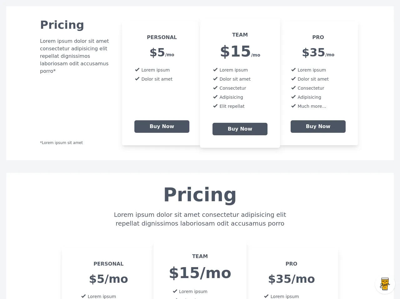
The preview of Pricing table wireframes UI component
To create a pricing table wireframe with Tailwind CSS, we will use a combination of HTML and CSS. The HTML will define the structure of the pricing table, while the CSS will define the styling. Here is a preview of what the pricing table wireframe will look like:
Free download of the Pricing table wireframes's source code
The source code of Pricing table wireframes UI component
To create the pricing table wireframe, we will use a combination of HTML and CSS. Here is the source code for the pricing table wireframe:
<style>
@import url(https://cdnjs.cloudflare.com/ajax/libs/MaterialDesign-Webfont/5.3.45/css/materialdesignicons.min.css);
</style>

<div class="min-w-screen min-h-screen bg-gray-100 px-5 py-5">

    <div class="w-full mx-auto bg-white px-5 py-10 text-gray-600 mb-10">
        <div class="max-w-5xl mx-auto md:flex">
            <div class="md:w-1/4 md:flex md:flex-col">
                <div class="text-left w-full flex-grow md:pr-5">
                    <h1 class="text-4xl font-bold mb-5">Pricing</h1>
                    <h3 class="text-md font-medium mb-5">Lorem ipsum dolor sit amet consectetur adipisicing elit repellat dignissimos laboriosam odit accusamus porro*</h3>
                </div>
                <div class="w-full mb-2">
                    <p class="text-xs">*Lorem ipsum sit amet</p>
                </div>
            </div>
            <div class="md:w-3/4">
                <div class="max-w-4xl mx-auto md:flex">
                    <div class="w-full md:w-1/3 md:max-w-none bg-white px-8 md:px-10 py-8 md:py-10 mb-3 mx-auto md:my-2 rounded-md shadow-lg shadow-gray-600 md:flex md:flex-col">
                        <div class="w-full flex-grow">
                            <h2 class="text-center font-bold uppercase mb-4">PERSONAL</h2>
                            <h3 class="text-center font-bold text-4xl mb-5">$5<span class="text-sm">/mo</span></h3>
                            <ul class="text-sm mb-8">
                                <li class="leading-tight"><i class="mdi mdi-check-bold text-lg"></i> Lorem ipsum</li>
                                <li class="leading-tight"><i class="mdi mdi-check-bold text-lg"></i> Dolor sit amet</li>
                            </ul>
                        </div>
                        <div class="w-full">
                            <button class="font-bold bg-gray-600 hover:bg-gray-700 text-white rounded-md px-10 py-2 transition-colors w-full">Buy Now</button>
                        </div>
                    </div>
                    <div class="w-full md:w-1/3 md:max-w-none bg-white px-8 md:px-10 py-8 md:py-10 mb-3 mx-auto md:-mx-3 md:mb-0 rounded-md shadow-lg shadow-gray-600 md:relative md:z-50 md:flex md:flex-col">
                        <div class="w-full flex-grow">
                            <h2 class="text-center font-bold uppercase mb-4">TEAM</h2>
                            <h3 class="text-center font-bold text-4xl md:text-5xl mb-5">$15<span class="text-sm">/mo</span></h3>
                            <ul class="text-sm mb-8">
                                <li class="leading-tight"><i class="mdi mdi-check-bold text-lg"></i> Lorem ipsum</li>
                                <li class="leading-tight"><i class="mdi mdi-check-bold text-lg"></i> Dolor sit amet</li>
                                <li class="leading-tight"><i class="mdi mdi-check-bold text-lg"></i> Consectetur</li>
                                <li class="leading-tight"><i class="mdi mdi-check-bold text-lg"></i> Adipisicing</li>
                                <li class="leading-tight"><i class="mdi mdi-check-bold text-lg"></i> Elit repellat</li>
                            </ul>
                        </div>
                        <div class="w-full">
                            <button class="font-bold bg-gray-600 hover:bg-gray-700 text-white rounded-md px-10 py-2 transition-colors w-full">Buy Now</button>
                        </div>
                    </div>
                    <div class="w-full md:w-1/3 md:max-w-none bg-white px-8 md:px-10 py-8 md:py-10 mb-3 mx-auto md:my-2 rounded-md shadow-lg shadow-gray-600 md:flex md:flex-col">
                        <div class="w-full flex-grow">
                            <h2 class="text-center font-bold uppercase mb-4">PRO</h2>
                            <h3 class="text-center font-bold text-4xl mb-5">$35<span class="text-sm">/mo</span></h3>
                            <ul class="text-sm mb-8">
                                <li class="leading-tight"><i class="mdi mdi-check-bold text-lg"></i> Lorem ipsum</li>
                                <li class="leading-tight"><i class="mdi mdi-check-bold text-lg"></i> Dolor sit amet</li>
                                <li class="leading-tight"><i class="mdi mdi-check-bold text-lg"></i> Consectetur</li>
                                <li class="leading-tight"><i class="mdi mdi-check-bold text-lg"></i> Adipisicing</li>
                                <li class="leading-tight"><i class="mdi mdi-check-bold text-lg"></i> Much more...</li>
                            </ul>
                        </div>
                        <div class="w-full">
                            <button class="font-bold bg-gray-600 hover:bg-gray-700 text-white rounded-md px-10 py-2 transition-colors w-full">Buy Now</button>
                        </div>
                    </div>
                </div>
            </div>
        </div>
    </div>

    <div class="w-full mx-auto bg-white px-5 py-10 text-gray-600 mb-10">
        <div class="text-center max-w-xl mx-auto">
            <h1 class="text-5xl md:text-6xl font-bold mb-5">Pricing</h1>
            <h3 class="text-xl font-medium mb-10">Lorem ipsum dolor sit amet consectetur adipisicing elit repellat dignissimos laboriosam odit accusamus porro</h3>
        </div>
        <div class="max-w-4xl mx-auto md:flex">
            <div class="w-full md:w-1/3 md:max-w-none bg-white px-8 md:px-10 py-8 md:py-10 mb-3 mx-auto md:my-6 rounded-md shadow-lg shadow-gray-600 md:flex md:flex-col">
                <div class="w-full flex-grow">
                    <h2 class="text-center font-bold uppercase mb-4">PERSONAL</h2>
                    <h3 class="text-center font-bold text-4xl mb-5">$5/mo</h3>
                    <ul class="text-sm px-5 mb-8">
                        <li class="leading-tight"><i class="mdi mdi-check-bold text-lg"></i> Lorem ipsum</li>
                        <li class="leading-tight"><i class="mdi mdi-check-bold text-lg"></i> Dolor sit amet</li>
                    </ul>
                </div>
                <div class="w-full">
                    <button class="font-bold bg-gray-600 hover:bg-gray-700 text-white rounded-md px-10 py-2 transition-colors w-full">Buy Now</button>
                </div>
            </div>
            <div class="w-full md:w-1/3 md:max-w-none bg-white px-8 md:px-10 py-8 md:py-10 mb-3 mx-auto md:-mx-3 md:mb-0 rounded-md shadow-lg shadow-gray-600 md:relative md:z-50 md:flex md:flex-col">
                <div class="w-full flex-grow">
                    <h2 class="text-center font-bold uppercase mb-4">TEAM</h2>
                    <h3 class="text-center font-bold text-4xl md:text-5xl mb-5">$15/mo</h3>
                    <ul class="text-sm px-5 mb-8">
                        <li class="leading-tight"><i class="mdi mdi-check-bold text-lg"></i> Lorem ipsum</li>
                        <li class="leading-tight"><i class="mdi mdi-check-bold text-lg"></i> Dolor sit amet</li>
                        <li class="leading-tight"><i class="mdi mdi-check-bold text-lg"></i> Consectetur</li>
                        <li class="leading-tight"><i class="mdi mdi-check-bold text-lg"></i> Adipisicing</li>
                        <li class="leading-tight"><i class="mdi mdi-check-bold text-lg"></i> Elit repellat</li>
                    </ul>
                </div>
                <div class="w-full">
                    <button class="font-bold bg-gray-600 hover:bg-gray-700 text-white rounded-md px-10 py-2 transition-colors w-full">Buy Now</button>
                </div>
            </div>
            <div class="w-full md:w-1/3 md:max-w-none bg-white px-8 md:px-10 py-8 md:py-10 mb-3 mx-auto md:my-6 rounded-md shadow-lg shadow-gray-600 md:flex md:flex-col">
                <div class="w-full flex-grow">
                    <h2 class="text-center font-bold uppercase mb-4">PRO</h2>
                    <h3 class="text-center font-bold text-4xl mb-5">$35/mo</h3>
                    <ul class="text-sm px-5 mb-8">
                        <li class="leading-tight"><i class="mdi mdi-check-bold text-lg"></i> Lorem ipsum</li>
                        <li class="leading-tight"><i class="mdi mdi-check-bold text-lg"></i> Dolor sit amet</li>
                        <li class="leading-tight"><i class="mdi mdi-check-bold text-lg"></i> Consectetur</li>
                        <li class="leading-tight"><i class="mdi mdi-check-bold text-lg"></i> Adipisicing</li>
                        <li class="leading-tight"><i class="mdi mdi-check-bold text-lg"></i> Much more...</li>
                    </ul>
                </div>
                <div class="w-full">
                    <button class="font-bold bg-gray-600 hover:bg-gray-700 text-white rounded-md px-10 py-2 transition-colors w-full">Buy Now</button>
                </div>
            </div>
        </div>
    </div>

    <div class="w-full mx-auto bg-white px-5 py-10 text-gray-600 mb-10">
        <div class="text-center max-w-xl mx-auto">
            <h1 class="text-5xl md:text-6xl font-bold mb-5">Pricing</h1>
            <h3 class="text-xl font-medium mb-10">Lorem ipsum dolor sit amet consectetur adipisicing elit repellat dignissimos laboriosam odit accusamus porro</h3>
        </div>
        <div class="w-full md:flex mb-5">
            <div class="w-full md:w-1/4 md:max-w-none bg-white px-8 md:px-10 py-8 md:py-10 mb-3 mx-auto md:my-6 rounded-md shadow-lg shadow-gray-600 md:flex md:flex-col">
                <div class="w-full flex-grow">
                    <h2 class="text-center font-bold uppercase mb-4">PERSONAL</h2>
                    <h3 class="text-center font-bold text-4xl mb-2">$5<s2an class="text-lg">/mo</span></h3>
                    <p class="text-center font-bold mb-5">
                        <a href="#" class="hover:underline hover:text-gray-700 transition-all transform hover:scale-110 inline-block">Read more<i class="mdi mdi-arrow-right-thick ml-1"></i></a>
                    </p>
                    <ul class="text-sm px-5 mb-8">
                        <li class="leading-tight"><i class="mdi mdi-check-bold text-lg"></i> Lorem ipsum</li>
                        <li class="leading-tight"><i class="mdi mdi-check-bold text-lg"></i> Dolor sit amet</li>
                    </ul>
                </div>
                <div class="w-full">
                    <button class="font-bold bg-gray-600 hover:bg-gray-700 text-white rounded-md px-10 py-2 transition-colors w-full">Buy Now</button>
                </div>
            </div>
            <div class="w-full md:w-1/4 md:max-w-none bg-white px-8 md:px-10 py-8 md:py-10 mb-3 mx-auto md:-mx-3 md:my-3 rounded-md shadow-lg shadow-gray-600 md:relative md:z-50 md:flex md:flex-col">
                <div class="w-full flex-grow">
                    <h2 class="text-center font-bold uppercase mb-4">TEAM</h2>
                    <h3 class="text-center font-bold text-3xl md:text-4xl mb-2">$15<span class="text-lg">/mo</span></h3>
                    <p class="text-center font-bold mb-5">
                        <a href="#" class="hover:underline hover:text-gray-700 transition-all transform hover:scale-110 inline-block">Read more<i class="mdi mdi-arrow-right-thick ml-1"></i></a>
                    </p>
                    <ul class="text-sm px-5 mb-8">
                        <li class="leading-tight"><i class="mdi mdi-check-bold text-lg"></i> Lorem ipsum</li>
                        <li class="leading-tight"><i class="mdi mdi-check-bold text-lg"></i> Dolor sit amet</li>
                        <li class="leading-tight"><i class="mdi mdi-check-bold text-lg"></i> Consectetur</li>
                        <li class="leading-tight"><i class="mdi mdi-check-bold text-lg"></i> Adipisicing</li>
                        <li class="leading-tight"><i class="mdi mdi-check-bold text-lg"></i> Elit repellat</li>
                    </ul>
                </div>
                <div class="w-full">
                    <button class="font-bold bg-gray-600 hover:bg-gray-700 text-white rounded-md px-10 py-2 transition-colors w-full">Buy Now</button>
                </div>
            </div>
            <div class="w-full md:w-1/4 md:max-w-none bg-white px-8 md:px-10 py-8 md:py-10 mb-3 mx-auto md:-mx-3 md:mb-0 rounded-md shadow-lg shadow-gray-600 md:relative md:z-50 md:flex md:flex-col">
                <div class="w-full flex-grow">
                    <h2 class="text-center font-bold uppercase mb-4">PRO</h2>
                    <h3 class="text-center font-bold text-4xl md:text-5xl mb-2">$35<span class="text-lg">/mo</span></h3>
                    <p class="text-center font-bold mb-5">
                        <a href="#" class="hover:underline hover:text-gray-700 transition-all transform hover:scale-110 inline-block">Read more<i class="mdi mdi-arrow-right-thick ml-1"></i></a>
                    </p>
                    <ul class="text-sm px-5 mb-8">
                        <li class="leading-tight"><i class="mdi mdi-check-bold text-lg"></i> Lorem ipsum</li>
                        <li class="leading-tight"><i class="mdi mdi-check-bold text-lg"></i> Dolor sit amet</li>
                        <li class="leading-tight"><i class="mdi mdi-check-bold text-lg"></i> Consectetur</li>
                        <li class="leading-tight"><i class="mdi mdi-check-bold text-lg"></i> Adipisicing</li>
                        <li class="leading-tight"><i class="mdi mdi-check-bold text-lg"></i> Much more...</li>
                    </ul>
                </div>
                <div class="w-full">
                    <button class="font-bold bg-gray-600 hover:bg-gray-700 text-white rounded-md px-10 py-2 transition-colors w-full">Buy Now</button>
                </div>
            </div>
            <div class="w-full md:w-1/4 md:max-w-none bg-white px-8 md:px-10 py-8 md:py-10 mb-3 mx-auto md:my-3 rounded-md shadow-lg shadow-gray-600 md:flex md:flex-col">
                <div class="w-full flex-grow">
                    <h2 class="text-center text-3xl font-bold uppercase mb-2">ENTERPRISE</h2>
                    <p class="text-center font-bold mb-5">
                        <a href="#" class="hover:underline hover:text-gray-700 transition-all transform hover:scale-110 inline-block">Read more<i class="mdi mdi-arrow-right-thick ml-1"></i></a>
                    </p>
                    <ul class="text-sm px-5 mb-8">
                        <li class="leading-tight"><i class="mdi mdi-check-bold text-lg"></i> Lorem ipsum</li>
                        <li class="leading-tight"><i class="mdi mdi-check-bold text-lg"></i> Consectetur</li>
                        <li class="leading-tight"><i class="mdi mdi-check-bold text-lg"></i> Adipisicing</li>
                        <li class="leading-tight"><i class="mdi mdi-check-bold text-lg"></i> Sed do eiusmod</li>
                        <li class="leading-tight"><i class="mdi mdi-check-bold text-lg"></i> Aliquip ex</li>
                        <li class="leading-tight"><i class="mdi mdi-check-bold text-lg"></i> Excepteur</li>
                        <li class="leading-tight"><i class="mdi mdi-check-bold text-lg"></i> Dolor sit amet*</li>
                    </ul>
                </div>
                <div class="w-full">
                    <button class="font-bold bg-gray-600 hover:bg-gray-700 text-white rounded-md px-10 py-2 transition-colors w-full">Enquire Now</button>
                </div>
            </div>
        </div>
        <div class="text-center max-w-xl mx-auto">
            <p class="text-xs leading-tight">*Lorem ipsum dolor sit, amet consectetur adipisicing elit. Aliquam eligendi officiis, impedit ducimus eaque a corporis, dolore quia officia quam tenetur suscipit dolores, quos, quaerat quo provident iusto. Eius, impedit!</p>
        </div>
    </div>
</div>

<!-- BUY ME A BEER AND HELP SUPPORT OPEN-SOURCE RESOURCES -->
<div class="flex items-end justify-end fixed bottom-0 right-0 mb-4 mr-4 z-10">
    <div>
        <a title="Buy me a beer" href="https://www.buymeacoffee.com/scottwindon" target="_blank" class="block w-16 h-16 rounded-full transition-all shadow hover:shadow-lg transform hover:scale-110 hover:rotate-12">
            <img class="object-cover object-center w-full h-full rounded-full" src="https://i.pinimg.com/originals/60/fd/e8/60fde811b6be57094e0abc69d9c2622a.jpg"/>
        </a>
    </div>
</div>
How to create a Pricing table wireframes with Tailwind CSS?
To create a pricing table wireframe with Tailwind CSS, follow these steps:
Step 1: Set up the HTML structure
The first step is to set up the HTML structure for the pricing table. Here is an example of what the HTML structure should look like:
<div class="pricing-table">
  <div class="pricing-plan">
    <div class="pricing-header">
      <h3 class="pricing-title">Basic</h3>
      <p class="pricing-price">$10<span>/month</span></p>
    </div>
    <ul class="pricing-features">
      <li>Feature 1</li>
      <li>Feature 2</li>
      <li>Feature 3</li>
    </ul>
    <button class="pricing-button">Buy Now</button>
  </div>
  <div class="pricing-plan">
    <div class="pricing-header">
      <h3 class="pricing-title">Pro</h3>
      <p class="pricing-price">$20<span>/month</span></p>
    </div>
    <ul class="pricing-features">
      <li>Feature 1</li>
      <li>Feature 2</li>
      <li>Feature 3</li>
      <li>Feature 4</li>
    </ul>
    <button class="pricing-button">Buy Now</button>
  </div>
  <div class="pricing-plan">
    <div class="pricing-header">
      <h3 class="pricing-title">Premium</h3>
      <p class="pricing-price">$30<span>/month</span></p>
    </div>
    <ul class="pricing-features">
      <li>Feature 1</li>
      <li>Feature 2</li>
      <li>Feature 3</li>
      <li>Feature 4</li>
      <li>Feature 5</li>
    </ul>
    <button class="pricing-button">Buy Now</button>
  </div>
</div>
Step 2: Style the pricing table with Tailwind CSS
The next step is to style the pricing table with Tailwind CSS. Here is an example of what the CSS should look like:
/* Pricing Table */
.pricing-table {
  display: flex;
  justify-content: center;
  flex-wrap: wrap;
  margin: 0 auto;
  max-width: 800px;
}

/* Pricing Plan */
.pricing-plan {
  background-color: #fff;
  border: 1px solid #e2e8f0;
  border-radius: 0.25rem;
  box-shadow: 0 0 10px rgba(0, 0, 0, 0.1);
  margin: 1rem;
  padding: 2rem;
  text-align: center;
  width: 100%;
  max-width: 300px;
}

/* Pricing Header */
.pricing-header {
  margin-bottom: 2rem;
}

/* Pricing Title */
.pricing-title {
  font-size: 1.5rem;
  font-weight: bold;
  margin-bottom: 0.5rem;
}

/* Pricing Price */
.pricing-price {
  font-size: 2rem;
  font-weight: bold;
  margin-bottom: 1rem;
}

/* Pricing Features */
.pricing-features {
  list-style: none;
  margin-bottom: 2rem;
  padding: 0;
  text-align: left;
}

.pricing-features li {
  margin-bottom: 0.5rem;
}

/* Pricing Button */
.pricing-button {
  background-color: #4299e1;
  border: none;
  border-radius: 0.25rem;
  color: #fff;
  cursor: pointer;
  font-size: 1rem;
  font-weight: bold;
  padding: 0.75rem 1.5rem;
  transition: all 0.2s ease-in-out;
}

.pricing-button:hover {
  background-color: #2b6cb0;
}
Step 3: Add Tailwind CSS to the project
To use Tailwind CSS, you need to add it to your project. You can either download the CSS file and include it in your HTML, or you can use a package manager like npm to install it. Here is an example of how to include Tailwind CSS in your HTML:
<link href="https://cdn.jsdelivr.net/npm/[email protected]/dist/tailwind.min.css" rel="stylesheet">
Step 4: Customize the pricing table
Finally, you can customize the pricing table by modifying the HTML and CSS. You can change the colors, fonts, and layout to match the design requirements of your website.
Conclusion
In conclusion, Tailwind CSS is an excellent choice for creating pricing table wireframes. It provides a set of pre-defined classes that can be easily customized to match the design requirements of your website. By following the steps outlined in this article, you can quickly create a beautiful and responsive pricing table wireframe with Tailwind CSS.